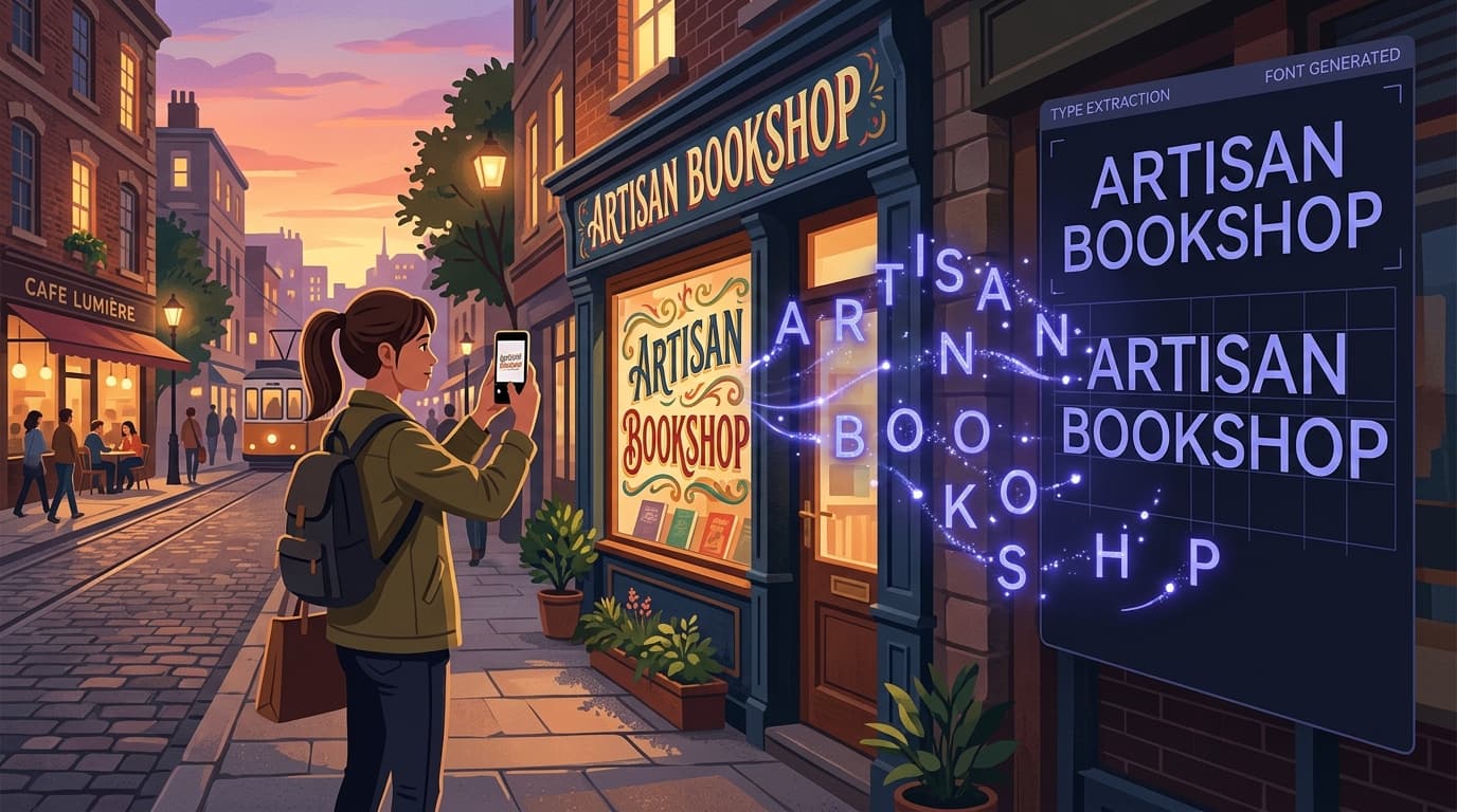
A strong brand is recognizable before anyone reads the name. Its colors, photography, voice, layouts, and typography work together to create a feeling people can identify in seconds. Yet typography is often treated as a last-minute design choice: pick a popular sans serif, set a few weights, and move on. That approach can work for a new business, but it eventually creates a ceiling. When your brand grows, a generic typeface can make your website, packaging, pitch decks, social posts, and product interface look increasingly interchangeable with everyone else’s.
A custom font for brand use is not simply an expensive design indulgence. It is a reusable visual asset that can make everyday communication feel more consistent, distinctive, and intentional. The good news is that building a unique brand font no longer has to mean commissioning a type foundry or investing a six-figure budget. In many cases, a carefully digitized handwritten sample, lettering style, or existing visual reference can become a practical starting point for a brand identity font.
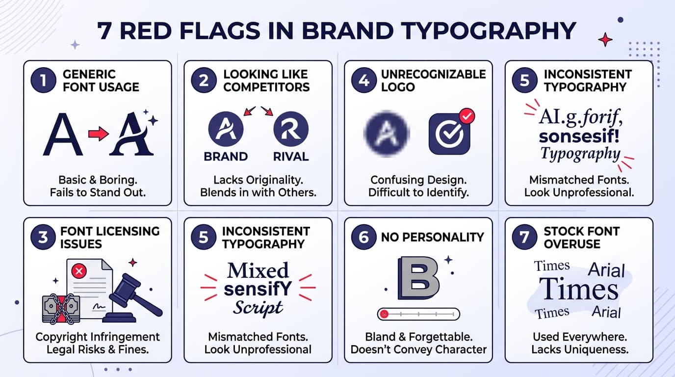
Below are seven signs your typography is holding your brand back, along with a realistic path to creating a custom typeface that fits the way your business actually communicates.
1. Your Brand Looks Too Similar to Your Competitors
If you can replace your company name with a competitor’s and the design still feels plausible, your typography is not doing enough brand work. This is especially common in crowded categories such as skincare, coffee, technology, real estate, and online education, where many companies draw from the same short list of trendy fonts.
Look at your homepage, three recent social posts, and a sales presentation beside competitors’ materials. Do the letterforms have a recognizable personality? Perhaps your industry is filled with polished geometric sans serifs, while your brand is warm, witty, and craft-led. A slightly irregular handwritten display font or a softer serif could create the contrast your identity needs. Conversely, a precise, compact custom typeface might help a technical company look more authoritative than competitors using playful defaults.
A unique brand font does not need to be used for every word. Often, its most effective role is in headlines, campaign names, pull quotes, packaging details, and short calls to action. That limited but consistent use makes the brand easier to recognize without sacrificing readability in body copy.
2. Your Logo Font Is Carrying the Entire Identity
Many brands have a distinctive logo but use generic typography everywhere else. The result is a split personality: the logo feels memorable, but the website, newsletter, and social content could belong to almost anyone. If removing your logo makes your materials immediately less recognizable, it is a strong sign that your visual system needs a supporting brand identity font.
Your logo font can provide useful clues. Maybe the logo has distinctive rounded terminals, sharp angles, an energetic handwritten rhythm, or a vintage brush texture. You do not have to turn the logo itself into a complete alphabet, but you can extend its visual DNA into a companion font. For example, a bakery with a hand-lettered logo could create a matching display alphabet for flavor names and seasonal promotions. A consulting firm with a refined serif wordmark might develop custom initial caps for reports and keynote slides.
Treat the logo as the beginning of a typographic system rather than the only unique element in it. The goal is continuity: readers should sense the same brand character from a two-word Instagram graphic to a 20-page proposal.
3. Your Team Keeps Breaking the Brand Guidelines
Inconsistent typography is not always a discipline problem. It is often a system problem. If team members constantly substitute fonts, stretch text, use random weights, or recreate headlines by hand in Canva or presentation software, your current guidelines may be too difficult to follow.
A useful brand typography system gives people clear, practical choices. It might specify one readable text font for long-form content, one flexible interface font for digital products, and one custom display font for short, high-impact messaging. It should also answer basic questions: Which font is used for webinar titles? Which size and tracking work for social graphics? Is the custom style appropriate for all caps? What is the fallback when a font is unavailable?
A tailored font can simplify these decisions because it gives teams an obvious place to add personality. Instead of experimenting with dozens of downloaded fonts, they can use the approved custom typeface for defined moments. Build a short cheat sheet with examples, not just rules. Show a correct email header, a slide cover, a product label, and a social graphic. Better adoption comes from making the right choice the easy choice.
4. Your Best Brand Assets Are Handwritten or Hand-Lettered
Perhaps your founder’s handwriting appears on packaging, your physical shop uses hand-painted signs, or your campaign work regularly includes lettering created by a designer. These assets can be charming and authentic, but they are hard to scale. Each new headline requires manual work, and consistency becomes difficult when several people try to imitate the style.
This is where a custom font maker can be particularly useful. Rather than treating handwriting as a one-off texture, you can turn its most useful character traits into a downloadable font. The objective is not necessarily to capture every wobble or pen variation. It is to preserve the features that make the writing feel like your brand: a high crossbar on the “t,” wide lowercase letters, rounded dots on the “i,” or a lively baseline.
Start with a clean sample written in dark ink on plain white paper. Include uppercase and lowercase letters, numerals, and punctuation that your brand uses often. Write at a natural pace, but leave enough space between characters for accurate recognition. If the final font will be used in headlines, prioritize legibility at display sizes. If you want it for short notes or product labels, test it in those real settings before rolling it out.
5. Your Brand Voice Has Personality, but Your Type Does Not
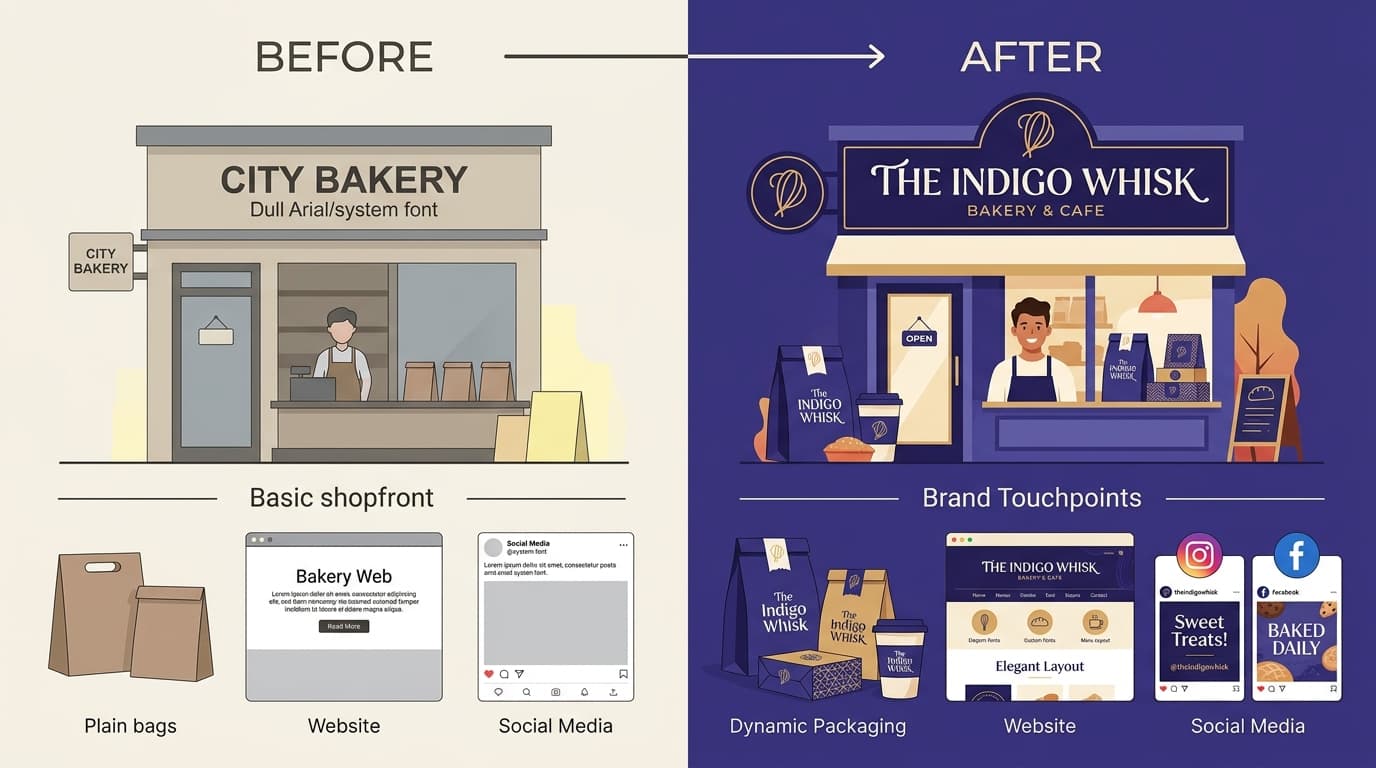
A brand can sound candid, optimistic, rebellious, thoughtful, luxurious, or quietly expert in writing—then lose all of that character when the words are displayed in a neutral default font. Type is not decoration added after the message. It changes how the message is perceived.
Consider a few practical mismatches. A cheerful children’s activity brand using a rigid corporate font may feel colder than its copy suggests. A heritage food producer using an ultra-clean tech sans serif can lose the sense of craft it has worked to establish. On the other hand, a healthcare company should be careful not to use an overly quirky custom typeface in contexts where clarity and trust matter most.
Define three to five adjectives that describe the visual voice you want readers to feel. Then connect each adjective to letterform traits. “Friendly” may mean open counters and soft curves. “Confident” may mean sturdy strokes and clear proportions. “Handmade” may mean subtle irregularity. “Premium” may mean measured contrast and generous spacing. This exercise helps you brief a designer—or create a font from your own lettering—with more precision than simply asking for something that looks creative.
6. You Need More Consistency Across Channels
Modern brands communicate in many places: websites, apps, sales decks, ads, invoices, onboarding emails, printed inserts, event signage, and video captions. Each channel has its own constraints, but the audience should still recognize the same company. A custom font for brand applications can act as a visual thread across those touchpoints.
The key is to use it strategically. A custom display font might be ideal for a landing-page headline, a shipping-box message, and the opening frame of a video. It may not be the right choice for a dense help-center article or a mobile form field. Pair it with a highly readable licensed font for body text and interface copy. This creates hierarchy: functional typography handles long reading, while the custom font supplies recognition and emotion.
Before launch, test your font in the places that matter most. Check it at small sizes, in black and white, on low-quality printers, and on mobile screens. Review combinations such as “rn,” “cl,” “I,” and “l” to make sure they do not create confusion. Test numerals if you publish prices, dates, metrics, or product names. A font earns its place in the system when it works beyond the polished brand board.
7. You Are Rebranding—or About to Grow Beyond Your Current Look
Rebrands, product launches, new markets, and major funding milestones are natural moments to review typography. You may not need a complete redesign, but growth often exposes limitations in a visual identity that was built quickly. A font selected for a small local business may not have enough range for a national campaign. A trendy logo treatment may be difficult to adapt into presentations, packaging, or international communications.
Creating a custom typeface can be a focused way to make a rebrand feel proprietary without replacing every element. It can preserve the emotional qualities your existing audience likes while giving your team a more scalable system. For instance, a café expanding into retail could turn its familiar counter-sign lettering into a font for coffee bags and wholesale materials. A creator-led business could convert a recognizable handwritten signature style into a repeatable brand asset as the team grows.
Do not wait until the identity is visibly stale. If your business is investing in more content, more campaigns, or more customer touchpoints, typography is worth addressing early. It compounds: every future asset becomes an opportunity to reinforce recognition.
How to Get a Custom Font Without Hiring a Type Designer
A practical process for creating and using your font
Commissioning a professional type designer remains the best route when you need a large character set, multiple weights, multilingual support, advanced OpenType features, or a font intended for extensive commercial distribution. But many small businesses, creators, and marketing teams need something more focused: a usable font based on a handwriting sample or lettering style for headlines, campaigns, labels, and brand accents.
Start by deciding on the job your font must do. Write a one-sentence brief, such as: “This font will make short campaign headlines feel personal and energetic,” or “This font will extend our hand-painted logo style to packaging.” A narrow purpose prevents overdesign and helps you evaluate results objectively.
Next, prepare source material. Create a character sheet containing uppercase letters, lowercase letters, numbers, and common punctuation. Use a consistent pen or marker, good lighting, and a flat white background. Avoid shadows, folds, and crowded letters. If your style comes from an existing illustration, choose a clean, high-resolution version where individual characters can be clearly identified. Include the characters you truly need; a retail brand, for example, should not forget currency symbols, ampersands, apostrophes, and numerals.
Then use an AI-assisted custom font maker such as Snapafont to convert the image into a .TTF font file. Snapafont is designed to turn an image of lettering or handwriting into a downloadable font, making it a practical option when you want to move from a physical sample to a usable digital asset without learning traditional font-production software. Upload the clearest sample possible and review the generated characters carefully.
Finally, test and refine before treating the font as official. Type realistic phrases rather than judging letters in isolation: product names, a homepage headline, an event date, an all-caps button, and a sentence with punctuation. Check spacing, repeated letters, and the overall rhythm. If a few characters feel off, improve the source sample and generate another version. Once you are happy, document where the custom font should be used, provide the .TTF file to the appropriate team members, and keep a readable companion font for body copy. That combination gives you a distinctive system that remains practical day to day.
Turn Your Distinctive Lettering Into a Brand Asset
If your best brand personality currently lives in a sketchbook, storefront sign, handwritten note, or logo detail, it does not have to stay there. Converting that visual character into a font can give your team a repeatable way to create recognizable headlines, social graphics, packaging messages, and campaign assets.
Snapafont makes that first step accessible: upload a clear image of your handwriting or lettering and turn it into a downloadable .TTF file you can test in the tools your team already uses. Visit snapafont.com to create a font, try it in real brand materials, and see whether a more distinctive typographic voice is the missing piece of your identity.
Ready to turn your image into a font?
Upload any image and get a real, downloadable .TTF font file in seconds.
Try Snapafont Free →