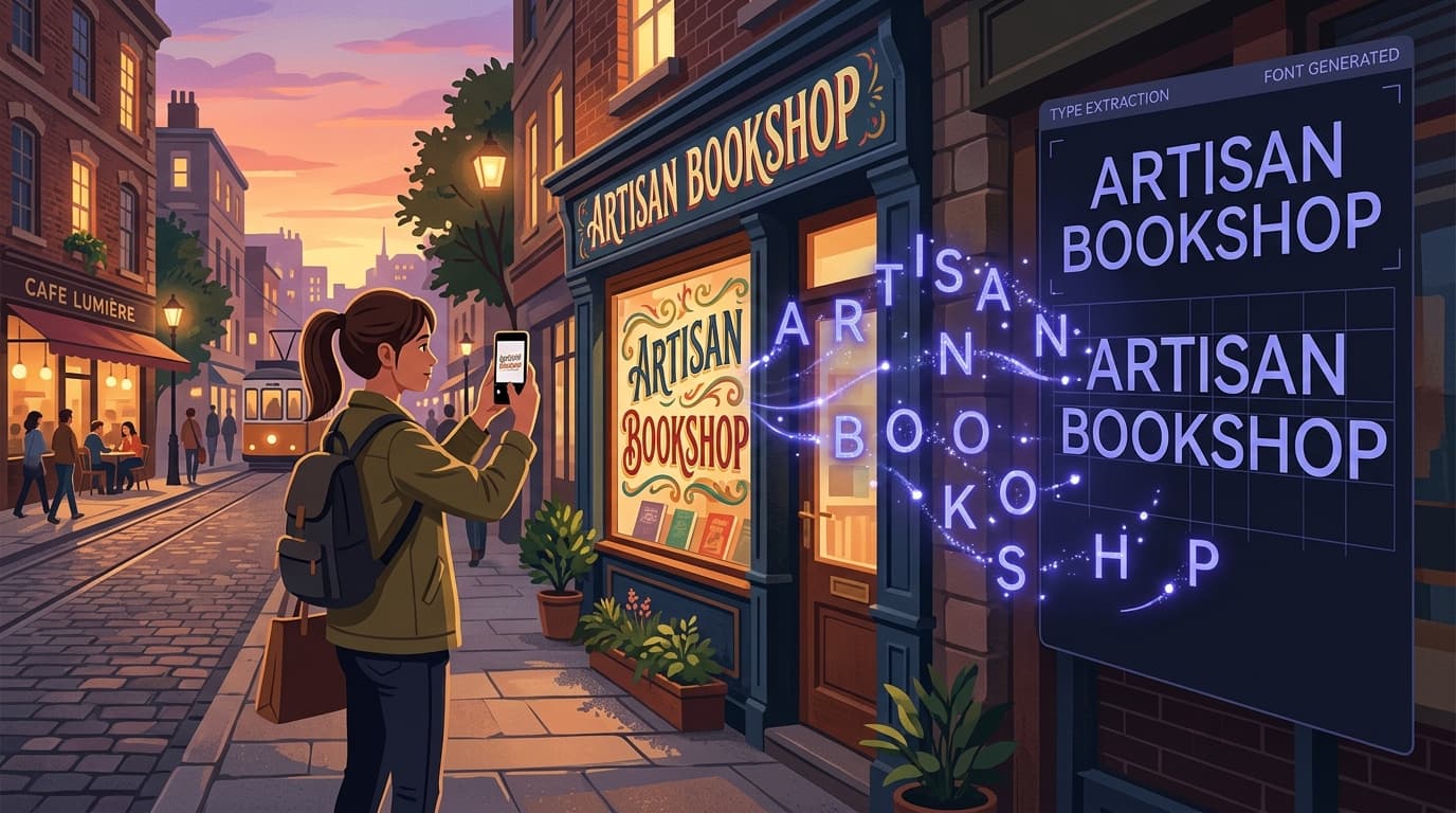
You spot it everywhere: a hand-painted café sign with perfectly uneven letters, a vintage logo with a distinctive "R," or a photo of a poster whose type feels exactly right for your next project. The frustrating part is that a typeface is not the same thing as an image. Cropping the letters from a photo only gives you pixels; it does not give you a usable font you can type with in Canva, Adobe apps, Word, Figma, or a website.
Today, AI makes that gap much easier to close. Instead of manually tracing every character in specialist font software, you can turn image into font data with a focused workflow: start with a clear reference image, let an AI identify the letterforms and infer a coherent character set, review the result, and download a real .TTF file. In many cases, an image to font online tool can produce a starting font in under a minute.
This guide explains how to create custom font files from logos, signs, scans, and photos, what kinds of images work best, and how to get results that are practical rather than merely interesting. It also covers an important distinction: use this process for lettering you own, have permission to use, or are creating for personal experimentation. A font from photo can be a powerful creative asset, but it should not be used to copy or redistribute protected typefaces without appropriate rights.
Why Custom Fonts Matter
Typography carries personality before a reader processes a single word. A clean geometric sans-serif can feel modern and efficient. A weathered brush script can feel handmade and energetic. A condensed serif can suggest editorial authority or old-world craftsmanship. When a brand, event, packaging concept, or personal creative project needs a specific voice, the default fonts already installed on every computer often cannot provide it.
A custom font creator helps turn visual inspiration into something reusable. Rather than placing the same image of a wordmark into every layout, you can type new headlines, names, captions, menu items, invitations, social graphics, and mockups in a consistent style. That creates flexibility. For example, a bakery may have a hand-lettered storefront sign but need matching text for seasonal chalkboards and Instagram posts. A designer working on a fictional film poster may want a font from image reference to build a complete title sequence. A family can turn a loved one's handwritten alphabet into a meaningful font for cards and keepsakes.
There is also a major production benefit. Raster lettering does not scale cleanly: enlarging a small photo can introduce blur and jagged edges. A .TTF font is vector-based, so the same letters can be used at 12 points in body copy or 120 points on a poster while remaining crisp. It can also be colored, tracked, kerned, animated, exported, and integrated into most design workflows.
The goal is not always to recreate a reference with forensic precision. In fact, many successful projects use a source image as a style direction. The AI can infer shared traits such as thick-and-thin contrast, rounded terminals, narrow proportions, irregular baseline movement, or retro inline details, then apply those traits across a usable alphabet. That is what turns a one-off visual reference into a tool for making new words.
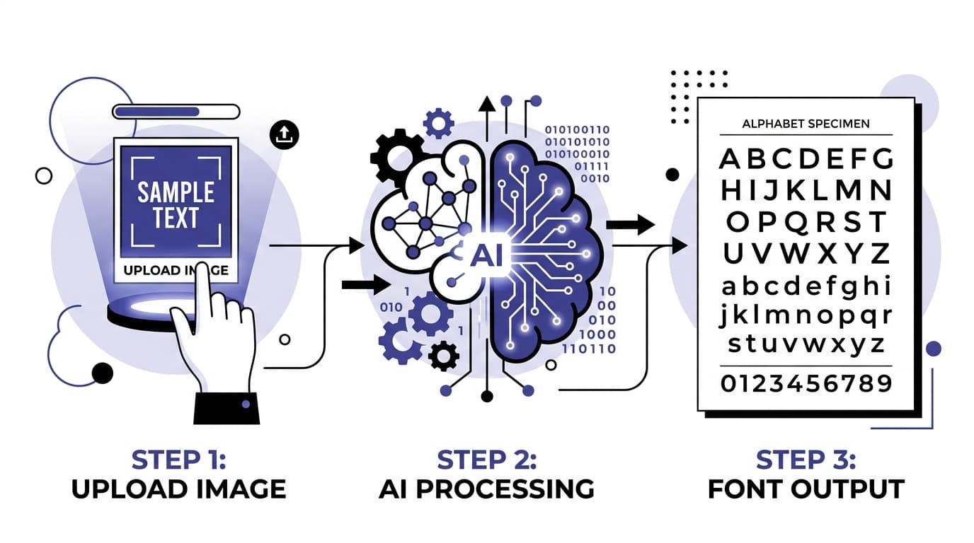
How to Turn Any Image Into a Custom Font: Step by Step
The quickest route is to use an AI font generator designed to interpret reference imagery and export a font file. Snapafont is built for this exact job: upload an image, let the system analyze its lettering style, and download a usable .TTF font. The following process will help you get a stronger result from the first upload.
1. Choose a Reference Image With a Clear Lettering Style
Start with an image that has a single, recognizable typographic direction. Good candidates include a logo, storefront sign, book cover, poster, handwritten sample, product label, or scanned lettering. The lettering does not need to show every letter of the alphabet, but it should reveal enough visual information for the AI to understand the style.
For instance, a photo reading "MORNING MARKET" gives clues about uppercase shapes, width, stroke weight, spacing, and decorative details. A reference that only contains the word "OXO" is less useful because it reveals very little about how the style handles straight stems, diagonals, bowls, or lowercase characters. If you have several photos of the same lettering style, select the clearest one or create a simple collage that keeps the lettering large and unobstructed.
2. Crop and Clean Up the Image Before Uploading
A few seconds of preparation can significantly improve a font from image. Crop tightly around the letters so the style is the obvious subject. Remove distracting borders, unrelated objects, large shadows, or busy backgrounds when possible. If the lettering is photographed at an angle, straighten it or correct perspective with a basic image editor. High contrast is especially helpful: dark letters on a light background or light letters on a dark background are easier to interpret than letters partially hidden by reflections or textures.
Do not over-edit the source. Heavy sharpening, aggressive filters, or extreme contrast adjustments can erase the subtle texture that gives hand-drawn lettering its character. Aim for readable shapes, not a sterile image. If a painted sign has natural brush variation, keeping some of that variation visible may help preserve its personality in the generated font.
3. Upload the Image to an AI Font Generator
Open Snapafont, upload your prepared image, and allow the AI to analyze the reference. This is the key moment where an image to font online workflow differs from simply using an image-tracing tool. The system is not only looking for visible letters; it is interpreting the broader design language and using it to generate characters that may not appear in the source image.
Be intentional about your desired outcome. If the source is a bold all-caps restaurant sign, expect the strongest result to be an all-caps display font. If you need polished long-form text, a decorative sign reference may not be the best starting point. Display fonts are excellent for headlines, labels, logo explorations, and short messages, while readable body fonts need more restrained proportions and spacing.
Once processing is complete, review the preview text. Type a few words that contain different shapes, such as "Hamburgefontsiv" or "Quick brown fox," along with the exact phrases you expect to use. This quickly reveals whether rounds, diagonals, punctuation, and repeated letters feel coherent.
4. Download, Install, and Test the .TTF File
When you are happy with the direction, download the .TTF file. TTF, or TrueType Font, is widely supported across operating systems and creative applications. On most Windows computers, right-click the file and select Install. On macOS, double-click the file and choose Install Font in Font Book. After installation, restart any app that was already open so it can refresh its font list.
Test the font in the environment where you will actually use it. Try it in a design app, a presentation, a social template, or a word processor. Check uppercase and lowercase letters, numerals, apostrophes, quotation marks, ampersands, and the punctuation that appears in your project. Also test at the intended size. Small counters in letters such as "a," "e," and "o" may look great in a 90-point headline but fill in at 14 points.
Finally, save the source image, the downloaded font, and notes about its intended use in the same project folder. Clear naming is helpful, especially if you generate several variations. A name such as "HarborSign_Display_v1" is much easier to find later than "font-final-new.ttf."
What Makes a Good Input Image?
The best source images have readable letters, consistent styling, and enough detail to communicate the type's personality. Resolution matters, but clarity matters more. A sharp phone photo of six large letters can be more useful than a high-resolution image where the lettering is tiny. As a practical rule, make sure individual characters are visibly separated and large enough to inspect without zooming excessively.
Look for consistency in stroke treatment. If one word is painted in a heavy brush style and another word uses a plain sans-serif, crop to the style you want to turn into a font. Likewise, avoid references where letters are heavily covered by leaves, people, glare, folds, or other objects. AI can make reasonable inferences, but it cannot reliably recover design decisions that are not visible.
Perspective is another common issue. A sign photographed from the side may make one end of each word much taller than the other. Correcting perspective before upload gives the model more reliable shape information. If correction is not possible, choose a different image or crop to the most front-facing section. For curved signage, focus on individual letterforms rather than expecting the arc of the original layout to become part of every line of text.
Also consider whether the reference has enough variation. A sample containing letters like A, E, M, N, O, R, S, and T provides clues about straight lines, curves, diagonals, crossbars, and terminals. Numbers and punctuation are useful bonuses. If you are creating a font from photo of handwritten text, a full alphabet written by the same person will generally create a more faithful result than a single signature.
Avoid using blurry screenshots of type specimens, watermarked artwork, or text that belongs to a commercial font foundry unless you have permission. The strongest creative use case is original work: your own handwriting, your own signage, lettering commissioned for your brand, archival material in the public domain, or a reference whose rights you have verified.
What You Get After Creating the Font
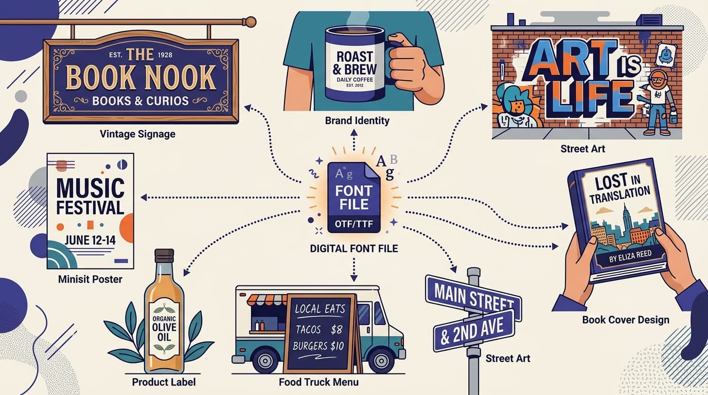
The primary output is a downloadable .TTF font file that you can install and type with. Unlike a PNG or JPG of lettering, it is not limited to one word, color, or size. Once installed, it can become part of your normal design toolkit. Use it for presentation titles, branded templates, stickers, invitations, product mockups, video captions, social posts, and web graphics.
A generated font should be treated like any other design asset: test it before committing to a large production run. Evaluate legibility, especially in common combinations such as "rn" versus "m," "I" versus "l," and "O" versus "0." Look at spacing in words with repeated characters, such as "letter," "coffee," or "minimum." If a style is intentionally irregular, slight variation can be a feature; if it makes words difficult to read, reserve the font for short display text.
It is also useful to pair your new typeface with a neutral supporting font. A bold custom display face might work beautifully for headings while a familiar sans-serif handles paragraphs, prices, navigation, or disclaimers. This pairing approach lets the unique font make an impact without asking it to do a job it was never designed to do.
Think of the first output as a creative version rather than the only possible version. Try more than one source crop, lighting adjustment, or reference image. One upload may capture texture particularly well, while another may produce cleaner proportions. Comparing versions is often the fastest way to arrive at a font that fits your project.
Frequently Asked Questions
Below are practical answers to the questions people commonly have before they turn an image into a working font.
Can AI create a full font from a photo with only a few letters?
Yes, an AI font generator can infer a broader character set from a limited reference by recognizing visible stylistic patterns. However, more visible characters generally provide more reliable results. A photo with multiple letters, varied shapes, and clear details gives the AI stronger evidence for how unseen characters should look. For a display font, a short word can be enough to create a compelling result; for extensive writing, use a richer reference and test the generated alphabet carefully.
How long does it take to create a custom font?
With a clear source image and an online tool such as Snapafont, generating and downloading a first .TTF version can take under a minute. The extra time is usually in selecting the best image and testing the font in your intended application. That testing is worthwhile because it ensures the font works at the sizes and in the words you actually need.
Can I turn a logo or a known font into my own font?
Only do so when you own the artwork, have explicit permission, or the material is available for the intended use. Logos and commercial fonts may be protected by copyright, trademark, license terms, or other rights. Creating a look-alike font from someone else's branded or licensed lettering can create legal and ethical issues. Use original lettering or properly licensed references for client work, public projects, and commercial distribution.
Turn Your Reference Into a Font You Can Actually Use
A great piece of lettering should not have to stay trapped in a photo. If you have a clear image and permission to use it, you can turn that visual style into a practical font asset for your next design. Start with your best crop, keep the lettering readable, and test the result in real words rather than judging it from a single preview.
Snapafont makes the process straightforward: upload a reference image, let AI transform its visual character into a typeable font, and download a .TTF file for your workflow. Whether you are exploring a handmade brand direction, preserving handwriting, or building a standout display face from a sign or photo, try it at snapafont.com and see what your inspiration looks like as a font.
Ready to turn your image into a font?
Upload any image and get a real, downloadable .TTF font file in seconds.
Try Snapafont Free →