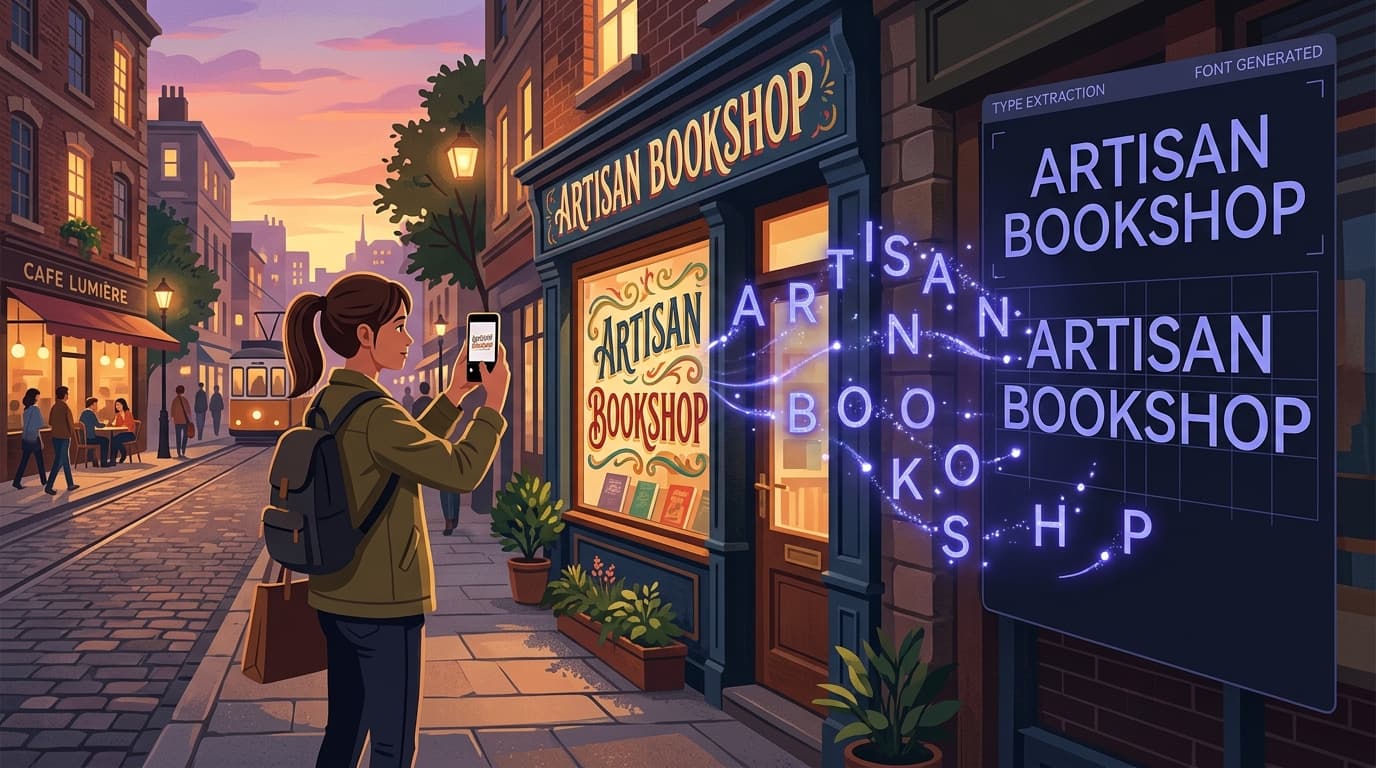
A hand-painted menu board, a faded delivery van, a ceramic tile sign outside a neighborhood café, the lettering on a vintage jacket: designers encounter compelling type everywhere. The challenge is moving from “that lettering is perfect” to a usable typeface without losing the character that made it interesting in the first place.
Learning to extract font from image sources is not simply a technical shortcut. It is a way to build a more observant visual practice. Real-world type often contains qualities that polished digital fonts do not: weathering, imperfect spacing, unusual proportions, regional sign-painting traditions, and the small inconsistencies that make lettering feel human. With a thoughtful process, a font from photo can become a practical asset for a mood board, a brand exploration, an editorial project, or a personal creative toolkit.
This guide explains how to find strong source material, photograph it well, prepare it for conversion, and turn a typeface from image reference into a working font file. It also covers the crucial finishing work: testing letters, adjusting spacing, understanding limitations, and respecting the rights of original creators. Tools such as Snapafont make font capture substantially faster by converting letterforms in an image into a downloadable .TTF font file, but the quality of the result still begins with your eye and your source image.
What Fonts Work Best for Extraction?
Look for clear, consistent letterforms before you look for novelty
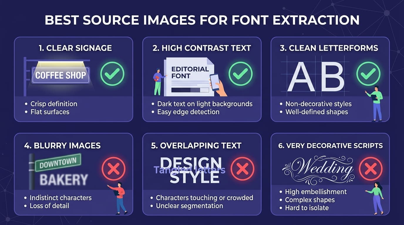
The best candidates for font extraction are not always the most elaborate signs. A successful source needs enough visible characters, clear separation between letters, and a reasonably consistent drawing style. If you can see uppercase A through Z, lowercase letters, or a useful mix of numbers and punctuation, you have a much stronger starting point than you would with a single decorative word.
Bold display lettering is often the easiest material to capture. Think storefront signs, painted truck lettering, athletic jerseys, packaging, restaurant menus, book covers, and event posters. Heavy strokes remain legible even when the surface is aged or the photo is not perfect. Sans serifs, slab serifs, simple script lettering, and hand-drawn block caps can all work well, provided the characters are not heavily overlapping.
Consistency matters. A sign may have wonderfully expressive letters, but if every “E” is drawn differently or the baseline changes dramatically from word to word, an automated font extraction tool has less reliable information to work with. That does not make the source unusable; it simply means you may be creating an interpretive typeface rather than a precise digital reconstruction. For expressive one-off lettering, that can be a feature rather than a flaw.
Avoid sources with extreme perspective, very low resolution, dense shadows, severe reflections, or lettering obscured by objects. Cursive scripts with connected letters can be more difficult because the tool must determine where one glyph ends and the next begins. Likewise, distressed paint may look beautiful in situ but can create broken contours that need cleanup after conversion.
A practical rule: choose a source where you could confidently trace the outline of each character by hand. If you can distinguish the letter boundaries, stroke widths, counters, and terminals, you are likely working with an image that can produce a useful font from real world lettering.
How to Capture Great Source Images
A better photograph creates a better font
The extraction process begins before you open any software. A clean, intentional photograph saves time and preserves more of the original letterform. Whenever possible, photograph the lettering straight on. Position your camera so its sensor is parallel to the sign or surface; this minimizes keystoning, where vertical lines appear to lean inward or outward. If you must shoot at an angle, take several images so you have options for later perspective correction.
Use the highest resolution available. A phone camera is usually more than capable, especially in good light, but avoid digital zoom. Move closer instead, or take multiple overlapping frames if the sign is large. Make sure the letters occupy a meaningful portion of the image. A distant photo of an entire building may be evocative, but it rarely supplies enough pixel detail for accurate font capture.
Diffuse daylight is ideal because it reduces harsh glare and deep shadows. For glossy signs, painted windows, or metal surfaces, shift your angle slightly until reflections move away from the type. Lock focus directly on the lettering and tap to set exposure if your phone allows it. Bright white lettering on a dark field can easily become overexposed, erasing fine details such as serif shapes and internal counters.
Capture more than one example of each character whenever you can. Multiple instances help you compare how repeated letters behave. For example, look at every “R” on a sign: are the bowls identical? Is the leg consistently angled? If one instance is damaged, another may offer the clean evidence you need. Also photograph the full sign before taking close-ups. The wide shot preserves context, color, placement, and the original rhythm of the lettering for future reference.
Before extraction, make a working copy of your photograph and apply restrained edits. Crop tightly around the lettering, straighten the horizon, correct perspective, increase contrast gently, and remove obvious visual distractions. Do not over-sharpen; artificial edge halos can be mistaken for part of the glyph. For dark letters on a light background, a high-contrast grayscale version is often easier to process. Keep the untouched original too, since texture or edge detail may be useful later.
The Font Extraction Process, Step by Step
From source image to editable .TTF file
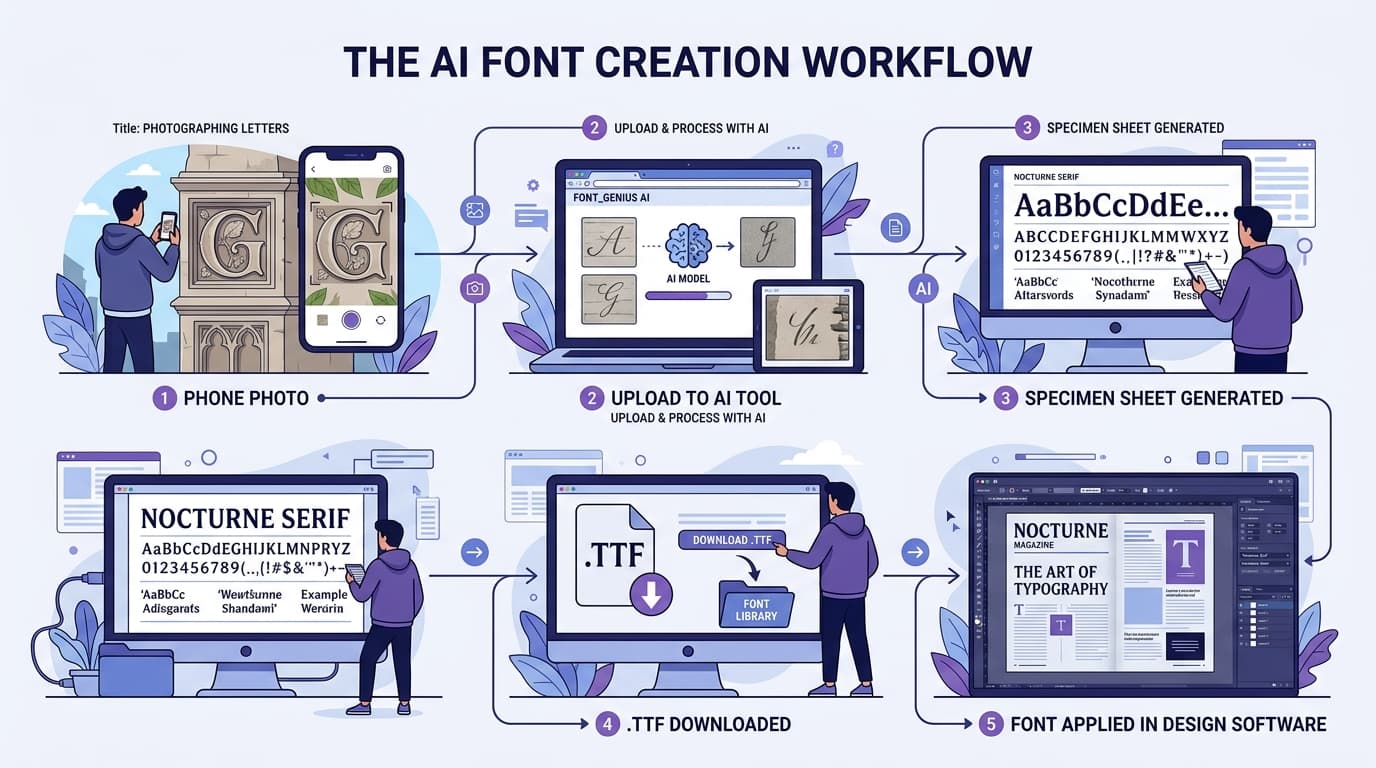
Once your image is prepared, begin by deciding what you are actually trying to make. Are you recreating a complete alphabet, building a display font from the characters visible on one sign, or identifying a close existing match? These are different tasks. If the goal is to identify and extract font details for a client reference, you may only need a few representative glyphs. If the goal is a usable working file, prioritize character coverage and consistency.
Start with the cleanest, clearest version of the source. In Snapafont, upload the image and let the AI analyze the visible lettering. The service is designed to turn image-based letters into a downloadable .TTF file, reducing much of the manual tracing and font-building work traditionally required. Review the detected glyphs carefully. Automated results are a starting point, not a substitute for design judgment.
Check common problem letters first: A, R, S, G, e, a, g, and y. These glyphs reveal a typeface’s structural logic and are often where an image-based conversion shows errors. Look for closed counters that have become filled in, thin joins that have disappeared, or decorative terminals that were interpreted as noise. Then inspect repeated characters for consistency. If two photographed “O” forms have different damage patterns, choose the cleaner one as the model.
Next, assess the character set. Most real-world examples do not include every glyph you need. A café sign reading “MORNING COFFEE” gives you useful letters such as C, E, F, G, I, M, N, O, and R, but it does not provide B, J, K, P, Q, U, V, W, X, Y, or Z. Do not pretend the missing letters are fully documented. Instead, either use the font for limited display text, create complementary glyphs based on the visible design system, or pair it with another typeface for body copy.
Export the generated file and test it in a design application immediately. Type words at several sizes, on light and dark backgrounds, and in short and long lines. This is where you see whether the font is genuinely usable rather than merely recognizable. A successful typeface from image conversion preserves the source’s personality while remaining readable in the context where you plan to use it.
Working With Your Extracted Font
Refine the file for the job it needs to do
A newly extracted font should be treated like a first proof. Install the .TTF file, then test it with real words rather than only an alphabet specimen. Set a headline, a price list, a social post, and a few sentences. Different letter combinations expose different issues: “AV” reveals diagonal spacing, “To” shows overhang behavior, and “minimum” quickly exposes uneven rhythm.
Pay close attention to spacing. Source lettering may have been manually spaced for one specific word, which does not automatically translate to a font that works across hundreds of words. If the letters feel crowded or disconnected, adjust tracking in your layout software as a temporary solution. For a long-term font asset, edit sidebearings and kerning pairs in a dedicated font editor. High-value pairs usually include AV, AW, AY, Ta, Te, To, Va, Wa, Yo, and punctuation around quotation marks.
Preserve intentional imperfections, but remove accidental ones. A slightly uneven baseline, a lopsided bowl, or a brushy terminal may be the heart of the design. A jagged edge caused by compression artifacts is not. This distinction is essential when translating font from photo material: authenticity does not mean copying every flaw introduced by weather, lighting, or camera processing.
Name and organize the file clearly. Use a descriptive internal name such as “Riverside Sign Display Draft,” not “font-final-final-2.” Include a note about the source, date, location, and any changes you made. This documentation is especially useful when a font capture develops into a broader brand system or when collaborators need to understand its intended use.
Finally, remember that display lettering is usually strongest in display settings. An extracted sign font may shine at 48 points on a poster but become difficult to read at 10 points in a paragraph. Use it for headlines, packaging accents, pull quotes, labels, event graphics, and wordmarks; pair it with a proven text face for longer copy.
Creative Use Cases for Fonts Captured From the Real World
Turn visual research into usable design material
Real-world type can make a project feel grounded in a particular place, era, or community. For hospitality branding, a designer might capture the hand-painted lettering from an old market sign and use a refined version for a seasonal menu or merchandise line. For an editorial project about local architecture, fonts extracted from building plaques and historic storefronts can provide distinctive chapter openers while preserving a relationship to the story’s setting.
In event design, a font from real world signage can establish a visual theme quickly. A neighborhood block party might use letters inspired by the venue’s painted facade; a retro film screening could draw on the marquee lettering of a local cinema. The key is to use the captured type purposefully, not as a random decorative effect. Let the source connect to the content, audience, or location.
Fashion, music, and packaging projects also benefit from this approach. A designer could create a small all-caps font from a vintage workwear patch for limited-edition apparel graphics. A record label could build a title treatment from letters found on analog equipment. A specialty food brand might use the confident, imperfect forms of a market crate stencil as a display accent. In each case, the extracted type provides texture and specificity that generic font libraries may not offer.
There is also value in personal research libraries. Keep a folder of well-photographed lettering organized by category: scripts, industrial stencils, neon signs, painted serif capitals, transit graphics, and packaging labels. Over time, this becomes a source of visual insight even when you do not convert every image into a font. Snapafont can be especially useful when one of those references becomes relevant to an active project and you need to move from inspiration to a functional file efficiently.
Tips and Tricks for Better Font Capture
Improve quality without losing the original character
First, separate identification from recreation. If you suspect a sign uses an existing commercial typeface, try to identify it before creating a replacement. The letters may be a stock font, a modified font, or hand lettering inspired by one. Identifying the original can be faster and may provide a more complete character set. When the exact match is unavailable or the lettering is clearly custom, extraction becomes a practical way to create a project-specific interpretation.
Second, collect enough evidence before drawing missing letters. Look for related signs from the same business, other packaging from the same era, or additional photos online. A single word can be misleading; a second source may reveal a lowercase style, a numeral system, or a distinctive alternate letter. This research is often what separates a convincing reconstruction from a generic approximation.
Third, keep texture separate from structure when possible. If the appeal lies in cracked paint, grain, or ink bleed, make a clean structural font first. Then apply the texture as an image overlay, mask, or alternate treatment in the final layout. This gives you a flexible font that works at different sizes while still letting you recreate the weathered original when appropriate.
Fourth, test in the actual output medium. A font that looks excellent on a high-resolution monitor may fail in a small screen banner, a vinyl cut, or a low-cost print run. Print a sample, view it on a phone, and inspect it at the intended distance. If thin details vanish, simplify them rather than forcing fidelity to the photo.
Finally, be thoughtful about rights and attribution. Photographing lettering in public does not automatically grant broad rights to reproduce a proprietary typeface, logo, or brand identity. Historical and anonymous lettering may raise different questions than contemporary branded work, but commercial use can still require research and permission. Use captured type responsibly, especially for logos, products, client work, or anything that could imply affiliation with the original business. When in doubt, create an original typeface inspired by general characteristics rather than directly replicating a protected design.
Start Building Your Real-World Type Library
The next time you spot lettering worth saving, do more than take an inspiration photo. Capture it straight on, preserve the clearest details, and see what the forms can become in use. A well-chosen image can give you a distinctive display voice for a project, a useful research artifact, or the beginning of a uniquely personal font collection.
Snapafont helps make that transition from observation to application simple: upload a strong source image, review the extracted letterforms, and download a working .TTF font file you can test in your preferred design tools. Visit snapafont.com to try your next font capture and turn the type you find in the world into something you can work with anywhere.
Ready to turn your image into a font?
Upload any image and get a real, downloadable .TTF font file in seconds.
Try Snapafont Free →

