There is no universal list of the best fonts for logos because a logo does not need to be universally attractive. It needs to be recognizably, strategically right for one brand. The condensed sans serif that makes a streetwear label feel energetic may make a financial adviser seem reckless. A warm, high-contrast serif that gives a boutique hotel a sense of heritage could feel too formal for a children’s learning app.
That is the central idea behind effective logo typography: type is not decoration added after the brand is designed. It is one of the clearest expressions of the brand itself. Before a customer reads a headline, visits a website, or tries a product, the shape, spacing, weight, and rhythm of the letters have already suggested something about the company.
This logo typography guide explains the major logo font types, where each tends to work best, and what can go wrong when it is used without a clear reason. You will also find practical ways to evaluate what font for a logo fits your particular audience, industry, and long-term goals. The aim is not to copy a famous brand’s typeface. It is to identify the visual voice your brand needs and choose—or create—the type that delivers it consistently.
The Main Logo Font Types and What They Communicate
Start with personality, not popularity
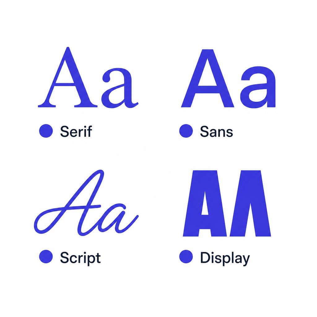
Most logo typeface styles fall into a few broad families: serif, sans serif, script, display, and custom lettering or custom fonts. These categories are useful shortcuts, not rigid rules. A geometric sans serif and a humanist sans serif can create very different impressions, just as a refined calligraphic script has little in common with a casual brush script. Still, knowing the families gives you a strong starting point for choosing logo font direction.
Serifs often signal heritage, editorial confidence, craftsmanship, or trust. Sans serifs can feel modern, efficient, approachable, or technologically capable. Scripts bring personality, intimacy, movement, and a human hand. Display faces make a bolder visual statement and are often built for distinctiveness rather than neutral readability. Custom logo fonts and lettering offer the most ownership because the letterforms can be shaped around the brand’s specific story.
A helpful way to narrow down good fonts for logos is to list three to five personality words first. For example, a sustainable skincare company might choose “calm, botanical, premium, transparent.” A fitness app might choose “motivating, direct, adaptive, optimistic.” Then evaluate type choices against those words. If the font could describe the opposite of the intended personality, it is probably not doing its job.
Also consider the context in which the logo appears. A restaurant may need an inviting storefront sign, a compact social avatar, menu headers, delivery packaging, and an app icon. A B2B software firm may need its mark to work in a browser tab, presentation deck, product interface, and procurement document. The best logo fonts are the ones that maintain their character in the situations where customers actually encounter them.
Serif Fonts for Logos: Heritage, Authority, and Editorial Character
Best for brands that need depth and distinction
Serif fonts have small finishing strokes, called serifs, attached to letterforms. In logo design, those details can make a name feel established, literary, luxurious, intelligent, or handcrafted. That is why serif logos are common among law firms, publishers, wineries, hospitality brands, fashion houses, premium food companies, and institutions that want to communicate credibility.
Not every serif makes the same statement. Old-style serifs, with softer transitions and more calligraphic movement, can feel warm and rooted in tradition. They suit artisanal products, heritage brands, and organizations with a thoughtful, human tone. Transitional serifs tend to be more polished and balanced, making them useful for professional services or upscale consumer brands. Didone-style serifs, with dramatic thick-thin contrast, often suggest fashion, beauty, and luxury—but can become fragile at small sizes. Slab serifs use heavier, block-like serifs and can add confidence, utility, or a vintage-industrial edge.
Consider a fictional independent publisher named Northline Press. A classic old-style serif with generous spacing could signal care, permanence, and literary expertise. By contrast, a high-contrast fashion serif would likely create the wrong expectation, even though both choices are technically serif fonts. This is why selecting from a list of logo font types is only the first step; the specific construction of the letters matters.
When using serif typography, test small-scale performance early. Thin serifs can disappear in a favicon, an embroidered uniform, or a small product label. Check difficult character combinations too, such as “rn,” “cl,” “I,” and “l,” because unclear forms can hurt readability. If the logo contains a short name, a more expressive serif may be practical. For a long company name, a calmer serif with a large x-height and clean spacing is often the safer choice.
Sans Serif Fonts for Logos: Clarity, Modernity, and Flexibility
A broad category with more personality than it gets credit for
Sans serif fonts omit the finishing strokes found in serifs. Their relatively clean shapes make them one of the most widely used logo typeface styles, especially for digital-first brands. They can project simplicity, accessibility, precision, speed, inclusivity, or innovation. But “sans serif” is not synonymous with bland. The proportions, terminals, spacing, and weight of a sans can make it feel geometric and futuristic, friendly and rounded, or practical and neutral.
Geometric sans serifs are based on circles, squares, and simple proportions. They often work well for architecture practices, design studios, technology companies, and contemporary retail brands. Their discipline can feel confident, although an overly perfect geometric face may seem cold if the brand needs warmth. Humanist sans serifs have more organic proportions and open letterforms, which can improve readability and make a company feel more approachable. They are particularly effective for healthcare, education, public services, and software products with diverse audiences.
Imagine two logo directions for a budgeting app called Lantern. A tightly spaced, squared-off geometric sans could make the app feel efficient and technical. A humanist sans with an open “a,” generous counters, and a softer rhythm might instead communicate guidance and reassurance. Neither approach is inherently better; the right one depends on whether Lantern wants to lead with control or support.
When choosing logo font options in this family, pay close attention to differentiation. A plain sans serif can be highly functional, but it may look interchangeable with competitors if it has no distinctive feature. Small adjustments can help: customize one letter, change a terminal, use a carefully selected alternate glyph, or establish a unique relationship between an icon and wordmark. Avoid forcing uniqueness through excessive distortion. A logo should still look intentional and read instantly on a mobile screen.
Script Fonts for Logos: Human, Expressive, and Memorable
Use personality with a disciplined approach
Script fonts imitate handwriting, calligraphy, brushwork, or connected cursive letterforms. They are often among the most emotionally expressive good fonts for logos because they can imply a personal maker, a signature, a celebration, or a sense of motion. Beauty brands, cafés, wedding businesses, bakeries, creative studios, and personal brands frequently use scripts to create a more intimate relationship with their audience.
The risk is legibility. A script that looks beautiful as a large headline may become impossible to read on a bottle cap, profile image, receipt, or website navigation bar. Complex swashes can also date quickly, especially when they are chosen because they look decorative rather than because they support a clear brand idea. The more ornate the script, the more important it is to keep the rest of the visual identity restrained.
For instance, a neighborhood florist called Morrow could use a restrained, custom-inspired script for “Morrow,” paired with a simple sans serif descriptor reading “flowers and gifts.” The contrast provides charm without making the complete logo difficult to decode. A children’s party business could use a brush-style script, but should favor wide, open forms and avoid overly thin strokes so the logo remains friendly rather than chaotic.
Before approving a script logo, ask someone unfamiliar with the business to read it at a glance. Test it in one color, at 24 pixels high, and in black on white. If viewers repeatedly misread the name, the typeface is asking the audience to work too hard. Scripts are strongest when their distinct personality does not come at the expense of recognition.
Display Fonts for Logos: Bold Recognition for Brands That Need to Stand Out
A strategic choice, not a shortcut to being different
Display fonts are designed to make an immediate impression. They may be condensed, unusually wide, heavily textured, retro-inspired, decorative, experimental, or built around dramatic letter shapes. For a logo, this can be valuable: a distinctive display face may give a new brand instant visual territory in a crowded category.
These fonts are especially effective when the brand’s personality is naturally expressive. Think entertainment venues, music labels, food trucks, sports teams, gaming communities, youth-oriented products, festival brands, or niche retail concepts. A bold condensed display typeface could help a hot-sauce label feel loud and confident. A quirky, chunky face could support an ice-cream brand with a playful tone. A western-inspired face may make sense for a ranch event, but would be a poor fit for a cybersecurity consultancy.
The main design challenge is restraint. A highly stylized font already carries a lot of visual information, so it usually needs a simple color palette, minimal supporting graphics, and clear spacing. Do not pair an ornate display wordmark with several competing typefaces, gradients, textures, and icons unless the intentional goal is maximalism. In most cases, one strong typographic gesture is more memorable than five unrelated ones.
Test display logos across time as well as scale. Ask whether the design reflects a lasting brand characteristic or a visual trend that may soon feel old. Trend-aware work is not automatically wrong, but a logo typically needs to last longer than a social campaign. If you love a trendy display font, consider using it in advertising while keeping the primary logo slightly more durable.
Custom Font Logos: When a Unique Letterform Is the Best Asset
Turn a visual reference into ownable brand typography
A custom font or custom-drawn wordmark is often the right answer when off-the-shelf options come close but do not fully capture the brand. It can preserve the useful qualities of a category while introducing details competitors cannot easily copy. A local brand might draw inspiration from vintage packaging, a founder’s handwriting, regional sign painting, archival labels, or a distinctive piece of illustration. The goal is not imitation; it is to translate a meaningful visual cue into a usable, recognizable identity.
Custom work is especially valuable if your name is short, unusual, or central to the brand story. A few carefully altered characters can create a logo that is both readable and unique. For example, a cycling company could use a practical sans serif but customize the “R” with a subtle forward-leaning leg. A tea company could create a slightly organic serif with leaf-like terminals. These details should feel integrated into the letters, not pasted on as gimmicks.
If you have found a lettering sample, sketch, or image that captures the feeling you need, Snapafont can turn that image into a downloadable .TTF font file. That gives designers a practical starting point for using a visual reference consistently across a wordmark, packaging accents, and supporting brand materials. As with any custom asset, review the output for spacing, character coverage, readability, and rights before making it the center of a commercial identity.
A custom logo font should still meet the same functional standards as any other choice. Build a simple test sheet showing the logo in black and white, reversed out of a dark background, at tiny and large sizes, and alongside likely competitors. Look for weak joins, inconsistent stroke widths, crowded counters, or letter pairs that collapse. Originality matters, but it only creates value when customers can recognize and remember the name.
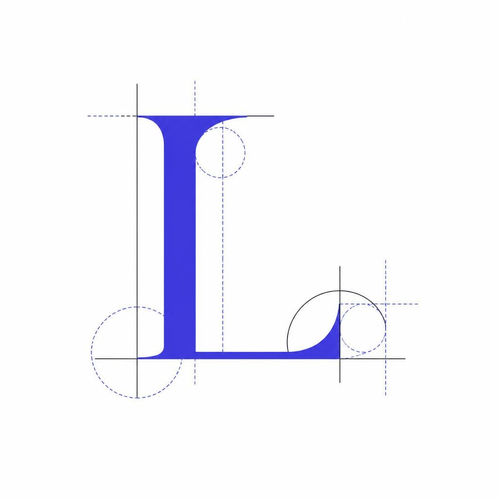
How to Decide What Font for a Logo Fits Your Brand
A practical decision process before finalizing the wordmark
Choosing logo font direction becomes much easier when you replace subjective questions such as “Do we like it?” with useful criteria. Start by defining the audience. What does the customer need to feel before they buy, book, subscribe, or inquire? A luxury travel planner may need to create trust and anticipation. A tax platform may need to reduce anxiety. A craft soda brand may need to prompt curiosity and appetite. The strongest type choice supports that emotional task.
Next, map your competitive landscape. Collect 10 to 20 competitor logos and identify patterns. If every competitor uses a blue geometric sans serif, using the same approach may make your business look credible but forgettable. You do not need to reject category conventions completely; customers use them as cues. Instead, decide which conventions to keep and which to challenge. A legal firm might retain a composed serif but choose warmer proportions and more contemporary spacing than its peers.
Then run each candidate through a practical checklist: Can people read it quickly? Does it work at small sizes? Does it still function in one color? Does it have enough weights or a compatible secondary typeface for future materials? Can you license it correctly? Does it look convincing on the touchpoints that matter most? A font that shines in a polished mockup but fails in an email signature or app header is not one of the best fonts for logos for your situation.
Finally, avoid designing by committee. Gather feedback from representative customers or trusted stakeholders, but ask focused questions. Instead of “Which one do you prefer?” ask “Which logo feels more established?” “Which one seems easier to use?” or “Which would you trust with a premium purchase?” Their answers will reveal whether the typography communicates the intended position. Use that evidence alongside professional judgment, not in place of it.
Create a Logo Typeface That Feels Like Your Brand
The right logo font is rarely the most downloaded, the most fashionable, or the one another successful company uses. It is the one whose shapes, tone, and practical performance reinforce what makes your business different. Start with the brand personality, select a type category that supports it, and test the result where customers will actually see it.
When a found font cannot capture the character you have in mind, a visual reference can be the beginning of something more ownable. Snapafont helps turn an image of lettering into a usable .TTF font, making it easier to explore custom-inspired typography without losing the original spark that caught your attention. Visit snapafont.com to convert a reference image and begin testing a type direction that is genuinely yours.
Ready to turn your image into a font?
Upload any image and get a real, downloadable .TTF font file in seconds.
Try Snapafont Free →

