Typography is one of the fastest ways to make a business look established—or accidentally make it look improvised. The words on your website, packaging, invoices, social posts, and presentations all communicate before a customer has time to read them. A bold geometric sans serif can suggest modern efficiency. A warm serif can imply craftsmanship and trust. A narrow all-caps display face can feel editorial, premium, or energetic depending on how it is used.
The good news is that great brand typography without a designer is entirely achievable. You do not need a 40-page brand book, an agency budget, or encyclopedic type knowledge. What you need is a simple system: choose a small number of appropriate fonts, assign each one a clear job, document a few rules, and apply them consistently. This approach works for solo founders, local businesses, creators, consultants, ecommerce shops, and early-stage teams that need a polished identity now.
DIY brand typography is not about pretending to be a professional type designer. It is about making deliberate decisions instead of defaulting to whatever font happens to be available in a template. This guide explains how to build a practical font system, source fonts responsibly, create something more distinctive when needed, and keep your visual identity consistent as your business grows.
Start With the Two-Font Rule
The most dependable rule for self branding typography is also one of the simplest: start with two fonts. Use one font for headlines and one font for body copy. In many cases, these can be two families with different personalities; in other cases, they can be two styles within a large type family. Either route gives your brand contrast without visual chaos.
Your headline font is the attention-getter. It appears in homepage hero statements, campaign graphics, section titles, packaging names, slide covers, and social-media hooks. Your body font is the workhorse. It needs to remain clear in product descriptions, emails, blog posts, menus, policies, captions, and mobile screens. Because body copy is read in longer stretches, readability matters more than novelty.
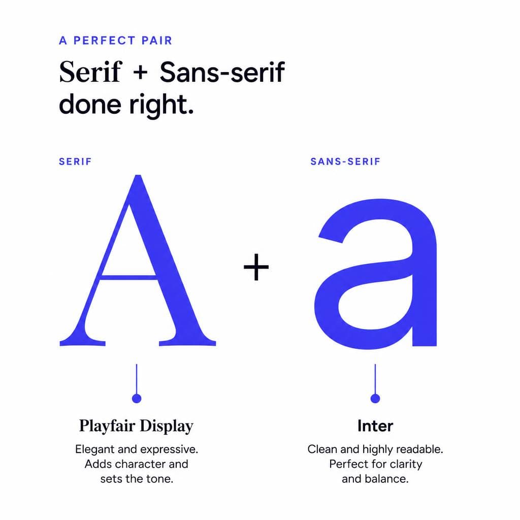
For example, a handmade candle studio might pair a high-contrast serif such as Playfair Display for headings with a clean sans serif such as Inter for paragraphs. The serif adds a sense of ritual and refinement; the sans serif keeps ingredients, shipping information, and calls to action easy to scan. A practical B2B software company could reverse the mood with Space Grotesk for headings and Source Sans 3 for body copy, creating a crisp, technical, approachable system.
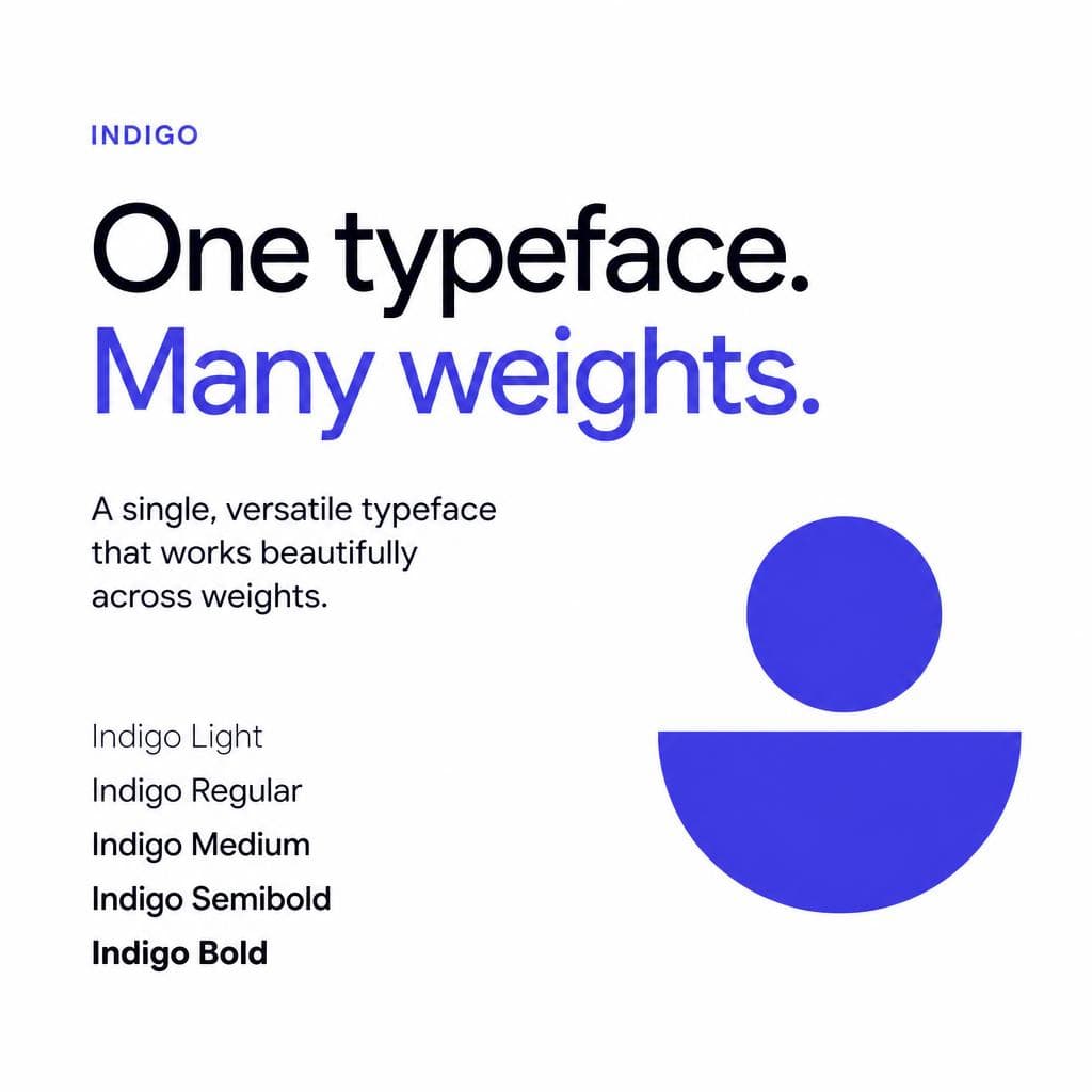
The point is not to choose famous fonts. The point is to create useful contrast. A serif heading font with a sans-serif body font is the easiest combination, but it is not mandatory. You can pair a condensed sans serif with a neutral sans serif, or use one versatile family with a bold headline weight and a regular body weight. Avoid pairing two highly decorative fonts, two very similar fonts, or more than three typefaces at the beginning. Too many choices make everyday design slower and weaken recognition.
Before finalizing a pairing, test it in real brand situations. Write a homepage headline, a three-sentence product description, a button label, an Instagram post, and an invoice heading. If the combination only looks good as a giant mockup but feels awkward in an email or on a phone, it is not yet a useful brand system.
Choose a Primary Font That Matches Your Brand’s Job
When people search for brand fonts without a designer, they often begin with the question, “Which font looks best?” A more productive question is, “What should someone feel and understand about my business in five seconds?” Typography should support that answer.
Start by choosing three to five brand traits. A financial planner may want to feel calm, credible, human, and clear. A youth sports brand may want to feel energetic, optimistic, bold, and inclusive. A luxury skincare label may want to feel restrained, tactile, thoughtful, and premium. Those traits become a filter for every font option you consider.
Serif fonts, which have small finishing strokes on letters, often communicate heritage, editorial quality, warmth, or expertise. They can be excellent for law firms, wellness brands, publishers, food businesses, and premium consumer products. Sans-serif fonts tend to feel contemporary, direct, digital, and accessible. They are common in technology, fitness, education, and service businesses because they perform well at many screen sizes. Monospaced fonts can add a technical or utilitarian note, while script and handwritten fonts can feel personal—but should usually be saved for a very limited accent role because they are harder to read.
A strong primary font must work beyond a logo. Check whether it includes uppercase and lowercase letters, numbers, common punctuation, currency symbols, accented characters if your audience needs them, and enough weights for your likely uses. At a minimum, try to have regular, medium, and bold. A family with italic styles is helpful for editorial content, quotes, or emphasis. A font that looks beautiful in one word but lacks a usable bold weight can create problems as soon as you build a website or sales deck.
Also test the font at the sizes where it will actually live. View body text at 16 pixels on a mobile screen. Print a small label or business card. Put a heading over an image. Try your brand name in all caps and title case. Watch for letters that become confusing, such as a lowercase “l,” capital “I,” and number “1.” This hands-on testing is the part of brand font DIY that prevents expensive rework later.
One useful decision framework is to choose a primary font for function first and personality second. If your business depends on long-form reading—such as consulting, education, health, or publishing—prioritize legibility. If your business relies on distinctive packaging, fashion, entertainment, or creator-led products, you may give your display typeface more personality while keeping the body font quietly functional.
Where to Source Fonts Legally and Affordably
You do not have to buy an expensive custom typeface to create a brand without a designer. There are excellent free, open-source, subscription-based, and paid font libraries. The important part is understanding licensing before you put a font on your website, products, ads, or downloadable files.
Google Fonts is a practical place to begin. Its library is free to use and easy to add to websites, which makes it especially useful for early-stage brands. Families such as Inter, DM Sans, Manrope, Lora, Libre Baskerville, Work Sans, and Fraunces offer polished options for many brand personalities. Adobe Fonts is another strong resource for businesses that already use Creative Cloud; its fonts can be activated for supported design and web workflows under the relevant subscription terms.
For more distinctive commercial options, browse reputable foundries and marketplaces such as Fontshare, Fontspring, MyFonts, Creative Market, and independent type foundries. Buying directly from a foundry can be a good way to support the people who made the typeface while finding a less overused family. A paid font does not automatically make a brand better, but it can be worthwhile when the family has the exact character, language support, weights, and licensing flexibility you need.
Always read the license rather than assuming “downloadable” means “free for business.” A desktop license may cover design files and printed materials but not webfont embedding. A webfont license may be based on monthly page views. App, ebook, broadcast, server, logo, and merchandise uses can have separate terms. If you are adding letters to a product, selling editable templates, or embedding a font in an app, look closely at the license. Keep a copy of your receipt and license terms in a shared brand folder.
Avoid downloading fonts from random free-font sites unless the creator and commercial license are unmistakably clear. Unverified files can carry legal uncertainty, outdated versions, or security risks. Saving a few dollars is not worth rebuilding customer-facing materials after receiving a takedown request.
Generate a Distinctive Typeface From Your Own Visual Ideas
A common limitation of DIY brand typography is sameness. Popular free fonts are popular for good reasons, but customers may see them across dozens of websites and social accounts. You can solve this without commissioning a full custom typeface by introducing one controlled, recognizable custom element.
For instance, a florist could turn the lettering from a hand-painted market sign into a display font for seasonal collections and packaging. A restaurant could create a small title font from a chef’s handwritten menu lettering. A vintage seller could use letterforms from a public-domain postcard, provided the underlying source is legally usable. These custom details are most effective when used sparingly: logo treatments, campaign titles, product names, pull quotes, or short social graphics—not dense paragraphs.
The source image matters. Use a high-contrast image with letters that are reasonably separated and visible. A straight-on photograph or scan is easier to convert than a tilted, shadowy image. Aim to capture the alphabet, numbers, and any punctuation you will need. If the original lettering only contains a few letters, consider the practical gap: a beautiful custom font is less useful if you cannot write product names, URLs, or headlines with it.
Snapafont can turn an image of lettering into a downloadable .TTF font file, making this approach accessible for founders who have a visual asset but do not want to manually build glyphs in specialized font software. After generating a font, test every key character before treating it as a brand asset. Check spacing, lowercase and uppercase behavior, punctuation, and readability at small sizes. It is also wise to use a generated font as a display layer alongside a dependable body font rather than relying on it for every communication.
Be careful about intellectual property. Do not convert another company’s logo, a contemporary designer’s lettering, or a font you do not have rights to use into a new font file. Start with your own handwriting, original artwork, lettering you commissioned with appropriate rights, or genuinely public-domain source material. Distinctiveness is valuable only when it is legally and ethically sound.
Maintain Consistency With a One-Page Typography Guide
The biggest difference between random font choices and a recognizable identity is consistency. Once you have chosen your brand identity fonts, document the rules in a one-page guide that anyone on your team can follow. This is the practical backbone of self branding typography.
Include the exact font names, file locations or links, and the role assigned to each font. Then define a small type scale. For a simple website, you might specify: H1 at 48–64 pixels in your headline font; H2 at 32–40 pixels; H3 at 24–28 pixels; body copy at 16–18 pixels; and small supporting text at 14 pixels or larger when possible. For print, record point sizes separately because print and screen sizing do not translate perfectly.
Add rules for weight, capitalization, alignment, and spacing. For example: “Headlines use semibold, sentence case, and 110% line height.” Or: “Body copy uses regular weight, left aligned, 150% line height, with no justified paragraphs.” These instructions sound minor, but they stop a brand from drifting when someone creates a quick presentation, a contractor designs an ad, or a new employee sends an event flyer.
Do not use all caps everywhere. It can be useful for short navigation labels or compact category tags, but long all-caps messages are harder to read. Likewise, avoid using thin weights for small text, especially on low-contrast backgrounds. Accessibility is part of good typography: provide strong contrast between text and its background, maintain comfortable line spacing, and ensure important text remains readable on mobile devices.
Create a few reusable templates in the tools you already use: Canva, Figma, Google Slides, Notion, your email platform, and social scheduling tool. Lock in the correct fonts, heading sizes, colors, and spacing. This removes decision fatigue and ensures that DIY materials still look intentional. Review your touchpoints every few months—website pages, lead magnets, social highlights, proposals, receipts, and packaging—to replace one-off substitutes and keep the system intact.
Finally, give yourself permission to refine. A brand system is not permanent on day one. If customers struggle to read a headline font, if your webfont slows down a page, or if your business shifts from playful consumer products to serious enterprise services, adjust the system. Make changes deliberately, update the guide, and apply them across major touchpoints rather than changing fonts on a whim.
Make Your Brand More Recognizable With Lettering That Is Yours
A strong DIY typography system does not require endless font hunting. Choose a readable workhorse font, pair it with a complementary headline style, set a few repeatable rules, and use those rules everywhere. If you want an extra layer of originality, your own handwriting, illustrated lettering, or a meaningful archival visual can become a memorable display typeface—without turning your entire brand into a design experiment.
When you have an image with lettering worth preserving, try Snapafont at snapafont.com. It gives you a practical way to transform that visual inspiration into a usable .TTF font file, so you can test it in real headlines, packaging concepts, presentations, and social templates. Start with one small, distinctive use, validate that it is readable and appropriate for your audience, and let your brand’s typography become more recognizable over time.
Ready to turn your image into a font?
Upload any image and get a real, downloadable .TTF font file in seconds.
Try Snapafont Free →

