Can AI create a font? Yes—but the useful answer is more nuanced than a simple yes or no. Today’s AI can help designers turn handwriting, lettering samples, scanned alphabets, and visual references into editable font files far faster than traditional type development alone. It can identify characters, infer missing glyphs, normalize shapes, and package a working typeface into a format such as TTF. That makes AI font creation a practical workflow for many projects rather than a novelty reserved for experimentation.
At the same time, an AI custom font is not automatically a polished, release-ready type family. Type design still involves optical balance, spacing, kerning, language support, licensing decisions, testing, and aesthetic judgment. The strongest results come from treating AI as an accelerator: it reduces the mechanical work of converting visual letterforms into usable digital type, while the designer retains control over the creative and technical decisions that make a font genuinely good.
This guide explains what an AI font maker can realistically do today, where machine learning font technology still needs human oversight, and how to decide whether an AI typography tool fits your project. Whether you are preserving a loved one’s handwriting, creating a brand display face, digitizing lettering from a sketchbook, or prototyping a campaign identity, the goal is to know what to expect before you begin.
How AI Font Creation Works
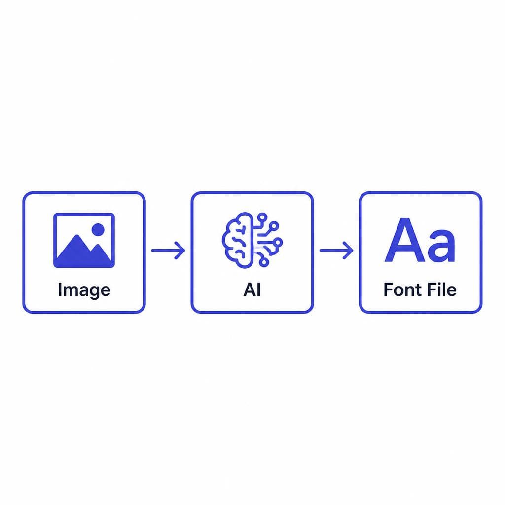
Most AI font creation workflows begin with a source image. That image might be a photographed handwritten alphabet, a page of marker lettering, a scanned worksheet, or a collection of individual letterforms. The system first uses image analysis to distinguish foreground ink from the background, recognize likely glyph shapes, and isolate each character. This is similar to optical character recognition, but the objective is not merely to read text—it is to preserve the visual characteristics that make the lettering distinctive.
Next, the tool converts the detected shapes into vector-like outlines or editable glyph data. This stage may include cleanup steps such as removing noise from a scan, smoothing rough contours, correcting perspective, and standardizing the baseline. If the source contains a complete alphabet, the software maps each recognized character to its proper keyboard position. If it contains only a partial set, the system may use pattern recognition and style inference to help generate related characters.
The “AI” portion is particularly useful when the source material is imperfect. A machine learning font model can learn visual relationships in letters: for example, that lowercase n, h, and m often share stem and arch structures, or that a capital O should have a consistent stroke treatment with C and Q. Rather than manually tracing every character from scratch, the designer starts with a digitized set of glyphs and refines it as needed.
Finally, the glyphs are exported as a font file. A TTF file contains more than visible letter outlines; it also includes character mappings, metrics, and font metadata. Depending on the tool and source material, you may receive a basic installable font quickly, then make manual adjustments in type-design software if the project requires advanced kerning, alternate glyphs, OpenType features, or extensive multilingual support.
The quality of the input has an enormous effect on the output. Photograph lettering in even light, use high contrast between the letters and paper, avoid shadows, and keep the page as flat and front-facing as possible. For handwritten alphabets, leave space between characters and include upper- and lowercase letters, numbers, and common punctuation if you want them in the finished font. Clean source material gives the AI fewer ambiguities to solve and gives you a more faithful result.
What AI Can Do for Font Designers Today
The most valuable use of an AI font maker is speed. A conventional digitization workflow can require tracing, assigning Unicode values, setting side bearings, exporting files, installing test versions, and repeating those steps as problems emerge. AI can shorten the path from image to a usable draft, especially when the goal is a custom display font, a handwriting font, or a one-off project asset.
AI can also preserve personality that is often lost when lettering is recreated too cleanly. Consider a café owner with a recognizable chalkboard script, an illustrator whose letters have intentionally uneven brush texture, or a family trying to preserve a grandparent’s handwritten notes. In these cases, the slight inconsistencies are part of the appeal. An AI custom font workflow can retain the tilt, irregular spacing, rounded terminals, and expressive stroke variation that make the source feel human.
Another useful capability is character completion. A designer may draw the wordmark letters for a campaign but lack a full alphabet. An AI generate font workflow can help establish a broader character set based on the visual logic in those original letters. This is particularly helpful during ideation: instead of spending days building a complete family before seeing it in context, designers can test headlines, social graphics, packaging concepts, and landing pages earlier in the process.
AI tools are also effective for rapid font prototyping. A brand designer might create three lettering directions—friendly rounded marker, elegant high-contrast script, and bold geometric caps—and turn each into a test font. Once the client sees real phrases rather than isolated letter samples, feedback becomes more concrete. The selected direction can then receive the deeper refinement required for final use.
Snapafont is designed for this practical middle ground: uploading an image and turning it into a downloadable TTF font removes much of the friction from digitizing lettering. That can be especially useful when the priority is quickly transforming a visual style into a font you can install and test in everyday design applications.
Beyond branding, AI typography tool workflows are useful in education, events, content creation, and archival work. Teachers can create classroom fonts from student lettering. Event teams can turn a signature invitation style into a matching signage font. Creators can make consistent overlays for video thumbnails. Archivists can digitize a historical handwriting sample for limited, respectful use. In all of these examples, AI is not replacing the design decision; it is making the implementation more accessible.
What AI Font Creation Cannot Fully Replace
AI can generate a useful font, but it cannot independently make every judgment that experienced type designers make. The biggest limitation is optical correction. Letters that look mathematically aligned may not look visually aligned. A round O usually needs to extend slightly above and below a flat H to appear the same height. Curves, joins, counters, and stroke endings often need subtle adjustments that depend on how the typeface will be used.
Spacing is another area where human review matters. Good fonts do not simply place every character in an equal-width box. The white space around an A should behave differently from the white space around an O, and combinations such as To, AV, Wa, and Yo often need kerning adjustments. AI may establish usable default metrics, but display typography and professional editorial work benefit from reviewing words and sentences at their intended sizes.
A machine learning font system also cannot reliably infer an entire design system from a small or inconsistent sample. If you upload only a few stylized capitals, it may create related characters, but the results may not match the creator’s intended rhythm. The challenge becomes greater with complex scripts, multilingual character sets, ligatures, alternate forms, numeral styles, and variable font axes such as weight or width.
There are legal and ethical limits as well. Do not upload copyrighted fonts, logos, or another artist’s lettering and present the resulting output as your own original typeface. AI does not erase intellectual-property rights. When working from historical documents, commissioned lettering, or client materials, confirm that you have permission to digitize and use the source. For commercial brands, document ownership of the original artwork and clarify who owns the resulting font file.
Finally, AI cannot determine your project’s typographic strategy. It cannot decide whether a handwritten font is legible enough for body text, whether your brand needs a sans serif companion, or whether a dramatic display face will still work on small mobile screens. Those are design decisions tied to audience, hierarchy, accessibility, and context.
Who Benefits Most From an AI Custom Font Workflow
AI font creation is especially valuable for designers and creators who already have a visual source but need a functional font quickly. Brand designers can use it to extend custom lettering into campaign assets. Illustrators can transform their signature hand into a font for prints, merchandise, or social content. Small businesses can create a distinctive type treatment without commissioning a full custom type family at the start of their growth.
It is also a strong fit for personal and sentimental projects. A handwriting font made from letters, cards, or journal pages can be used for family books, memorial materials, wedding stationery, or keepsake designs. In these situations, perfect typographic polish may be less important than authenticity. A slightly irregular baseline can be a feature because it carries the character of the original writing.
Marketing teams and agencies benefit when they need to test concepts quickly. For example, an agency pitching a summer festival could create a temporary font from hand-painted poster lettering, then use it across mockups for tickets, wayfinding, and social posts. If the client approves the direction, the team can decide whether the prototype is sufficient or whether to commission a type designer for a fully engineered family.
However, AI may not be the ideal standalone solution for every project. If you need a broad multilingual corporate typeface, a highly readable UI font, an extensive retail family with multiple weights, or a font intended for distribution and licensing, partner with a professional type designer. AI can still support research and prototyping, but the final product requires more rigorous engineering and testing.
A useful rule is this: use AI when you need to capture and apply a visual voice; use specialist type design when you need a robust, scalable typographic system. The two approaches can complement each other rather than compete.
How to Set Realistic Quality Expectations
A successful AI-generated font should be judged against its intended use, not against the most polished commercial typeface on the market. For a bold headline on a poster, minor irregularities may be invisible—or may add charm. For a paragraph of 10-point text in a mobile app, those same irregularities can become distracting and hurt readability.
Start by testing your new font in real phrases, not just an alphabet preview. Write the brand name, a headline, a short paragraph, dates, prices, and common calls to action. Include difficult combinations such as “AVATAR,” “Typography,” “minimum,” and “2026.” These tests reveal whether letters collide, whether spacing feels uneven, and whether certain characters need redrawing. Print the results as well as viewing them on screen; thin strokes and rough edges can behave differently in physical output.
Review the most frequently used glyphs first. For English-language branding, prioritize A–Z, a–z, numerals, basic punctuation, apostrophes, quotation marks, ampersands, and currency symbols. If the font will appear in email, web pages, or presentations, test it in those environments. If it will be used in packaging, test it at the smallest production size and on the actual substrate when possible.
You can often improve a draft significantly with a short refinement pass. Clean stray points and scan artifacts, make baseline alignment more consistent, adjust overly tight or loose side bearings, and repair characters that were misread by the recognition process. Keep a copy of the original source image so you can compare changes against the handwriting or lettering you want to preserve.
It is also important to separate “handmade” from “broken.” Intentional texture, irregular stroke width, and imperfect alignment can make a font feel authentic. Unintentional issues—such as clipped descenders, unreadable punctuation, disconnected shapes, or inconsistent character mapping—should be fixed. The best AI generate font results retain expressive imperfection while removing technical friction.
When evaluating an AI typography tool, look for a simple upload-to-export process, clear character mapping, reliable font-file output, and the ability to test the result in your preferred design software. A straightforward tool is often more useful than an overcomplicated system, particularly when your aim is to get from an image to an installable font without a steep type-design learning curve.
Turn Your Lettering Into a Font You Can Use
If you have handwriting, sketches, hand lettering, or an alphabet image that deserves to be more than a flat graphic, try converting it into a working font. Begin with a clean, high-contrast image, include as many characters as you can, and test the finished font in the actual phrases your project needs. That approach lets you preserve the source’s personality while quickly discovering where refinement will have the biggest impact.
Snapafont makes that first practical step simple: upload your image, convert the lettering into a downloadable TTF font, and install it for use in your design workflow. It is a useful way to explore AI font creation without turning a creative idea into weeks of manual digitization. Visit snapafont.com to try it and see how your own lettering looks as a usable typeface.
Ready to turn your image into a font?
Upload any image and get a real, downloadable .TTF font file in seconds.
Try Snapafont Free →

