
Choosing type for a website, product, or brand often starts with a deceptively simple question: should you use a free library font or create something of your own? In the custom font vs Google Fonts discussion, the practical answer is not that one option always wins. Google Fonts is an excellent default for many projects. It is fast to implement, easy to license, broadly compatible, and full of polished typefaces that work well for everyday digital design.
For roughly 80% of common use cases—an internal tool, a portfolio site, a blog, a local service business, or an early-stage startup—Google Fonts can solve the typography problem quickly and capably. But it cannot automatically make a brand recognizable, preserve the personality of hand-drawn lettering, or give a product a visual asset competitors cannot download from the same public catalog.
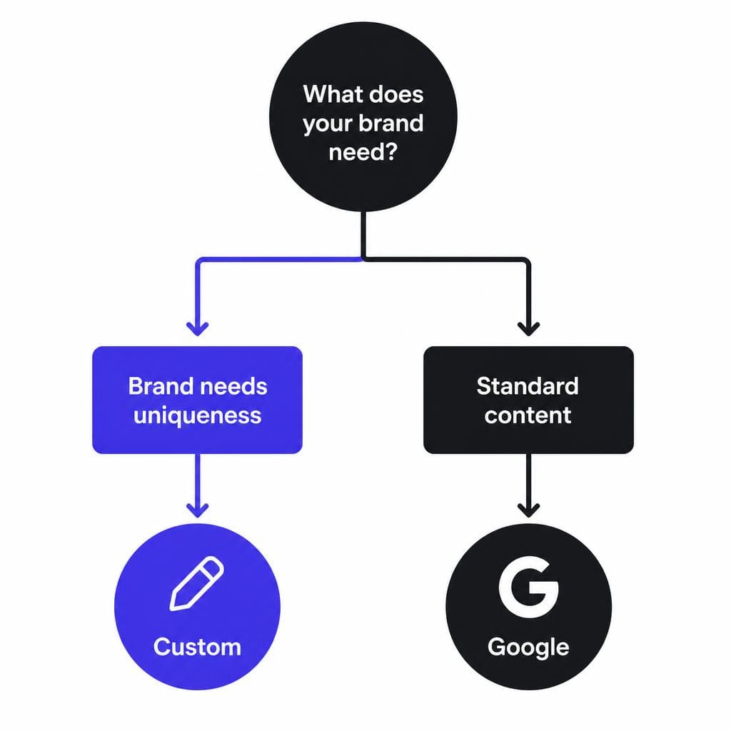
The smarter question is: what job does typography need to do for this project? If it primarily needs to be readable, accessible, and inexpensive, a Google font may be ideal. If it needs to carry brand memory, communicate a distinct point of view, or turn existing lettering into a reusable asset, a custom font is often the better investment. This guide explains where each option excels, the Google Fonts limitations worth planning around, and how to make a confident choice without overspending.
What Google Fonts Does Well
Google Fonts succeeds because it removes several real barriers to using good typography online. The library is free to use, simple to embed, and large enough to cover most familiar categories: geometric sans-serifs, humanist sans-serifs, editorial serifs, display faces, monospaced fonts, and multilingual families. Most options use open-source licenses, which generally makes them suitable for commercial websites, apps, presentations, and marketing materials. Still, it is wise to review the specific font’s license and repository documentation when your usage is unusual.
Speed is another major advantage. A designer can test combinations such as Inter with Lora, DM Sans with Fraunces, or Manrope with Source Serif in minutes. Variable fonts can offer multiple weights and widths in one family, giving teams responsive flexibility without commissioning a typeface from scratch. For a startup proving product-market fit, this is often exactly the right tradeoff: use a dependable system now and reserve a deeper brand investment for later.
Accessibility and usability also favor established library fonts. Many popular families have generous x-heights, clear letterforms, multiple weights, and language support. For example, a healthcare portal may choose Noto Sans because its broad script coverage helps serve international users. A knowledge-base product might use Roboto or Open Sans because the familiar shapes remain comfortable in dense UI text. These are not exciting choices in isolation, but they can be exceptionally effective choices for reading.
When to use Google Fonts is therefore fairly clear. Choose them when typography is supporting content rather than acting as the core visual signature; when launch speed matters more than exclusivity; when the budget is limited; or when your team needs a stable, well-tested family with many weights and language variants. They are also a strong choice for body copy even on brands that use a more distinctive custom font for headlines or packaging.
A practical example: imagine a small accounting firm rebuilding its site. Its visitors want clear explanations, trust signals, easy-to-scan service pages, and accessible forms. A restrained pairing such as Source Sans 3 for interface and body text plus Merriweather for a few editorial headings can look professional, load reliably, and leave budget available for better photography, copywriting, and conversion work. In that scenario, a custom font may not meaningfully improve business results.
The Real Google Fonts Limitations
The biggest limitation is not quality. Plenty of Google Fonts are beautifully made. The issue is differentiation. Because the catalog is public, the same typefaces appear across thousands of websites, pitch decks, ecommerce stores, and app interfaces. A font can be perfectly readable and still feel generic when audiences have encountered it repeatedly. If your brand relies on a memorable first impression, sharing its primary visual voice with countless other businesses can weaken that impression.
This is especially important for companies in crowded visual categories. A skincare label, specialty coffee roaster, wedding photographer, boutique hotel, fashion retailer, or creative agency often sells a feeling before it sells a feature. If each uses a popular sans-serif with the same familiar spacing and weight, their identities can blur together. The problem is not that a free font is inherently inferior; the problem is that a public asset offers little ownership.
Google Fonts limitations also show up when a brand has existing lettering. Perhaps a founder’s signature is on product labels, a historic restaurant has a painted sign, or an illustrator created a unique alphabet for a campaign. A library font may approximate that style, but approximations often lose the irregular details that make the original meaningful: a tilted crossbar, a narrow lowercase “e,” an exaggerated terminal, or the varied rhythm of brush lettering. Those details are precisely what people remember.
Another issue is control. A Google font family comes with the glyph set, proportions, spacing, and stylistic choices its designers made for broad use. You can change size, weight, tracking, and color, but you cannot make it truly fit a specialized logo system without creating a modified derivative and carefully managing its license and quality. You may need custom ligatures, an alternate “a,” a stylized ampersand, special numerals, a limited all-caps display set, or support for a particular language. At that point, a standard library family may become a workaround rather than a solution.
Technical considerations matter too. External font delivery can introduce privacy, performance, and reliability questions depending on how a site is configured. Self-hosting open-source font files is often a sensible way to retain the benefits of a Google family while reducing third-party requests. Whichever approach you choose, load only the weights and character subsets you use, use font-display settings thoughtfully, and test for layout shift. Free does not mean zero implementation work.
Finally, a brand font vs Google comparison should account for long-term perception. A public font can establish a clean baseline, but it is difficult to build proprietary equity in something every competitor can access. The more your audience associates a distinct letter shape with your brand, the more value typography can create beyond mere legibility.
When a Custom Font Makes Sense
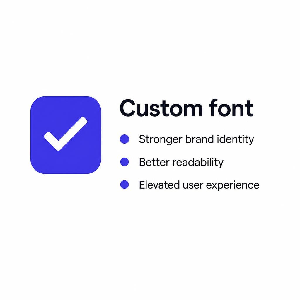
A custom font makes the most sense when lettering is an important part of how customers recognize, trust, or emotionally connect with your brand. It does not always mean commissioning a huge family with every language, weight, and OpenType feature. In many cases, the right answer is a focused display font for headlines, campaign art, social templates, or packaging, paired with a highly readable system or Google font for long-form text.
Use a custom font over Google Fonts when your brand already has distinctive handwritten, painted, or illustrated letters that deserve to be used consistently. For example, a neighborhood bakery may have a charming hand-lettered wordmark on its storefront. Rather than recreating the look manually in every Instagram post and menu, the team could convert the lettering style into a usable font for short headlines. The font preserves the recognizable character while making everyday design faster and more consistent.
Custom typography is also valuable when differentiation directly affects pricing power. Premium consumer products, hospitality brands, entertainment projects, publishing imprints, and design-led software often benefit from a type system that signals care. Consider a boutique travel company: its itinerary pages could use an exclusive display face that echoes old railway signage, while its booking interface remains in a neutral sans-serif. The custom face provides atmosphere; the functional face protects clarity. This hybrid approach avoids turning every paragraph into a branding exercise.
There are several strong signals that a custom solution is worth considering:
• Your current type choices look interchangeable with those of competitors.
• You repeatedly recreate the same lettering by hand in Canva, Figma, Photoshop, or social posts.
• Your logo contains characters or a visual rhythm you want to extend into headlines.
• Your audience buys partly because of craft, heritage, personality, or originality.
• You need specific glyphs, ligatures, alternates, or multilingual details that off-the-shelf options do not provide.
• You are refreshing an established identity and want an asset that can remain recognizable for years.
The key is to match the scope to the business need. A custom display font with uppercase letters, lowercase letters, numbers, basic punctuation, and a few signature alternates may be enough for a campaign or small brand. A full custom text family is a larger strategic investment and should be tested rigorously for readability, spacing, language coverage, and rendering at small sizes.
For teams that already have letterform artwork, Snapafont can be a practical starting point. It turns an image of an alphabet or lettering into a downloadable TTF font file, helping creators move from a static visual reference to a font they can install and use. Before converting anything, prepare a clean image: use high contrast, keep letters separated, avoid shadows and perspective distortion, and include the characters you will actually need. The cleaner the source, the more useful the resulting font will be.
Do not confuse “custom” with “decorative everywhere.” Even a highly distinctive font should be deployed with restraint. Reserve it for the moments where brand recognition matters most—hero headings, packaging, calls to action, pull quotes, event graphics, or section labels. Keep body copy comfortably readable, test on mobile devices, and ensure color contrast meets accessibility requirements.
Cost Comparison: Free Font vs Custom
A free font vs custom decision is not just about the price shown on day one. It is about the total cost of getting a usable, consistent, and strategically appropriate result. Google Fonts has the lowest direct cost: typically zero license fees, no custom design timeline, and a quick implementation path. For many organizations, that makes it the financially responsible option.
But free fonts can have indirect costs when they do not fit the brand. If your marketing team spends hours each month making generic type look more distinctive through manual effects, illustration overlays, or repeated one-off lettering, those labor costs accumulate. The same happens when inconsistent typography requires frequent design review, or when a brand refresh becomes necessary earlier because the identity never felt ownable in the first place.
Custom typography ranges widely in cost. At the high end, commissioning a professional type designer for a complete family can require substantial budget. That process may include research, concept development, character-set planning, extensive kerning, technical production, language support, testing, and licensing terms tailored to your organization. It is appropriate for mature brands with complex needs, but it is not the only route.
A middle-ground option is creating a limited font from existing brand lettering. This can be especially cost-effective for small businesses, creators, and campaign teams that need a practical set of characters rather than a full editorial type system. The tradeoff is scope: you may receive a useful display tool, not a replacement for a robust, professionally engineered text family. Be honest about how and where it will be used.
Here is a useful budgeting framework. Choose Google Fonts if the project needs to launch quickly, the type will mostly be body text or UI, and the money saved can improve a more important customer-facing element. Consider custom work if typography appears prominently across high-value touchpoints, if a unique voice can improve recognition, or if reusable lettering will reduce ongoing production time. The best return often comes from a hybrid: invest in a small distinctive brand font, then rely on an open-source sans-serif for paragraphs, forms, emails, and complex interface states.
Also account for maintenance. Document your typography rules: font files, fallback stacks, allowed weights, line-height ranges, usage examples, and who owns updates. A $0 font without governance can produce a chaotic brand. A modest custom font with clear rules can produce a polished one.
How to Get Started With the Right Font Strategy
Start with function, not personal preference. Write down the places your type will appear: website body copy, app UI, logo extensions, product packaging, email, social graphics, print materials, presentations, or signage. Then identify the primary role of each use case. Is it meant to be read for several minutes? Scanned quickly? Recognized from a distance? Felt emotionally? A single typeface rarely performs every role equally well.
Next, audit your category. Collect screenshots of five to ten direct competitors and note the type styles they use. If nearly everyone uses the same clean geometric sans-serif, a custom headline font may create useful contrast. If your category already leans heavily on expressive scripts and ornate serifs, restraint may be the differentiator. The goal is not to be different for its own sake; it is to be recognizable while still appropriate to the audience.
Create a simple two-column test. In one column, build a page or campaign concept with a Google font pairing. In the other, test your existing lettering or a proposed custom display font. Use real words, not placeholder text: product names, button labels, a 30-word paragraph, prices, dates, and mobile headings. Check whether the characters remain clear at their intended size. Pay particular attention to “I,” “l,” “1,” “O,” and “0,” as well as punctuation, currency symbols, accented characters, and numerals if they matter to your business.
If you choose a Google family, self-host it where appropriate, subset unused characters, and load only necessary weights. A typical marketing site often does not need nine weights plus italics. Two or three carefully chosen styles can create a stronger hierarchy and reduce font-file overhead. Define fallbacks, such as a system sans-serif, so content remains usable during loading.
If you choose a custom route, begin with a modest character plan. List every letter, number, and symbol required for the next six to twelve months. For an English-language brand, that might include A–Z, a–z, 0–9, periods, commas, apostrophes, hyphens, ampersands, parentheses, currency signs, and a few accented letters based on your audience. Test the font in the actual software your team uses before building a large campaign around it.
For image-based lettering, photograph or scan the source straight-on in even lighting. Place characters on a plain background, leave space between them, and avoid letting one letter touch another. If the source is a sign, capture multiple close, sharp images rather than relying on a distant photo with glare. Once converted, inspect spacing and use the font in sample headlines before finalizing your brand guidelines. This process helps ensure the visual charm of the original lettering survives its transition into a practical digital tool.
Turn Your Existing Lettering Into a Usable Brand Asset
Google Fonts remains a smart choice when clarity, speed, and broad usability are the priority. But when your best visual idea is already sitting in a sketchbook, storefront sign, logo treatment, or hand-lettered sample, you do not have to settle for a close approximation from a public library.
If you want to test whether your lettering can become a practical font for headlines, social content, packaging, or brand templates, try Snapafont at snapafont.com. Upload a clean image, convert it into a downloadable TTF file, and test it in the tools your team already uses. It is a straightforward way to explore a more distinctive brand voice while keeping the scope focused on the characters and use cases that matter most.
Ready to turn your image into a font?
Upload any image and get a real, downloadable .TTF font file in seconds.
Try Snapafont Free →

