
A familiar problem can quietly weaken an otherwise strong brand: the type on your website looks polished, but Instagram uses a near-match, your presentation software substitutes another font, and the printed business card looks slightly different again. Each version may seem acceptable on its own. Together, however, they make the brand feel less deliberate.
Consistent typography is one of the fastest ways to make a business look recognizable and trustworthy. People may not consciously identify a typeface, but they notice the cumulative effect of repeated visual cues: the same letter shapes, spacing, weights, and overall personality appearing wherever they encounter your company. When those cues shift from platform to platform, recognition gets harder and design teams spend more time fixing avoidable inconsistencies.
The good news is that typography consistency does not require a huge design department or an expensive rebrand. It requires a practical system: select a small font set, create reliable font files, understand each platform’s limitations, and document how the fonts should be used. This guide explains why inconsistency happens, how to establish a same font everywhere workflow, and how to keep it working as your brand grows.
Why Typography Becomes Inconsistent
Small technical differences create visible brand differences
Most font inconsistency is not caused by poor taste. It is caused by fragmented tools. Websites, social media apps, email platforms, desktop software, printers, and presentation tools all have different font support, licensing requirements, and export behaviors. A font that is installed on one designer’s laptop may not exist on a teammate’s computer. A typeface that works in a design app may be unavailable in a website builder. A social platform may not allow custom fonts at all unless text is turned into an image or added in a separate creative tool.
Font substitution is a frequent culprit. When an application cannot find the intended font, it automatically replaces it with a fallback. The replacement may have a similar name or broad category, such as sans serif, but its proportions can be dramatically different. A narrow headline can wrap onto three lines. A button label can overflow. A carefully balanced logo lockup can suddenly look crowded. These changes are especially common when files move between Windows and macOS, when a vendor opens an editable document without the original fonts, or when a website references a font file that fails to load.
Another issue is confusing font families with font files. A family might include Regular, Italic, Medium, Semibold, Bold, Condensed, and other styles. If your brand guidelines simply say “use Montara” or “use our handwritten logo font,” team members may choose different weights or software may simulate bold and italic instead of using the real files. True brand font consistency needs more than a font name; it needs approved files, style names, and clear rules for when each style is appropriate.
Finally, many brands start with a visual reference rather than a usable typeface. Perhaps the desired lettering exists in an old sign, packaging photograph, scanned note, or vintage logo. Recreating it manually for every post leads to inconsistent results because each designer redraws or approximates it differently. Converting that reference into a usable, controlled font is often the step that turns an attractive idea into a repeatable brand asset.
Build a Single Font File System
The foundation of font consistency across platforms
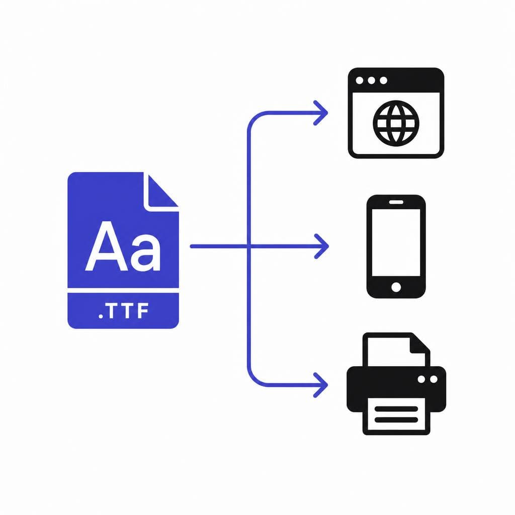
The most dependable path to font consistency across platforms is to maintain one approved source for every brand typeface and style. In practical terms, that means your organization should have a central folder or asset library containing the exact font files that staff, freelancers, agencies, and vendors are permitted to use. For most everyday desktop workflows, a .TTF file is widely supported and easy to install on both Windows and macOS. Web use may also require webfont formats such as .WOFF or .WOFF2, depending on your site setup.
Start by defining a compact brand font system. Many small and midsize brands need only three roles: a display font for headlines, a text font for paragraphs, and an optional accent font for limited uses such as pull quotes, labels, or campaign artwork. For example, a local coffee company might use a bold custom script for major headlines, a clean geometric sans serif for menus and web copy, and the same sans serif in heavier weights for calls to action. This is more usable than trying to force a decorative typeface into every context.
Create an asset package with an unambiguous naming convention. Instead of emailing a file called “final-font-new.ttf,” use names such as “BrandDisplay-Regular.ttf,” “BrandDisplay-Bold.ttf,” and “BrandText-Semibold.ttf.” Include a short readme that identifies the version, the license owner, the approved use cases, and installation instructions. Store the package in a location your team can reliably access, such as a shared drive, digital asset manager, or organized brand portal. Restrict editing rights so only designated owners can replace core files.
If your signature lettering only exists in an image, a photo, or a scanned piece of artwork, turning it into a real font removes a major source of variation. Snapafont can convert an image of lettering into a downloadable .TTF font file, giving your team an asset they can install and use rather than repeatedly tracing the same shapes. Before converting, use the cleanest source image available: high contrast, level alignment, minimal shadows, and clearly separated characters produce a more useful result.
A single source does not mean one font format solves every scenario. It means there is one canonical design for the typeface and a clearly managed set of approved production formats. Keep the master font files together, record which webfont files were generated from them, and avoid downloading random copies from font-sharing sites. That discipline makes a unified brand typography system much easier to protect over time.
Apply the Same Typography on Every Platform
A practical cross-platform font checklist
Your font strategy should account for the way people actually create and publish content. The goal is not to make every channel identical. The goal is to preserve the recognizable parts of the system—typeface choice, hierarchy, tone, and spacing—while adapting to each platform’s technical constraints.
For your website, upload licensed webfont files through your content management system, theme settings, or developer workflow. Specify font-family declarations and define sensible fallback fonts in CSS. Test the site on current versions of major browsers and on both mobile and desktop devices. Pay close attention to page speed: if a font file is too large, subset it to include only the characters and language support you need, then use modern formats such as WOFF2 where possible. Establish styles for H1, H2, body copy, buttons, captions, and forms so editors are selecting approved styles rather than improvising font settings in each post.
For social media, remember that native text tools are limited and can change without notice. Create reusable templates in a design platform that supports your installed custom font. Make versions for common sizes, such as vertical stories and reels, square feed posts, landscape LinkedIn graphics, and Pinterest pins. Define safe margins so headlines are not hidden behind interface controls. If accessibility matters—as it should—do not place crucial information only inside an image; pair designed graphics with meaningful captions, alt text where available, and readable contrast.
For presentations and internal documents, install the approved desktop font files on every contributor’s device. Provide a branded slide template with preconfigured title, subtitle, body, chart, and caption styles. In PowerPoint, consider embedding fonts when sharing a deck, but test the file first because embedding permissions vary by font license. When sending a final presentation to someone who only needs to view it, export a PDF. For documents that must remain editable, include the font package and installation instructions rather than assuming recipients already have it.
For print, communicate early with your printer. Supply PDF files using the printer’s preferred specifications, typically with fonts embedded or converted to outlines when no further text editing is needed. Outlining can prevent substitution, but it should be a final-output step, not the only archive of your design; outlined letters cannot be edited as text. Request a proof for high-stakes materials such as packaging, signage, event banners, and business cards. The proof can reveal wrapping, weight, ink, or spacing issues before a full production run.
For email, use a more conservative approach. Many email clients do not consistently load custom webfonts. Define a font stack that starts with your preferred webfont where supported and then falls back to a close, widely available system font. Maintain your brand through consistent type scale, colors, logo treatment, image templates, and writing voice even when the exact typeface cannot render. This is an important distinction: typography consistency is not always literal pixel-for-pixel sameness. It is a controlled, recognizable experience under real-world constraints.
Why a Custom Font Can Strengthen Brand Recognition
Own the details people remember
A custom font gives a brand a visual asset competitors cannot easily duplicate. Stock fonts are useful, affordable, and often highly functional, but they are also available to thousands of other businesses. A distinctive custom display face can make a restaurant’s menu, a skincare brand’s packaging, or a creative studio’s portfolio immediately more recognizable.
The advantage is not merely novelty. A purpose-built typeface can reflect specific brand qualities. Soft, rounded letterforms may support an approachable family brand. Tall, high-contrast letters can suggest editorial luxury. Slightly irregular handwriting can communicate craft and personality. The key is to use custom typography strategically. Highly expressive type works best for logos, short headlines, social graphics, campaign titles, and packaging accents. Long paragraphs need readability first, which is why pairing a custom display font with a reliable text font is usually the strongest approach.
Custom fonts also reduce dependence on a single design tool. Once your lettering is available as an installable font, it can be used in many applications rather than being trapped in one original artwork file. Snapafont is particularly useful for brands that want to preserve lettering from a physical sample, historical artwork, or image and make it usable in everyday design workflows. Always review the output carefully, especially character spacing, punctuation, numerals, and commonly used uppercase and lowercase letters, before adopting it as a core brand asset.
Be mindful of legal and operational considerations. Do not convert lettering that belongs to another brand or artist without permission. If a typeface is commissioned, document ownership and usage rights. If it is derived from your own original lettering, keep the source image, conversion file, font files, and version notes in your brand archive. These records protect continuity when team members change or when a supplier needs to reproduce your materials.
Maintain Typography Consistency as Your Brand Grows
Turn guidelines into a routine, not a forgotten PDF
A font system only works if people can follow it quickly. Create a concise typography guide that answers practical questions: Which font is used for headlines? Which weights are approved? What is the default body size? How much line spacing should be used? Which styles are allowed in social posts? What are the fallback fonts for web and email? Add visual examples of correct and incorrect use. A one-page guide that a marketer can use in two minutes is often more effective than a 70-page brand book nobody opens.
Assign ownership. One person or small group should approve new font styles, update templates, manage licenses, and maintain the canonical font folder. This does not mean every social post needs a lengthy review. It means there is a clear decision-maker when an agency asks for files, a contractor uses an unapproved substitute, or a new website template introduces conflicting typography.
Schedule lightweight audits every quarter or before major campaigns. Review your homepage, recent social posts, sales decks, email templates, printed collateral, and key marketplace listings. Look for inconsistent weights, incorrect line breaks, stretched lettering, simulated bold, or fallback fonts that have slipped into public-facing work. Keep a simple checklist and resolve the highest-visibility issues first.
Version control matters too. If you adjust a custom font, record what changed and why. Do not silently replace a file with a new version that has different character widths; it can alter page layouts, templates, and documents. Name revisions clearly, test them in your most important tools, and announce the update to everyone who uses the brand assets. This small amount of process prevents a supposedly unified brand typography system from drifting over time.
Finally, train people through templates rather than reminders alone. Prebuilt social layouts, presentation masters, document styles, and website components make the correct choice the easy choice. When the system is convenient, brand font consistency becomes a normal part of publishing instead of a last-minute design correction.
Make Your Brand Lettering Usable Everywhere
If the typeface you want is currently locked in a logo image, old sign, sketch, or photographed piece of lettering, your team will keep approximating it until it becomes a real font asset. Converting that lettering into an installable file gives you a practical foundation for more consistent typography across websites, social templates, presentations, and print projects.
Try Snapafont at snapafont.com to turn an image into a downloadable .TTF font file, then add the result to your approved brand asset library. Pair it with clear usage rules and reusable templates, and you will be much closer to seeing the same recognizable brand voice wherever customers find you.
Ready to turn your image into a font?
Upload any image and get a real, downloadable .TTF font file in seconds.
Try Snapafont Free →

