An app icon has very little room to make an impression. On many home screens, users see it at roughly 60 pixels or less, surrounded by competing colors, shapes, and notification badges. If your icon includes a letter, wordmark, or monogram, the type choice must do far more than look attractive in a design presentation: it has to remain recognizable in a fraction of a second.
Choosing a font for app icon work is therefore different from choosing body copy for an interface or a display face for a website header. App icon typography needs a clear silhouette, strong spacing, and enough personality to reinforce the product without becoming visual noise. The best app icon font is usually not the most decorative one. It is the one that preserves its identity after being reduced, rasterized, placed on a colored tile, and viewed in less-than-perfect conditions.
This guide explains the practical constraints behind icon-scale lettering, the styles that hold up best, when to adapt a system font versus create a custom mark, and how to test your design before launch. It also covers a realistic process for creating a distinctive app icon letter design without sacrificing the instant recognition that mobile products depend on.
Constraints of App Icon Typography
The first rule of app icon typography is simple: design for the smallest likely appearance, not the largest artboard. A letter can look refined at 1024 × 1024 pixels and become an indistinct blob at 48 × 48. Your work must survive downscaling, anti-aliasing, differing screen densities, dark and light wallpapers, and the visual competition of a crowded home screen.
At icon size, users do not read type in the usual sense. They recognize shape. A successful logo font for app use creates a memorable outer contour before viewers notice details such as terminals, contrast, or subtle curves. For example, a bold lowercase “a” with a distinctive single-storey form may be recognizable immediately, while a thin double-storey “a” can lose its internal opening and resemble another character. Likewise, an “M,” “W,” “S,” or “G” may need more deliberate customization than a simple “C” or “O” because their internal structures are easier to distort at small sizes.
Spacing is equally important. Tight tracking that feels sophisticated in a full wordmark often collapses in an icon. If you use two or three letters, leave enough separation for each character to retain its silhouette. If you use one letter, make sure the counterspaces—the enclosed or partially enclosed areas inside letters such as “B,” “P,” “R,” “a,” and “e”—remain open. Closed counters are one of the most common reasons an app icon letter design fails at small sizes.
The icon background also changes how a typeface performs. White lettering on a saturated blue square may appear heavier than the same lettering on a pale yellow background. Fine details can disappear against textured, gradient-heavy, or high-contrast artwork. Use the background as part of the typographic system rather than treating it as an afterthought: the letterform, color, padding, and contrast should work together as one compact visual unit.

Five non-negotiable small-scale rules
Start with generous clear space. As a practical baseline, keep the letter or monogram noticeably inside the icon’s safe visual area rather than pushing it toward the rounded edges. Although platform masks and export requirements vary, a mark that is too large will feel cramped and can be visually clipped by different icon treatments.
Avoid hairlines and fragile joins. Strokes that are obvious on a desktop monitor can disappear when the image is compressed or displayed in a small notification surface. Make thin strokes thicker than your first instinct suggests, and reinforce joins where diagonals meet stems.
Limit detail. Do not rely on inline strokes, tiny serifs, intricate ligatures, shadows, or multiple overlapping letterforms to communicate the brand. One confident detail—a cut corner, unusual crossbar, rounded terminal, or custom notch—is often enough to make the mark ownable.
Prioritize contrast. The letter should be easily distinguishable from its background in both normal and dim conditions. A contrast ratio mindset is useful even when the icon is not strictly interface text: avoid near-identical hues and test on common wallpaper colors.
Finally, remember that app stores may show the icon at several sizes, while users may see it in search results, folders, widgets, and notifications. Your mobile app icon font needs to work across all of these contexts, not only on a carefully staged launch screen.
What Font Styles Work at Small Sizes
The strongest styles for app icons tend to have a high x-height, sturdy strokes, open counters, and uncomplicated silhouettes. Geometric sans serifs, humanist sans serifs, rounded grotesks, and carefully simplified slab-inspired forms can all work well. The right direction depends on the personality of the product, but clarity should guide every choice.
Geometric sans styles suit modern tools, finance products, productivity apps, and brands that want a clean, confident presence. Their circles, straight stems, and consistent structure scale predictably. However, pure geometry can sometimes feel generic, especially when a single capital letter is used. Add a subtle brand-specific intervention, such as a softened corner, modified apex, or altered terminal, to avoid looking interchangeable with dozens of other icons.
Humanist sans styles offer more warmth and character. Their more calligraphic proportions can help letters remain distinguishable: the “I,” “l,” and “1,” for instance, are often easier to tell apart than in a strictly geometric face. This makes them useful for education, health, community, and service apps. Keep an eye on stroke modulation, though. Excessive thick-thin contrast can create uneven visual weight at tiny sizes.
Rounded fonts communicate friendliness and accessibility, particularly for family, wellness, social, and consumer products. Their soft terminals can also reduce the harshness of a high-saturation icon tile. The risk is that overly rounded forms lose definition. A rounded “E” with short arms or a soft “S” with narrow internal space may blur when reduced.
Serifs, scripts, and high-contrast display faces are not automatically wrong, but they demand restraint. A sturdy slab serif can be effective for a heritage-oriented brand if its serifs are broad and simplified. A script may work when the icon is built around one unmistakable initial, but it should not depend on delicate flourishes. In most cases, use the expressive style in the wider brand system and simplify the app icon version.
Match the style to the brand, then simplify it
Before committing to an app branding font, write down three brand attributes and one functional requirement. For example, a meditation app might be “calm, human, and premium,” with “readable on a lavender background” as its functional requirement. A bold rounded sans with a custom open “M” may fit better than an elegant, thin serif that only communicates premium.
Try designing with one character first. Many effective icons are based on an initial rather than an entire company name because a single character gives you room to make the silhouette larger and more distinctive. If the name begins with a weak or highly common letter, consider a two-letter monogram, a recognizable symbol integrated with the initial, or an abstract form derived from the wordmark. The goal is not to force every part of the name into the square; it is to make the brand easier to spot.
When evaluating candidates, view them in black and white before experimenting with color. If the form does not read as a simple black shape on white, color will not solve the underlying structure. This fast test helps identify whether you have selected a durable app icon font or merely an attractive typeface at large scale.
Custom Fonts vs. System Fonts for App Icons
A familiar system or commercial font can be a smart starting point. It is fast, affordable, and usually engineered with sound proportions. For a new product that needs to ship quickly, selecting a robust weight from a reputable sans-serif family and making only minor adjustments may be entirely appropriate. The key is to check whether the result looks distinct in the category. If ten competing apps use nearly identical bold initials on solid-color backgrounds, a standard font may not give users a reason to notice yours.
A custom logo font for app identity makes more sense when typography is central to recognition, when the initial is common, or when the product needs a defensible visual asset across the app, website, social profiles, and marketing. Custom does not have to mean drawing an entire type family from scratch. Often, it means creating a custom one- or two-letter mark based on a chosen typographic direction. You might widen the lower bowl of an “R,” remove a crossbar from an “A,” turn a dot into a meaningful symbol, or create a distinctive ligature for a two-letter monogram.
Do not modify a font without checking its license. Many font licenses restrict alterations, embedding, logo use, or redistribution. Even if you only plan to use a rendered icon, confirm the permitted use in the font’s license agreement. Creating an original letterform avoids uncertainty and gives you more control, but it also introduces a responsibility: preserve the legibility principles that professionally made fonts already solve.
A practical middle ground is to use an existing typeface as visual research, sketch several original letterforms, and then refine the best direction into a standalone icon mark. This combines speed with individuality and prevents the design from feeling like a default placeholder.
How to Test Legibility Before You Ship
Never approve app icon typography solely from a vector editor at 400% zoom. Export the icon at realistic sizes and test it in the environments where users will encounter it. At a minimum, inspect versions at 1024, 180, 120, 80, 60, 48, and 32 pixels. The exact platform specifications may change over time, but a range of sizes exposes weaknesses quickly.
Create a simple test board with your icon placed beside 15 to 25 common app icons. Include both visually quiet and visually busy neighbors. Ask a few people to identify it after a brief glance, then ask what letter or symbol they saw. If people hesitate, misread the letter, or only recognize it after studying it, simplify the form. This is especially important when the icon relies on a brand initial such as “Q,” “R,” “S,” “G,” or “Y.”
Test on light, dark, colorful, and photographic wallpapers. Also check the icon in a folder, where it may be smaller or visually crowded, and in grayscale, where color can no longer carry the identity. If the mark only works because of a specific gradient or hue, its underlying form is probably too weak.
Use a blur test as an additional diagnostic. Step back from the screen, squint, or apply a slight Gaussian blur to a screenshot. You should still be able to identify the overall letterform and its contrast against the tile. This is not a substitute for user testing, but it quickly reveals whether your design depends on details too fine for normal use.
Use evidence to refine, not just approve
When a test fails, diagnose the exact issue instead of starting over blindly. If the letter is unreadable, enlarge the counterspaces, thicken vulnerable strokes, or simplify the shape. If it is readable but forgettable, introduce one ownable modification to the silhouette. If it disappears among neighboring icons, reassess the background color, edge contrast, and visual weight.
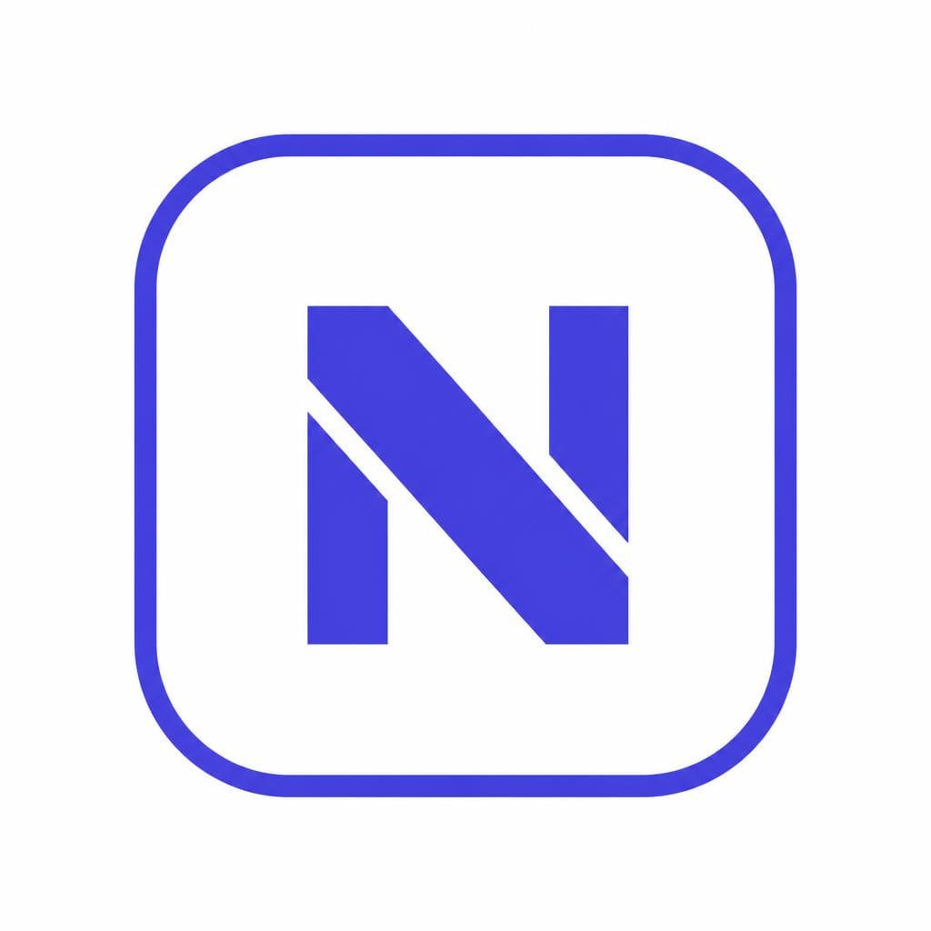
Keep a small comparison set as you iterate: version A might have a wider “N,” version B a larger diagonal gap, and version C a more saturated background. Testing variations side by side makes subjective design feedback more concrete. The winning design is rarely the most detailed option. It is usually the one that delivers the clearest recognition with a small amount of memorable character.
Creating Your Own App Icon Letter Design
Begin with a concept, not decoration. Identify what the app does and choose one visual attribute to express. A secure finance app could use a stable, wide letter with protected inner space. A creative editing app might use a cut, overlap, or transformable shape. A travel app could incorporate a directional angle. The visual idea should be subtle enough that the letter still reads instantly.
Next, sketch in monochrome. Draw the letter at a large size, but regularly reduce it to icon scale. Start from broad construction: stems, bowls, diagonals, and negative spaces. Only after that should you adjust corners, terminals, or unique cuts. Aim for a compact silhouette with intentional proportions. Wider forms often feel more stable, while narrow forms can look elegant but may lose presence in a square icon.
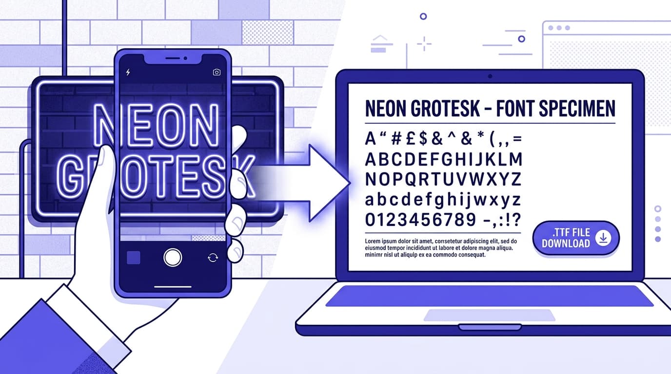
Then turn the design into a reusable typographic asset. If you want consistency across promotional graphics, onboarding screens, social templates, and app-store imagery, it helps to have the custom glyph available as a font rather than as a one-off image. Snapafont can turn a clear image of your custom lettering into a downloadable TTF font file, making it easier to use the same distinctive character across your brand materials.
Before exporting the final icon, create optical corrections. Perfect mathematical centering is not always visual centering: a rounded “O” may need to sit slightly higher or lower than a flat-sided “H,” and a diagonal-heavy “A” can appear off balance even when its bounding box is centered. Adjust by eye at final size. Also review the letter’s weight after rasterization; it may need to be slightly heavier than the equivalent text used elsewhere in the brand.
Build a Distinctive Icon Without Losing Readability
A strong font for app icon design is not about fitting a miniature wordmark into a square. It is about creating a letterform that users can recognize immediately, even when it is small, surrounded by competitors, and viewed only briefly. Start with clear structure, protect negative space, choose a style that reflects the product, and test repeatedly at real-world sizes.
If you have sketched a custom initial, monogram, or handwritten brand mark and want to use it consistently beyond the icon itself, try Snapafont at snapafont.com. You can convert your lettering image into a usable TTF font, then apply the same recognizable form across app-store graphics, campaign assets, landing pages, and brand touchpoints. That consistency helps transform a good icon into a visual identity people learn to recognize.
Ready to turn your image into a font?
Upload any image and get a real, downloadable .TTF font file in seconds.
Try Snapafont Free →