A shopper can decide whether an online store feels credible in seconds—often before they have compared features, read reviews, or reached the add-to-cart button. Product photography, price, and shipping information matter enormously, but typography quietly determines whether people can absorb all of that information without friction. If the type is cramped, faint, overly decorative, or inconsistent, even an excellent product can feel harder to trust.
That is why choosing a font for ecommerce is not simply a branding exercise. It is a usability and conversion decision. The right ecommerce typography helps visitors scan category pages, understand product details, recognize price and delivery information, and confidently take the next step. The wrong online store font can create cognitive effort at precisely the moment a customer needs clarity.
This guide explains how type influences purchase decisions, how to assign distinct roles to headlines and body copy, what typography communicates about trust, and how to test changes without relying on personal taste. Whether you run a one-product Shopify store or a large catalog, the goal is the same: make every important piece of information easy to notice, easy to read, and consistent with the promise of your brand.
How Typography Affects Purchase Decisions
Typography affects conversion because it affects comprehension. In behavioral research, this is often described through processing fluency: people tend to respond more positively to information that is easy to process. On an ecommerce site, fluency means a shopper can immediately distinguish a product name from a variant, scan the price, find the size guide, understand the delivery promise, and read key specifications. Every unnecessary pause introduces doubt or abandonment risk.
Product page typography is especially important because it carries the information that resolves purchase objections. A customer may love the image but still need to know the dimensions, materials, compatibility, care instructions, return window, or estimated arrival date. If these details are presented in tiny text, long dense paragraphs, low-contrast gray, or an ornate display face, the buyer has to work too hard. The result is not always a conscious thought such as “this font is bad.” More often, the page simply feels less clear, less polished, or less dependable.
### Readability reduces decision friction
Readable type gives shoppers a path through a page. Use a body size that remains comfortable on mobile, where many stores receive the majority of browsing traffic. For most interfaces, 16px is a practical starting point for paragraph text; depending on the typeface’s x-height and proportions, 17px or 18px may be better. Maintain generous line height—roughly 1.4 to 1.7 times the font size for body copy—and avoid overly wide text columns. On desktop, a line length around 45 to 75 characters is usually easier to read than a full-width block.
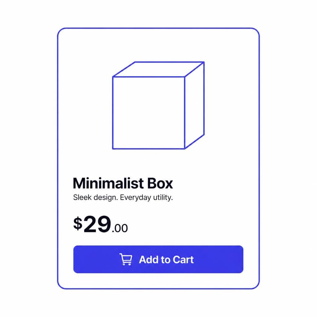
Visual hierarchy matters just as much as the typeface itself. The product title should be clearly more prominent than secondary metadata. Price needs a recognizable treatment without overpowering the product. Variant labels, stock status, shipping details, and returns information should be easy to locate. Use size, weight, spacing, and position to establish this hierarchy before relying on color alone. This helps shoppers scanning quickly and supports visitors with color-vision differences.
### Match type to the shopping task
Different pages demand different reading behaviors. A collection page is primarily a scanning environment, so concise product names, consistent card layouts, and legible prices are priorities. A product detail page must support comparison and reassurance, so its descriptive text needs more breathing room. Checkout should be exceptionally plain and task-focused: clear labels, obvious error states, and no stylized typography that makes form fields feel ambiguous.
For example, a skincare shop may use a refined serif for product names and a highly legible sans serif for ingredients, routine instructions, and subscriptions. A parts retailer may prioritize a neutral sans serif across its catalog because part numbers, technical measurements, and compatibility tables need fast, error-free reading. Neither approach is universally “better.” The effective ecommerce conversion font is the one that supports the customer’s task while accurately expressing the brand.
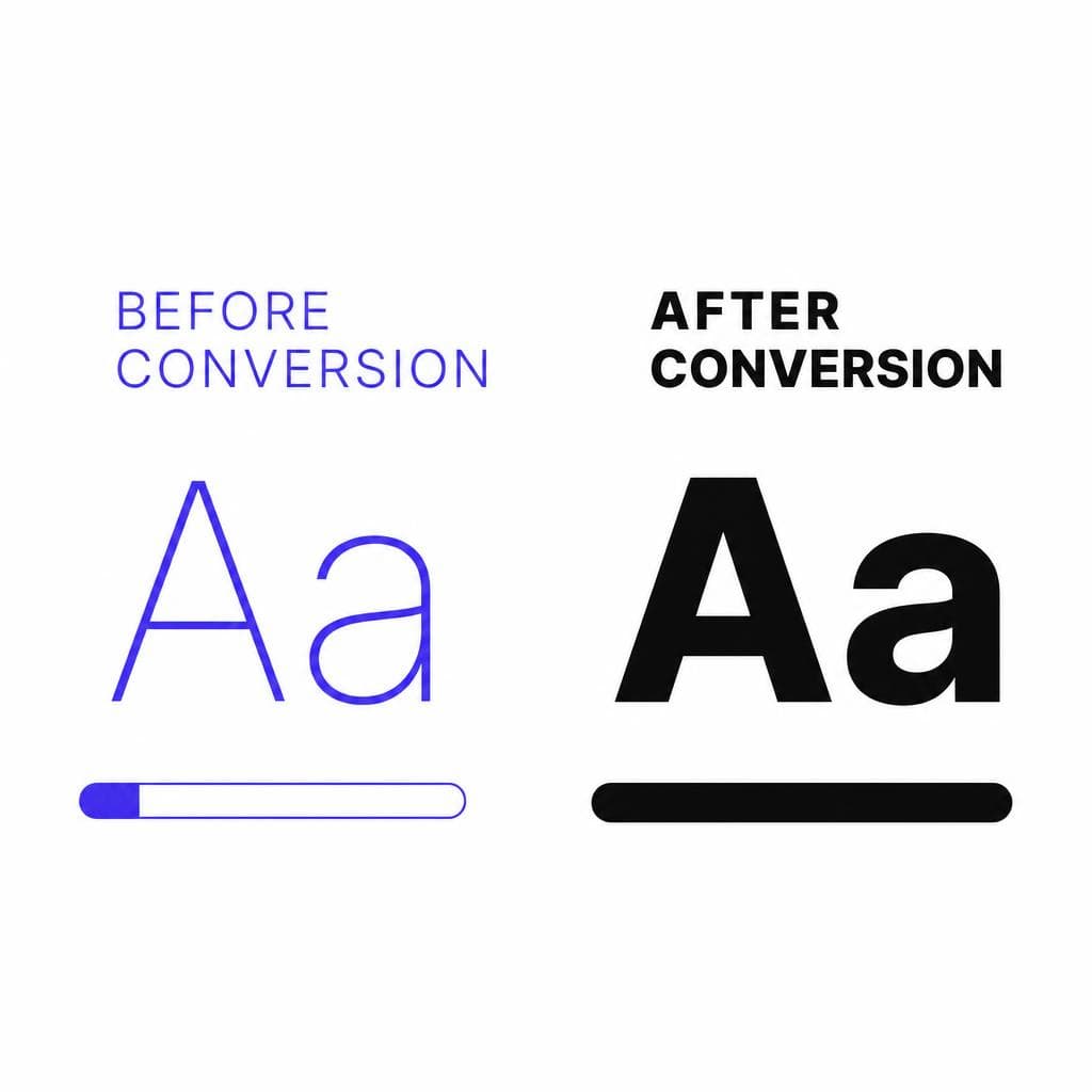
Give Headlines and Body Copy Different Jobs
A common ecommerce typography mistake is treating every piece of copy as though it needs the same visual personality. Headlines and body text serve different purposes. Headlines create attention, define sections, and help customers understand what they are looking at. Body copy carries the proof: materials, benefits, instructions, policies, and details that make a purchase feel safe.
### Headlines should create recognition and hierarchy
A headline font can carry more character than a body font. It may be a distinctive serif, a condensed sans, or a softly rounded display face, provided it remains readable at the sizes you use. Use it deliberately for hero statements, collection names, product titles, and high-level promotional messages. Avoid setting long product descriptions or policy copy in a display typeface. Decorative characteristics that look memorable in a three-word heading often become tiring across several sentences.
Be precise about hierarchy. A product title should not compete with a homepage hero headline, and an accordion heading should not visually resemble a primary call to action. Establish a type scale with a limited number of levels—for example, display headline, H1 product title, H2 section heading, card title, body, small supporting text, and caption. Consistent levels make the store easier to learn from page to page.
### Body text should disappear into the reading experience
The best body font is usually the one shoppers barely notice because it is effortless to read. Look for open letterforms, clear punctuation, distinguishable characters such as uppercase I, lowercase l, and the numeral 1, and a useful range of weights. A regular weight for paragraphs plus medium, semibold, and bold options is often enough for a strong interface.
If you pair fonts, create contrast without conflict. A classic combination is a characterful serif headline paired with a clean humanist sans serif for body copy. Another is a bold geometric sans for headings with a neutral sans for product details. Do not pair two fonts that are merely similar; subtle differences in proportions can make the result look accidental. Test the pairing on real content, including long product names, sale prices, ingredient lists, and mobile menus—not just on a mood board.
A useful rule is to limit the main interface to one or two families. A third font may be appropriate for a small campaign treatment, but too many families weaken hierarchy and make a shop font system feel improvised. Use weight, size, case, and spacing to add variation before introducing another typeface.
Use Typography as a Trust Signal
Trust is built through many small details. Typography is one of them because it signals care, consistency, and operational maturity. A store with sharp product images but poor spacing, inconsistent capitalization, and unreadable policy text sends mixed signals. Shoppers may not diagnose the problem as typography, but they can still conclude that the company is less established or that checkout may be risky.
### Prioritize legibility over aesthetic trends
Low-contrast text has become a common visual trend, but it can hide the exact information shoppers need to complete a purchase. Ensure normal body text meets accessible contrast expectations; WCAG guidance commonly calls for a 4.5:1 contrast ratio for normal text and 3:1 for large text. Contrast is not merely an accessibility checklist item. It helps a shopper read delivery conditions, recurring-payment terms, and product limitations without zooming or straining.
Avoid using all caps for paragraphs or detailed labels. All caps can work for short navigation items, small badges, or an occasional category label, but it reduces the recognizable word shapes that support fast reading. Similarly, reserve very light font weights for large decorative text. On many mobile screens, light weights blur or lose contrast.
### Make important commerce information unmistakable
Your return policy, shipping timeline, warranty, subscription terms, and payment options should look as intentional as your product story. Use clear headings, short paragraphs, and bullets where appropriate. Make links visually identifiable through more than a subtle color shift; underlines, weight changes, or clear hover and focus states help users recognize interactive elements.
Consistent numerical styling also matters. Prices should align cleanly, currency symbols should be unambiguous, and sale pricing must not be confusing. If your font includes tabular figures, consider using them in comparison tables, cart summaries, and subscription options so numbers align vertically. For a fashion retailer, that might mean making size-chart measurements easy to compare. For a supplement brand, it could mean making serving counts and dosage instructions immediately scannable.
Finally, inspect typography in every state: an out-of-stock product, an invalid promo code, a form error, a discounted item, and a long translation. A design that looks polished only in the ideal state is not yet a trustworthy shopping experience.
The Advantages of a Custom Ecommerce Brand Font
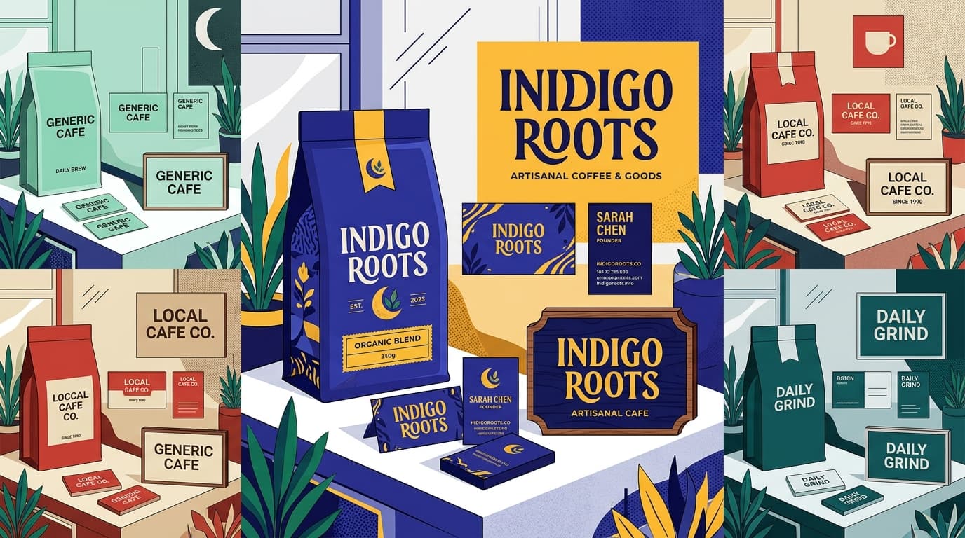
A distinctive ecommerce brand font can help a store become recognizable beyond its logo. When used consistently across packaging, email, social content, product pages, and seasonal campaigns, typography becomes part of the brand memory customers carry with them. This is particularly valuable in categories where products are visually similar, such as candles, coffee, apparel, stationery, or digital goods.
Custom does not have to mean difficult to read. The strongest approach is often a custom display or accent font for brand moments, paired with an accessible workhorse font for the interface. For example, a handmade ceramics business might transform its own lettering from packaging labels into a display face for homepage headlines and collection titles, while keeping specifications and checkout copy in a robust sans serif. The result can feel personal without asking shoppers to decipher critical information.
A custom font also gives you more control over consistency. Instead of relying on a generic style that competitors may use in the same templates, you can preserve recognizable letter shapes across campaigns and channels. However, test the technical basics before launch: webfont file size, loading behavior, character coverage, kerning, supported weights, numerals, punctuation, and rendering on both iOS and Android. Use font-display settings that avoid invisible text while a font loads, and always define a sensible fallback stack.
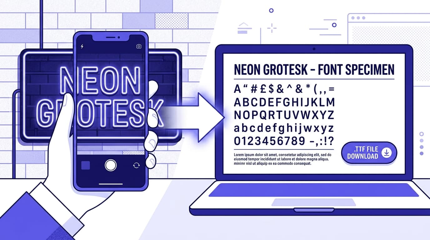
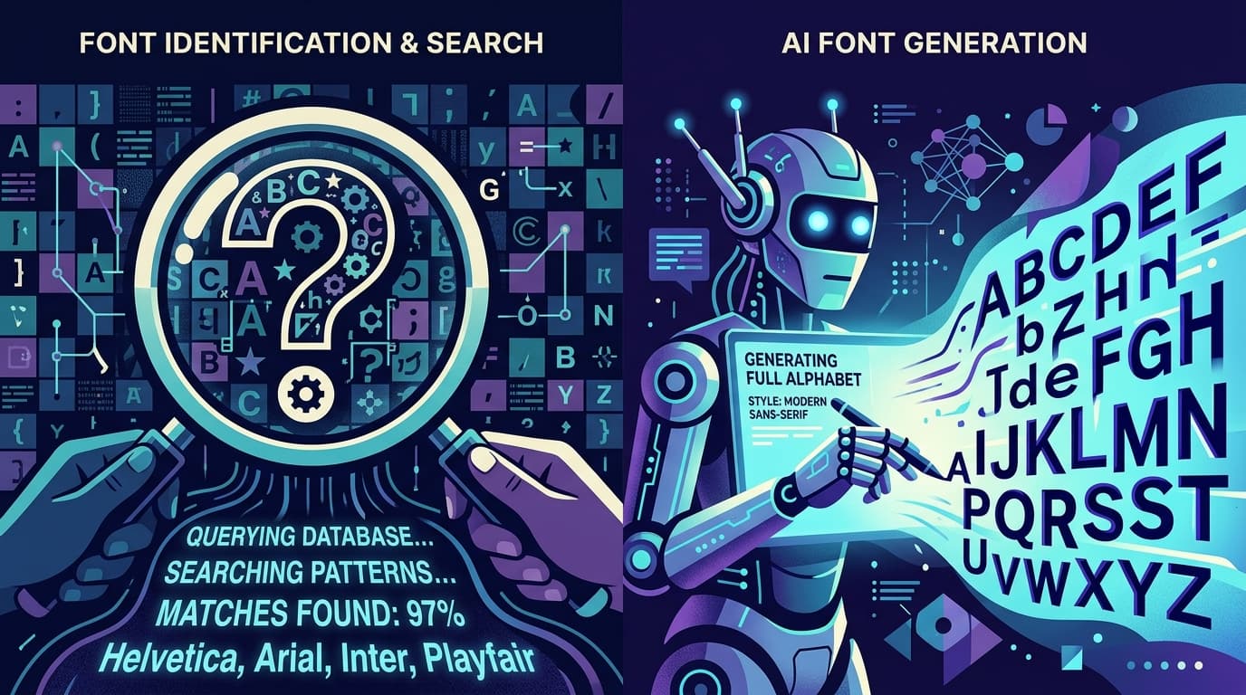
If your starting point is an image of hand lettering, a vintage label, or a signature brand mark, Snapafont can turn that visual reference into a downloadable TTF font file. It is still wise to use the resulting typeface strategically: check key characters, refine your content hierarchy, and keep high-stakes ecommerce UI text in a font optimized for continuous reading.
How to Test Your Typography for Better Conversions
Typography decisions should be validated with evidence, not settled by the loudest opinion in a design review. A tasteful redesign can still reduce conversion if it makes product information harder to scan. Start by identifying the page and behavior you want to improve: add-to-cart rate on a product page, size-guide engagement, checkout completion, email capture, or conversion from collection pages.
### Run focused A/B tests
Test one meaningful typographic variable at a time whenever possible. Useful experiments include increasing product-description body size from 15px to 17px, changing a narrow body face to a more readable one, increasing line height, strengthening the contrast of secondary details, or simplifying an overly stylized product-title font. Measure the primary conversion metric, but also watch supporting signals such as add-to-cart clicks, scroll depth, accordion opens, error rates, and return visits.
Do not change the font, layout, images, offer, and button copy all in the same test. If results improve, you will not know why. Give the test enough traffic and time to account for normal variation, and segment results by device. A type change that helps desktop users may have a much larger—or entirely different—effect on mobile.
### Combine analytics with usability observation
Quantitative data tells you what happened; usability sessions help explain why. Ask five to eight representative shoppers to complete practical tasks: find an item in a specific size, determine delivery timing, compare two variants, identify the return window, and place an item in the cart. Watch for hesitation, zooming, misread labels, or questions such as “Is this included?” Those moments often expose product page typography problems that a conversion dashboard cannot identify on its own.
Use a pre-launch checklist as well. View the store at 320px wide, on a real phone in bright light, at 200% browser zoom, and with longer product names. Check keyboard focus states and screen-reader-friendly semantic heading order. Confirm that promotional badges do not obscure price information and that text remains readable over images. This practical review often delivers more value than chasing a trendy typeface.
Once you find a winning treatment, document it in a lightweight typography system. Record font families, approved weights, sizes, line heights, letter spacing, text colors, and usage examples for product cards, product pages, cart, checkout, and emails. Consistency prevents future campaigns or app integrations from slowly eroding the clarity you worked to establish.
Create a More Recognizable Store Without Sacrificing Clarity
Your typography should make shopping feel simpler while making the brand feel more distinctly yours. Start with readable body copy, clear hierarchy, accessible contrast, and a restrained type system. Then use a signature display treatment where it can add recognition: a collection title, packaging-inspired campaign headline, or branded editorial section. Test it against real product content and real customer behavior before applying it everywhere.
If you have a piece of lettering, a logo-inspired alphabet, or an image that captures your brand’s personality, try Snapafont at snapafont.com to convert it into a downloadable TTF font. You can use that custom asset to explore memorable headline and campaign typography while keeping the essential shopping experience clear, fast, and conversion-focused.
Ready to turn your image into a font?
Upload any image and get a real, downloadable .TTF font file in seconds.
Try Snapafont Free →