
Your brand typeface may look perfect on your website, packaging, and social posts. Email is different. A message that looks polished in one inbox can quietly fall back to Arial in another, or worse, lose spacing and hierarchy when an unsupported font is handled badly. That does not mean you have to abandon your brand font email strategy. It means you need to design for the realities of email rendering.
Custom font email marketing works best when it treats web fonts as a progressive enhancement rather than a requirement. People using clients that support your chosen font get the full branded experience. Everyone else receives a carefully planned fallback that is equally readable, usable, and on-brand enough to feel intentional. This approach protects deliverability, accessibility, and conversion while still giving your newsletter a distinctive look where support exists.
In this guide, you will learn why email typography is unusually complicated, which clients can display a web font email, how to add fonts safely, how to build fallback stacks that do not break layouts, and when image-based text is the smarter choice. The goal is not to force one font into every inbox. The goal is to send an email that works everywhere and looks exceptional wherever it can.
Why Email Fonts Are More Complicated Than Website Fonts
Email clients are not browsers
On a modern website, you can load a font with CSS, test it in major browsers, and expect broadly consistent results. Email clients use a completely different rendering environment. Some are browser-like, some use their own engines, and desktop Outlook versions on Windows have historically relied on Microsoft Word to render HTML. That last detail explains many of the strange limitations marketers encounter.
A font in email also depends on factors outside your control. The recipient may read the message in Gmail on the web, Gmail on Android, Apple Mail on macOS, Outlook for Windows, Outlook on the web, Yahoo Mail, or a privacy-focused third-party app. They may have images disabled, use dark mode, increase default text size, or block remote resources. A custom font newsletter must remain understandable under all of those conditions.
There are three practical categories of fonts in email. First, there are web-safe fonts such as Arial, Georgia, Verdana, Times New Roman, and Courier New. These are commonly installed on devices and are the most reliable options. Second, there are web fonts hosted online and loaded with CSS, such as a licensed brand typeface served from your domain. Third, there are fonts represented as images, where the text is baked into a graphic rather than rendered as selectable HTML text.
The important distinction is that a font file does not travel inside an email the way an attachment does. Your HTML references a font resource, and the email client decides whether it will request, load, and use that resource. If it refuses, the client uses the next font in your CSS stack. This is why a robust fallback is not optional; it is the foundation of good email typography.
There is also a licensing question. A font license that permits desktop design work or website use does not automatically permit email embedding or external hosting. Before using a commercial typeface, confirm that your license covers webfont delivery and the expected volume of recipients. If you are creating a font from lettering, a logo, or a scanned alphabet, make sure you own the rights to the source material and that the final letterforms are legally appropriate for commercial use.
Which Email Clients Support Web Fonts?
Plan for support, but design for graceful fallback
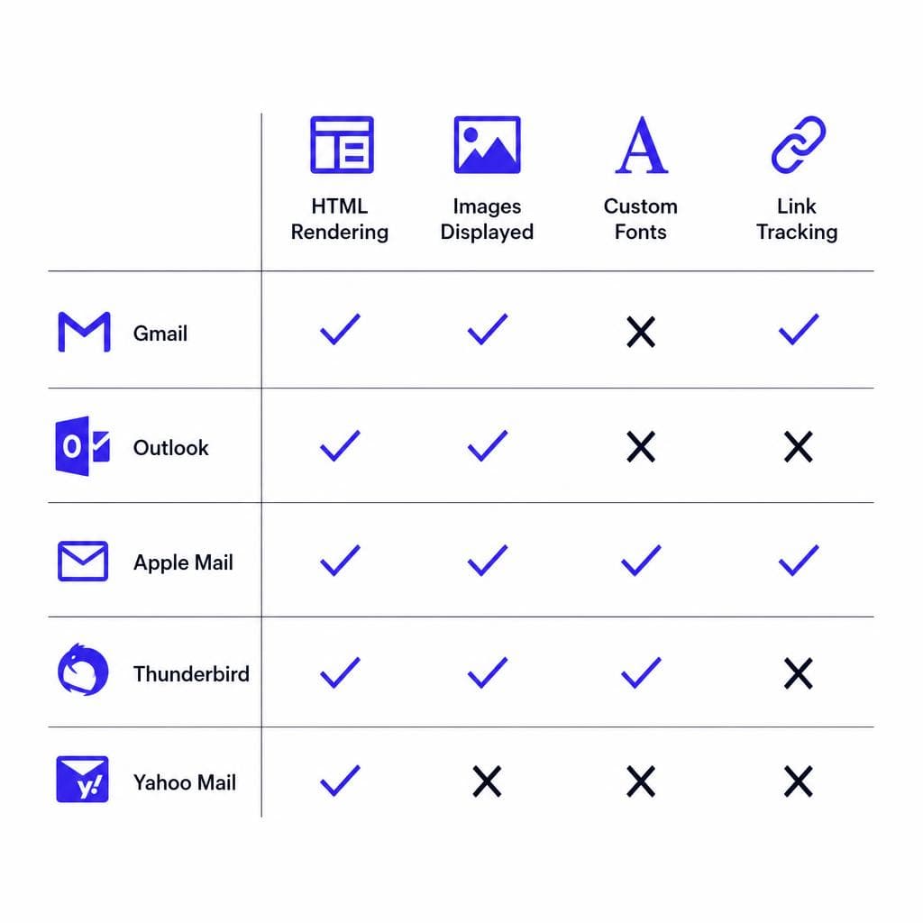
Email font support changes over time, so always test your exact template before a major campaign. In broad terms, Apple Mail on macOS and iOS has historically been among the most dependable environments for web fonts. Other clients with meaningful support have included Outlook for Mac, Outlook on the web in some configurations, and selected Android mail apps. These clients can make a carefully implemented brand font feel like a natural extension of your website.
Gmail is the major complication for many marketers. Gmail’s web and mobile experiences have traditionally offered limited or inconsistent support for externally loaded custom fonts, often falling back to the next available typeface. Many versions of Outlook for Windows also do not support standard web font loading and may use a default fallback. Because Gmail and Outlook represent a large share of many lists, assume a substantial portion of recipients will not see your custom face.
That is not a reason to skip web fonts altogether. It is a reason to choose a fallback that preserves the design. If your custom sans-serif has a geometric, modern character, a stack beginning with Arial or Helvetica may be a suitable safety net. If your custom face is an editorial serif, Georgia may maintain the intended tone better than a generic sans-serif. Your audience should see a consistent hierarchy even when they do not see identical letterforms.
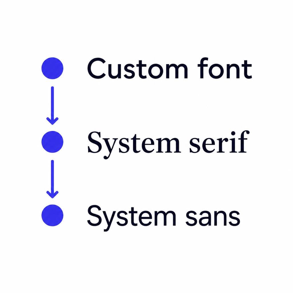
A useful planning method is to divide your audience into three experiences. Experience one: supporting clients display the web font. Experience two: clients without web font support display your primary fallback. Experience three: highly restrictive clients display a generic system font. Review the design at each level. If the message only works in experience one, the campaign is not ready to send.
Do not rely solely on a public compatibility chart. Build a test list that includes the inboxes your subscribers actually use, particularly Gmail, Outlook for Windows, Apple Mail, iPhone Mail, Yahoo Mail, and Outlook on the web. Services such as Email on Acid and Litmus can also provide previews across clients. Test real send behavior, not just code pasted into a browser, because email service providers may rewrite CSS or strip unsupported declarations.
How to Implement a Web Font in Email Safely
Use CSS that fails gracefully
The safest implementation starts with a properly licensed, web-optimized font file in WOFF or WOFF2 format. Host it over HTTPS on a stable domain you control. Avoid depending on a temporary file URL, and do not use a font file that requires authentication or restrictive hotlink settings. If the client supports the font, it must be able to retrieve the file without a login or redirect.
Add an @font-face declaration in the email’s style block, then apply the font family with a fallback stack. Some email clients support @font-face while ignoring other loading methods, so this is usually the clearest starting point. A simplified pattern looks like this:
@font-face { font-family: 'Brand Sans'; src: url('https://example.com/fonts/brand-sans.woff2') format('woff2'); font-weight: 400; font-style: normal; }
h1, h2, p, a { font-family: 'Brand Sans', Arial, Helvetica, sans-serif; }
Keep the CSS simple and inline critical font-family declarations when your email platform allows it. Many email builders inline styles automatically, but they may remove @font-face rules or place them in a location that some clients ignore. Send a test from the actual platform you will use, whether that is Mailchimp, HubSpot, Klaviyo, Campaign Monitor, or a custom system.
Use separate @font-face declarations for each weight and style you truly need. For example, regular 400 and bold 700 are often enough. Do not assume a client can synthesize a convincing bold or italic version. At the same time, do not load an entire font library just because it is available. Large font payloads can slow rendering and create needless complexity. A newsletter normally needs one family and one or two weights.
Avoid JavaScript, CSS imports that depend on browser behavior, and experimental font-loading techniques. Email clients commonly strip scripts, and many block remote CSS imports. Also avoid setting a custom font only on a parent container and assuming every element will inherit it. Headings, buttons, table cells, and links can receive client-specific styling, so define type intentionally on the elements that matter.
Finally, test line wrapping at realistic inbox widths. A font with wider characters can turn a tidy two-line headline into three lines in supporting clients, while a narrower fallback may alter the opposite direction. Build enough vertical breathing room that either result still looks deliberate.
Build a Fallback Stack That Protects Your Layout
Choose for metrics, not just visual similarity
A fallback stack is the ordered list of fonts that the email client tries when your first choice is unavailable. The obvious goal is visual resemblance, but the more important goal is compatible text metrics: character width, x-height, weight, and line spacing. A fallback that is aesthetically similar but much wider can push navigation, buttons, prices, and headlines out of alignment.
Start by identifying the role of your brand font. Is it a compact sans-serif used for body copy? A high-contrast serif reserved for headlines? A hand-drawn display face used only in campaign titles? Then select a fallback that can perform the same role. For instance, a clean brand sans might use 'Brand Sans', Arial, Helvetica, sans-serif. A refined serif might use 'Brand Serif', Georgia, 'Times New Roman', serif. The generic family at the end matters because it gives every client a final, sensible instruction.
Keep body copy conservative. Body text should generally use a familiar, highly legible face at 14 to 18 pixels, with a line-height around 1.4 to 1.6. In email, readable copy is more valuable than typographic novelty. Reserve distinctive display fonts for short headings, labels, or a single promotional phrase. A 40-character headline is much less likely to create a damaging layout shift than a 600-word article rendered in an unpredictable font.
Test the stack with your longest real content, not placeholder text. Use a subject-related headline with long words, a product name, a discount code, and a button label such as “Shop the summer collection.” Check desktop and mobile widths. If a button becomes too narrow or the label wraps, give it more horizontal padding, use a shorter call to action, or set a minimum practical width. Never solve the problem by reducing text to an unreadable size.
You should also plan for accessibility. Do not set body text below a comfortable reading size, maintain clear contrast, and do not depend on a font’s thin weight to establish hierarchy. Some recipients use enlarged text settings, and many clients alter sizing. Semantic HTML, live text, logical heading structure where supported, and meaningful link labels remain more important than a perfect type specimen.
A practical example: imagine a skincare brand using a custom editorial serif for headlines and a neutral sans-serif for body copy. Its heading stack could be 'Maison Serif', Georgia, serif, while body copy uses Arial, Helvetica, sans-serif. Apple Mail readers may see the editorial typeface, while Gmail readers see Georgia. Both experiences still communicate premium, readable, organized content. That is successful custom font email marketing: brand expression without a single point of failure.
When Image-Based Text Is the Better Alternative
Use images selectively, never as the entire email
Sometimes the exact look of a typeface is essential. A product launch may have a campaign wordmark, a limited-edition collection name, or a short headline whose personality cannot be replicated by Georgia or Arial. In those cases, an image containing text can be a sensible controlled exception. Because the lettering is part of the image, it will look the same in clients that support images.
The catch is significant: many recipients block images by default or view email in low-bandwidth conditions. Screen readers cannot interpret image text unless you provide useful alt text, and text embedded in images cannot be selected, searched, resized, or translated as easily as live HTML. For these reasons, do not turn the whole newsletter into one large graphic. That approach harms accessibility, makes dark-mode behavior harder to manage, and can feel promotional or suspicious to spam filters.
Use image text for short, nonessential decorative content. Good examples include a campaign logo at the top of an email, a stylized three-word seasonal headline, or a product name treatment. Keep the offer details, dates, pricing, key benefit, and CTA as live text. If the image is unavailable, the recipient should still understand what you are offering and what action to take.
For every text image, write descriptive alt text that communicates the message rather than merely describing the design. Instead of “blue banner,” use “New: Coastal Linen collection.” Set explicit width and height attributes when possible, optimize the image for file size, and use a high-resolution source that remains sharp on retina screens. Confirm that your design still works when the image is hidden and its alt text appears in its place.
If you need a custom typeface for a campaign asset but do not have a ready-to-use digital font, Snapafont can turn suitable letterform artwork or an alphabet image into a downloadable TTF file. That can be useful for creating consistent headings, graphics, and supporting brand assets. For the email itself, however, retain the same progressive approach: use live text and fallbacks for essential content, and reserve the exact type treatment for places where an image is genuinely justified.
Create a Brand Font You Can Use Beyond the Inbox
Email is only one part of a consistent brand system. Once you have a usable typeface, you can apply it to landing pages, social graphics, downloadable resources, packaging mockups, and the selective image-based headline treatments that make campaigns recognizable. The key is to create the font carefully, confirm rights and readability, and then use it with sensible fallbacks in channels such as email where support varies.
If you have a scan of hand lettering, a logo-derived alphabet, or original letterforms that deserve to become a working font, try Snapafont at snapafont.com. It converts an image into a downloadable .TTF font file, giving you a practical starting point for building a more distinctive visual system. Then use the guidance in this article to make sure your brand typography enhances every inbox rather than breaking it.
Ready to turn your image into a font?
Upload any image and get a real, downloadable .TTF font file in seconds.
Try Snapafont Free →

