
Fitness brands compete in a category built on momentum. Whether you run a neighborhood strength gym, launch a running apparel label, sell home workout programs, or coach athletes online, people form an opinion about your brand before they read a single training plan. Your color palette, photography, logo, and especially your type choices signal what kind of effort, community, and results customers can expect.
That is why choosing a font for a fitness brand is more strategic than picking something that simply looks “strong.” A heavy block typeface may feel right for a powerlifting facility but out of place for a restorative yoga-and-mobility studio. A sleek italicized athletic font can convey speed for a cycling company, yet become hard to read on a small nutrition label. The best gym font supports the personality of the business while working reliably on signage, apparel, social posts, apps, and web pages.
This guide breaks down the most effective font types for fitness and sports brands, explains what each style communicates, and offers practical ways to build a usable gym typography system. The goal is not to follow a trend blindly. It is to select typography that makes your brand feel as focused and capable as the people it serves.
What Fitness Typography Communicates
Typography is visual body language. Before a viewer consciously processes a headline such as “Train Harder” or “Built for Race Day,” its letterforms have already communicated an emotional cue. Thick strokes, narrow proportions, sharp angles, open counters, rounded terminals, and slanted baselines each influence how the message feels.
For fitness and sports businesses, the most important perceptions are usually strength, motion, confidence, discipline, accessibility, and expertise. Your sports brand typography should prioritize the two or three qualities most relevant to your specific audience rather than attempting to communicate all of them at once. A premium personal-training studio may need controlled confidence and expertise. A bootcamp brand may need urgency and camaraderie. A youth sports academy may need energy, clarity, and encouragement.
Consider these common associations when evaluating typefaces:
• Heavy, wide sans serifs suggest power, durability, and physical presence. They are popular for strength training, combat sports, and team apparel.
• Condensed sans serifs create intensity and efficiency. Their vertical, compressed shape makes headlines feel forceful and helps fit big statements into limited space.
• Italics and obliques imply movement, acceleration, and forward progress. They are useful for running, cycling, motorsport-inspired collections, and performance campaigns.
• Rounded sans serifs feel friendly, modern, and approachable. They can work well for wellness platforms, beginner programs, community gyms, and family-oriented studios.
• Serif typefaces can convey heritage, craft, authority, or premium positioning. In sports, they are often best used as a secondary typeface or in a restrained editorial role rather than for every high-energy headline.
• Hand-drawn or brush styles can add raw personality, but they need careful use. A distressed display face might suit a limited challenge campaign or a boxing event, while relying on it for navigation and long paragraphs will damage readability.
A useful exercise is to write down three words your ideal customer should feel when they see your brand. For example, a functional fitness gym might choose “capable, relentless, united.” A Pilates studio could choose “precise, calm, elevated.” Test potential fonts against those terms in realistic words, not just in a font menu. Set your gym name, a class title, a price offer, and a short paragraph. The typeface that looks exciting in a specimen can fail when it has to communicate “Tuesday, 6:15 AM” clearly from across a room.
The strongest fitness logo font choices also recognize that a logo is only one part of a larger system. A distinctive display style can make a memorable wordmark, but it needs supporting typography that keeps everyday communication clear.
Why Bold and Condensed Styles Dominate Gym Branding
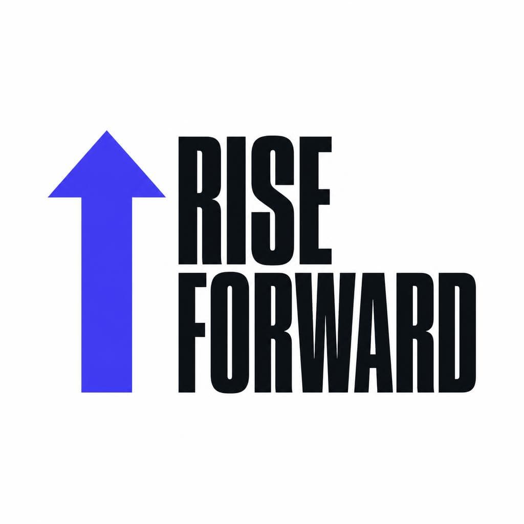
Bold condensed sans serifs are a staple of gym typography for good reasons. They occupy less horizontal space than wide fonts, allowing brands to use large, high-impact language on posters, storefront windows, apparel, and mobile screens. Their upright structure creates a visual resemblance to strength and compression: compact, controlled, and difficult to ignore.
This category is especially effective when your message needs to be visible quickly. Imagine a wall graphic reading “NO QUIT,” a social ad promoting “8 WEEK RESET,” or a race-day shirt with a team name across the chest. A condensed display face makes each message feel immediate without requiring a long line of copy. It also pairs naturally with high-contrast photography, where type often needs to sit over an image of a lift, sprint, or group class.
However, bold does not automatically mean better. Extremely condensed letters can become unreadable at small sizes, especially in all caps. Before adopting a gym font, test it in the locations that matter: a 16-pixel mobile button, an Instagram Story, a printed timetable, a water bottle, and a jersey back. If the “R,” “A,” “P,” and “B” blur together at smaller sizes, reserve the font for major headlines and use a more open sans serif for information-heavy materials.
A practical hierarchy for a strength-focused brand might look like this:
• Primary display font: a bold condensed sans serif for campaign statements, class names, and logo-adjacent graphics.
• Primary text font: a neutral sans serif with generous spacing and clear numerals for schedules, memberships, and website copy.
• Optional accent: an italic version of the display font for small callouts such as “NEW,” “LIVE,” or “ATHLETE TESTED.”
The spacing around bold condensed fonts matters as much as the typeface itself. Tight tracking can make a headline feel aggressive, but too little space causes letters to merge. Start with the font’s default spacing, then make small adjustments after viewing the words at their final size. Avoid stretching a typeface wider or taller to force it into a layout; distortion weakens the design and can make even a strong athletic font look amateur.
For brands with a more inclusive or lifestyle-led position, try a semi-condensed weight rather than the narrowest possible option. It retains visual energy while feeling less militaristic. This is often the better choice for a women’s strength community, an all-levels training app, or a hybrid gym that combines conditioning, mobility, and recovery.
Geometric vs. Organic Type: Match the Font to the Training Experience
One of the most useful decisions in sports brand typography is whether your visual language should feel geometric and engineered or organic and human. Neither direction is inherently superior. The right choice depends on the experience you promise.
Geometric sans serifs are built from clean circles, straight lines, and consistent proportions. They tend to feel modern, precise, technical, and disciplined. Brands focused on measurable performance often benefit from this approach: endurance coaching platforms, wearable-tech companies, race training programs, sports recovery tools, and minimalist performance apparel. A geometric font can reinforce messages about data, progress tracking, repeatable systems, and high standards.
For example, a running coach who markets pace analysis and structured race plans could use a geometric headline font with clear numerals, then pair it with a highly readable body font for split times and training details. In this setting, numeral design is not a minor consideration. Check whether “1,” “I,” and lowercase “l” are easily distinguishable, and whether the zero is clear in metrics such as “10K,” “5:00,” and “100%.”
Organic type styles use softer curves, slightly irregular details, or humanist proportions. They can feel warm, energetic, grounded, and community-driven. These characteristics suit outdoor fitness groups, surf and climbing brands, yoga and mobility spaces, nutrition brands, and coaches whose value proposition centers on sustainable habits rather than punishment. An organic typeface can make a workout brand font feel more encouraging without becoming childish.
A useful middle ground is the humanist sans serif. It maintains clean digital readability but includes subtle variation that makes letters feel less mechanical. This can be an excellent default for membership communications, long-form educational content, and apps where users need to read workouts under time pressure.
When comparing geometric and organic choices, use a simple scenario test. Put each candidate font into the same three pieces of copy: a hard-hitting headline, a friendly welcome message, and a detailed class schedule. Then ask which version most honestly represents the brand. If the font makes “Recovery matters” feel cold, it may not support a wellness-led business. If it makes “Competition starts now” feel too gentle, it may not be the best option for a high-performance sports label.
You can also combine the two approaches. Use a geometric display font for bold campaign moments and a humanist sans serif for body copy. The contrast creates energy while keeping the brand accessible. The key is consistency: define when each font is used, who can use it, and which weights are approved.
Use a Custom Font for Exclusivity and Recognition
Many fitness brands use similar visual cues: black-and-white photography, bold uppercase headlines, angular logos, and condensed type. Those conventions are effective, but they can also make competitors look interchangeable. A custom font or custom-derived type treatment gives a brand a more ownable visual asset.
Exclusivity does not require designing an entire type family from scratch. You may only need a recognizable font for your logo, campaign headlines, athlete names, or apparel drops. Perhaps your brand began with hand-painted lettering on a gym wall, a coach’s distinctive marker writing, a vintage team badge, or an archival sign that captures the story behind the business. Turning that source material into a usable font can preserve its character across digital and printed touchpoints.
Before creating a custom font, choose reference imagery carefully. The best source image has high contrast, clean letter shapes, and enough characters to establish a consistent style. A straight-on photograph of painted lettering will produce better results than a low-resolution image taken at an angle under uneven lighting. If possible, photograph or scan the reference against a simple background, correct the perspective, and make sure letter edges are visible.
It is also important to consider licensing and ownership. Do not convert a competitor’s logo, a copyrighted typeface, or artwork you do not have permission to use. Use lettering you created, assets your business owns, public-domain material where appropriate, or source material that has been licensed for the purpose. A custom-looking font should strengthen your identity without creating legal risk.
Snapafont can be helpful when you have an image of original lettering and want to turn it into a downloadable TTF font file. That makes it easier to carry a signature look from a mural, sketch, or branded graphic into design tools used for social media, merchandise, and campaign assets.
Keep custom typography focused on its best role. A unique display font can establish immediate recognition, while a dependable supporting sans serif handles membership forms, training notes, and small screen interfaces. This division protects usability. It also helps your custom asset remain special instead of becoming visual noise.
For instance, a boxing gym could build a rough, hand-lettered display style from its original ring-banner artwork, using it only for event posters, apparel, and key slogans. It could then use a clean sans serif for class times, waiver forms, and trainer bios. The result feels authentic, not chaotic.
Implement Your Font System Across Every Brand Touchpoint
A great font choice becomes valuable only when it is implemented consistently. Fitness customers encounter brands in fast, fragmented moments: scrolling between sets, looking at a timetable, spotting a shirt at a race, or deciding whether to sign up from a phone. Consistent typography turns those individual impressions into recognition.
Start by documenting a compact type system. Include the font names, approved weights, acceptable capitalization, size ranges, line-height guidance, and examples of what not to do. A one-page typography guide is enough for many smaller brands. It prevents trainers, freelance designers, and social media managers from replacing the intended type with whatever is installed on their computer.
Use display type selectively. It works best for high-impact content: your logo lockup, campaign headlines, seasonal challenges, merchandise, milestone graphics, and short motivational lines. Use a readable text font for longer material, including workout instructions, legal copy, product descriptions, email newsletters, and website navigation. This is especially important for fitness apps and digital programs, where poor type choices can create real friction during a workout.
Here are several touchpoint-specific recommendations:
• Website: Use large, confident headings, but ensure body copy is comfortable to read on mobile. Keep line lengths moderate and avoid placing small white type over busy action photos.
• Class schedules: Prioritize clarity over personality. Use tabular numerals if available so class times align cleanly. Make booking buttons visually distinct without relying only on color.
• Social media: Create a small collection of reusable templates. Use the same headline treatment, spacing, and placement patterns so posts are recognizable even without the logo.
• Apparel: Test type at actual print size. Fine details and narrow counters can fill in during screen printing or embroidery. A simple, slightly heavier version often produces a better final garment.
• Signage: View designs from the expected distance. A font that works on a laptop can become illegible on a window decal or exterior sign. High contrast and generous spacing matter.
• Training materials: Avoid decorative display fonts for exercise instructions. Members should be able to scan sets, reps, rest periods, and safety notes instantly.
Accessibility should be part of your gym typography strategy, not an afterthought. Maintain sufficient color contrast, do not use all caps for long paragraphs, and avoid relying on extremely thin weights. Clear typography makes your brand more usable for everyone, including users reading under harsh gym lighting, on small screens, or while fatigued after a workout.
Finally, audit your system twice a year. Gather your latest social posts, emails, website pages, posters, and merchandise. Do they look like one brand? Are type weights being used consistently? Are headlines still readable and relevant to your current audience? Small adjustments to templates and guidelines can keep a fitness identity sharp as the business grows.
Create a Fitness Font That Looks Like Your Brand
The best font for a fitness brand is not necessarily the loudest one. It is the one that reflects your training philosophy, remains readable wherever members meet you, and gives people a visual cue they can remember. Start with the emotional response you want to create, choose a dependable type system for everyday communication, and reserve distinctive display styling for the moments that deserve extra energy.
If your gym, team, or workout brand already has original lettering in a logo sketch, mural, jersey concept, or hand-drawn campaign graphic, you do not have to leave that character trapped in an image file. Snapafont lets you transform image-based lettering into a downloadable TTF font that can be used across your creative workflow. Visit snapafont.com to explore how you can turn a signature visual style into a more consistent, recognizable brand asset.
Ready to turn your image into a font?
Upload any image and get a real, downloadable .TTF font file in seconds.
Try Snapafont Free →

