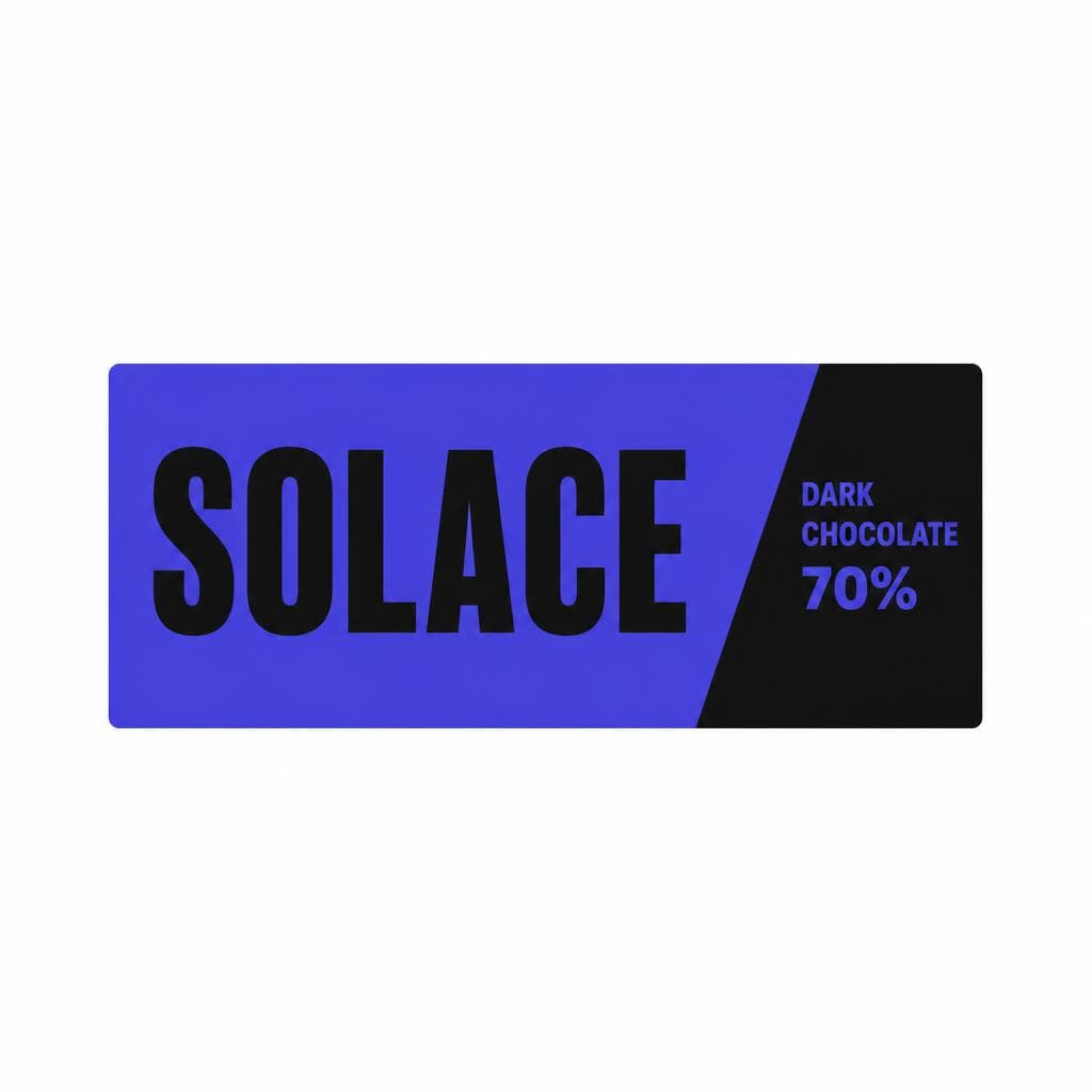
A food or drink package gets only a few seconds to earn attention. Before shoppers compare ingredients, read a menu description, or learn the brand story, they absorb a visual impression: comforting, fresh, indulgent, handmade, premium, playful, or energizing. Typography is a major part of that impression. The right font for food brand applications can make a jar of pasta sauce feel like a family recipe, a sparkling water feel crisp and contemporary, or a chocolate bar feel like a small luxury.
That is why food and beverage typography should never be an afterthought. Type communicates flavor cues, price positioning, audience, and even perceived quality. A bold condensed sans serif can suggest a punchy hot sauce; an elegant high-contrast serif can make a wine label feel established and refined; a rounded handwritten style may give cookies or ice cream a friendly, homemade character. None of these choices are universally “best.” They work when they match what is inside the package and what buyers hope to experience.
This guide explains how to choose a restaurant font, food packaging font, food label font, or beverage brand font with intention. It also covers how type interacts with color, category conventions, legibility, and brand differentiation—so your identity makes people hungry, thirsty, or curious before they have read a single word on the label.
How Fonts Affect Appetite and Perception
Typography does not literally change flavor, but it can shape expectations of flavor. Research in sensory marketing consistently shows that visual cues affect what people anticipate from a product. When a package looks airy, clean, and minimalist, shoppers may expect a lighter or more natural experience. When it uses heavy letters, deep colors, and tight spacing, they may anticipate something rich, intense, and filling.
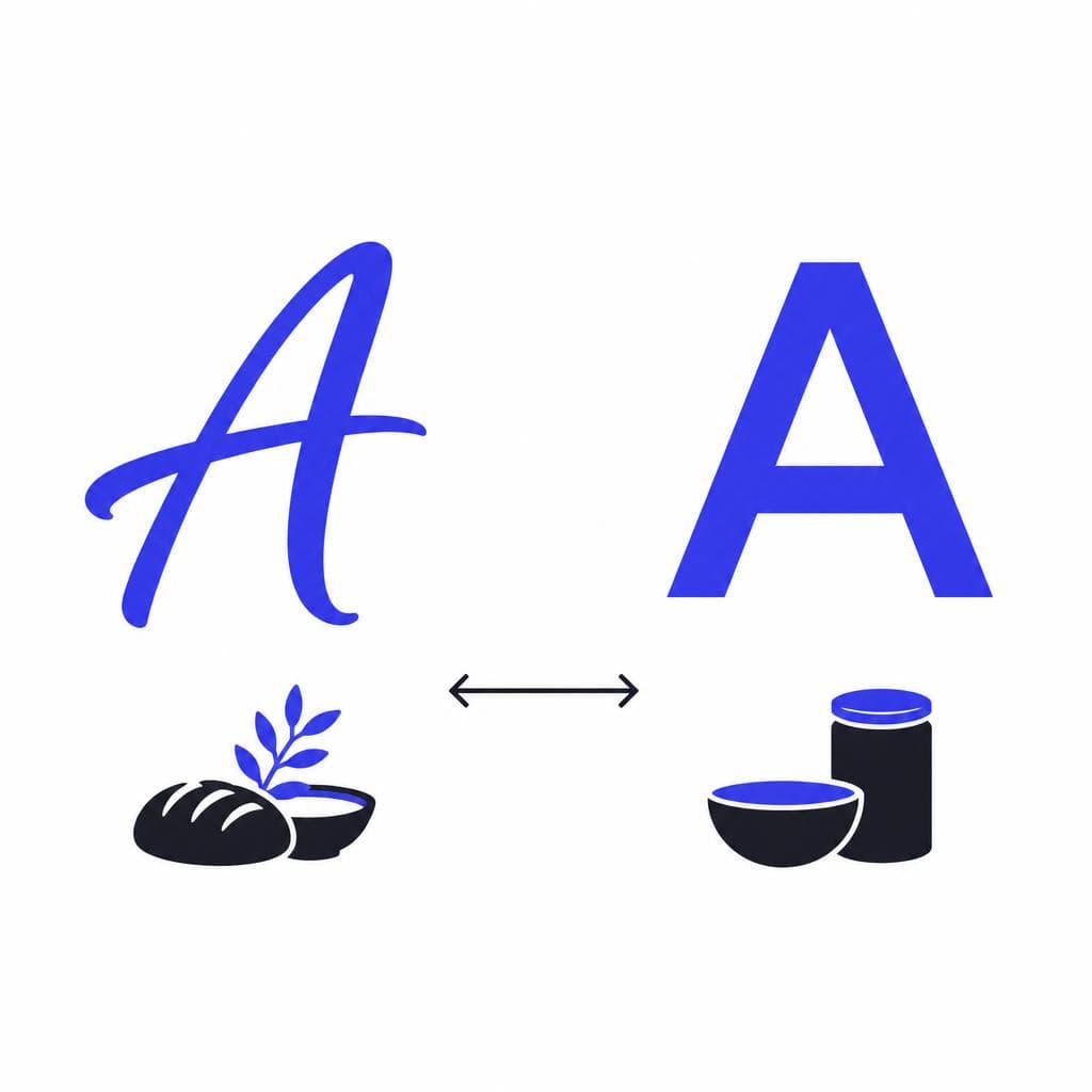
The key is to think about the personality carried by letterforms. Rounded, soft forms often feel approachable, sweet, and comforting. They are particularly useful for family-oriented snacks, bakery products, yogurt, ice cream, and casual cafés. Angular shapes, sharp terminals, and condensed weights can feel spicy, energetic, assertive, or urban, making them useful for barbecue sauces, protein products, street-food concepts, and functional beverages. Fine serif details and generous spacing tend to signal craftsmanship, heritage, and premium quality—common cues in specialty coffee, wine, olive oil, craft chocolate, and gourmet pantry goods.
A good food label font also controls pace. Large display lettering reads as confident and immediate. Narrow all-caps lettering can feel efficient and modern, but may become cold or difficult to read if overused. Loose tracking can create calm sophistication; tighter spacing can create intensity and abundance. Consider a premium granola brand: a warm serif wordmark paired with restrained sans serif product details can suggest care and ingredient transparency. By contrast, a neon-colored energy drink with a geometric display face and compact supporting text can communicate speed and stimulation.
Legibility is part of appetite, too. If an ingredient list, flavor name, or product benefit is hard to scan, the brand can feel less trustworthy. This matters especially in crowded aisles, where customers may be reading from two or three feet away. Test your type at actual packaging size, in realistic lighting, and on the material you plan to use. A beautiful script that works on a laptop may fail on a small curved bottle. The emotional role of typography matters, but clarity is what lets customers act on that first positive impression.
Artisanal vs. Modern Positioning: Choose Type That Tells the Truth
One of the biggest decisions in food and beverage typography is where the brand sits between handcrafted tradition and contemporary efficiency. This is not simply a choice between serif and sans serif. It is a choice about the story you want people to believe at a glance.
Artisanal brands usually benefit from typography with visible character: old-style serifs, letterpress-inspired forms, restrained scripts, hand-drawn lettering, or subtly imperfect contours. These styles can imply small batches, local sourcing, recipe heritage, and human care. A sourdough bakery, for example, might pair a hand-rendered logotype with a highly legible serif for bread names and ingredients. The important word is “restrained.” Overly decorative type can turn authenticity into cliché, especially if it makes important information difficult to read.
Modern brands tend to use cleaner geometry, clear hierarchies, and fewer visual elements. This works well for products positioned around functionality, wellness, convenience, or design-forward simplicity. A ready-to-drink protein shake may use a sturdy sans serif and bold numeric information to emphasize grams of protein and nutritional clarity. A minimalist canned coffee can use a neutral grotesk with ample white space to feel elevated without seeming formal.
The strongest identities often blend both worlds. A craft hot sauce brand could use a custom expressive wordmark to communicate flavor and personality, then set heat levels and ingredients in a clean sans serif for quick shelf reading. A modern restaurant font can work similarly: use an evocative display face for the restaurant name, then select a practical text face for menus, reservation pages, allergens, and directional signage.
Before choosing fonts, write three to five positioning words. Examples include “sunny, Mediterranean, unfussy,” “precise, nutritious, high-performance,” or “nostalgic, generous, neighborhood.” Then evaluate every type choice against those words. If the font says “luxury French patisserie” but the product is an affordable, loud, spicy chip brand, the visual message is misaligned. Typography should amplify the real experience rather than disguise it.
Choosing Typography by Food and Beverage Category
Use category cues, then add a distinctive brand signal
Every category has visual conventions. Those conventions help shoppers understand a product quickly, but copying them too closely makes a brand disappear. The goal is to use familiar signals for clarity while introducing one ownable typographic element.
For bakery, desserts, and sweet snacks, soft rounded letters, friendly scripts, and warm serifs often perform well because they suggest comfort and indulgence. Keep the flavor name prominent: “Salted Caramel,” “Lemon Poppy,” and “Double Chocolate” should be easier to spot than secondary marketing copy. A food packaging font for cookies might use a playful display face on the front, supported by a simple sans serif for nutritional information and claims.
For coffee, tea, and specialty pantry products, typography can carry origin and craft. Serifs, editorial-style type, and subtle custom lettering may suggest expertise and depth. However, specialty does not have to mean old-fashioned. A clean, modern coffee label with a carefully spaced serif can still communicate quality while standing out from rustic competitors. Use hierarchy to make roast, origin, tasting notes, or brewing method easy to scan.
For sauces, condiments, and spicy products, type should communicate intensity without sacrificing readability. Bold condensed forms, chunky serif styles, or high-energy lettering can make a strong statement. The heat level should be instantly understandable through a large type treatment, clear system, or both. Avoid using a novelty display face for every word; one expressive element is often enough.
For health foods and functional products, clear information design is essential. Buyers may be looking for protein content, sugar level, allergens, botanical ingredients, or dietary certifications. A beverage brand font in this category should feel credible and clean, while still retaining enough warmth to avoid a clinical impression. Pair a confident sans serif headline with highly legible smaller text, and give key nutritional information visual priority.
For alcohol and premium nonalcoholic drinks, typography helps establish occasion. A refined wine label may use an elegant serif, while a craft beer can may choose more experimental illustration-led lettering. A nonalcoholic aperitif could use a high-contrast serif and restrained layout to communicate sophistication. In each case, the drink brand typography should match the setting the buyer imagines: a dinner party, a beach day, a celebration, a quiet evening, or a quick social gathering.
For restaurants and cafés, the type system must work beyond a logo. Your restaurant font needs to appear on menus, social posts, window vinyl, takeaway packaging, websites, loyalty cards, and perhaps a tiny order-confirmation screen. Build a family of roles: display type for the name and campaign moments, a dependable text face for menus and descriptions, and a utility style for prices, allergens, hours, and navigation. Consistency across these touchpoints turns a good first impression into recognition.
Pair Color and Type for a More Appetizing Brand System
Color and typography are interpreted together, not separately. A rounded typeface can feel playful in bright yellow, nostalgic in cream and red, or premium in deep burgundy and gold. When selecting a food label font, assess it in the actual color environment where customers will see it.
Warm colors—reds, oranges, and yellows—often suggest energy, sweetness, spice, and appetite. They can be powerful for fast casual restaurants, snacks, sauces, and value-oriented products. Cool greens and blues can suggest freshness, hydration, plant-based ingredients, or calm, but blue should be used thoughtfully in food because it can feel less naturally appetizing in large amounts. Earthy browns, olive greens, muted oranges, and parchment neutrals support organic, rustic, and ingredient-led positioning. Dark palettes with cream or metallic accents can create a premium, indulgent effect for chocolate, coffee, spirits, and gourmet goods.
Contrast is the non-negotiable rule. A great beverage brand font will underperform if the product name disappears against the can color or if thin strokes break up in print. Check contrast in grayscale as well as color, since it reveals whether hierarchy comes from clear value differences or only from hue. Also inspect the design at thumbnail size. In an online grocery listing, the brand and flavor name need to remain recognizable when the package is only a few centimeters tall.
Use no more than two or three type families in most systems. A practical formula is one expressive display face, one versatile text sans or serif, and optional utility lettering for nutrition panels or small labels. Create rules rather than choosing fonts afresh for each item: define headline case, spacing, maximum line length, flavor-name treatment, and minimum font sizes. These rules are particularly valuable when a product line grows from three flavors to twenty.
Finally, print samples. Ink absorption, textured stock, foil, embossing, glass curvature, and matte coatings can all change the perceived weight of type. What looks elegant on a bright digital mockup may look faint on recycled paper. A physical prototype is one of the quickest ways to catch typography problems before a production run.
When a Custom Font Can Make Your Brand More Memorable
Custom typography is especially valuable in crowded categories because it gives a brand a visual asset competitors cannot simply license from the same font library. It does not always mean commissioning a full type family from scratch. Sometimes a custom wordmark is enough; in other cases, a small branded display font for flavor names, menu headings, and campaign graphics creates a stronger system.
Start with a practical brief. Collect references that describe the desired feeling, not fonts you want copied. For example: “the imperfect charm of a handwritten farm stand sign, but readable on a 250 ml bottle,” or “the confident brush energy of a taqueria menu, with clear uppercase letters for spice levels.” Define which characters are essential. If you sell internationally, include accented characters and language-specific needs. If you run a restaurant, make sure the lettering covers prices, common menu terms, and seasonal specials.
You can also begin with your own handwriting, a hand-painted sign, a sketch, or lettering from an existing piece of brand art. Snapafont turns an image into a downloadable .TTF font file, making it a practical route for teams that want to preserve the personality of hand-drawn lettering in usable digital type. This can be particularly useful for a bakery founder’s signature style, a beverage label illustration, or a distinctive marker-lettered food truck identity.
Before deploying a generated font, test it like any other design asset. Type common product names, numbers, punctuation, ingredient claims, and awkward letter combinations such as “AV,” “To,” “ry,” and “ll.” Look for inconsistent spacing, characters that become unclear at small sizes, and a lack of contrast between similar letters. Use the custom font selectively if needed: it may be excellent for the brand name and headings while a conventional text font remains the better choice for ingredients and legal copy.
A custom solution should solve a branding problem, not add decoration. Ask whether the lettering makes the product easier to recognize, more believable in its category, and more enjoyable to encounter. If the answer is yes—and it remains readable across package sizes, digital channels, and print materials—it can become one of the most durable pieces of your identity.
Turn Your Brand’s Visual Personality Into Usable Type
The best food and beverage typography makes a promise people can feel: this will be rich, refreshing, fiery, wholesome, celebratory, or made with care. Start with the product truth, choose a type direction that supports it, and test the result where it matters most—on shelf, on screen, and in customers’ hands.
If your strongest brand idea begins as a handwritten recipe card, painted storefront sign, packaging sketch, or piece of lettering you already love, you do not have to leave it as a static image. Try Snapafont at snapafont.com to convert that visual starting point into a downloadable font you can test across labels, menus, social graphics, and packaging concepts. It is a useful way to explore a more distinctive brand voice while keeping the process grounded in real-world readability and consistency.
Ready to turn your image into a font?
Upload any image and get a real, downloadable .TTF font file in seconds.
Try Snapafont Free →

