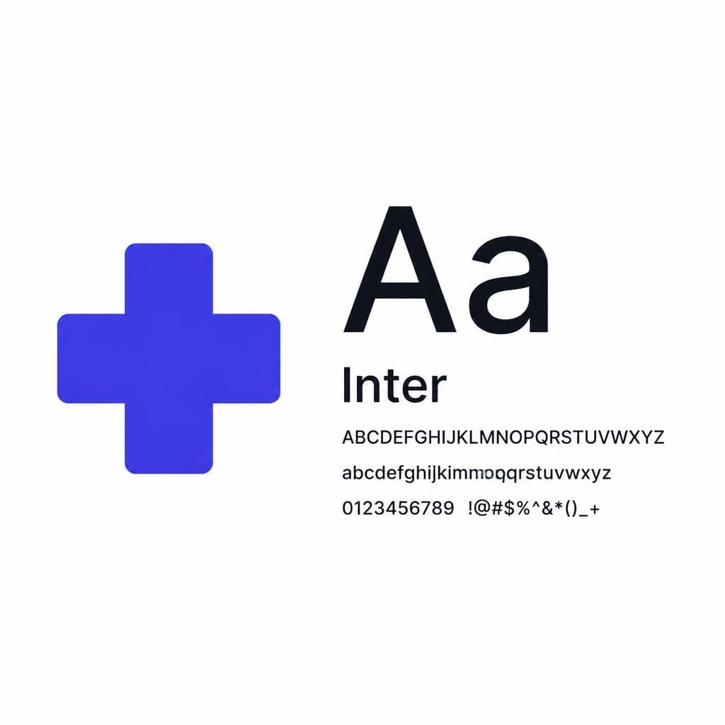
Typography for healthcare brands is not a cosmetic decision. It shapes whether a patient can quickly understand an appointment reminder, confidently read a prescription instruction, locate the right hospital department, or feel reassured while comparing providers online. In a category where people often arrive anxious, ill, overwhelmed, or making a decision for someone they love, every visual choice has to reduce friction.
That is why healthcare typography carries a different kind of weight. A typeface can signal medical expertise and rigorous standards, but it also needs enough humanity to avoid making care feel cold or bureaucratic. It must perform just as well on a mobile screen, a wayfinding sign, a lab-result portal, a printed discharge document, and a small medical logo. The best font for healthcare is rarely the trendiest one; it is the one that makes critical information feel clear, credible, and accessible.
This guide explains how to choose and use a medical brand font that supports clarity, trust, and professionalism. Whether you are building a hospital identity, refreshing a private clinic website, launching a telehealth product, or creating materials for a specialist practice, the principles are the same: make reading easy, make hierarchy obvious, and let the brand’s personality serve the patient experience rather than distract from it.
What Healthcare Typography Must Communicate
Healthcare brand design needs to communicate several messages at once. Patients want evidence of competence: qualified clinicians, dependable processes, accurate information, and a commitment to safety. They also want to feel seen as people rather than cases. Strong healthcare typography helps deliver both messages before a visitor reads a full sentence.
First, it should communicate clarity. Patients may be scanning an insurance page, comparing appointment times, reading pre-operative preparation steps, or trying to understand unfamiliar terminology. Dense blocks of text, ambiguous letterforms, and weak heading structures increase cognitive effort at exactly the wrong moment. Typography should make it immediately clear what the page is about, what action comes next, and where a reader can find support.
Second, it should communicate trust. A well-chosen medical logo font and a consistent text system make an organization appear organized and established. Trust does not necessarily mean using a severe serif or an ultra-corporate sans serif. It means selecting type that feels intentional, stable, and appropriate to the level of care being offered. An academic medical center may need a more formal voice than a neighborhood pediatric clinic, but neither should look improvised.
Third, it should communicate empathy. A fertility practice, mental health provider, hospice organization, and children’s hospital all benefit from typography that feels calm and approachable. This can come from generous spacing, open letterforms, moderate weight contrast, and plain-language copy as much as from the font itself. Empathy is often the absence of unnecessary visual pressure.
Finally, healthcare typography must support inclusivity. Your audience includes people with low vision, dyslexia, limited English proficiency, cognitive fatigue, reduced digital confidence, and temporary impairments caused by illness or stress. A design that is merely attractive for a fully attentive designer on a large monitor is not enough. A useful clinic font system works for real people under real conditions.
### Match the typographic voice to the care setting
Start by defining the emotional and operational role of the organization. A trauma center may prioritize directness, urgency, and authority. A dermatology brand may seek clinical precision with a polished, contemporary feel. A family practice may want familiarity and warmth, while an oncology center needs a measured balance of expertise and compassion.
Write down three to five attributes the brand should convey, then identify the attributes it should avoid. For example, a telehealth platform might aim for “reassuring, modern, simple, and private,” while avoiding “playful, trendy, or technical.” This short exercise prevents teams from choosing type based only on personal taste. It also gives practical criteria for reviewing candidate fonts across website copy, forms, ads, and signage.

Put Legibility Above All Else
Legibility is the non-negotiable foundation of a hospital branding font system. In healthcare, a small misunderstanding can become a missed appointment, incorrect preparation, delayed follow-up, or unnecessary anxiety. Brand expression matters, but it should never make essential information harder to read.
Choose body fonts with open counters, distinct letter shapes, and even spacing. Counters are the enclosed or partially enclosed spaces inside characters such as “a,” “e,” “o,” “p,” and “d.” Open counters remain recognizable at small sizes and on lower-quality screens. Also look closely at potentially confusing pairs: capital I and lowercase l, zero and capital O, one and lowercase l, and “rn” versus “m.” A typeface may look excellent in a large specimen but fail in a patient ID field, medication instruction, or web form.
For most digital healthcare experiences, body text should generally begin around 16 px, with 18 px often providing a more comfortable reading experience for patient-facing educational content. Use line height of roughly 1.4 to 1.7 times the font size, depending on the typeface and column width. A 16 px font with 24–26 px line height, for instance, is usually easier to scan than tightly packed text. Keep line lengths manageable—roughly 45 to 75 characters per line is a practical target for longer content.
Typography hierarchy is equally important. Patients should be able to scan a page and identify the service, the key recommendation, eligibility requirements, and the next action without reading every word. Use a small number of predictable levels: page title, section heading, subheading, body text, labels, and supporting notes. Make hierarchy visible through size, weight, spacing, and placement—not color alone. Someone with color-vision differences should still know which text is a heading.
### Test fonts in the moments that matter
Do not approve a font based only on a logo mockup or homepage hero. Test it in realistic content. Set a sample appointment confirmation with the date, time, location, parking note, phone number, and cancellation instructions. Create a mobile screen with a symptom checklist. Print a referral form. Place a long clinician name beside a specialty, credentials, and an availability label. These are the contexts where weaknesses become obvious.
Ask practical questions: Can a patient distinguish 8:00 from 6:00 quickly? Are phone numbers easy to read? Do all-caps labels remain understandable? Can staff scan a waiting-room sign from several feet away? Does bold text remain calm rather than shouty? If the answer is no, change the type scale, weight, spacing, or font before finalizing the system.
Accessibility standards should guide the entire decision. Maintain adequate color contrast between text and background, avoid very thin weights for essential copy, and never rely on tiny text to fit more information into a constrained space. For web experiences, test zoom behavior, screen-reader markup, responsive reflow, and keyboard focus states. A readable font for healthcare is only one part of accessible communication, but it is a major one.
Balance Warmth and Authority
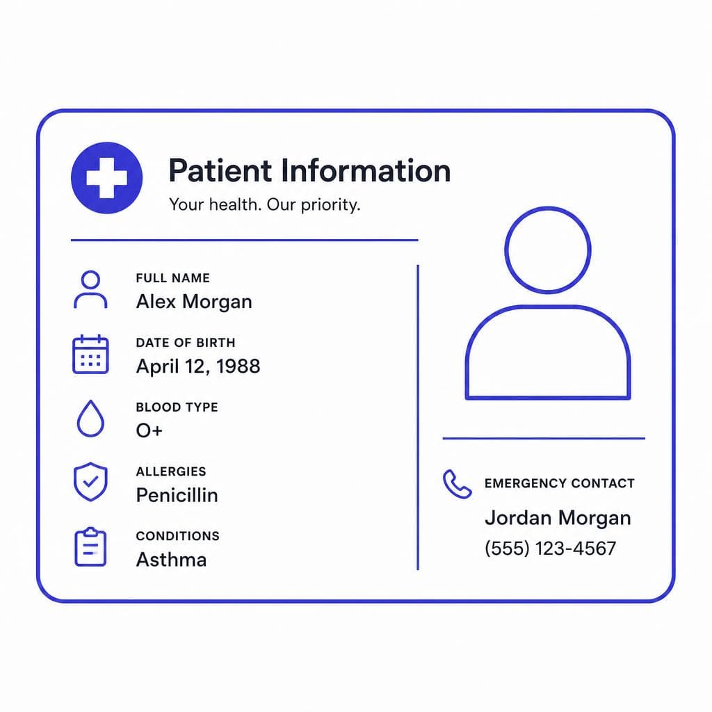
A common mistake in healthcare branding is treating warmth and authority as opposites. Patients need both. They want a provider who is knowledgeable enough to trust and humane enough to approach with difficult questions. The goal is not to make a brand feel either clinical or friendly; it is to find the right proportion for its audience and services.
Sans serif typefaces are popular in healthcare because many have clean structures, work well on screens, and feel contemporary without becoming overly decorative. Humanist sans serifs, in particular, can be a strong choice because their forms tend to have subtle calligraphic influences and generous openings. They often feel more approachable than rigid geometric sans serifs while retaining a professional appearance.
Serifs can also work beautifully for healthcare when used thoughtfully. A readable serif can add heritage, editorial confidence, and a sense of care—especially for university-affiliated hospitals, women’s health brands, wellness-focused practices, and premium private care. However, serif body text should be thoroughly tested at small sizes and on mobile devices. A serif used for display headings alongside a straightforward sans serif for body copy is often an effective combination.
Avoid using overly stylized scripts, novelty faces, distressed fonts, or ultra-condensed display fonts in patient-facing communication. A script may seem personal, but it can become difficult to read in a medical logo font or navigation label. Highly geometric fonts can look modern, but closed forms and uniform shapes sometimes reduce character recognition at smaller sizes. Likewise, excessively heavy type can feel alarmist when used in clinical alerts or sensitive health messaging.
### Build a role-based type system
A practical system assigns each font a job. For example, use one dependable sans serif for body text, forms, interfaces, and directional information. Add a second typeface only if it makes a clear contribution, such as a serif for campaign headlines or editorial patient stories. This approach keeps the system recognizable without creating visual noise.
Consider a community clinic that wants to feel welcoming and capable. It might use a humanist sans serif in regular and semibold weights for most communications, with generous white space and sentence-case headings. An orthopedic practice, by contrast, might use a more structured sans serif, firmer weights, and compact-but-readable headings to imply precision and movement. Neither approach is inherently better; success comes from fitting the typographic tone to the care promise.
Use restraint with personality. In healthcare, the patient’s need to understand always outranks the designer’s need to make a memorable typographic gesture.
Pair Color and Fonts for Calm, Clear Communication
Color and type work as one system. Even the best healthcare typography can become difficult to use when paired with insufficient contrast, overly saturated backgrounds, or too many competing accents. The aim is not to make every page look muted; it is to create a visual environment where important information is easy to find and easy to trust.
Many organizations lean on blue because it is associated with calm, reliability, and cleanliness. Blue can be effective, but it is not a requirement for credible healthcare brand design. Greens can suggest restoration and balance, warm neutrals can create comfort, and carefully used purples can support premium or specialized services. What matters most is how colors function across the system: primary text, supporting text, links, alerts, buttons, charts, and backgrounds all need defined, accessible roles.
For body copy, dark neutral text on a light background is often the most comfortable choice. Pure black on pure white can feel harsh for lengthy reading, so a very dark charcoal on off-white may be more pleasant while still meeting contrast requirements. Avoid placing thin type over photography, gradients, or colored panels unless a solid overlay guarantees readability. If text must sit on an image, test it over the brightest and busiest areas, not just the ideal crop.
### Use font contrast, not clutter
When pairing fonts, seek contrast in role rather than contrast for its own sake. A warm serif headline paired with a neutral sans serif body font can create an effective distinction. So can a strong semibold heading and a regular body style from the same font family. In many cases, using one versatile family with multiple weights is the clearest and most economical solution, particularly for a hospital with hundreds of templates and departments.
Keep the palette of typographic treatments limited. If headings use a large, confident weight, let body copy stay quiet. If a callout uses a colored background, avoid adding italics, all caps, underlining, and multiple font weights at the same time. Too many signals make users work harder to determine what matters.
Reserve red, orange, and other high-attention colors for meaningful states such as urgent warnings, overdue actions, or critical safety information. If every promotional card or button uses urgent color, actual alerts lose their distinction. This is especially important in patient portals and clinical communications, where visual conventions should support fast, accurate interpretation.
Custom vs. Standard Fonts: Choosing the Right Investment
A standard commercial or open-source typeface is often the right starting point for a healthcare organization. It can be deployed quickly, supported across digital and print channels, and licensed at a predictable cost. For many clinics and growing health brands, a well-selected standard font, clear type scale, and disciplined implementation will deliver more value than an expensive custom typeface that is inconsistently used.
Custom typography becomes worthwhile when the organization has a clear strategic need. Large health systems may require a distinctive identity across many facilities. A health technology company may need a tailored character set for a multilingual interface. A legacy institution may want to preserve recognizable lettering while improving legibility for contemporary channels. In these cases, custom work can create meaningful differentiation—but only if the budget also covers documentation, licensing, accessibility testing, and rollout support.
There is also a useful middle path: create a custom display asset or wordmark while using a proven standard typeface for body copy and interfaces. This gives the brand a unique signature without forcing patients to read long passages in an untested or overly distinctive face. For example, a specialty clinic might preserve a hand-lettered sign or historical logo as part of its identity, then use a highly legible sans serif for appointment pages, emails, and consent forms.
### Recover a type style without sacrificing usability
Sometimes a healthcare team has an image of legacy signage, a scanned brochure, a photographed building name, or an existing mark whose lettering they want to preserve. Rather than redrawing every character manually, a tool such as Snapafont can turn an image of lettering into a downloadable .TTF font file. That can be useful for exploring a historical or proprietary visual style, creating limited campaign display text, or documenting an existing typographic asset.
Treat any image-derived font as a starting point, not an automatic full-system solution. Review spacing, punctuation, numerals, accented characters, and behavior at small sizes. Check whether the characters are sufficiently distinct for patient-facing use. If the recovered style is expressive but not ideal for long reading, use it selectively for a logo, donor campaign, wall graphic, or short headline, then pair it with a reliable text font.
Before committing, confirm practical rights and governance. Make sure your organization owns or has permission to use the source lettering. Define which teams can use the font, where it can appear, and which approved alternatives should be used in software that does not support custom fonts. A font choice is most successful when it is not just visually strong, but easy for staff, agencies, and technology partners to apply consistently.
Create a Healthcare Type System Patients Can Trust
The right healthcare typography does not call attention to itself during a stressful moment. It helps a patient find the right department, understand the next step, recognize a trusted provider, and feel a little more in control. Begin with readability, define a simple hierarchy, test real-world communications, and make every stylistic choice earn its place.
If your organization is working from an existing sign, logo, printed artifact, or photographed lettering style, Snapafont can help you quickly explore that visual material as a usable font file. Upload the image, generate a downloadable .TTF, and test the result in realistic healthcare layouts before deciding where it belongs in your brand system. Visit snapafont.com to turn a typographic reference into a practical starting point for your next hospital, clinic, or medical brand project.
Ready to turn your image into a font?
Upload any image and get a real, downloadable .TTF font file in seconds.
Try Snapafont Free →

