
Luxury is often recognized before it is explained. A customer may not consciously identify the letterforms on a perfume box, a fashion campaign, or a hotel website, yet they can immediately sense whether the brand feels exclusive, cultivated, contemporary, traditional, or merely expensive. That reaction is not accidental. Typography is one of the fastest ways a business signals its position, because type sets the visual voice for every name, headline, label, menu, email, and social post.
For a luxury business, the right luxury brand font does more than look elegant. It makes the brand feel deliberate. It creates a pace that invites people to slow down, notice details, and assign greater value to what they see. Conversely, a generic, overly playful, poorly spaced, or technically inconsistent type choice can undermine a premium product—even when the photography, packaging, and pricing are strong.
This does not mean every premium brand font needs to be a thin serif in all caps. Luxury typography has many dialects: the restrained modernism of a Swiss-inspired sans serif, the editorial confidence of a high-contrast serif, the intimacy of a refined script, or the authority of a historic display face. What they share is discipline. Every detail, from the curve of an “R” to the amount of empty space around a wordmark, contributes to the impression that nothing was left to chance.
This guide explains the philosophy behind high-end typography and turns it into practical decisions you can apply to a logo, packaging system, website, campaign, or emerging brand identity.
How Luxury Fonts Communicate Premium
A font for luxury brand positioning works through association, contrast, craft, and consistency. Typefaces carry cultural memories. A Didone serif with dramatic thick-and-thin strokes can recall fashion editorials, French beauty houses, and heritage publishing. A restrained grotesk sans serif may evoke modern architecture, gallery signage, and technical precision. A calligraphic script can suggest personal service, ceremony, or artisanal production. These associations give a viewer an emotional shortcut before they read the actual copy.
The most effective luxury typography also controls contrast. In a high-contrast serif, for example, hairline strokes sit beside much heavier vertical stems. This visual tension feels polished and intentional, especially at large sizes. In a geometric sans, the contrast may be lower, but precision appears through carefully engineered circles, straight lines, and measured proportions. Neither approach is automatically “more luxurious.” The question is whether the visual character supports the kind of premium experience being offered.
Consider three different examples. A couture-inspired fashion label might use a high fashion font with narrow proportions, sharp serifs, and generous tracking in its logo, then pair it with a neutral sans serif for product details. A boutique winery may choose a softer old-style serif with organic curves, communicating heritage and handcraft rather than runway glamour. A premium skincare company might adopt a clean, humanist sans serif with discreet use of a delicate serif for campaign headlines, balancing clinical credibility with sensorial warmth.
Craft is equally important. Luxury audiences are particularly alert to details that feel generic or careless: uneven letter spacing, distorted type, too many decorative effects, or a logo that becomes illegible at small sizes. A premium typeface should have a clear purpose and perform beautifully in the contexts where it appears. The letters should remain recognizable on a tiny foil stamp, feel poised across a website hero image, and retain their personality on a receipt or shipping card.
Finally, premium is communicated through repetition. A single elegant headline cannot create luxury if every other touchpoint uses unrelated fonts and inconsistent spacing. Establish a small type system, use it consistently, and allow customers to learn its visual language over time. Familiarity, when paired with quality, creates authority.

The Role of Negative Space in Luxury Typography
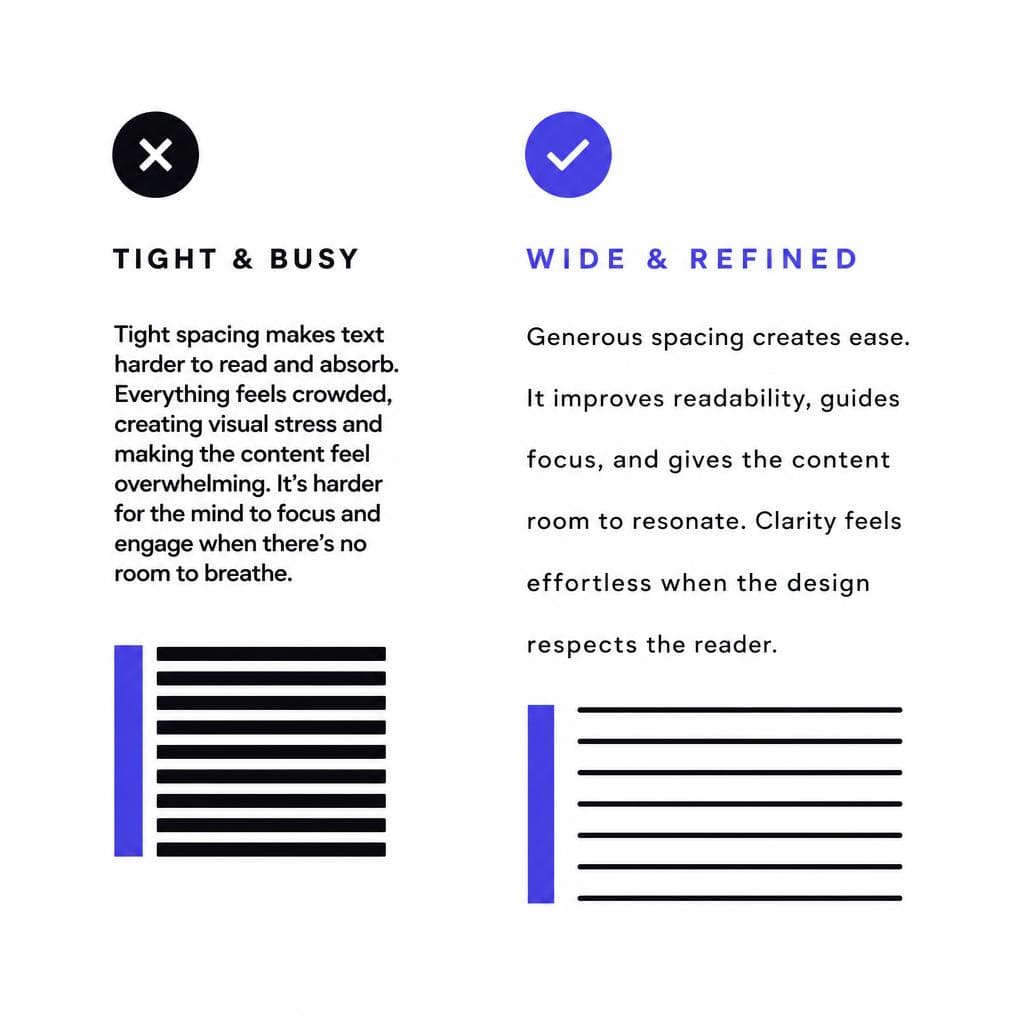
White space is not unused space. In luxury design, it is often the element that makes the typography feel expensive. Generous margins, measured line spacing, and breathing room around a wordmark communicate confidence: the brand does not need to shout, crowd the page, or explain everything at once.
This principle matters because visual density changes perceived value. Compare a crowded product label full of competing badges, scripts, and promotional phrases with a label that features one carefully set product name, a restrained descriptor, and ample blank space. The second approach gives every detail more importance. It also asks the viewer to engage more closely, which is a useful psychological cue for products built around discovery, craft, and exclusivity.
Start with tracking, the space between letters. Many luxury wordmarks use slightly expanded tracking, especially in uppercase serif or sans-serif lettering. The result can feel composed and ceremonial. However, more space is not always better. Excessive tracking can make words hard to read and make a logo look amateurish. Test at the actual size where customers will encounter it. A fragrance carton may accommodate spacious lettering; a small jewelry clasp or mobile navigation label may require tighter, more functional spacing.
Leading—the space between lines—also changes the brand’s tone. Editorial fashion headlines can use close leading for drama, while a hotel brochure might use more open leading to create calm and ease. For body copy, legibility remains essential. A luxurious experience should never force readers to work unnecessarily hard. Use comfortable line height, practical line lengths, and enough contrast between text and background.
A useful working rule is to remove before you add. If a layout feels less premium than it should, do not immediately search for a more ornate luxury brand font. First, reduce the number of messages, simplify the hierarchy, increase the outer margins, and give the primary type more room. Often, the existing typeface will begin to look more considered once it is allowed to breathe.
Thin Weights and Refinement: Use Delicacy Without Losing Clarity
Thin letterforms are closely linked with luxury because they suggest delicacy, precision, and restraint. Hairline serif details and ultra-light sans-serif strokes can feel like fine jewelry: controlled, subtle, and dependent on exact execution. Used well, they are especially effective for beauty, fashion, interiors, hospitality, and premium events.
But thin does not automatically mean refined. A typeface that is too light can disappear on a screen, break up in print, or become weak when placed over photography. This is one of the most common mistakes in luxury branding: selecting an elegant display weight, then deploying it everywhere because it looks impressive in a large mockup. At 14 pixels on a phone, or on uncoated paper, that same type may become difficult to read and feel less premium than a sturdier alternative.
Treat delicate weights as an accent rather than a default. Use them for a campaign title, a large product category, a limited-edition name, or a short line of packaging copy. Pair them with a regular or book weight from the same family for descriptions, navigation, ingredients, and legal information. This creates hierarchy while protecting usability.
Production testing is essential. Print samples at the smallest intended size. View web designs on a low-brightness mobile screen. Test light text over every likely photo treatment. If a stroke vanishes, use a slightly heavier weight, enlarge the text, increase contrast, or reserve the thin style for a different application. Refinement is not fragility. The best high-end typography looks effortless because it has been designed to work under real conditions.
Custom vs. Heritage Fonts: Choosing the Right Source of Distinction
One major decision for a growing luxury identity is whether to use an existing premium typeface, modify a licensed family, or commission a fully custom font. There is no universal answer. The right route depends on your brand story, budget, need for exclusivity, and the number of places typography must work.
Heritage and commercially available typefaces offer immediate advantages. They are often expertly drawn, technically robust, and available in multiple weights, language sets, and optical sizes. A well-chosen existing face can bring cultural depth to a new brand. For example, an old-style serif may lend credibility to a family-run watchmaker, while an elegant contemporary sans can make a new private members’ club feel established without pretending to have centuries of history. The key is to use the font with enough originality in layout, proportion, color, and imagery that the identity does not feel like a template.
Custom typography offers greater ownership. A bespoke wordmark or font can encode unique details: a signature ligature, a particular serif shape inspired by an architectural feature, or proportions based on historical packaging. It can also prevent direct competitors from using the same recognizable style. This level of distinction is valuable when typography is central to the brand, as it often is in fashion, fragrance, spirits, and luxury retail.
Custom does not necessarily mean starting from a blank page. Many brands begin by commissioning a custom wordmark, then build their wider system around a carefully licensed text family. This is a practical middle ground: the logo becomes proprietary, while the supporting typography remains reliable and flexible across web, print, and international communication.
If your inspiration begins with a reference image—perhaps an archival label, hand-painted sign, or photographed lettering—document the traits you want to preserve before you seek a solution. Look for stroke contrast, width, terminal shape, baseline behavior, spacing, and mood. Tools such as Snapafont can help turn suitable lettering imagery into a usable .TTF starting point for exploration, prototypes, or a highly specific display treatment. Before using any reference, ensure you own the artwork or have permission to reproduce it, and involve a type designer when the identity requires extensive character sets, multilingual support, or production-grade refinement.
Application Principles for a Premium Brand Font
Build a system, not just a beautiful logo
A luxury identity succeeds when its type choices work beyond the logo. Create a simple typography system with defined roles. Most brands need at least a display style for high-impact moments, a text style for longer reading, and a functional style for small or utilitarian information. These may all come from one versatile family, or from a disciplined pairing of two families.
For a fashion brand, the display role may be an expressive serif used for seasonal campaigns and large editorial titles. The text role may be a calm sans serif for product descriptions, size guides, and e-commerce navigation. For a premium restaurant, a refined serif could carry menu section titles, while a highly legible sans serif handles allergens, pricing, reservations, and directions. The contrast between roles should be noticeable enough to create hierarchy but not so extreme that the brand seems to change personality from page to page.
Set rules for capitalization. All caps can communicate formality and authority, but long paragraphs in uppercase are tiring to read. Reserve capitals for short labels, navigation, small headlines, or a wordmark. Use title case or sentence case where warmth and accessibility matter. Similarly, decide whether numbers, dates, currency, and units are part of the brand voice. A luxury hotel’s “24 HOUR CONCIERGE” and “24-hour concierge” convey different moods, even with the same font.
Pay close attention to pairing. When combining a serif and sans serif, look for complementary proportions rather than simply choosing two fashionable fonts. Compare x-height, width, contrast, and overall rhythm. A very delicate serif may need a quiet, neutral sans partner so both faces have room to perform. Avoid pairing multiple highly expressive styles; the result can look more theatrical than premium.
Use hierarchy to guide attention. On a product page, the product name should lead, followed by the category or short promise, then price and descriptive copy. Make the differences clear through size, weight, spacing, and placement—not through a confusing assortment of fonts. A coherent hierarchy improves conversion because it makes information easy to scan while preserving an elevated atmosphere.
Do not neglect digital accessibility. Maintain readable contrast, avoid placing fine text directly over busy images, and provide adequate size on mobile devices. Luxury should feel inclusive in the sense that customers can actually use the site, understand the packaging, and complete a purchase without friction. A premium experience is measured by care, and readability is care made visible.
Before launch, make a touchpoint checklist: logo, website, social templates, product labels, shipping materials, email, presentation decks, retail signage, and customer-service documents. Review each item side by side. If the typography feels coherent across both a tiny order confirmation and a large campaign poster, the brand system is doing its job.
Turn Distinctive Lettering Into a Usable Brand Asset
Sometimes the right direction for luxury typography is not found by scrolling through a font library. It may already exist in a piece of lettering that captures your brand’s character: an original sketch, a vintage-inspired label you created, a hand-drawn monogram, or a carefully art-directed campaign treatment. The challenge is turning that visual idea into something your team can actually test across names, headlines, packaging, and digital layouts.
Snapafont makes that process more accessible by converting an image of lettering into a downloadable .TTF font file. It is especially useful when you want to explore a distinctive display font for a luxury concept, evaluate how custom lettering behaves across a fuller alphabet, or move from a static visual reference toward a working typographic prototype. You can then test spacing, scale, hierarchy, and legibility in the real materials that shape customer perception.
Start with a clean, high-contrast source image, review the resulting characters carefully, and use the font where its personality is strongest. For a public-facing, long-term identity, confirm rights and consider professional type refinement when needed. Ready to see how your own lettering could support a more memorable premium brand? Try Snapafont at snapafont.com and turn your visual idea into a font you can put to work.
Ready to turn your image into a font?
Upload any image and get a real, downloadable .TTF font file in seconds.
Try Snapafont Free →

