For a nonprofit, typography is not a decorative afterthought. Every headline on a donation page, label on a food parcel, event flyer, annual report, and social post contributes to a larger question in the audience’s mind: “Can I trust this organization?” A strong font for nonprofit communications helps answer that question before a supporter has read a full sentence.
Nonprofit audiences often arrive with high emotional stakes. A donor may be deciding whether to give money. A volunteer may be looking for a credible way to contribute. A person seeking services may need clear information quickly and may already feel stressed or excluded. In those moments, type has to work hard: it must feel human without becoming informal, authoritative without becoming cold, and distinctive without getting in the way of comprehension.
The best nonprofit branding font is therefore not simply the prettiest available option. It is a practical system that reflects the mission, serves diverse readers, and stays consistent across digital and printed materials. This guide explains how to choose charity typography that builds trust, balances warmth with authority, meets accessibility needs, and remains realistic for a limited budget.
What Nonprofit Typography Must Do
A nonprofit organization font has a broader job than a campaign logo or a one-time poster. It needs to support recognition over time while helping people complete important tasks. Before comparing typefaces, define the communication jobs your typography must perform.
First, it must establish credibility. People are more likely to donate, partner, or share personal information when an organization appears capable and organized. Clear letterforms, deliberate hierarchy, and consistent spacing signal care. This does not mean every NGO brand font needs to be conservative. It means the type choices should look intentional. A playful handwritten headline paired with a cramped, difficult-to-read body font can make a serious organization appear improvised. By contrast, a carefully chosen expressive display face with a dependable sans serif for everyday reading can feel both personal and professional.
Second, typography needs to create emotional connection. A youth arts charity might use open, energetic letterforms and bright typographic scale to convey possibility. A hospice or bereavement organization may benefit from calm, spacious text and gentle contrast that communicates dignity. An environmental advocacy group may choose an organic-feeling serif or sturdy grotesk that suggests grounded action. The emotional tone should come from the mission and the people served, not from a generic assumption that all charities should look soft or sentimental.
Third, it must make action easy. Donation amounts, registration dates, helpline numbers, eligibility criteria, and emergency information should be unmistakable. Build a clear hierarchy: one dominant headline, concise supporting copy, distinct calls to action, and legible supporting details. For example, on a fundraising landing page, “Help 50 families access safe housing” should be the visual focal point, while the donate button uses a short, direct label such as “Give monthly.” Avoid using all caps for long calls to action, tight tracking, or low-contrast text that forces readers to work harder.
Finally, cause branding typography must work everywhere. Test it in a mobile navigation menu, a 12-point annual-report paragraph, a volunteer T-shirt, a social media story, and a black-and-white office printer. A font that looks compelling only in a polished desktop mockup is not a complete brand solution.
Balancing Warmth and Authority in Your Font Choices
Warmth and authority are not opposites. The most effective mission-driven brand font systems combine them in the right proportion for the organization’s purpose. The key is to decide where each quality should appear.
Humanist sans serifs are a reliable starting point for many nonprofits. Their slightly varied forms and open shapes tend to feel approachable while remaining highly readable. They are useful for organizations in health, education, community services, and international development because they communicate clarity without looking overly corporate. A humanist sans can work as both headline and body type, especially when the organization needs a simple, cost-efficient system.
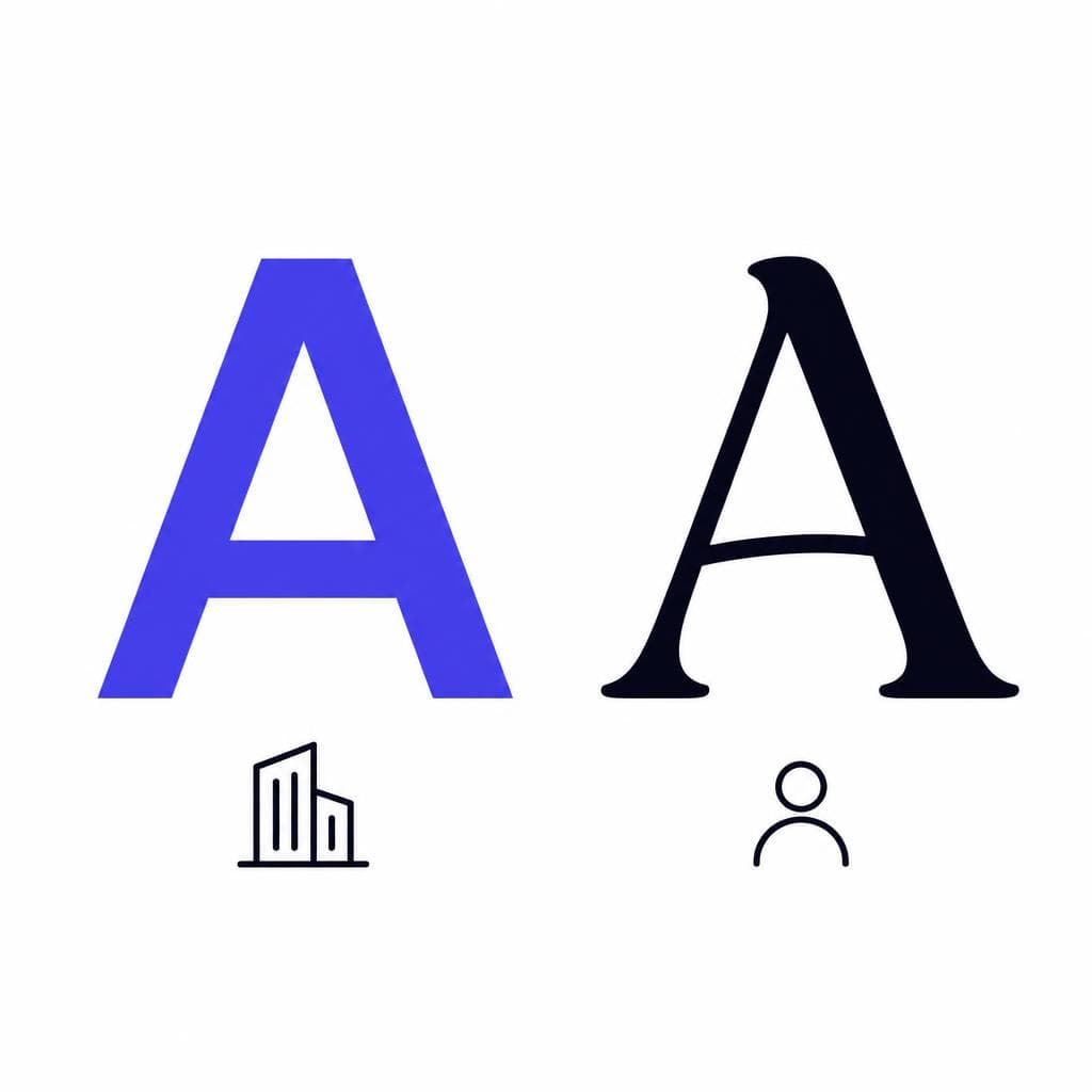
Serifs can introduce heritage, seriousness, and editorial warmth. A readable serif headline paired with a neutral sans serif body font can be effective for museums, foundations, policy organizations, legal-aid groups, and established charities. The serif brings gravitas to stories and campaign statements, while the sans serif keeps forms, navigation, and small text clean. Look for generous spacing, distinct lowercase letters, and sturdy shapes rather than extremely thin, high-contrast styles.
Rounded sans serifs can feel welcoming and optimistic, but they require restraint. They are often a good fit for children’s programs, disability inclusion initiatives, community food projects, or joyful public-health campaigns. However, using a highly rounded font for every word can make urgent or complex information seem less serious. Consider reserving it for headlines, labels, or short moments of personality and using a plainer companion font for body copy.
Display faces, scripts, and hand-drawn lettering can communicate individuality, especially when they reflect the actual community behind the work. Use them sparingly. A campaign headline such as “Everyone deserves a place to belong” may benefit from expressive lettering, but caseworker guidance and donation instructions should remain in an accessible text face. A useful rule is this: the more essential the information, the less decorative its typography should be.
Create a small decision matrix before committing. List three to five attributes your brand should convey, such as compassionate, capable, optimistic, local, bold, or evidence-led. Then evaluate each font option at real sizes against those attributes. Ask staff, volunteers, and community members what the type makes them expect from the organization. Their responses can reveal whether a font feels reassuring, bureaucratic, youthful, elite, or trustworthy in ways a design team may not anticipate.
Accessibility Requirements for Charity Typography
Accessible typography is central to trust. It ensures more people can understand your services, participate in your campaign, and make informed choices. It is also one of the clearest ways a nonprofit can show that its values are reflected in its everyday communications.
Start with legibility, not trendiness. For body text, choose fonts with open counters (the enclosed spaces in letters such as “e,” “a,” and “o”), clear distinction between similar characters, and stable proportions at small sizes. Readers should easily tell uppercase I, lowercase l, and the numeral 1 apart. This matters on referral codes, phone numbers, passwords, donation receipts, and any information that must be copied accurately.
Use adequate size and spacing. On websites, a body size of around 16 pixels is a sensible baseline, although some audiences will benefit from larger text. Use comfortable line height, typically about 1.4 to 1.6 times the font size, and avoid overly long line lengths. On print, test text at its final physical size rather than relying on an enlarged screen preview. A font can appear readable at 200 percent zoom and fail completely on a small appointment card.
Contrast is equally important. Text should stand out clearly from its background, including text placed over photographs. The WCAG contrast guidance is a practical benchmark: standard body text generally needs a contrast ratio of at least 4.5:1, while large text needs at least 3:1. Do not use a pale brand color for essential body copy simply because it looks delicate. If a color cannot carry readable text, use it as an accent, divider, or background instead.
Avoid communicating meaning through font styling alone. If an application deadline is urgent, do not rely solely on red text or bold type; include clear wording such as “Apply by 5 June.” Do not use all caps for paragraphs, excessive italics, or justified text that creates uneven gaps between words. Make links visually distinguishable through more than color, and ensure that website styles preserve focus indicators for keyboard users.
Most importantly, test with the people who use your materials. Ask volunteers to read a printed instruction sheet in ordinary lighting. Use a phone to review a donation flow outdoors. Invite people with low vision, dyslexia, or other relevant access needs to identify friction points. Accessibility is not a final compliance check; it is a design input that makes every nonprofit organization font choice stronger.
When a Custom Font Makes Sense for a Nonprofit
A custom font can help a nonprofit turn a recognizable visual idea into an ownable brand asset. This is especially valuable when the organization has a strong visual heritage, works in a crowded fundraising category, or needs to represent a distinctive community voice without relying on generic stock typography.
Custom does not have to mean creating an enormous type family from scratch. A practical approach may be a bespoke display alphabet for campaign headlines, a set of branded numerals for impact statistics, or a limited font based on lettering from a historic sign, community artwork, or archival material. For example, a neighborhood preservation nonprofit could transform the letterforms from an old local theater marquee into a headline font, then pair it with a widely available sans serif for service information. The result is memorable, locally rooted, and still easy to use.
A custom NGO brand font should always come with boundaries. Define where it is appropriate, which weights and sizes preserve readability, and what fallback font should appear when the custom file cannot be used. Also confirm licensing and ownership in writing. The organization should know whether it can use the font on a website, in a mobile app, in paid advertisements, in partner materials, and on merchandise. These details prevent a meaningful investment from becoming a future constraint.
For teams that already have a photographed sign, a hand-lettered campaign wordmark, or a scanned piece of community artwork, Snapafont can turn an image into a downloadable TTF font file. This can be a useful route for developing a distinctive headline or campaign font from existing visual material. Treat the resulting font as part of a wider system: refine the source image, test every character you need, and pair the custom lettering with a highly legible text font for long-form communication.
The right custom solution makes the brand more recognizable without asking staff to become typographic experts. If it creates too many choices, is difficult to install, or compromises key information, simplify it.
A Budget-Friendly Approach to Building a Strong Font System
Limited budgets do not require weak branding. In fact, a focused typography system is often more sustainable than an expensive collection of fonts with unclear usage rules. Start by selecting two dependable roles: one font for display and one for body copy. In many cases, a single versatile family with multiple weights can perform both roles and reduce training, licensing, and production complexity.
Look first at open-source font libraries and confirm that their licenses support your intended uses. Review whether the family includes the weights, italics, numerals, punctuation, and language support your organization needs. If your nonprofit serves multilingual communities, language coverage is not an optional detail. A font that lacks necessary accents or non-Latin scripts can exclude the very people your communications are meant to reach.
Create a concise typography guide that anyone can follow. It might specify: headlines use the semibold weight; body copy uses regular; captions use regular at a smaller size; hyperlinks are underlined; and calls to action use semibold sentence case. Include approved size ranges for web, print, and social media. A one-page guide, a few ready-made templates, and properly named files will often deliver more value than a complex brand manual.
Prioritize the materials that carry the highest stakes. Improve the donation page, service directory, annual report template, and event signage before spending time on decorative graphics. On social media, reuse a small set of type treatments rather than inventing new ones for every post. Repetition builds recognition and helps supporters identify your message quickly in a crowded feed.
If you want a signature visual element but cannot commission a full custom typeface, consider creating a limited accent font from existing lettering, then keep the rest of the system open-source and accessible. This is where an image-to-font workflow can be particularly cost-effective. It lets a team explore a unique voice while reserving its budget for user testing, content writing, translation, or program delivery.
The measure of success is not how many fonts your organization owns. It is whether a supporter can recognize your communications, a reader can understand them, and a staff member can produce them consistently.
Build a Font System That Makes Your Mission Easier to Recognize
A thoughtful font strategy helps a nonprofit look trustworthy, sound human, and make essential information easier to use. Begin with readability and accessibility, choose a tone that matches the reality of your mission, and document simple rules that staff and partners can apply with confidence. If you already have meaningful lettering in a photo, sign, sketch, or archival asset, it may also provide the seed for a more distinctive visual identity.
To explore that option, try Snapafont at snapafont.com. Upload a clear image of lettering and turn it into a downloadable TTF font file, then test it in a real campaign headline, event invitation, or impact report. Use the custom result where personality matters most, while keeping clear, accessible fonts in place for everyday reading and critical calls to action.
Ready to turn your image into a font?
Upload any image and get a real, downloadable .TTF font file in seconds.
Try Snapafont Free →

