
A podcast cover is often designed at 3000 × 3000 pixels, but most listeners will first encounter it as a tiny square in Spotify, Apple Podcasts, YouTube Music, or a social feed. At 60 pixels wide, artwork details disappear, subtle textures flatten, and long subtitles turn into visual noise. What remains visible is the overall contrast, the color block, and—more than many creators realize—the type.
That is why choosing a font for podcast branding is not a finishing touch. It is a strategic decision about recognition. A strong podcast cover font helps a listener understand the show’s mood before reading a description: insightful and journalistic, funny and informal, eerie and cinematic, intimate and personal, or sharp and businesslike. It also gives the show a recognizable visual voice across episode art, clips, guest graphics, newsletters, and merchandise.
The best choice is rarely just “a cool font.” It is a typeface that stays legible at thumbnail size, matches the promise of the show, and can be used consistently everywhere your audience sees you. This guide explains how podcast typography shapes perception, how to match a type direction to your genre, what to test before committing, and how to create a custom show font when off-the-shelf options do not express your brand.
How Podcast Font Choices Shape Perception
Type has personality because people recognize visual patterns long before they consciously analyze letters. Thick geometric sans-serif lettering can feel modern, direct, and confident. A high-contrast serif can suggest editorial intelligence, culture, or storytelling. Handwritten lettering may feel warm and human, but it can also look messy if the strokes become too thin or irregular at small sizes. These impressions are not rigid rules, yet they strongly influence the expectations a new listener brings to a show.
Consider two fictional shows with the same title: “After Hours.” Set in a condensed, all-caps sans serif with neon colors, it reads like a nightlife, comedy, or music podcast. Set in a restrained serif with generous spacing and a dark navy background, it feels more like long-form interviews or reflective cultural criticism. The words have not changed. The podcast logo font has changed the story around them.
Your lettering also signals production quality. A well-built hierarchy—show title first, a short descriptor second if needed, host name last or omitted—appears intentional. By contrast, six competing font styles, excessive effects, and lengthy copy often make a polished show look improvised. A listener may never say, “The tracking is too tight,” but they will feel whether the cover is easy to process.
Podcast typography is especially important because audio is intangible. A book has pages, a restaurant has food, and a product has physical materials. Before someone presses play, a podcast has its name, cover image, and social presence. Typography gives that invisible experience a visual form. It can make a solo host seem approachable, a niche investigative show seem credible, or a playful roundtable seem energetic before the first second of audio begins.
Match Your Podcast Branding Font to the Show Genre
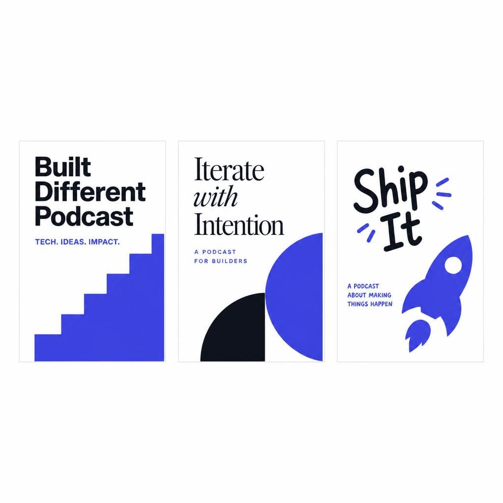
Genre is a useful starting point, not a template. Your goal is not to copy every other show in your category. Instead, identify the visual conventions listeners already understand, then choose one or two elements that make your cover distinct. A true-crime podcast, for example, may benefit from tension, restraint, and contrast—but it does not need another distressed “crime scene” typeface to communicate its premise.
For business, finance, and technology podcasts, clean sans serifs, modern grotesques, and sturdy serifs tend to perform well. They support clarity and authority, particularly when episode titles, charts, or short social quotes are part of the broader visual system. A podcast branding font with medium-to-bold weights gives you room to create hierarchy without constantly switching typefaces. If the show is aimed at founders, operators, or investors, avoid novelty fonts that make an expert discussion feel less credible.
For interview, culture, and narrative shows, a serif or expressive display face can add character. A literary interview series might use a bookish serif for the title paired with a neutral sans serif for supporting information. A music history show could use a distinctive retro-inspired display font, provided the letterforms remain readable. The key is to pair personality with utility: reserve the expressive type for a short title, and use a simpler secondary font for episode details.
Comedy and pop-culture shows can take more visual risks. Chunky lettering, playful italics, irregular but controlled shapes, and bright color contrast can reflect energy and humor. Still, funny does not have to mean cluttered. If your title is “The Bad Advice Club,” large, bold lettering on a solid background will usually land better than tiny speech bubbles, multiple emojis, and three lines of decorative text.
Wellness, parenting, relationships, and personal-development podcasts often benefit from warmth rather than generic softness. A humanist sans serif, rounded serif, or carefully made handwritten accent can create intimacy. Be cautious with ultra-thin scripts and pale color palettes: they may look calming on a large screen but vanish inside a podcast app. For a show about therapy or honest relationships, clarity is part of trust.
Horror, mystery, and fiction podcasts can use atmospheric typography, but the title still has to function as a thumbnail. Build mood through background imagery, color, spacing, and a limited amount of texture rather than making every letter unreadable. A frightening podcast cover font should be eerie because of its composition, not because listeners cannot decipher it.
A practical exercise is to build a three-word brand brief before selecting a font. Write the emotional traits you want listeners to feel—for example, “curious, rigorous, optimistic” or “unfiltered, hilarious, fast.” Then list three traits you do not want, such as “corporate, precious, chaotic.” Evaluate candidate fonts against both lists. This prevents you from choosing a typeface based solely on what looks attractive in a font menu.
What Makes a Podcast Cover Font Work at Thumbnail Size
A beautiful typeface is not automatically a useful podcast cover art font. Podcast platforms create unusually demanding viewing conditions: small dimensions, crowded interfaces, mobile screens, dark-mode environments, and competing covers immediately beside yours. Test for real-world use rather than judging only from a large design canvas.
First, prioritize legibility. Use a title that can be read quickly at approximately 60 to 100 pixels wide. This usually means limiting the main title to two or three lines, using a sufficiently heavy weight, and choosing letterforms with clear silhouettes. Thin strokes, narrow counters—the open space inside letters such as O, P, and A—and overly condensed forms often collapse at small sizes. If a listener has to zoom in, the font is not doing its job.
Second, build strong contrast. Contrast includes light versus dark values, but it also includes the difference between letter shape and background complexity. White type over a busy photograph may technically have enough brightness contrast in places, yet still be hard to read. Add a darker overlay, place text inside a solid area, or simplify the image. Do not rely on drop shadows and outlines as a substitute for a clear composition; those effects can become muddy at thumbnail scale.
Third, keep the title dominant. Your show name should be the largest piece of information on the cover. A listener does not need “New episodes every Tuesday” on the artwork. They do not need a biography, a list of topics, or the full names of five co-hosts. If you need a descriptor, make it short: “Stories of modern work,” “A comedy advice show,” or “The history behind the headlines.” Remove anything that does not help a new listener identify the show.
Fourth, use fewer fonts than you think. One strong display face plus one supporting text face is enough for most covers. In many cases, a single font family with different weights is even better. This consistency helps the artwork feel intentional and makes future episode templates easier to produce. A good podcast art design font is not just the font that looks best on launch day; it is the one that you can use reliably for a year of assets.
Finally, run a thumbnail test. Export the cover, place it beside six to ten competing podcast covers, and view it on your phone. Ask three questions: Can I read the title instantly? Does the visual mood match the show? Can I identify this as mine after a quick glance? Repeat the test in grayscale as well. If the design only works because of a specific color effect, it may lose impact in certain app interfaces or accessibility settings.
Creating a Custom Show Font for a More Ownable Brand
A custom show font can be valuable when your podcast has a distinctive visual idea that standard fonts cannot capture. It does not necessarily mean designing an entire typeface from scratch. For some brands, a custom wordmark is enough. For others—especially shows that publish frequent quote cards, episode covers, or video clips—a usable custom font creates a more flexible system.
Start with source material that already belongs to the show. It could be the host’s handwriting, lettering from a vintage sign that inspired the concept, notes from a field journal, a hand-drawn title treatment, or characters created by an illustrator. The source should be stylistically relevant and legally yours to use. Avoid tracing a commercial typeface or pulling letterforms from artwork without permission. A custom font should strengthen your identity, not introduce avoidable rights problems.
Before converting an image into letters, make it practical. Create a clean, high-contrast image of the alphabet, ideally including uppercase and lowercase characters, numbers, punctuation, and the symbols you expect to use. Keep characters separated, avoid shadows, and use dark marks on a plain light background. If you only need a podcast logo font for a title, you may be able to begin with a smaller character set—but include alternates for letters that appear frequently in your show name. A title like “Coffee Confessions” may need several usable versions of C, O, and F to avoid repetitive shapes.
Then test the custom lettering in context. Does it work in the title at large size? Can it support short episode headlines? Are common words readable? Does it have enough spacing and consistent baseline alignment to look deliberate? Handwriting often has charm precisely because it is imperfect, but uncontrolled inconsistencies can make templated episode graphics look amateurish. You may decide that a custom display font is best reserved for the main title, while a reliable sans serif handles episode numbers and guest names.
Tools such as Snapafont can turn a clean image of your lettering into a downloadable TTF font file, making it easier to carry a recognizable hand-drawn or brand-specific style into design tools that accept installed fonts. The most successful result comes from preparation: give the conversion process clear source characters, review the output, and test it across the words your show actually uses. Treat the generated font as part of a system, not as a novelty effect.
Custom does not automatically mean better. If your show is analytical, restrained, and information-heavy, a carefully chosen licensed font family may communicate the brand more effectively. The purpose of customization is memorability and fit. Use it where it gives the audience a stronger, clearer signal about what makes your podcast different.
Apply Your Podcast Typography Across Every Listener Touchpoint
Your cover should be the beginning of a visual system, not a one-off design. Once you choose your primary podcast cover font, define simple rules for using it across assets. Identify a display font for the show title, a text font for supporting information, a small palette of brand colors, and a few repeatable layout choices. Put these decisions in a one-page style guide so editors, freelancers, and future collaborators can keep the brand consistent.
For episode art, keep the podcast title in a predictable place and use the supporting font for the guest name or episode subject. If every episode changes typeface, color direction, and layout completely, returning listeners may not recognize it in their feed. Variation is useful, but the core identifiers should remain stable. A consistent title lockup, border, color field, or type treatment creates that recognition.
For short-form video and audiograms, optimize for motion and small screens. Captions require high readability, so use a simpler, heavier font than the one you use for expressive cover titles if necessary. Keep lines short, use generous line spacing, and ensure text stays within safe margins for vertical platforms. Your podcast typography can still feel branded through color, weight, and a recurring graphic detail rather than forcing the main display type onto every subtitle.
For your website, email, and merchandise, think beyond the square cover. A wide website header may allow the show name to breathe in a way that the cover cannot. T-shirts may work better with a simplified one-color version of the logo. Printed stickers may require thicker strokes and fewer fine details. Test each use independently while maintaining the same underlying visual language.
A useful workflow is to create five starter templates immediately after finalizing your font choices: the main cover, an episode announcement, a guest quote card, a vertical video caption frame, and a newsletter or website banner. Populate each template with real words from your first few episodes. This reveals problems early—such as a font that looks great with a short title but fails on a long guest name—and ensures your launch assets feel connected from day one.
Turn Your Podcast’s Visual Voice Into a Working Font
If your strongest brand idea begins with handwriting, a sketched wordmark, or lettering you created for the show, do not leave it trapped in a single image file. Converting that style into a font lets you use it consistently in cover variations, quote graphics, launch materials, and other branded assets while keeping the character that makes the podcast feel personal.
Prepare a clean image of your letters, include the characters you expect to use, and test the final result at actual podcast thumbnail size. Then try Snapafont at snapafont.com to transform your image-based lettering into a downloadable TTF font file. It is a practical way to make a distinctive visual idea reusable—so your podcast can look recognizable wherever a future listener finds it.
Ready to turn your image into a font?
Upload any image and get a real, downloadable .TTF font file in seconds.
Try Snapafont Free →

