
Choosing a font can feel oddly high-stakes when you are building a startup. One typeface seems too corporate, another feels too playful, and the one everyone on the team likes may suddenly look suspiciously similar to a competitor’s. It is easy to spend an afternoon comparing font specimens, then launch with five different typefaces across the website, pitch deck, product UI, and social posts.
The good news: choosing a font for startup branding does not need to become a design marathon. A strong startup font is not necessarily the most original, expensive, or fashionable option. It is the one that helps people understand your company quickly, works reliably in the places you communicate, and stays consistent as your team grows.
This guide gives founders a practical way to make the decision without overthinking it. You will learn how to connect typography to brand strategy, narrow choices quickly, decide whether one font is enough, and build simple rules that prevent brand drift. The goal is not to find a magical font that does every job. The goal is to choose confidently, document a few decisions, and get back to building.
Why Font Choice Is a Strategic Decision
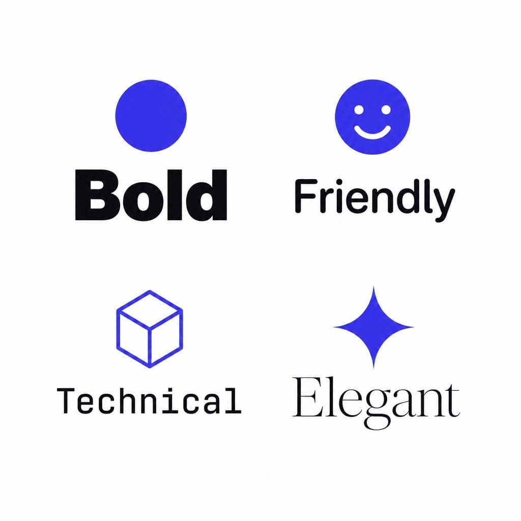
Typography is one of the fastest signals your brand sends. Before someone reads a headline, they register its visual tone. Rounded, open letterforms can suggest friendliness and accessibility. A sharp geometric sans serif may feel modern and efficient. A restrained serif can communicate expertise, editorial confidence, or premium positioning. These impressions are not universal laws, but they influence how people interpret the words that follow.
That is why a startup branding font is more than decoration. It affects perceived trust, clarity, personality, and product usability. A cybersecurity company selling to enterprise buyers may need typography that feels calm, credible, and precise. A consumer wellness app may want warmth and low-pressure approachability. A developer tool can be expressive, but its type still needs to make code snippets, technical documentation, and dense settings screens easy to scan.
The strategic part is alignment. Your font for startup communications should reinforce the position you are trying to own rather than simply match a design trend. Start by completing this sentence: “We want customers to see us as the most ___ choice for ___.” The missing words might be dependable, intuitive, inventive, transparent, premium, or fast. Then ask whether your typography supports that claim.
A practical example: imagine two fintech startups. One helps freelancers send invoices; the other provides risk management software to CFOs. Both could use a sans serif, but they should not necessarily use the same kind. The invoicing product may benefit from generous spacing, softer shapes, and conversational headings. The risk platform may need tighter, more structured typography that remains legible in tables, reports, and dashboards. In both cases, the type system becomes evidence for the brand promise.
Typography also has an operational cost. Every extra typeface, weight, and exception creates another decision for marketing, product, sales, and support teams. A thoughtful early choice prevents future rework and makes every page, deck, and interface feel like it came from the same company.
A Simple Framework for Choosing a Font for Your Startup
Start with the jobs the font must do
Do not begin with a giant font library. Begin with use cases. List where your brand font startup choice must appear during the next 12 months: website headlines, long-form body copy, product interface, logo, investor deck, paid ads, onboarding emails, social graphics, and documentation. A typeface that looks great as a huge homepage headline may perform badly in a 12-pixel settings menu or a paragraph on a mobile screen.
Next, rank those uses. For most early-stage companies, the website and product are the priority. If your startup is sales-led, proposals and presentation templates may belong near the top. If your business relies on content, reading comfort matters more than a striking wordmark. This exercise quickly exposes whether you need a flexible workhorse family or a separate display face for occasional big moments.
A Simple Framework for Choosing a Font for Your Startup
Choose three personality traits, not ten
Vague feedback is where font selection gets stuck. “It needs more energy” or “this feels a little off” may be honest reactions, but they are hard to act on. Replace broad opinions with three traits that are directly relevant to your positioning. For example: clear, optimistic, and capable. Or: technical, rigorous, and understated. Or: bold, playful, and inclusive.
Use those traits to make trade-offs. A highly decorative display typeface might be bold and playful, but it may not be clear enough for product screens. A classic serif might be rigorous and premium, but not optimistic enough for a youth-focused app. You are not looking for perfect scores across every adjective; you are looking for the best fit for the job.
It helps to put candidate fonts into context before deciding. Create one simple test page using your real company name, a hero headline, two buttons, a short paragraph, a pricing table, and a sample interface label. Use actual messaging, not “The quick brown fox.” Real copy reveals awkward word shapes, cramped punctuation, weak numerals, and personality mismatches much faster.
A Simple Framework for Choosing a Font for Your Startup
Run four practical tests before committing
First, test legibility. View body text at its intended size on a phone and laptop. Check whether lowercase letters such as i, l, and j are distinguishable, whether the x-height is comfortable, and whether paragraphs remain easy to read after a few minutes. For tech startup typography, also inspect zero, one, uppercase I, and lowercase l. Ambiguous characters can cause genuine usability problems in dashboards, API keys, and developer documentation.
Second, test range. Can the family handle a calm paragraph, a clear hierarchy of headings, small navigation labels, and prominent calls to action? Look for useful weights such as regular, medium, semibold, and bold. You do not need every available weight, but relying on artificial browser bolding or italics often produces inconsistent results.
Third, test distinctive details. Inspect currency symbols, arrows, punctuation, tabular numbers, and accented characters if you serve international users. If your product displays dates, pricing, analytics, or financial information, tabular numerals are especially useful because each digit occupies the same width and columns align cleanly.
Fourth, test ownership and licensing. Confirm that the font license covers websites, apps, presentations, advertising, and team use. A “free” font may be suitable, but check its license rather than assuming. Google Fonts can be an efficient source for many startups, while paid commercial families can be worthwhile when their breadth, language support, or distinctive character solves a real need.

The One-Font Rule for Early-Stage Startups
For most early-stage companies, one versatile font family is enough. This is not a rule against creativity; it is a rule in favor of speed and consistency. A strong family with several weights can establish hierarchy through size, weight, spacing, and color without forcing your team to figure out pairings every time they make a slide or post an announcement.
The one-font approach works particularly well when you have no full-time brand designer. Use regular for body copy, medium or semibold for UI labels and subheads, and bold for major headings. Adjust scale before adding another typeface. A 48-pixel headline, 24-pixel subhead, and 16-pixel body style can look distinct while remaining cohesive. In a product UI, use fewer dramatic size jumps and rely on weight, spacing, and layout instead.
A second font becomes reasonable when it has a clear, limited job. For example, a brand may use a display face only for campaign headlines while keeping its primary sans serif for everything functional. Another sensible combination is a readable serif for editorial content plus a neutral sans serif for navigation and UI. The key is to document the role: “Font A is for headings above 32px; Font B is for body and interface text.” If the rule cannot be explained in one sentence, it is probably too complicated for this stage.
Be cautious with startup logo font decisions. A logo does not always need a completely different typeface from the rest of the brand. A customized wordmark based on the primary family can create recognition while preserving coherence. Conversely, selecting a highly stylized logo font that never appears elsewhere can make the logo feel disconnected from the actual product experience.
When It Makes Sense to Go Custom
Custom typography is valuable when it solves a specific brand or product problem, not simply because custom sounds premium. It may be the right move if your name is common and your category is visually crowded, if you need a memorable logo that cannot be achieved with standard typesetting, or if your product has unusual character requirements. Companies with global language needs, hardware interfaces, high-volume publishing, or a mature design system may eventually benefit from a bespoke font or modified family.
There are degrees of customization. The lightest option is a tailored wordmark: adjust a few letters, refine spacing, or build a distinctive ligature for the company name. The middle option is customizing select brand characters or creating a small display alphabet for campaigns. The most involved option is commissioning a full font family with multiple weights, language coverage, and technical features. The right level depends on how often the type will be used and whether its uniqueness creates measurable business value.
Founders sometimes also have a practical source of typography they have overlooked: handwriting, sketches, or lettering created during the company’s early development. These can carry genuine provenance in a founder story, a creator-led brand, or a community project. If you have an image of lettering you want to turn into usable digital type, Snapafont can convert it into a downloadable TTF font file. That approach is best used intentionally—for a wordmark, campaign accent, or limited display voice—rather than as a substitute for highly legible UI text.
Before going custom, ask three questions: Will customers actually encounter this often enough to notice? Does it strengthen a brand asset competitors cannot easily copy? Can we maintain it across product, web, and marketing channels? If the answer is no, a well-chosen existing family is usually the faster and smarter decision.
The Consistency Checklist That Matters More Than Endless Font Searching
Once you have selected a startup font, consistency becomes the real differentiator. Customers rarely praise a company for having a technically perfect typeface. They do notice when a website feels polished, an email feels familiar, and a product screen feels like part of the same experience. That recognition comes from repetition.
Create a one-page typography guide that anyone on the team can use. It should specify the primary font family, approved weights, fallback fonts, and where each style belongs. Include the exact fonts in shared tools such as Figma, presentation software, website templates, and document templates. If people cannot access the approved font easily, they will substitute whatever is available.
Use this checklist before publishing major assets:
• Is the primary font installed or embedded correctly in this channel? • Are headings, subheads, body copy, captions, and buttons using the approved styles? • Is body text large enough to read comfortably on mobile? • Are line lengths reasonable, ideally not stretching into very long unbroken lines? • Are weights used consistently, rather than inventing a new boldness level for every asset? • Are numbers, tables, prices, and code-like strings easy to distinguish? • Does contrast meet accessibility expectations, especially for small text? • Have we used the same capitalization, punctuation, and spacing conventions as our existing materials?
For web typography, set a dependable fallback stack. Even when your preferred web font fails to load, the experience should remain readable. For example, a sans-serif brand might use its web font followed by Arial and the system sans-serif. Also optimize font files: serve only the weights and character sets you need, use modern web formats where possible, and avoid loading four families just to create a landing page. Better page performance is part of better brand experience.
Review your typography quarterly, not daily. As the product, audience, and marketing channels evolve, you may discover that your original selection needs a new weight, a larger body size, or a clearer data-table style. These are normal refinements. Resist changing the entire brand font startup system because a new type trend appears on social media. Consistency compounds; novelty resets that advantage.
Make the Decision, Then Build a System Around It
The best approach to choosing font for startup branding is simple: define the feeling you need to create, test a small shortlist in real contexts, choose the most practical option, and give your team clear rules for using it. A typeface does not need to carry your entire brand by itself. It needs to make your words easier to trust, read, and recognize.
If your strongest visual asset is a piece of original lettering, a handwritten note, or a sketch that captures your company’s personality, you do not have to leave it trapped in an image file. Try Snapafont at snapafont.com to turn that image into a downloadable TTF font you can test in your branding workflow. Use it thoughtfully alongside a readable core typeface, and you can preserve the human, distinctive detail that made your startup feel like yours in the first place.
Ready to turn your image into a font?
Upload any image and get a real, downloadable .TTF font file in seconds.
Try Snapafont Free →

