For years, the default answer to almost every software branding question was simple: use Inter. It is a capable, readable, well-supported typeface, and it solves a real problem for product teams that need a polished interface quickly. But a SaaS brand font does more than make dashboards legible. It signals whether a company feels enterprise-ready, developer-native, warm and consultative, bold and disruptive, or generic enough to disappear into a crowded category.
That matters because SaaS buyers rarely experience a brand in one place. They move from a search result to a homepage, from a pricing page to a demo deck, then into a product interface, knowledge base, lifecycle email, and support documentation. Typography is the visual system that connects each of those moments. When it is chosen deliberately, it makes a product feel more coherent and trustworthy before a visitor has even evaluated a feature.
This guide is not an argument against Inter, nor is it a call to choose an eccentric font merely to look different. It is a practical framework for choosing tech brand typography that matches your audience, category, product experience, and stage of growth. You will learn how to evaluate font personality, separate display and UI roles, avoid common implementation mistakes, and decide when a custom type direction is worth the effort.
What Tech Typography Communicates Before Users Read a Word
Every typeface carries associations. Some are created by its letterforms: wide circular counters can feel open and contemporary; condensed strokes can feel efficient and assertive; softened terminals can feel approachable. Others come from context. A monospaced font may suggest code and technical precision. A neutral grotesk sans may suggest modern infrastructure. A high-contrast serif can imply editorial authority, premium positioning, or strategic expertise.
For a software company font, the question is not simply, “Is this readable?” The better question is, “What will a buyer assume about us when this is the first thing they see?” A cybersecurity platform selling to CISOs may need to communicate control, rigor, and resilience. An HR platform may need clarity without coldness. A creative AI product can support more expressive display type, provided the interface remains effortless to scan. The same font choice will not serve all three equally well.
Typography also communicates operational maturity. In B2B software, buyers are often assessing risk alongside functionality. A cluttered landing page with inconsistent weights, awkward line breaks, and poorly rendered type can imply that the product is equally improvised. By contrast, a stable hierarchy, generous spacing, and consistent typography can make an emerging company appear more established. This does not mean every startup needs to imitate a legacy enterprise brand. It means the visual system should make the promised experience believable.
Consider a project-management tool aimed at independent designers. A slightly humanist sans with open apertures and a friendly rhythm might reinforce collaboration and accessibility. Now consider a data observability platform for engineering teams. A more restrained sans, paired with carefully limited monospace labels for logs, commands, and metrics, can create the sense of precision that users expect. Both can be excellent examples of software product typography; they simply express different product truths.
The strongest technology brand font choices are therefore strategic, not decorative. They support positioning, help users distinguish content types, and remain reliable across browser rendering, mobile screens, PDFs, demos, and product states such as empty tables, error messages, and dense settings pages.
The Move Beyond “Just Use Inter”
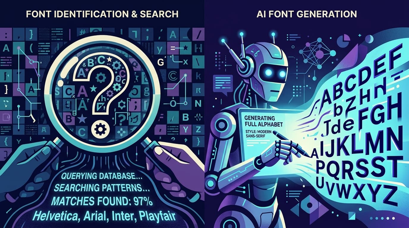
Inter became popular for good reasons. It was designed for screens, has a large character set, includes useful weights and variable-font capabilities, and performs well in interfaces. For a lean product team, it removes a great deal of uncertainty. The problem is not that Inter is overused in a technical sense. The problem is that relying on it without a point of view can make a company look interchangeable with thousands of other SaaS products.
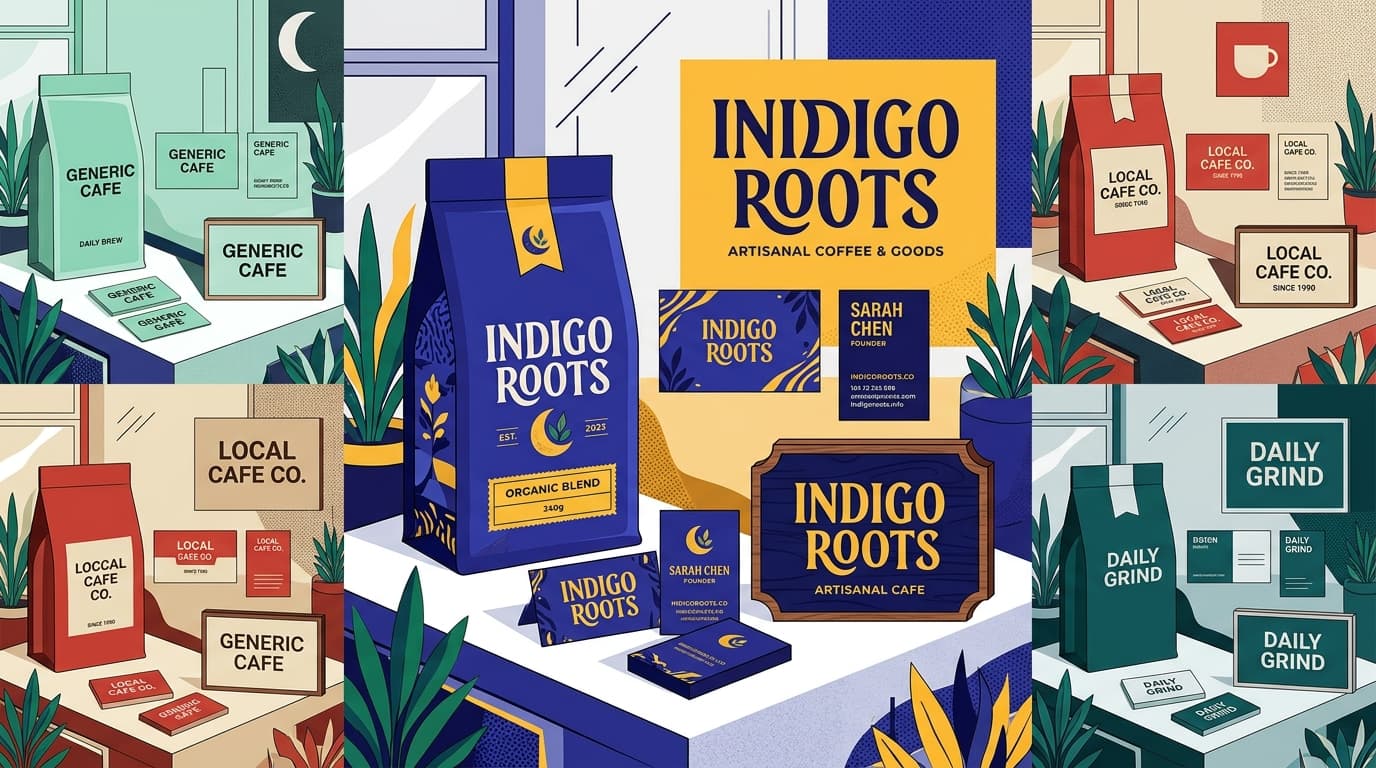
When every homepage uses the same familiar sans, the same oversized hero headline, and the same medium-weight UI labels, differentiation has to work harder elsewhere. Your logo, color, messaging, motion, and product screenshots may still create distinction, but the brand has lost one of its most persistent assets: its voice on the page. This is especially noticeable in saturated categories such as AI tools, analytics, CRM, finance, and developer platforms.
Moving beyond Inter does not require abandoning usability or spending months on a full custom typeface. Start by identifying the role Inter is currently playing. Is it serving as the interface font, the marketing headline font, the body font, and the documentation font? If so, a more thoughtful approach may be to keep a highly functional UI sans for the product while introducing a distinct display face for campaigns and homepage headlines. Alternatively, choose a variable sans with a different voice but equally strong screen performance.
A practical evaluation process helps. Set the same real copy in three to five candidate fonts: a 10-word headline, a 60-word product description, a pricing table, a table of dense metrics, a form with validation errors, and an email subject line. Compare them at actual sizes, not only in a font preview. Ask whether the shapes remain clear at 14px, whether bold weights become too dark, whether numerals are easy to compare, and whether the overall rhythm fits the brand claim.
For example, a company whose message is “complex workflows, made calm” might find that an ultra-geometric sans feels too rigid, while a humanist sans with open forms makes that promise more credible. A developer tool claiming “the fastest path from idea to deployment” may benefit from a sharper, more compact system that conveys momentum. The best startup tech font is not the newest or most fashionable option; it is the one that makes the intended impression consistently, from headline to error state.
Geometric vs. Humanist Sans: Choose the Right Personality
Most contemporary SaaS typography decisions eventually land on a sans serif, but “sans serif” is much too broad to be a strategy. Two major directions—geometric and humanist—are useful starting points because they create noticeably different impressions.
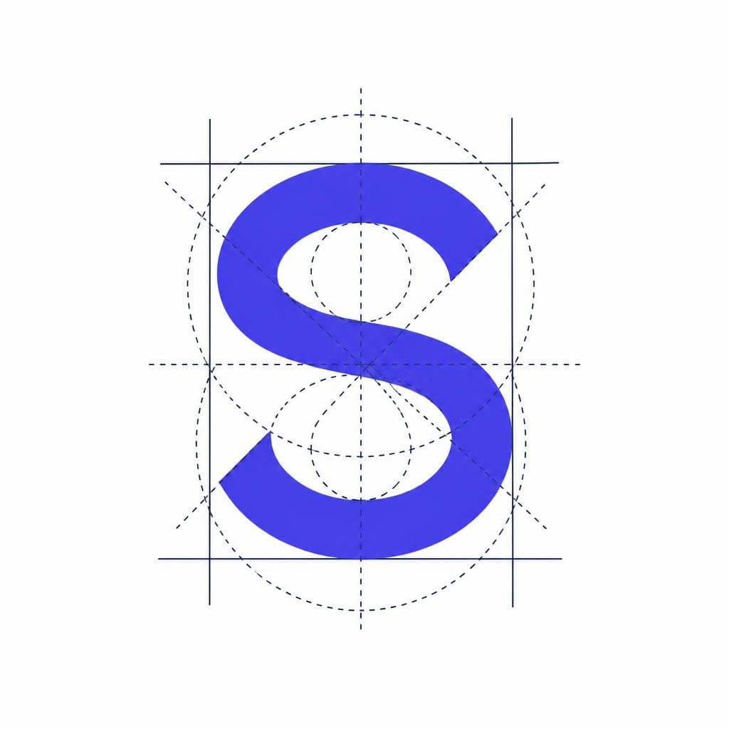
Geometric sans serifs are built around simplified, often circular or modular forms. They tend to feel clean, efficient, contemporary, and controlled. Their consistency can work well for products in automation, productivity, fintech, data, and design technology. In display sizes, a geometric family can create a strong, crisp brand signature. However, some geometric fonts become less comfortable in long passages or dense UI contexts because similar forms can be harder to distinguish quickly. Pay particular attention to characters such as lowercase “a,” “l,” uppercase “I,” and numerals.
Humanist sans serifs borrow more from handwritten movement and traditional letter construction. They often have more open apertures, varied proportions, and friendlier shapes. That makes them especially useful when a product needs to feel helpful, collaborative, educational, or people-centered. They can also provide excellent legibility in navigation, forms, support content, and settings screens. A humanist direction is often a strong fit for health tech, HR software, customer success tools, education platforms, and any service where adoption depends on reducing anxiety.
Neither category is inherently more professional. The key is alignment. A payroll tool may use a humanist sans to make a stressful administrative task feel manageable. A cloud security platform may use a geometric direction to emphasize systems thinking and disciplined execution. In both cases, test the fonts against real language from the business. Typography should make your words sound more like themselves, not fight them.
There is also a useful middle ground: neo-grotesk and contemporary utility sans families. These can feel neutral, compact, and highly functional, making them effective for technical products with complex interfaces. If your organization serves several audiences—from executives on the marketing site to operators inside the app—a neutral UI font may provide the flexibility you need, while a more distinctive secondary face handles brand expression.
Separate Display and UI Font Roles
A two-role system creates distinction without sacrificing usability
One of the most effective ways to improve SaaS typography is to stop asking one font family to do every job. Marketing headlines and product interfaces have different requirements. A display face needs memorable shape, strong presence at large sizes, and a voice that supports positioning. A UI face needs rapid recognition, compactness, reliable rendering, and clear hierarchy at small sizes. They can be the same family, but they do not have to be.
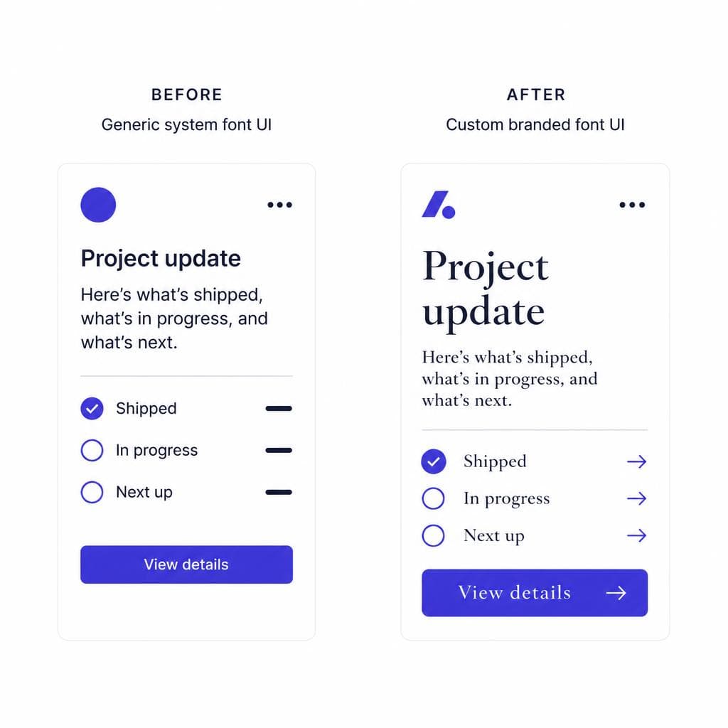
A common system uses a distinctive display sans or serif for H1 and major campaign moments, then a workhorse UI sans for body copy, navigation, controls, tables, and documentation. This approach gives the homepage a recognizable point of view while keeping the app calm and practical. It is particularly helpful for a product that has a visually expressive brand but a dense operational workflow.
Define the roles in writing. For instance: display font for H1–H2 and short metric callouts; UI font for everything within the application; monospace only for code, IDs, timestamps, command examples, and technical values. Then define sizes, weights, line heights, and tracking tokens. A simple scale might use 56/64 for large marketing headlines, 36/44 for section headlines, 18/28 for lead copy, 16/24 for body copy, and 14/20 for controls. The exact numbers will change by font, but the principle remains: type scales must be tested, not copied blindly.
Avoid using too many weights as a substitute for hierarchy. In software product typography, weight, size, color, spacing, casing, and placement all carry meaning. If every label is semibold and every card headline is bold, the interface becomes visually loud. Use regular text for most content, medium or semibold for purposeful emphasis, and bold sparingly. In a data table, for example, a user should be able to identify the primary value through alignment and spacing, not only through a heavier font weight.
Also check licensing and technical delivery early. Confirm webfont rights, app embedding rights if relevant, variable-font support, language coverage, and file size. Subset files when appropriate, preload only essential weights, and specify robust fallbacks. A beautiful technology brand font that causes layout shifts or slow page loads is not a successful brand decision.
When a Custom Brand Font Makes Sense
Create a recognizable voice without rebuilding your entire type system
A custom brand font is not necessary for every company, and it is rarely the first priority for an early-stage startup. Strong messaging, product value, layout, and a disciplined off-the-shelf type system will usually deliver more immediate impact. But custom typography becomes valuable when a business has reached a point where visual differentiation is strategic: perhaps it is entering a crowded market, consolidating a multi-product portfolio, refreshing an established identity, or building a category-defining platform.
Custom does not always mean commissioning an entire family from scratch. There are several levels of investment. The lightest option is a custom wordmark or a small set of modified display glyphs for campaign use. Next is a tailored version of a licensed typeface, where permitted, such as adjusted terminals, alternate characters, or a unique numeral style. The most comprehensive option is a full bespoke family with display, text, and UI variants. The right level depends on how often typography appears in high-value brand moments and how much distinction the company truly needs.
Imagine a fictional workflow automation company called Relaygrid. Its product helps operations teams turn messy cross-functional requests into repeatable processes. The original identity uses a generic geometric sans everywhere. It looks clean, but its homepage resembles competitors. Rather than replacing the entire product font, Relaygrid develops a custom display alphabet with slightly squared curves and connecting stroke details that echo the idea of handoffs between teams. The product keeps a highly legible UI sans for forms, tables, and automation builders. The result is recognizable marketing typography without forcing unusual letterforms into high-frequency interface tasks.
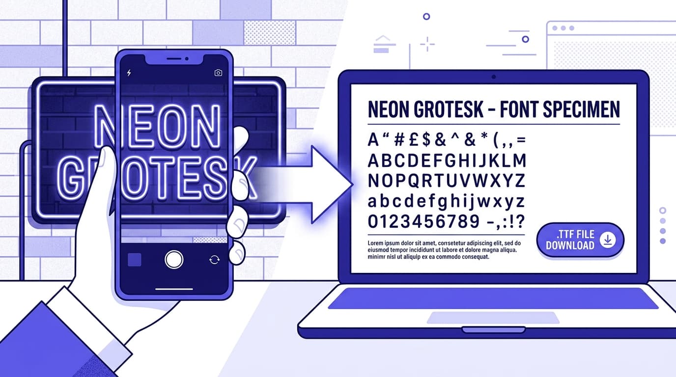
If you have lettering from a logo, product sketch, vintage sign, or other image-based source that captures your desired character, Snapafont can help turn that visual reference into a downloadable TTF font file. That can be a useful starting point for a custom display direction, especially for limited brand applications such as hero statements, social graphics, launch assets, or a distinctive wordmark extension. Before deploying any generated font broadly, test its character coverage, spacing, readability, and licensing fit for your intended use.
The key is restraint. A custom face should sharpen the brand, not create friction. Keep its role focused if the glyph set is limited, pair it with a dependable software company font for functional content, and document clear rules for when it appears. That balance preserves the value of uniqueness while protecting the user experience.
Build a Typeface System Your Product Can Grow Into
Serious SaaS typography is not about chasing the one “correct” font. It is about building a system that makes your company easier to recognize and your product easier to use. Start with the audience and the promise you need to communicate. Choose a UI font that holds up under real interface conditions. Add a display voice only where it improves distinction. Then test the system with actual screens, actual content, and the awkward edge cases every software team eventually encounters.
If your strongest visual idea begins with lettering in an image—a logo concept, drawn letters, a reference from a past identity, or an expressive campaign treatment—try Snapafont at snapafont.com. It gives teams a practical way to transform an image into a downloadable TTF font, so a distinctive visual direction can become something designers can test in real layouts. Use it to explore a display accent, develop branded campaign assets, or evaluate whether a custom type direction belongs in your next identity system.
The goal is not to be different for its own sake. It is to ensure that every headline, button, chart label, onboarding screen, and sales deck reinforces the same confident story about what your technology does and why customers should trust it.
Ready to turn your image into a font?
Upload any image and get a real, downloadable .TTF font file in seconds.
Try Snapafont Free →