
A wedding invitation does more than announce a date and location. It gives guests their first tactile and visual impression of the celebration: formal or relaxed, romantic or modern, playful or understated. While paper stock, color, and illustration all matter, typography often carries the strongest emotional signal. The right font for wedding invitations can make a simple card feel personal, intentional, and unmistakably yours.
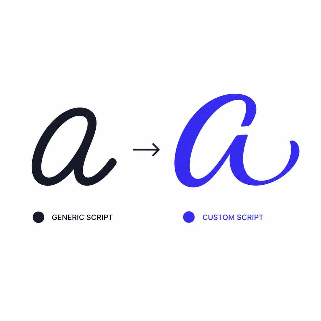
The challenge is that many couples begin with the same familiar script fonts. They are beautiful, but they also appear on thousands of invitation templates, wedding websites, signage packages, and place cards every year. A custom wedding font offers a more meaningful alternative. It can be built from your own handwriting, a partner’s calligraphy, or lettering created especially for the occasion. Instead of selecting a style that merely looks wedding-appropriate, you create an invitation typeface that reflects your relationship and can be used throughout the entire event.
This guide explains how to make a wedding invitation font that looks polished enough for print while still preserving the warmth of real handwriting. You will learn how to choose a suitable style, prepare calligraphy for digitization, refine it into a usable font, and apply it consistently across a complete stationery suite.
Why Font Choice Matters for Weddings
Wedding typography establishes tone before a guest reads a single sentence. A high-contrast serif with generous spacing can suggest a black-tie evening in a historic venue. Loose brush lettering may feel celebratory and artistic. A rounded handwritten style can communicate an intimate backyard dinner. Even practical details such as the time, dress code, and RSVP instructions feel more considered when they appear in a cohesive visual system.
A wedding invitation font also affects readability, which is especially important for the information guests need to act on. Names may be expressive, but ceremony times, addresses, websites, and RSVP deadlines must be easy to scan. The most successful invitation designs usually pair a display style with a restrained supporting typeface. For example, use a personalized script for “Amelia & Daniel,” then set “Saturday, the eighteenth of May” in a clean serif or sans serif. This hierarchy lets the emotional parts of the invitation shine without making practical information difficult to understand.
Choosing a custom wedding font creates a level of recognition that a downloaded template cannot easily replicate. Perhaps the lettering comes from the way one partner writes notes to the other, from a grandparent’s signature, or from calligraphy created during the planning process. Those details turn typography into a keepsake. Later, the same letterforms can appear on thank-you cards, photo albums, anniversary stationery, or framed artwork.
There is also a production consideration: a font should work at the sizes where it will actually be used. Delicate strokes that look elegant on a screen may fill in during letterpress printing or disappear when foil stamped. Extremely ornate capitals may look lovely as a monogram but become cramped in a small envelope return address. Evaluate every design decision in context, at print size, and on the stock or process you expect to use.
Popular Wedding Font Styles and What Works Best
Choose a style that supports the mood and the medium
There is no single correct wedding stationery font, but certain categories consistently work because they balance personality with legibility. The key is to select a direction based on the event, the quantity of text, and how the lettering will be printed—not simply on what is currently trending.
Classic calligraphy is a natural choice for formal weddings. It often features a slanted rhythm, thick-and-thin stroke contrast, graceful entry strokes, and elegant capitals. This style works especially well for names, monograms, envelope addressing, and short lines such as “together with their families.” Keep the body text in a contrasting but quieter face. A traditional serif can give formal calligraphy structure and prevent the design from looking overly ornate.
Modern calligraphy is generally more relaxed. Its baseline may vary slightly, its flourishes can feel freer, and its letters often have wider spacing. It suits contemporary celebrations, garden settings, and editorial-inspired suites. Because it can become expressive quickly, test words with lots of ascenders and descenders, such as “September,” “celebration,” and “country.” If those letterforms collide, reduce the flourishes or reserve this style for larger headings.
A handwritten wedding font is ideal when you want the invitation to feel personal rather than traditionally formal. Monoline handwriting, in which strokes are close to one consistent width, is especially versatile. It reproduces cleanly on digital printers, risograph, and simple home-print pieces. It can also work beautifully alongside watercolor artwork or candid engagement photography. The risk is making it look too casual or childlike, so aim for steady letter height, deliberate spacing, and readable punctuation.
Serif-led wedding typography has become popular for couples who want something refined without relying on script. Consider a custom serif based on hand-drawn letterforms, perhaps with slightly irregular terminals or unique alternate capitals. This approach feels bespoke while remaining easy to read in longer passages. It is excellent for destination guides, weekend itineraries, menus, and other pieces that require more copy.
For a quick style test, write the couple’s names, the date, the venue name, and a full address in your chosen lettering. A style that succeeds only with a two-word name is not necessarily a practical font for wedding invitations. Test uppercase letters, numerals, ampersands, and common punctuation early. These are exactly the characters that appear most often in wedding materials.

Creating a Custom Wedding Font From Calligraphy
Start with intentional source lettering
The quality of your source material determines how much cleanup will be needed later. Before writing the alphabet, decide whether you are making a full working font or a smaller display font. A complete font includes uppercase and lowercase letters, numerals, punctuation, symbols, and ideally accented characters. A display-only font may be enough if it will be used just for names, headings, and a few recurring phrases. For a full invitation suite, a broader character set is usually worth the extra effort.
Use smooth, bright white paper and a dark pen, marker, or calligraphy nib. Black ink creates the clearest contrast for scanning. Avoid textured paper, shadows, bleed-through, and very faint ink. If you are writing with a pointed pen, give the ink enough time to dry before scanning. Creating two or three versions of difficult letters—especially uppercase A, G, J, K, Q, R, and S—gives you better options later.
Write each character separately and leave clear space around it. Keep the x-height, or the height of lowercase letters such as x and a, reasonably consistent. You do not need to eliminate all natural variation; slight irregularity is often the charm of a custom wedding font. But consistency in overall scale, slant, and stroke behavior will make the final typeface look purposeful rather than accidental.
Pay special attention to letters that connect. In script lettering, a lowercase “o” may join differently from an “s,” “r,” or “v.” If your design relies on seamless connections, create common letter pairs such as “th,” “st,” “ll,” “tt,” “in,” and “on.” These combinations can later guide spacing decisions or become ligatures—special characters that replace two letters with a more natural joined form.
Scan the page at 300 dpi or higher; 600 dpi is even better if fine pen detail is important. A phone camera can work in good daylight, but place the page flat and photograph it directly from above to avoid perspective distortion. Save a high-resolution original before adjusting contrast. This preserves your options if you need to revisit the artwork after seeing a printed proof.
Digital Production Tips for a Print-Ready Font
Once your lettering is digitized, the goal is to preserve its character while making it function like a reliable font. Start by cleaning the scan: increase contrast, remove stray marks, and ensure the letter edges are distinct. If you convert the drawing to vectors, inspect curves closely. Automated tracing can introduce too many points, producing bumpy edges and files that are harder to edit. Simplify curves where possible, but do not smooth away the distinctive turns that make the lettering feel human.
Next, establish a consistent baseline, cap height, x-height, ascender height, and descender depth. These invisible guides are what let letters sit together naturally. A lowercase “g” should extend below the baseline without interfering with the next line, while a capital “H” should align with the other capitals. Small inconsistencies can be charming; dramatic ones make words look as though individual letters came from different alphabets.
Spacing, also called side bearings, matters as much as the drawings themselves. Look at words rather than single glyphs. A lovely lowercase “a” can still make every word feel uneven if it has too much empty room on one side. Then check kerning: the space between specific pairs such as “To,” “AV,” “Wa,” and “Yo.” Wedding names often reveal issues quickly. Print test lines containing names, dates, venues, and web addresses at their intended size.
Be conservative with thin details. At 12 points, an ultra-fine hairline may not survive certain printing methods. Letterpress can soften fine counters, foil can spread slightly, and textured cotton paper can reduce edge sharpness. If your invitation will use these finishes, ask the printer for a proof or run a small test before committing. In many cases, slightly sturdier strokes create a more luxurious printed result than fragile lines that only look impressive at high zoom.
You should also decide which characters your font must support. At minimum, include uppercase and lowercase letters, numbers, periods, commas, apostrophes, hyphens, parentheses, question marks, exclamation points, ampersands, and currency symbols if relevant. Add accented characters for names and places such as José, Zoë, Montréal, or Reykjavík. Do not forget the ampersand: it is one of the most visible symbols in wedding design, and a thoughtfully drawn “&” can become a signature feature.
If manual font software feels overly technical, an image-to-font workflow can remove much of the barrier. Snapafont can turn prepared lettering from an image into a downloadable .TTF font file, allowing couples and designers to move from handwritten characters to a usable digital typeface without building every file from scratch. Even with a streamlined tool, proofing remains essential: install the font, set real invitation copy, and inspect it at actual print scale before finalizing the design.
Using Your Font Across the Full Wedding Suite
Build consistency without using the custom typeface everywhere
A custom font becomes most valuable when it unifies the entire guest experience. Begin with the save-the-date and formal invitation, then carry the same visual language into RSVP cards, details cards, envelope addressing, wedding websites, welcome signs, menus, programs, place cards, table numbers, favors, and thank-you notes. Repetition makes the typeface feel like part of the event’s identity rather than a one-off decoration.
That said, use the custom lettering strategically. A highly expressive script can be tiring in paragraphs and frustrating for guests trying to find a schedule. Create a simple hierarchy. For example, set the couple’s names and section headings in the custom font, use a readable serif for invitations and menus, and use a neutral sans serif for tiny practical text such as URLs, dietary markers, and RSVP instructions. This three-part system gives you personality, elegance, and clarity.
Consider a realistic suite for a late-summer vineyard wedding. The custom wedding font could appear in large type for “Sofia & Miles” on the invitation, “Welcome” on the ceremony sign, and guests’ names on escort cards. A warm serif could handle the ceremony details and menu descriptions. A compact sans serif could label shuttle times and allergy information. Each piece feels connected, but none asks the decorative font to do a job it cannot perform well.
Make a small style guide before sending files to vendors. List the font names, approved sizes, color values, line spacing, and where each style should be used. Include samples for the invitation, signage, and menus. This prevents inconsistent substitutions when a stationer, planner, signage vendor, or family member creates additional pieces. Keep both the original font file and a PDF proof in a shared folder, and confirm whether vendors need the font installed or only need outlined artwork.
Finally, think beyond the wedding day. A personalized invitation typeface can make post-wedding thank-you notes especially cohesive, and it can be reused on holiday cards or anniversary materials. That long-term usefulness is one reason a well-made custom font is more than an invitation trend: it becomes a small, enduring design asset with personal history.
Turn Your Handwriting Into a Wedding Font You Can Use
You do not need to settle for the same script seen across every wedding template. If you have a page of calligraphy, a meaningful handwriting sample, or an alphabet you have drawn for your celebration, you can turn it into a wedding stationery font that is genuinely personal. Start by creating a clean, high-contrast character sheet, include the letters and symbols your suite needs, and test the resulting font with real names, dates, and addresses.
For a simple path from image to usable type, try Snapafont at snapafont.com. Upload your prepared lettering and create a downloadable .TTF file that can be installed in common design tools. You will still want to proof the font carefully and pair it with an accessible supporting typeface, but the result can give every invitation, sign, menu, and thank-you note a visual signature that belongs only to you.
Ready to turn your image into a font?
Upload any image and get a real, downloadable .TTF font file in seconds.
Try Snapafont Free →

