A convincing chalkboard font is more than a typeface with a rough edge applied to it. The familiar look of restaurant specials, classroom boards, café menus, and hand-drawn signs comes from physical behavior: chalk skips over uneven slate, dust gathers around strokes, pressure varies from letter to letter, and a human hand never repeats the same movement exactly. Those details create the warmth people associate with chalk typography.
The challenge is that standard digital fonts are designed for consistency. Every “A” is usually identical, spacing is mathematically controlled, and clean vector outlines can feel too polished. To recreate a chalkboard font successfully, you need to preserve the personality of the original lettering while making it usable in digital design software. This guide walks through the practical process, from preparing and photographing a chalkboard to extracting letterforms, cleaning a font, and restoring the texture that makes it feel genuinely hand-made.
Whether you are digitizing a favorite hand chalk font, building a custom chalkboard lettering font for a business, or experimenting with your own lettering, the goal is not perfection. The goal is controlled imperfection: readable characters with enough variation, grain, and irregularity to retain the feeling of real chalk.
Why Chalkboard Fonts Are So Distinctive
A chalkboard style font has a visual vocabulary that differs from marker lettering, pencil writing, or distressed print. First, its stroke edges are rarely solid. On a real board, tiny gaps appear where chalk catches only the raised parts of the surface. Thick strokes often have a denser center and broken outer edges, while thin strokes may fade in and out. This inconsistency is one of the strongest clues that viewers use to recognize chalk lettering.
Second, chalk has pressure-based variation. A person pressing hard at the beginning of a downstroke may leave a bright, wide mark, then lift slightly as they turn a corner. Rounded letters such as O, C, and S often show subtle differences in density around their curves. Even block lettering has this quality: the vertical line of an H may be heavy, while the crossbar looks lighter or more granular. When trying to recreate a chalkboard font, preserving these contrasts matters more than making every outline perfectly smooth.
Third, chalkboard lettering tends to include construction quirks. Baselines may wobble slightly. A capital E may have three bars of different lengths. The bowl of a P may be a little too high, and an R may have a lively angled leg. These are not necessarily mistakes; they are signs of a hand interpreting letterforms in real time. A useful chalkboard lettering font should keep enough of these traits to feel expressive without becoming difficult to read at normal sizes.
Finally, context shapes the look. White chalk on black slate is the classic reference, but chalk can also be pale gray, cream, yellow, pink, or muted blue. A dark green classroom board produces a different mood from a black restaurant menu board. Keep this in mind when evaluating a chalk font digital version. The font itself provides the letter shapes, but the final chalk effect also depends on contrast, background texture, stroke color, and the amount of dust or wear used in the composition.
Photographing Your Chalkboard Lettering for Digitization
Create a source image that is easy to convert
The quality of your source image determines how much repair work you will need later. Before writing, clean the board enough to remove distracting smudges, but do not aim for a flawless surface. A little board texture is useful reference material. Use fresh chalk if possible, because old, rounded pieces can make very thin, faint marks that are harder to capture. Write each character generously, leaving space around it so letters do not merge during processing.
For a complete font, make a deliberate character set rather than photographing a few decorative words. At minimum, include uppercase A–Z, lowercase a–z, numbers 0–9, and the punctuation you expect to use. Include symbols such as ampersands, apostrophes, periods, commas, question marks, exclamation points, parentheses, hyphens, and slashes if the font will be used for menus or social graphics. Write repeated characters where helpful—for example, two or three versions of a, e, s, r, and t—so you can choose the strongest sample or retain alternates later.
Photograph the board straight on, with the camera sensor parallel to the surface. This reduces perspective distortion, where letters near the outer edges become wider or taller than those in the middle. Use diffuse, even light from a window or softbox. Direct overhead lighting can create glare on a slate board and shadows from chalk buildup. Turn off flash, avoid dramatic filters, and use the highest-resolution camera setting available. A tripod or stable support is especially helpful because even a small amount of blur can soften the broken edges that give chalk its character.
If photographing is impractical, scan a sheet of dark paper or card that you have lettered with chalk. Scanning provides consistent lighting and can capture fine grain well. However, a photographed real board often retains more authentic surface variation. Whichever method you choose, save an untouched original before adjusting contrast, cropping, or removing the background. You may need to return to the original image when a faint stroke disappears during cleanup.
Handle Imperfection Without Losing Legibility
Know what to preserve and what to correct
The most common mistake in chalk font digital projects is over-cleaning. It is tempting to trace every letter into perfectly smooth vectors, align every baseline, and make all stroke widths identical. The result may be technically neat, but it no longer resembles a hand chalk font. Instead, separate useful imperfection from accidental damage.
Useful imperfections include slightly uneven edges, subtle changes in stroke width, imperfect circles, small baseline shifts, and minor differences between similar letters. These details communicate movement and material. For instance, if the two vertical strokes of a capital M are not exactly the same width, that can add charm. If the crossbar of an A sits a little high, it may become part of the typeface’s personality. Keep these decisions consistent enough that they look intentional.
Correct problems that interfere with reading or spacing. Remove large accidental blobs, disconnected pieces that make a character ambiguous, and overly faint areas that cause a letter to disappear at smaller sizes. Check confusing pairs carefully: I and l, O and 0, S and 5, B and 8, and r and n can become hard to distinguish in textured lettering. Also inspect internal spaces, known as counters. If the counter in an e, a, o, p, or d fills in after conversion, the font will look muddy rather than chalky.
A practical test is to view your letters at several sizes. At poster scale, you can preserve more grain and broken edges. At 14 or 16 points, too much fragmentation can make text tiring to read. Build the primary font for a useful middle ground, then use texture layers in individual designs when you want a more dramatic, close-up chalk effect. This division gives you a flexible font rather than a novelty file that only works in one large headline.
Extract and Clean the Letterforms
Turn a photographed alphabet into a usable font
Start by cropping the photographed board so that the lettering fills the image while retaining a margin around each character. Convert the image to grayscale first. Then adjust levels or curves gradually to increase separation between the chalk and the board. Avoid pushing contrast so far that all internal grain turns into solid white. A good extraction retains the main body of each stroke while preserving a few natural breaks near the edges.
Next, isolate the lettering from the background. In an image editor, this may involve selecting the light chalk marks, masking the board, and removing stray dust that is not connected to any character. Work at high zoom, but regularly zoom back out to make sure your fixes improve the overall form. A mark that looks important at 800% may be invisible at actual type size. Keep a copy of the cleaned raster artwork as an archive; it is useful for future texture overlays and promotional graphics.
When preparing characters for font creation, give each glyph a consistent canvas and naming system. Ensure the baseline is approximately aligned, but do not force every character into rigid uniformity. Set reasonable side bearings—the space on the left and right of each letter—because spacing has as much influence on a chalkboard font as the shapes themselves. A playful uppercase display style can use slightly uneven spacing, but words should still read as groups rather than as isolated drawings.
This is where an image-to-font workflow can save substantial time. Snapafont can turn a clear image of your letterforms into a downloadable TTF font file, helping you move from physical chalk lettering to a font you can install and use. Before uploading any source image, organize the characters clearly and make sure the lettering is high contrast. The cleaner the source structure, the less time you will spend correcting recognition issues afterward.
After generating the font, test it in real phrases rather than judging each glyph alone. Type a café menu heading, a school event poster, a quote graphic, and a paragraph of short labels. Look for awkward combinations such as To, Wa, Yo, AV, and Ty, where shapes can collide or leave distracting gaps. If your tool allows character spacing or kerning adjustments, refine the pairs that appear most often. The test phrase “Sphinx of black quartz, judge my vow” is also helpful because it contains every letter of the alphabet.
Add Texture Back for a More Believable Chalk Effect
Use the font as the foundation, then build the surface
A font file cannot always carry every subtle grain pattern from a physical board, especially when it needs to remain readable across different sizes and apps. The strongest approach is often to use the cleaned chalkboard font as the foundation and add visual texture in the final design. This lets you control the amount of wear for each project instead of locking one heavy effect into every letter.
Begin with a dark background that has restrained variation: slate black, charcoal, deep green, or muted navy can work well. Add a photographed board texture or a subtle noise layer above it at low opacity. Avoid highly detailed backgrounds that compete with the words. Then set your text in an off-white rather than pure white. Real chalk is usually soft and powdery, so colors such as warm ivory, light gray, or pale cream often look more natural.
To distress the letters, place a speckled mask or fine noise texture over the text and use it to create small transparent gaps. Keep the effect modest. Randomly deleting too much of the type makes it look like damaged printing, not chalk. Better results come from dense centers, imperfect edges, and occasional pinhole gaps. You can duplicate the text layer, blur the lower copy slightly, and reduce its opacity to suggest chalk dust around the strokes. Use this sparingly; a strong glow looks more like neon than powder.
For a menu or sign design, vary hierarchy the way a real chalk artist would. Use larger capitals for headings, a simpler line for prices or details, and small decorative flourishes only where they support the layout. Combining one expressive chalkboard style font with a clean sans serif can improve readability while preserving the handmade mood. For example, use the chalk lettering for “Saturday Brunch,” then set the time and address in a simple, well-spaced sans serif. This keeps the visual personality without asking textured letters to do every job.
If you want multiple versions of the same word to feel more natural, do not always duplicate a single text layer. Slightly change rotation, tracking, line position, or texture intensity between uses. If your font workflow supports alternate glyphs, use them for repeated letters in words such as “coffee,” “little,” or “dessert.” Variation is central to believable chalk typography because real chalk marks are never copied with machine precision.
Turn Your Chalk Lettering Into a Font You Can Use Anywhere
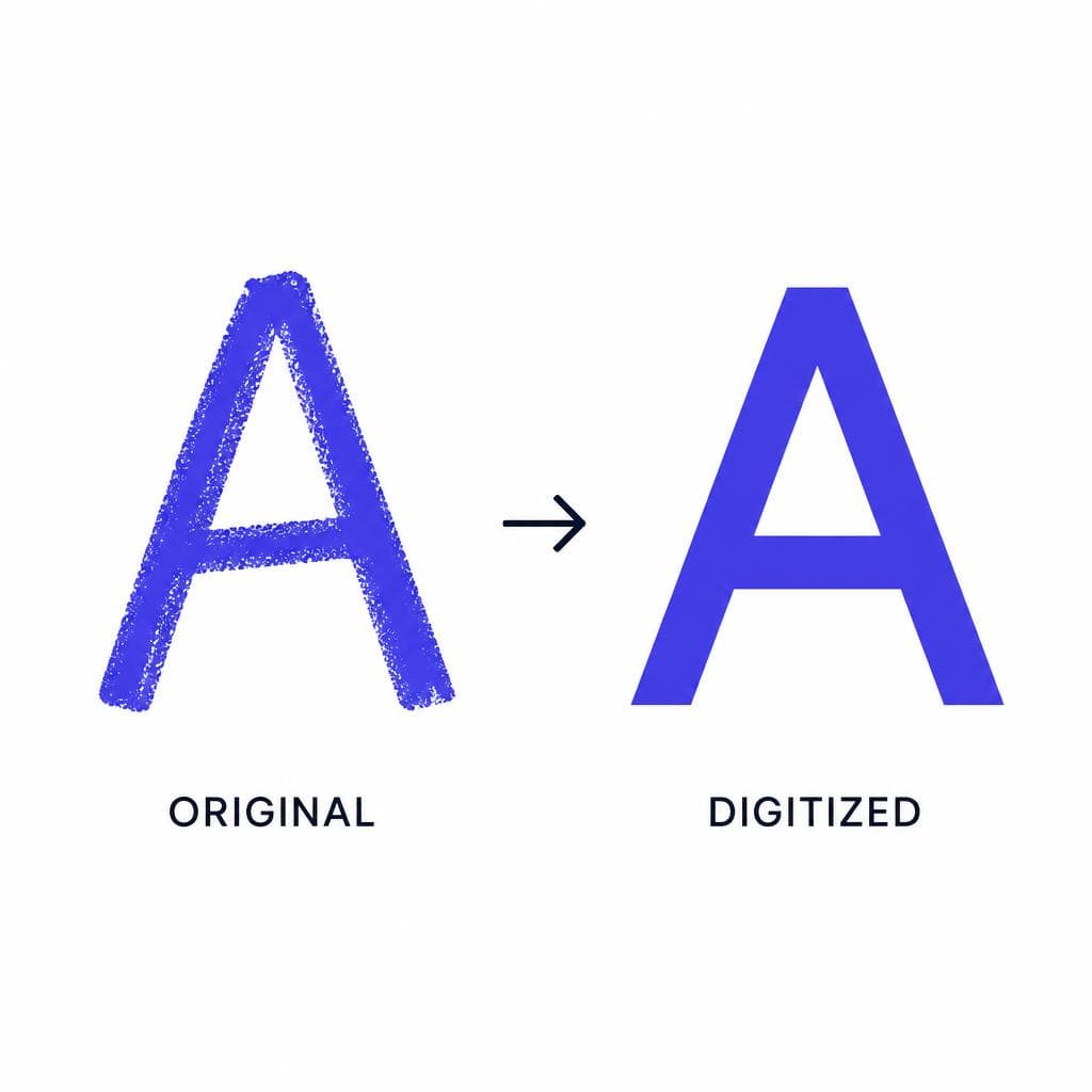
Digitizing chalk lettering does not mean stripping away everything that made the original special. With a well-lit source image, thoughtful cleanup, readable spacing, and a carefully controlled texture treatment, you can preserve the character of a real board while gaining the convenience of a reusable font. That means your favorite lettering can appear consistently across menus, posters, invitations, presentations, packaging, and social posts without needing to redraw every headline by hand.
If you have a photographed alphabet, a page of hand lettering, or an image containing a style you want to preserve, try creating a usable font with Snapafont. Visit snapafont.com to upload your image and turn it into a downloadable TTF file, then test the result in the design tools you already use. Start with a clean, high-contrast character set, keep the best imperfections, and refine the final chalk effect in your layouts for the most authentic result.
Ready to turn your image into a font?
Upload any image and get a real, downloadable .TTF font file in seconds.
Try Snapafont Free →

