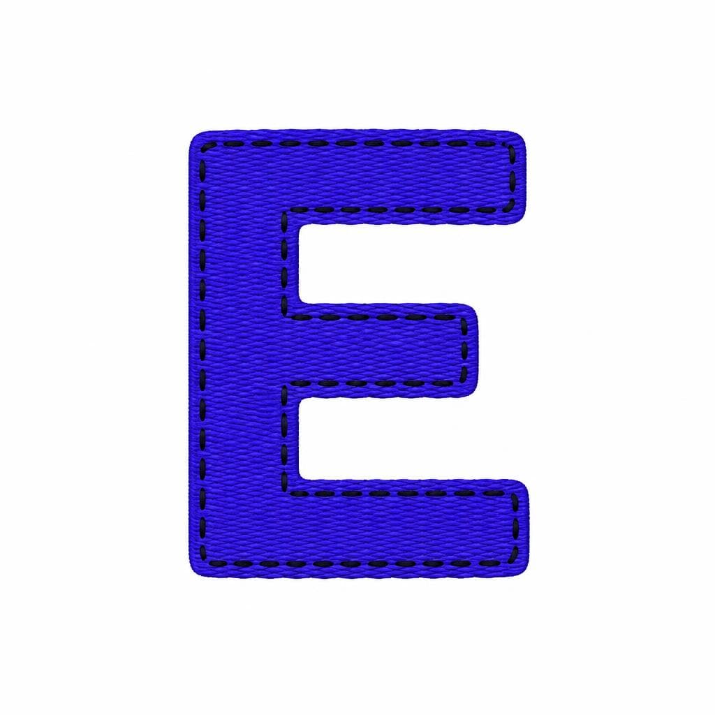
Embroidered lettering has a texture and weight that makes it instantly distinctive—and almost impossible to find in a conventional font library. Thread catches light, stitches introduce tiny variations, and the fabric beneath the design subtly changes every curve. Whether you are preserving a vintage jacket patch, rebuilding a team crest, matching a workwear badge, or adapting a hand-stitched wordmark for digital use, the goal is usually not to make an exact photographic copy. It is to create a usable font that retains the character of the original.
Creating a font from embroidery requires a different mindset from tracing clean ink lettering. You need to identify the underlying letterforms, decide which stitch details are essential, and remove the visual noise that makes a stitched sample difficult for software to interpret. This guide explains how to photograph, prepare, extract, and refine embroidery into an editable font file—while keeping the tactile personality that made the sample worth recreating in the first place.
Why Embroidered Fonts Are So Distinctive
An embroidered lettering font is more than a typeface with a rough texture applied over it. Its appearance comes from the relationship between letter shape, stitch direction, thread thickness, tension, and fabric. A satin stitch can make a narrow vertical stroke look glossy and dense. A chain stitch may make the same stroke feel loose, handmade, and dimensional. Even a simple block alphabet can become visually unique when the thread direction changes inside each letter.
This is why an embroidered logo font often feels more personal than a clean vector logo. The edges may be slightly uneven, counters can become smaller because thread expands into open spaces, and rounded corners are often fuller than their printed equivalents. Those traits are not necessarily defects. They are evidence of material and process, and they can make a reconstructed font feel authentic.
There are also two different outcomes people mean when they ask to recreate embroidery font designs. The first is a structural recreation: a clean, installable font based on the shapes of the embroidery, suitable for web graphics, packaging mockups, social posts, and editable text. The second is a visual recreation: a font or graphic system that also simulates stitch texture. In many practical projects, the best result combines both. Build a clean font first, then use an embroidery texture or effect selectively when the final artwork needs a sewn appearance.
Before extracting anything, inspect the sample for recurring design rules. Look at the width of vertical and horizontal strokes, the shape of terminals, the height of capitals, and the treatment of curves in letters such as C, G, O, S, and R. Notice whether the baseline is rigid or slightly irregular. If the source contains only a few letters, these observations will help you design missing glyphs that belong to the same stitching typography system rather than looking like unrelated substitutes.
Photographing Embroidery for Better Font Reconstruction
Capture the letterforms before you capture the texture
A strong source image reduces hours of cleanup. If you have physical access to the embroidered item, photograph it rather than relying on a compressed marketplace image, a social-media screenshot, or a photo taken from several feet away. Place the fabric as flat as possible and use a tripod or steady support so the camera is square to the lettering. Perspective distortion is especially harmful to fonts: a slightly angled photo can make one side of every letter appear wider or taller.
Use soft, even light from two sides if possible. Direct overhead light can create dark shadows between stitches, which may be useful for showing texture but makes it harder to distinguish the true boundary of each glyph. A bright overcast window, a light tent, or two diffused lamps generally work well. Avoid flash, since it can create shiny hotspots on polyester or metallic thread.
Photograph at the highest available resolution and leave room around the word. For small badge text, take both a full image and a close-up. The full image reveals overall spacing and proportion; the close-up helps identify stitch direction and edge behavior. If the fabric is heavily curved, such as on a cap or sleeve, take multiple images after gently flattening the area where possible. Do not stretch the material aggressively, because stretching can alter the letter shapes you are trying to preserve.
For a useful starting file, crop the lettering closely, straighten the baseline, and correct obvious perspective in an image editor. Keep an untouched original as reference. Your cleaned working image should make the letters easy to read at a glance, even if it does not yet look polished. That clarity matters much more than dramatic lighting or a perfectly styled product photo.

How to Deal With Thread Texture, Shadows, and Fabric Noise
Separate the letter shape from the material surface
The central challenge in embroidery font recreation is separating meaningful character from accidental noise. Individual stitches create ridges, gaps, highlights, and shadows. Woven fabric introduces its own grain. A camera may also add blur or compression artifacts. If all of that is treated as part of the letter outline, the resulting font can become lumpy, hard to read, and inconsistent at small sizes.
Start by deciding what must remain. Preserve details that repeat deliberately across the sample: a scalloped border used on every stroke, a consistent puffiness around corners, or a visibly irregular hand-stitched contour. Simplify one-off issues such as a loose strand, a snag, a deep shadow, or a fold in the fabric. A good rule is to ask: would this feature appear again if the same letter were stitched a second time? If not, it usually belongs in the source image, not in the font outline.
In an image editor, try a grayscale conversion first, then adjust levels or contrast until the thread separates from the background. Do not push contrast so far that thin joins disappear or bright thread becomes broken into fragments. For multi-color embroidery, isolate the thread color with a color-selection tool, but inspect the selected edges manually. Similar colors in the fabric, backing, or shadows can be mistakenly included.
For especially textured samples, prepare two versions of the image. Version one should be high contrast and optimized for identifying the silhouette. Version two should retain the original color and surface detail as a visual reference. Use the silhouette version for letter extraction, while checking the reference version whenever you are unsure whether a bump is part of the intended form. This approach avoids the common mistake of turning a beautiful stitched word into a fuzzy digital outline.
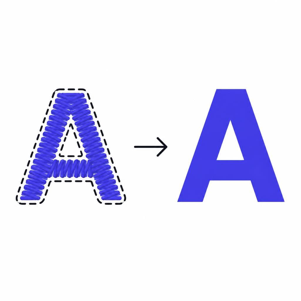
The Extraction Process: Turning Embroidery Into a Usable Font
Build a clean alphabet from the best available letters
Once the source image is prepared, isolate each character as cleanly as possible. If the embroidery is a wordmark, separate letters with a little surrounding margin so their edges are not clipped. Keep the letters in their original order for reference, but also make individual crops. This makes it easier to compare repeated forms—for example, whether two lowercase e characters truly share the same structure or differ because of stitch variation.
Next, establish the font’s basic metrics. Identify the baseline, cap height, x-height, ascender height, and descender depth. In an embroidered sample, these lines may not be perfectly precise, so use the average visual alignment rather than forcing every stitch edge into a rigid grid. If the original is all caps, use its cap height as the primary reference. If it includes lowercase characters, compare letters such as x, n, o, b, p, and g to infer the full system.
A practical workflow for a stitch font digital file is to begin with representative letters: H, O, n, o, A, and S. H reveals stroke thickness and spacing; O reveals curve behavior; n and o establish lowercase rhythm; A tests diagonals; S exposes whether the style can handle changing curvature. Once those are working, expand to the rest of the alphabet. Reuse consistent elements where appropriate. For example, the bowl of P may inform R, and the curve of C may help build G.
When you use an image-to-font workflow, provide a clean, high-contrast source and review the resulting characters rather than accepting them blindly. Snapafont can turn letter images into a downloadable .TTF font file, making it a practical starting point for converting a prepared embroidery sample into editable type. The quality of the result still depends on the source: clear separation, sensible cropping, and consistent letter alignment give any extraction tool much better information to work with.
After generating the font, test it with realistic words, not just isolated glyphs. Type the original embroidered word, then test names, headings, numbers, punctuation, and repeated-letter combinations such as “LL,” “OO,” “nn,” and “tt.” Look for spacing collisions and overly wide gaps. Embroidery often has custom manual spacing, so the space between letters in a photographed logo may not translate directly into a reusable font. Adjusting side bearings and kerning is what turns a collection of traced letters into type that feels intentional.
If you only have a partial alphabet, be transparent about where reconstruction begins. Use the existing letters as rules, not as a license to copy a different font for missing characters. Match stroke width, corner softness, contrast, and proportions. For a vintage varsity patch, a newly drawn B should echo the same squared bowls and padded edges as the original A and R. For delicate script embroidery, pay special attention to entry and exit strokes so new letters connect naturally.
Where a Recreated Embroidery Font Is Most Useful
A recreated embroidery font is valuable because it lets you extend a visual identity without repeatedly redrawing lettering. A small business can preserve the character of an old apron, storefront banner, or uniform badge while producing digital menus, stickers, event signage, and social graphics. A sports club can rebuild a legacy embroidered logo font for anniversary merchandise and player materials. A fashion or craft brand can use its recognizable stitched lettering in lookbooks, hang tags, email headers, and product mockups.
It is also useful for restoration projects. Museums, family archives, theater groups, and historical societies often have garments or textiles with lettering that cannot be easily reproduced by standard font libraries. A digital reconstruction allows them to label exhibits, create educational materials, or make reproduction graphics while keeping a connection to the original object.
For design work, consider using the font at display sizes first. The slight irregularity that makes stitching typography charming may become difficult to read in tiny interface labels or long body copy. Pair it with a neutral text typeface for paragraphs and reserve the recreated font for titles, short phrases, initials, product names, or branded callouts. This creates contrast while keeping the embroidered style special.
Finally, distinguish between a font and an actual embroidery production file. A .TTF is ideal for typing and designing digital layouts, but embroidery machines generally need formats such as DST, PES, EXP, or JEF, along with stitch-path planning. If your final goal is physical stitching, use the recreated font as artwork, then have it digitized for the specific machine, fabric, thread, and stitch technique. Lettering that looks perfect on screen may need underlay, pull compensation, and minimum-stitch-width adjustments before it sews cleanly.
Start With the Best Version of Your Embroidered Lettering
The most successful embroidery font recreation projects start with a clear sample and a clear purpose. Clean up the photograph, preserve the characteristics that make the stitching recognizable, and test the result in the words your brand or project actually needs. You do not have to reproduce every stray thread to retain the warmth, weight, and handmade confidence of the original.
When your letter images are prepared, Snapafont provides a straightforward way to convert them into an installable font you can use in everyday design software. Upload your cleaned character samples, generate a .TTF, and test the type in real layouts before committing to final artwork. Try it at snapafont.com to turn a distinctive embroidered reference into a flexible digital asset while keeping the original’s personality intact.
Ready to turn your image into a font?
Upload any image and get a real, downloadable .TTF font file in seconds.
Try Snapafont Free →

