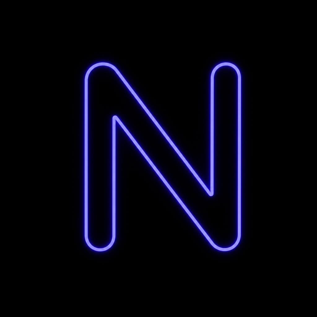
Neon signs have some of the most distinctive lettering in the world—and almost none of it exists in a standard font database. A hand-bent diner script, the compressed capitals above an old theater, or the looping logo on a motel marquee may look like type, but it was often drawn specifically for that sign. Its proportions were shaped by glass tubing, mounting hardware, viewing distance, and the practical limits of bending a glowing tube.
That is exactly why designers, historians, brand teams, and sign enthusiasts want to capture a font from neon sign imagery. Turning a photograph into a usable typeface can preserve an endangered piece of visual culture and make a project feel far more authentic than applying a generic “neon” effect to an unrelated font.
The process is not as simple as tracing the bright parts of a photo. To recreate neon font lettering successfully, you need to separate the letterform from its glow, correct camera distortion, make careful decisions about damaged or missing characters, and clean the resulting shapes without erasing their personality. This guide explains a practical workflow, from photographing a sign through extracting and refining a neon typeface you can actually use.
Why Neon Fonts Are So Unique
A neon sign font is rarely just a conventional typeface rendered in light. Many classic signs were designed by sign painters, fabricators, or architects rather than type designers. They may borrow from Art Deco, mid-century modern, streamline lettering, western display faces, or handwritten scripts, but their final forms were usually customized for one location and one name.
Neon construction changes letter shapes in visible ways. Each character is made from a continuous—or nearly continuous—glass tube. Tight inner corners may be rounded. Crossbars can be interrupted. Script letters may connect in unconventional places so the installer can route the tube efficiently. Capitals might be narrower than expected to fit a storefront, while curves can become broad and open to remain legible from across a street.
This makes vintage neon typography particularly valuable: its quirks are evidence of how the sign was made. For example, an “E” may have unusually short middle and lower arms, an “R” may have a dramatically extended leg, or an “S” may be flatter and more geometric than a comparable printed letter. These details are easy to “correct” during vector cleanup, but correcting them too aggressively often turns a one-of-a-kind sign into a bland imitation.
It also helps to distinguish between three layers in a neon image. First is the underlying letter skeleton: the route the tube follows. Second is the tube itself, with its width, caps, joins, and slight irregularities. Third is the emitted light: the halo, reflections, bloom, and color spill around the tube. When creating a reusable font, the letter skeleton and tube outline are generally the useful data. The glow is a visual treatment that should usually be recreated later in design software.
A final challenge is character coverage. Most signs only display a business name or a short phrase, not a full alphabet. You might have enough letters to identify a style but not enough to build a comprehensive font without designing the missing glyphs. A good neon font recreation therefore balances faithful extraction with informed extrapolation.
Photographing a Neon Sign for Font Extraction
Start with the best possible source image
The quality of the source image has a direct effect on how much cleanup your font will need. If you can photograph the sign yourself, capture more than one version. Take a straight-on image for tracing, a wider environmental shot for reference, and close-ups of difficult letters, joins, or damaged sections. A sign photographed at an angle can still be useful, but a frontal image saves significant time correcting perspective.
Use the highest resolution available. Avoid social-media screenshots, heavily compressed web images, and images where the sign occupies only a small portion of the frame. Fine details such as tube gaps, end caps, bends, and overlap points can disappear quickly at low resolution. If possible, shoot RAW so you have greater control over highlights and color in editing.
For a nighttime photograph, expose carefully to preserve the bright tubing. Automatic exposure frequently blows the tubes out into solid white shapes, eliminating the edges you need to trace. Lowering exposure, using a tripod, and bracketing several shots can help retain detail. A slightly underexposed image is usually more useful for lettering analysis than a spectacular but overblown neon photograph.
Daytime images can be unexpectedly valuable as well. When the sign is unlit, you may be able to see the actual tube route, supports, paint, and backing more clearly. Photograph both lit and unlit versions when possible. The lit image reveals the intended visual weight; the unlit image often reveals the construction logic.
Correct perspective before attempting extraction. In Photoshop, Affinity Photo, GIMP, or similar software, use a perspective or transform tool to make baseline and cap-height lines horizontal and vertical. Do not stretch the sign blindly: use architectural elements such as window frames, sign borders, or brick courses as guides. If the sign is curved around a building or mounted on a rounded canopy, expect some distortion that cannot be perfectly flattened from a single image.
When you cannot take the photo yourself, document the source. Save the highest-resolution original you can find, note where it came from, and preserve an unedited copy. This is useful for historical accuracy and for rights review. A photographed sign is not automatically free to reproduce commercially; the sign design, logo, photograph, or associated trademark may carry rights. For personal study, restoration research, or properly licensed work, careful attribution and permission checks are sensible parts of the workflow.
How to Handle the Neon Glow Effect Without Losing the Letterform
Glow is the biggest obstacle when you want a font from neon sign photography. It makes the letters look larger, softer, and sometimes connected even though the physical tubes are separate. If you trace only the outermost bright halo, the resulting font will be too heavy and muddy. If you trace only the white-hot center, it may become too thin and mechanical.
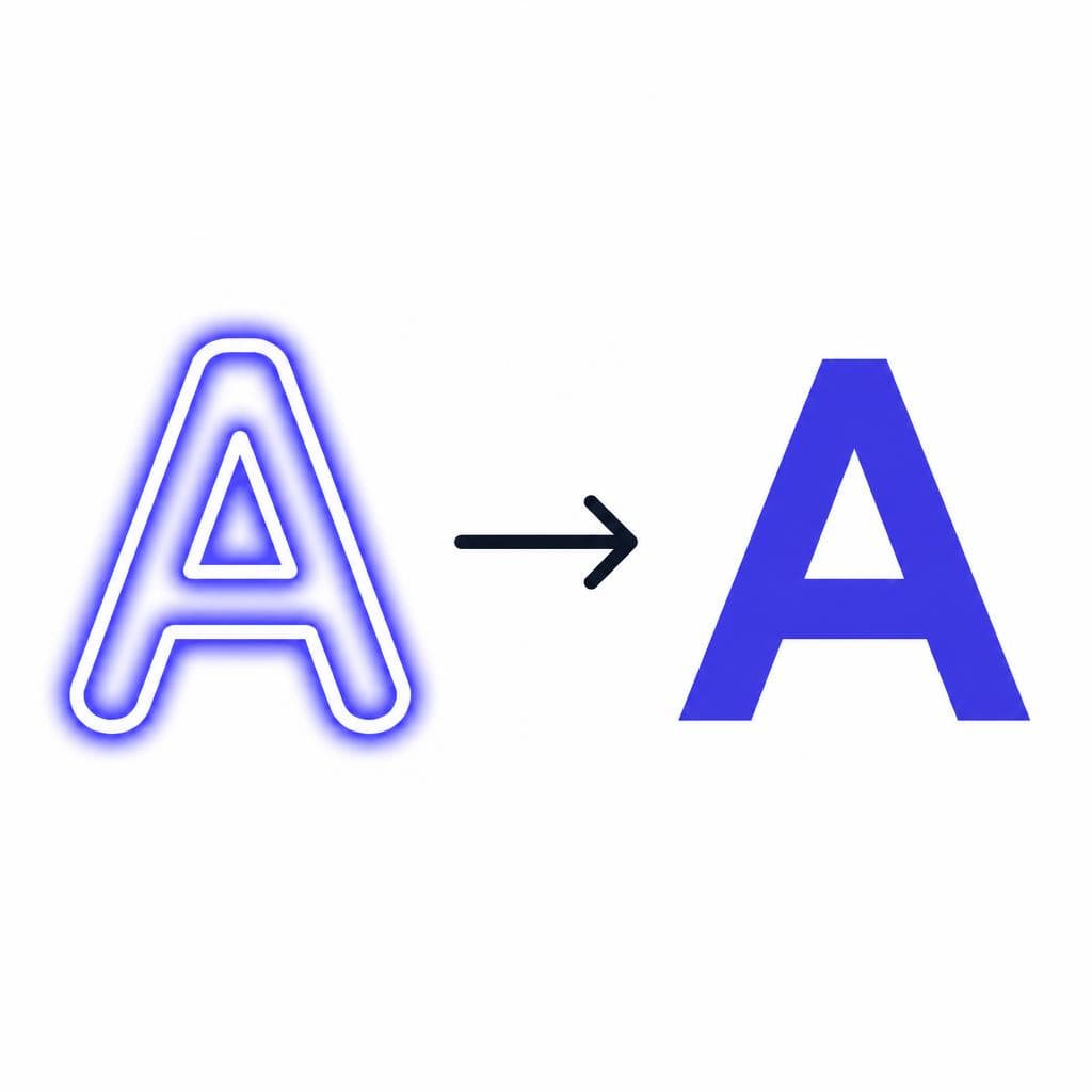
Begin by identifying the tube’s intended centerline. In a well-exposed photo, this is often visible as the brightest central region running through each stroke. Imagine drawing a single line down the middle of every tube. That line is the sign’s skeletal lettering. From there, decide what your font should represent: a monoline stroke font based on the centerline, or an outline font that reproduces the glass tube’s physical width.
For most reuse cases, an outline font is more flexible. It can be colored, stroked, filled, or given an outer glow in virtually any application. Build it from the visible tube edges rather than from the farthest edge of the light bloom. Keep the tube width reasonably consistent, but preserve intentional variations. A hand-formed script may widen gently at curves or terminals, and those slight differences can make the result feel authentic.
Image editing can help reveal tube boundaries. Reduce highlights and whites, pull down exposure slightly, increase local contrast carefully, and experiment with individual color channels. A red or blue channel may contain more useful edge definition than a composite RGB view, depending on the sign color and background. Avoid extreme sharpening; it can create false edges that make tracing harder.
Remember that glow should be added after the font is made. In a design tool, duplicate the text layer, blur the lower copy, tint it to match the tube color, and set an appropriate blend mode or opacity. Add a tighter inner bloom and a broader, low-opacity outer halo for more realistic results. This separation lets a single neon typeface work for print, web graphics, animation, and signage mockups without permanently embedding one photographic lighting condition into the letters.
Extracting and Cleaning Up Neon Sign Lettering
A practical conversion workflow
Once your reference is straightened and the glow is under control, isolate the clearest examples of each character. Crop individual letters or, if the word is tightly connected, crop the entire word first. Label the characters as you go. This simple step prevents confusion later when similar forms—such as “O,” “D,” and “Q,” or “I,” “l,” and “1”—need to be assigned to font slots.
Trace with as few nodes as possible. Whether you use Illustrator, Inkscape, FontForge, Glyphs, or another vector tool, smooth Bézier curves are essential. Neon tubing naturally creates broad, flowing arcs; a trace with dozens of tiny points looks jittery and is difficult to edit. Place points at changes in direction, use handles to control the curve, and compare the vector shape repeatedly against the source image.
Pay special attention to terminals, intersections, and gaps. In neon sign lettering, a visible break may be a deliberate electrical or construction gap rather than a missing stroke. For example, the middle bar of an “E” might stop short of the vertical stem, or a script connection may be implied by proximity rather than a literal join. Preserve these features when they contribute to the sign’s character, but make sure they remain readable at small sizes.
Next, normalize the font without sterilizing it. Establish a baseline, cap height, x-height if lowercase exists, and consistent side bearings. A photographed sign may sag slightly, have uneven letter spacing, or be mounted imperfectly. Those flaws may be charming in the original installation, but a functional font needs predictable spacing. Keep the distinctive drawn forms while correcting accidental camera skew and severe alignment drift.
If you have only a subset of letters, derive missing characters from the evidence you do have. Suppose your sign contains “M,” “O,” “T,” “E,” and “L.” The “O” establishes curve width, the “T” shows terminal treatment, and the “E” reveals horizontal-bar proportions. Use those rules to construct missing letters such as “C,” “G,” “F,” and “L.” Avoid copying an unrelated font to fill gaps; it often introduces incompatible contrast, curvature, or width. Instead, treat the existing sign as a miniature design system.
Test the alphabet in words, not just as isolated glyphs. Type sample phrases that stress different combinations: “MOTEL,” “COFFEE,” “NIGHT,” “SWEET DREAMS,” and “RIVERSIDE.” Check spacing pairs such as AV, TO, RO, LE, and script connections. Then test it at the size it will actually be used. A beautiful detailed trace may clog up in a small website heading, while a simplified version may be more readable and more faithful to how the sign appears from a distance.
For a faster route from image to editable font, Snapafont can turn lettering from a clean image into a downloadable .TTF file. You will still get better results by preparing a high-resolution, straight-on reference and removing obvious photographic distractions first. Think of automation as a way to accelerate character extraction and font generation, not as a replacement for the visual judgment required to preserve the original neon sign lettering.
Ways to Use a Recreated Neon Font
A recreated neon font can be useful well beyond an imitation sign graphic. For local businesses, it can preserve a recognizable visual asset when an original sign is being restored, moved, or documented. A restaurant with a beloved mid-century facade, for instance, could use its distinctive lettering on menus, event posters, apparel, and social posts while keeping the sign’s character consistent.
In editorial and heritage projects, a font derived from vintage neon typography can support a visual history of a neighborhood, road trip route, theater district, or hospitality brand. It can be used in exhibition labels, archival websites, documentary title cards, and map graphics. In these contexts, retain a clear record of what was directly extracted and what was reconstructed from incomplete evidence.
Creative teams also use a neon typeface for album covers, film concepts, game interfaces, themed invitations, and motion graphics. The strongest results do not rely on glow alone. Pair the lettering with dark negative space, a restrained color palette, subtle surface texture, and realistic lighting. A bright magenta tube against a deep blue-black background may work beautifully, but add too many flares, reflections, and gradients and the type becomes hard to read.
For digital use, make accessibility part of the design. Neon colors can have poor contrast against busy backgrounds, and light bloom can blur letter edges. Provide adequate contrast, avoid putting glowing text over detailed photography, and do not use decorative neon lettering for long body copy. It performs best for short headlines, logos, labels, and display-sized calls to action.
Finally, use the recreation responsibly. If the lettering is tied to an existing business identity, treat it as potentially trademarked or protected artwork. A custom font made for historical study may not be appropriate for selling unrelated commercial products. When in doubt, seek permission, license the design, or create an inspired-by typeface with meaningful differences rather than a direct duplicate.
Turn a Neon Reference Into a Font You Can Use
The best neon font recreation begins with observation: distinguish the tube from the glow, photograph or source the sign carefully, preserve its unusual construction details, and refine the letters for real-world use. Even a partial sign can provide enough evidence to build a compelling display alphabet when you approach it as a system rather than a collection of isolated shapes.
If you have a clean sign photo and want to move from reference image to working font more efficiently, try Snapafont at snapafont.com. Upload your prepared lettering image, generate a downloadable .TTF font file, and then review the characters for spacing, missing glyphs, and the details that make the original sign memorable. It is a practical starting point for preserving distinctive neon lettering while leaving you in control of the final creative and technical cleanup.
Ready to turn your image into a font?
Upload any image and get a real, downloadable .TTF font file in seconds.
Try Snapafont Free →

