A memorable box, bottle, pouch, or jar often owes as much to its lettering as it does to its colors or logo. Think of a hand-lettered coffee bag, condensed lettering on a vintage soda label, or the energetic script on a snack package. These designs can make people stop, recognize a product from across a shelf, and remember a brand long after the product is gone.
That makes product packaging one of the best places to look when you need distinctive typography for a design project. The challenge is that a font from packaging is rarely easy to identify with a standard font-matching tool. The text may be curved around a container, printed on textured material, distorted by a photo, or customized beyond recognition. In many cases, the lettering is not a retail font at all; it is a custom wordmark or hand-drawn display alphabet.
This guide explains how to find, identify, and recreate a product packaging font in a practical, responsible way. You will learn how to capture useful reference images, separate a font from a logo treatment, handle common extraction problems, and turn visible letterforms into a usable digital typeface. Whether you are restoring a retro look, creating a compatible secondary type system, or digitizing your own packaging lettering, the process starts with better reference material and ends with a font you can actually use.
Why Packaging Fonts Are So Distinctive
Package typography font choices are designed to work under unusually demanding conditions. Unlike a headline on a website, package text must compete with nearby products, communicate at a glance, survive small print sizes, and fit the personality of a physical object. A cereal box may use oversized, playful letters that appeal to children. A skincare label may rely on quiet, high-contrast serif type to suggest refinement. A hot sauce bottle might use heavy condensed capitals that remain readable on a narrow label.
Packaging also gives designers permission to be expressive. Letterforms may be stretched vertically, outlined, shaded, warped, stacked, or integrated with illustrations. A brand packaging font can include ligatures, swashes, uneven baselines, inline details, or intentionally irregular forms that would be impractical in body copy but powerful on a shelf. This is why a product packaging font often feels more original than the fonts used in ordinary advertising.
There are usually three layers to inspect. First, look at the main brand name or product title. This is the most likely area to contain custom lettering. Second, study category descriptors such as “sparkling water,” “dark roast,” or “limited edition.” These are often set in commercially available fonts and can provide clues about the broader type family. Third, examine small functional text, including ingredients, flavor names, weights, and claims. These details may use a more neutral packaging typeface selected for legibility.
Do not assume every visible letter belongs to one font. A craft chocolate wrapper, for example, might combine a custom script logo, a bold geometric sans for the flavor, a narrow serif for origin information, and a utilitarian sans serif for legal copy. Identifying each role separately produces a more convincing recreation than trying to force one typeface to do everything.
A useful way to describe what you see is to list visual traits rather than immediately naming a font: high or low contrast, rounded or sharp terminals, narrow or wide proportions, single-storey or double-storey “a,” decorative or plain capitals, connected or disconnected script, and geometric or humanist construction. These traits are more reliable than a first impression and give you a clearer search brief when using a label font finder or comparing candidate typefaces.
How to Photograph Packaging for Accurate Font Identification
Capture letters as evidence, not just as a pretty product shot
The quality of your source image determines how much success you will have identifying or recreating a font from label artwork. A stylish angled product photo may look great in a portfolio, but it is often a poor source for typography work. Your goal is to capture the lettering as front-facing, sharp, evenly lit, and large as possible.
Start with the physical package on a stable surface. Use diffuse daylight near a window or a soft light source that does not create glare. Glossy plastic, foil, glass, and metallic ink can produce bright reflections that erase parts of letterforms. Move the light or rotate the package until the text is visible without hotspots. Avoid using a direct flash unless you can diffuse it.
Place the camera parallel to the label whenever possible. Even a small angle can make vertical strokes lean and circles become ovals. If the packaging is flat, such as a box or pouch, take a straight-on photo at high resolution. If it is cylindrical, capture several overlapping close-ups rather than one wide photo. Photograph the center of the label, then each side, keeping the camera as perpendicular to each small area as you can. Later, those separate views can be corrected and compared.
Include every character you can find. The product name alone may show only six or seven letters, which is not enough to build a reliable alphabet. Search the front, sides, back, neck label, cap, promotional sticker, and alternate flavors. A single packaging line can reveal useful repeated characters: an “R” in the brand name, an “r” in “original,” an “a” in ingredients, and numerals in the net weight. If you are working from an online listing, look for a manufacturer image gallery, retailer photos, older package versions, or high-resolution press assets.
For best results, take both a full-pack shot and close-up crops. The full image preserves context, color, and layout; the crops make individual shapes easier to inspect. Save the original files rather than relying on compressed screenshots. A sharp image with letters at least 100 to 200 pixels high gives far better results than a tiny social-media image.
Finally, record where the package came from and when it was photographed. Packaging changes frequently. A 2024 label can use different lettering from a 2018 version, and limited editions may intentionally depart from the standard design. This simple note prevents you from matching the wrong era or recreating an outdated package typography font.
The Main Challenges of Extracting Type From Packaging
Know what you are looking at before you try to digitize it
The first challenge is perspective distortion. On a curved bottle or can, letters near the edges stretch away from the viewer, while letters in the middle may appear more accurate. Correcting this requires image editing software with perspective, warp, or mesh-transform controls. Work from the least distorted part of each image and compare repeated letters across multiple photos. Do not “fix” a curve by eye based on only one warped character.
The second challenge is print texture. Lettering may be embossed, debossed, screen printed, letterpressed, distressed, or printed over a photographic illustration. Shadows and texture can make a clean stroke look rough or broken. Before tracing, create a high-contrast working copy. Adjust levels so the type separates from the background, then use selective masking or manual cleanup to remove noise. Keep the original image on another layer so you do not accidentally erase a real detail such as an inline or a highlight.
A third challenge is distinguishing a font from custom logo art. A wordmark with unique connections between letters, altered proportions, or illustration-like details should be treated as lettering, not proof that a full font exists. For example, if a package has a distinctive “S” with a long tail that flows under the whole brand name, that feature may be unique to the logo. You can recreate the logo as vector artwork, but inventing a full alphabet from it requires careful decisions about how the style should behave on letters you cannot see.
Limited character coverage is another common problem. Suppose a tea carton shows only the word “MINT.” You might see the uppercase M, I, N, and T, but no curves, lowercase letters, punctuation, or numerals. In that case, do not claim you have identified the exact packaging typeface solely from four characters. Search related products, advertising materials, web pages, and brand guidelines for more samples. If no additional evidence exists, create a restrained companion font based on the visible principles rather than pretending to reproduce an unknown complete family.
Color effects can confuse automated matching as well. Shadows, outlines, gradients, and highlights may make one letter appear like several nested shapes. Isolate the core silhouette first. A red outlined “O” with a cream drop shadow is still, at its core, an O with a particular width, contrast, and terminal style. Once the basic construction is understood, decorative effects can be rebuilt separately in design software.
Finally, consider rights and intended use. Identifying a similar font for inspiration, compatibility, restoration, or personal study is different from copying a brand’s protected logo or misleading customers into thinking your work is affiliated with that brand. If the lettering belongs to a client, your own product, or a licensed project, clarify ownership before turning it into a font. For commercial projects, a typeface with a clear license or an original recreation is often the safer route.
How to Turn Packaging Lettering Into a Usable Font
From reference image to a practical character set
Start by defining the result you need. If you only need a faithful product title for one mockup, vectorizing the visible letters may be enough. If you need to write new headlines in the same style, you need a functional font with consistent spacing, baseline behavior, and a useful character set. That distinction saves time and prevents overbuilding.
For a true typeface recreation, prepare the reference image first. Crop tightly around the type, straighten it, correct perspective, and increase contrast without losing edges. If the letters sit on a curved baseline, separate the individual characters or use guide lines to determine their intended vertical alignment. Create a clean black-on-white source image whenever possible. Clean source material gives an AI conversion tool or a manual tracing workflow much more dependable contours.
Next, identify the minimum character set needed for your project. For an English display font, uppercase A–Z, lowercase a–z, numerals, basic punctuation, and symbols such as ampersand, apostrophe, hyphen, and slash are a strong starting point. If your packaging reference contains only capitals, it is reasonable to begin with an all-caps font. Add lowercase only if you have enough evidence to make it consistent rather than arbitrary.
Consistency matters more than literal tracing of every imperfect printed edge. Compare stems, curves, x-height, cap height, width, and spacing. If the “E” has heavy rounded ends, the “F” and “L” should likely share that logic. If the “O” is narrow and vertically stressed, related round letters such as C, G, Q, and D should follow the same proportions. Use visible letters as a design system: repeated stroke endings, counters, corner treatments, and contrast patterns tell you how unseen characters should be built.
Pay special attention to spacing. A font can have well-drawn outlines and still feel wrong because the side bearings are inconsistent. Test short words with difficult combinations: AV, To, WA, Yo, oo, nn, and punctuation next to capitals. Compare your output at the size where it will actually be used. A label-inspired display font may look excellent at 72 points but become muddy at 12 points, so create an alternate, simpler version if small-scale use is required.
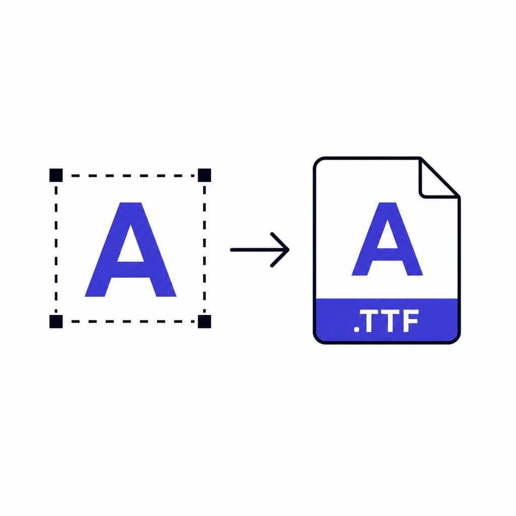
An image-to-font workflow can make this much faster when you have a clean image with representative letters. Snapafont converts image-based lettering into a downloadable TTF font file, giving designers a starting point they can install, test, and refine in their normal workflow. It is especially useful for digitizing original lettering, a client-owned package design, or a reference alphabet that would otherwise require repetitive manual rebuilding.
Before you finalize, test the font in real phrases rather than only in the original word. Type product names, flavor names, dates, pricing, promotional lines, and a short sentence. Check for collisions, awkward pairs, inconsistent stroke thickness, and characters that look too similar. Export a proof sheet with every glyph, then inspect it at print size and on screen. This step turns a visually interesting extraction into a usable result rather than a one-word novelty.
Practical Uses for a Recreated Packaging Typeface
A recreated packaging typeface can be valuable far beyond copying an existing label. One of the best uses is extending an original product identity. A small food brand may have hand-drawn lettering on its first package but no usable font for email headers, trade-show signage, social graphics, or seasonal flavor launches. Turning that lettering into a limited display font makes the visual system easier to maintain while keeping the personality that made the package distinctive.
It can also support archival and restoration work. Museums, collectors, publishers, and local-history projects often need period-appropriate lettering for exhibits, book covers, or recreated advertisements. Rather than using a vaguely “retro” substitute, they can study a historic package and build an informed display alphabet based on the surviving evidence. Clearly label any reconstruction as a recreation when exact source documentation is unavailable.
Another use case is packaging concept development. Designers can create a reference board from categories such as Japanese candy, Italian aperitivo, vintage pharmacy labels, or 1970s outdoor gear. Extracting typographic traits from these examples helps define a direction: condensed and bold, soft and rounded, engraved and formal, or loose and hand-painted. The final package should be original, but the process gives the design team a precise vocabulary for discussing style.
For makers and small businesses, a font from label art can bring consistency to physical and digital touchpoints. Imagine a candle maker whose jar label uses a brush-style title. With a matching font, they can create scent cards, thank-you notes, market signage, online banners, and gift packaging that all feel connected. Use the font selectively for display text, then pair it with a readable text face for ingredients, instructions, and long descriptions.
The same principle applies to internal brand systems. A custom display font can reduce repetitive manual lettering and help multiple team members create on-brand materials. Document where it should be used, recommended sizes, approved colors, and which neutral fonts accompany it. A concise style guide is often what turns a distinctive packaging asset into a sustainable design tool.
Bring Packaging Lettering Into Your Design Workflow
The best packaging typography has character because it was made to be seen, held, and remembered. With a sharp reference image, careful cleanup, and a realistic goal for the character set, you can preserve that character in a format that is useful for new design work.
If you have original lettering, client-approved label artwork, or a clean reference alphabet ready to digitize, try Snapafont at snapafont.com. Upload your image, turn the lettering into a downloadable TTF font, and test it in your actual headlines, labels, and brand materials. You will get a practical starting point quickly, leaving more time for the important work: refining the type and making it fit the project.
Ready to turn your image into a font?
Upload any image and get a real, downloadable .TTF font file in seconds.
Try Snapafont Free →

