
Tattoo artists create lettering that is difficult to mistake for anything else. A flowing blackletter capital, a tightly spaced Chicano script, or a rough hand-drawn flash phrase can carry the personality of the artist as strongly as an illustration does. That is exactly why turning tattoo lettering into a usable digital typeface is so valuable: it preserves a recognizable visual voice while making it practical for mockups, apparel, studio branding, client proofs, social posts, and more.
The process is not as simple as photographing a tattoo and pressing “convert.” Skin stretches, ink spreads, lighting creates glare, and most tattoos only show a few letters rather than a full alphabet. Still, with the right source material and a thoughtful workflow, you can digitize tattoo font designs without flattening the expressive details that make them special. This guide explains how to go from tattoo script to font, what to photograph, how to prepare lettering for extraction, and how to build a custom tattoo font that remains useful beyond a single image.
One important note before you begin: tattoo lettering is artwork. If the lettering was designed by another artist, get clear written permission before reproducing it as a font or using it commercially. Creating a typeface from your own lettering, from licensed artwork, or with an artist’s explicit approval protects both the creator and the finished project.
Why Tattoo Fonts Are So Distinctive
A tattoo font is more than a font that looks “edgy.” Authentic tattoo typography is usually shaped by a combination of hand movement, traditional references, tools, placement constraints, and the artist’s personal approach to line weight. The slight irregularity in a handwritten curve or the dramatic contrast between a thick and thin stroke often gives tattoo lettering its emotional impact.
Many popular tattoo lettering styles have deep visual traditions. Blackletter and Old English lettering rely on sharp angles, compressed forms, broken strokes, and ornate capitals. Chicano script often uses elegant connected letters, long baseline swashes, and controlled high-contrast strokes. Fine-line lettering can feel restrained and contemporary, while traditional tattoo flash lettering tends to be bold, simple, and readable from a distance. Even when two artists begin with the same word, their spacing, terminal shapes, crossbars, and flourishes can produce entirely different results.
This is why a custom tattoo font can be more useful than downloading a generic “tattoo-style” typeface. A generic font may suggest the mood of a tattoo, but it rarely captures the exact character of an artist’s lettering. Digitizing original lettering lets a studio maintain consistency across appointment cards, merchandise, aftercare materials, prints, and client concept boards without losing the look clients recognize.
At the same time, authenticity should not be confused with unreadability. A strong tattoo lettering font needs a visual system. Letters should share a common slant, stroke behavior, spacing logic, and proportion, even if the final look is intentionally rough or expressive. When converting artwork into type, the goal is not to eliminate every human quirk. The goal is to preserve purposeful quirks while making each character predictable enough to use in words the artist never originally drew.
Photograph Tattoo Lettering for Clean Font Extraction
The quality of your source image has a major effect on how easily you can turn tattoo lettering digital. Whenever possible, start from the original lettering sketch, stencil artwork, Procreate canvas, or paper flash sheet rather than a finished tattoo on skin. These sources have cleaner edges, more consistent contrast, and fewer distortions. If the tattoo itself is the only available reference, you can still get a good result, but careful photography matters.
Use bright, even, indirect light. Window light on an overcast day or a large soft light works better than a direct flash, which can create shine on moisturized skin and obscure fine lines. Position the camera perpendicular to the lettering rather than photographing from an angle. Angled photos make one side of the word wider than the other and can distort circular letters such as O, C, D, and G. Hold the camera steady, use the highest-resolution setting available, and take several shots before choosing the sharpest one.
Clean the visual field before capturing the image. Ask the client, when appropriate, to remove excess ointment; avoid photographing fresh work that is overly red, swollen, or reflective; and frame the lettering tightly enough that it fills much of the image. Include a little surrounding skin so you can straighten or crop later, but do not make the lettering a tiny part of a large full-body photograph. Fine hair, deep shadows, clothing edges, and busy backgrounds all make extraction harder.
For a lettering design on paper, scan it at 300 dpi or higher. A scan is generally preferable to a phone photo because it keeps lines flat and evenly lit. If a scan is unavailable, photograph the page from directly above with the paper lying flat. Use a plain background and make sure the entire page is in focus. Avoid automatic beauty filters, extreme sharpening, or high-contrast effects at this stage; those edits can erase thin entry strokes and delicate flourishes.
A practical example: if you want to create a tattoo script to font from the word “Familia,” photograph or scan the lettering at full size, then capture separate close-ups of details such as the capital F, the final a, and any swash intersections. The full image preserves overall proportion, while the close-ups help you inspect details that may disappear during cleanup.
Style Challenges When You Digitize Tattoo Font Artwork
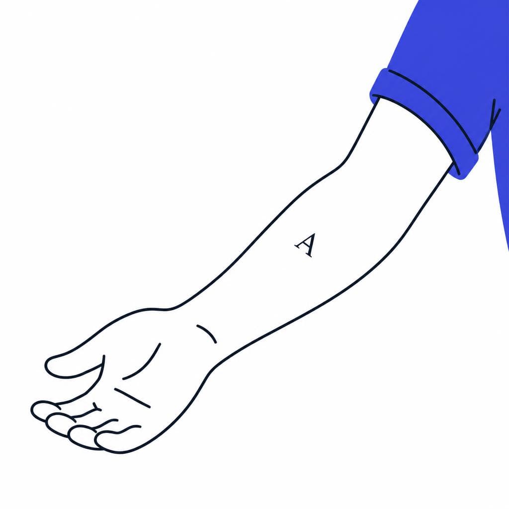
Tattoo lettering presents challenges that do not appear in clean printed type. The first is skin distortion. A design can curve around an arm, ribcage, hand, or neck, changing letter width and spacing. If the source is on a curved body area, do not assume the photographed shape is the original intended shape. Compare it to the artist’s stencil or sketch if possible, and gently correct perspective before building characters from it.
Ink aging and spread are another issue. Over time, black ink can expand slightly beneath the skin, closing counters in letters such as e, a, o, p, and d. Fine hairlines may also fade or break. When building the tattoo lettering font, use the artwork’s intended structure—not every imperfection visible in an aged tattoo—as your guide. Preserve the artist’s style, but reopen counters and clarify joins where necessary so the resulting font remains legible at different sizes.
Script styles require particular care because their letters often change depending on their neighbors. In a hand-lettered word, a lowercase r may exit differently before an a than before an i. A capital S may need a special swash when it begins a name. Standard fonts can handle this through alternate glyphs and ligatures, but an initial conversion may only include one version of each character. Identify the important variations early. At minimum, note beginning, middle, and ending forms for highly connected letters, plus common pairs such as th, ch, ll, tt, st, and any signature connections used by the artist.
Blackletter has a different problem: its decorative density can become muddy at small sizes. If your source has dramatic internal shading, diamonds, spikes, or extremely narrow gaps, test it in a short phrase at the smallest size you expect to use. A design that looks impressive as a 10-inch tattoo stencil may fail on a business card or website header. You may need a display version for large applications and a simplified companion version for smaller text.
Finally, remember that a single tattoo word is not automatically a complete font. You may only have examples of five or six letters. Use those letters as a style reference, then draw missing glyphs according to the same rules: examine the angle of diagonal strokes, the width of vertical stems, the height of ascenders, the form of terminals, and the amount of contrast. Consistency is what transforms a one-off piece into functional tattoo typography.
A Step-by-Step Process for Turning Tattoo Lettering Into a Font
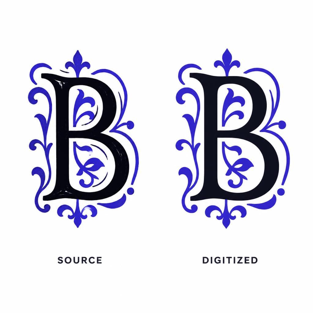
Start by defining the scope of the font. For a simple studio wordmark or a recurring set of names, you may only need capitals, lowercase letters, numerals, and basic punctuation. For broader branding and commercial use, plan for a fuller character set: A–Z, a–z, 0–9, punctuation, currency symbols, accented letters, and common ligatures. Make this decision before extraction so you know which missing characters must be designed from scratch.
Next, prepare your image. Crop away unnecessary surroundings, rotate the artwork until its baseline is level, and adjust contrast carefully until the lettering is easy to distinguish from the background. Remove dust, skin texture, glare, or stray marks manually if they interfere with the letter shapes. For lettering photographed on skin, perspective correction may be necessary. Keep a copy of the original image, then work on a duplicate so you can revisit details later.
Before converting, separate artistic features into two categories: structural and incidental. Structural features include the main outline, stroke contrast, loops, terminals, and intentional swashes. Incidental features include camera grain, uneven skin texture, isolated ink blowouts, or accidental scratches. Retain the structural features. Remove incidental noise. This distinction prevents a digitized design from becoming either sterile or messy.
Then convert the prepared lettering into editable character shapes. AI-powered image-to-font tools can dramatically reduce the time required for this stage. Snapafont lets you upload a lettering image and generate a downloadable .TTF font file, making it a practical starting point when you want to preserve hand-drawn forms without manually tracing every character. The output should still be reviewed like any other design asset, particularly when the source includes connected script or incomplete alphabets.
Once you have a working file, test it with real words rather than evaluating letters one by one. Type names, dates, short phrases, common tattoo requests, and combinations that contain challenging pairs. Look at “Memento Mori,” “Stay True,” “1994,” “Santos,” and “Love & Loyalty,” for example. Check whether spacing feels too open or cramped, whether connected letters collide, and whether capitals overpower lowercase letters. If an r and n combine so closely that they read as an m, adjust their spacing or redraw the exit stroke.
Pay close attention to kerning, the customized spacing between specific letter pairs. Tattoo script frequently needs kerning around capitals and flourishes: T-o, L-y, A-v, S-a, and P-a are common trouble spots. Blackletter may need adjustments where pointed forms create unwanted holes in a word. Even a small amount of kerning work can make a custom tattoo font look intentional rather than auto-generated.
Finally, export and test the font in the applications you actually use. Install the .TTF file and try it in a design program, word processor, web mockup, or stencil workflow. Test black on white, white on black, large headers, small labels, and outlines. Review it on a phone as well as a desktop screen. If the font will be used for physical products, print a proof; print often reveals spacing and thin-stroke problems that are easy to miss on a high-resolution display.
Useful Ways to Use a Custom Tattoo Font
A tattoo lettering digital file can become a useful studio asset long after the original tattoo is complete. One of the most immediate uses is client communication. Instead of redrawing the same signature lettering style for every inquiry, an artist can quickly typeset several name options, date placements, or phrase layouts. This does not replace custom tattoo design work; it speeds up early visual exploration and helps clients understand a direction before the artist refines the final piece.
Studio branding is another strong fit. A custom tattoo font can appear in appointment reminder graphics, flash drops, gift cards, aftercare sheets, booking announcements, and branded social templates. Consistent typography makes these materials feel connected, especially for artists whose lettering is central to their identity. For example, a blackletter specialist might use a simplified version for small captions and the full ornamental version for poster headlines.
Merchandise and print products also benefit from original type. Consider limited-edition shirts featuring a studio phrase, art prints with meaningful quotes, sticker packs, patch designs, or packaging inserts. When the lettering belongs to the artist or is properly licensed, a custom font creates repeatable assets without relying on overused stock typefaces. It can also help maintain consistency when collaborating with a graphic designer, printer, or marketing assistant.
There are useful personal applications as well. A client who has permission from the artist may want to preserve memorial handwriting or a meaningful tattoo phrase in a private digital format for invitations, family keepsakes, or a tribute print. In these situations, sensitivity matters: confirm ownership, be transparent about how the file will be used, and avoid distributing intimate or identifiable lettering without consent.
The key is to match the font to the job. Highly ornamental tattoo typography is usually best for headlines, names, logos, and short phrases. For body copy, choose a simpler companion typeface that supports readability. A script wordmark paired with a clean sans serif, for instance, often feels more professional than using elaborate lettering for every line of text.
Preserve the Lettering, Then Put It to Work
The best tattoo-inspired fonts do not merely imitate a category. They retain the decisions that make the original lettering memorable: the curve of a capital, the tension of a connected stroke, the deliberate imperfection of a hand-drawn line, and the spacing that gives a word its attitude. Start with a clean source image, respect the original artist’s rights, and test the result in real phrases before treating it as finished.
If you have original lettering, licensed tattoo artwork, or a hand-drawn design you want to make usable across digital projects, try Snapafont at snapafont.com. Upload your image, create a downloadable font file, and use the result as a foundation for proofs, branding, merchandise, and design experiments. A few minutes of preparation and testing can turn a one-time lettering piece into a flexible creative tool while keeping its distinctive character intact.
Ready to turn your image into a font?
Upload any image and get a real, downloadable .TTF font file in seconds.
Try Snapafont Free →

