
A great vintage poster can contain far more than an attractive composition. Its lettering may preserve a hand-painted sign style, a modified display face, a printer’s one-off alphabet, or a typeface that was never digitized. That makes it a valuable source for designers, archivists, filmmakers, brand teams, and anyone trying to create an authentic period feel without relying on generic “retro” fonts.
The challenge is that turning a font from a vintage poster into a usable digital typeface is not as simple as cropping a word and tracing it. Old ink spreads, paper yellows, paint cracks, images distort, and many posters only show a limited set of letters. A successful vintage typography recreation requires a mix of careful capture, cleanup, visual judgment, and testing.
This guide explains how to recreate vintage font artwork from a poster while retaining the qualities that made the original interesting. You will learn how to choose a suitable source, photograph or scan it, repair damage without erasing character, extract the letterforms, and turn them into a practical font file. The aim is not necessarily sterile historical perfection. It is to create a useful old poster typeface that still feels connected to its source.
Why Vintage Posters Are Unique Sources for Fonts
Vintage posters are unusually rich typographic references because they were made to be seen quickly, from a distance, and in a specific cultural moment. A 1930s travel poster may use tall, elegant capitals to suggest luxury and motion. A mid-century boxing poster may rely on condensed block lettering that feels urgent and loud. A 1970s concert bill may feature loose, psychedelic curves that would be difficult to find in a conventional type library.
Many examples are not “fonts” in the modern sense. Poster lettering was often drawn by an illustrator, adjusted by a sign painter, or modified directly by a printer. Even when a recognizable typeface was used, the artist may have changed terminals, widened letters, added shadows, altered spacing, or created a custom outline. That is why a vintage poster font can feel more distinctive than a downloaded retro display typeface: it often includes human decisions that are absent from a standardized digital family.
Before beginning, identify what kind of lettering you are looking at. Is it mechanically typeset, hand-lettered, stencil-based, painted, or built from cut-paper forms? Look at repeated characters. If every capital E is identical, the source may be based on a repeatable type system. If the two Es vary in bar length or angle, it is likely hand-drawn. This distinction affects your goal. With typeset material, you may be documenting or approximating an existing face. With hand lettering, you are creating a new digital interpretation based on the visual rules of the original.
Also consider the character coverage available. A poster that says “SUMMER FESTIVAL” provides several useful capitals but no lowercase letters, numerals, punctuation, or many key characters. That does not make it a poor source; it simply means you will need to extrapolate. Choose a poster with multiple lines of text, alternate words, dates, prices, or venue information whenever possible. The more examples you have of the same style, the more confidently you can build a cohesive vintage lettering font.
Finally, verify your rights before distributing or selling the result. Public-domain status, ownership of the physical poster, and copyright in its artwork are separate questions. Using an old poster as private visual research is different from publishing a commercial font based closely on protected lettering. When in doubt, seek permission or create a clearly transformative interpretation rather than an exact reproduction.
Scanning and Photographing the Poster Correctly
Capture quality determines how much repair work you will need later
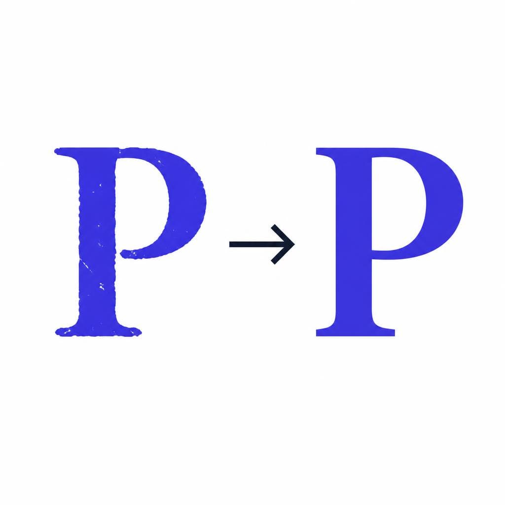
The strongest extraction workflow starts with the best source image you can obtain. If the poster can safely fit on a flatbed scanner, scan at 600 dpi or higher. This resolution preserves edge details, counters, thin strokes, and print texture that can disappear at lower resolutions. Save a lossless master file such as TIFF or PNG, then make separate working copies for cleanup and conversion.
Many posters are too large, framed, fragile, folded, or textured for scanning. In that case, photograph them with a camera or modern phone in controlled light. Mount the poster as flat as possible, keep the camera sensor parallel to the surface, and photograph from directly in front. Even a small angle can create perspective distortion, making one side of a letter wider than the other. Use a tripod, a timer or remote shutter, and even lighting from two sides to minimize shadows and glare.
Avoid using a single harsh lamp or direct flash. Glossy ink, varnish, and uneven paper can produce bright reflections across the letterforms. Soft daylight near a window can work well, but it changes quickly; diffused continuous lights are more reliable. If the poster is behind glass, reposition lights at angles that do not reflect into the lens and use a polarizing filter if your camera supports one.
Include a small ruler or color reference card in at least one documentation shot. It may not be needed for the final font, but it helps you track original scale and color decisions. Take a full-poster image first, then closeups of every line containing the target lettering. For a retro font from poster artwork, a close, sharp image of individual letters is usually more useful than one huge image where the text occupies only a small part of the frame.
After capture, correct perspective before you crop letters. Most photo-editing software has transform, perspective, or lens-correction tools. Align known vertical and horizontal strokes, but do not overcorrect a source that was intentionally irregular. Hand-painted lettering may lean or swell by design. The goal is to remove camera distortion, not to erase the original personality.
How to Deal With Age, Fading, and Damage
Age is often the reason vintage posters look beautiful, but it can also make letter extraction difficult. Common issues include stains, foxing, faded pigments, fold lines, cracks, ink bleed, torn edges, halftone patterns, and uneven exposure. The key is to distinguish accidental damage from intentional texture. A rough brush edge may be essential to the style; a brown stain crossing the middle of an O is not.
Start non-destructively. Keep the original scan untouched and use adjustment layers or duplicate files for edits. Increase contrast gradually, correct white balance, and use curves or levels to separate the lettering from the background. For example, dark red lettering on faded cream paper may become easier to isolate by adjusting the red channel rather than simply increasing global contrast. If the poster uses several colors, isolate the relevant one with a color-selection tool before converting it to black and white.
Repair major interruptions manually. A fold through the leg of an R can be reconstructed by comparing the curve, stroke width, and angle with other letters. A missing segment of an A’s crossbar should follow the logic established by the rest of the alphabet. Resist the temptation to smooth every irregularity. Slightly uneven contours, asymmetrical bowls, and imperfect alignment are often exactly what makes a recreate vintage font project feel credible rather than computer-generated.
Printed posters may show dot screens or ink spread along the edges. If the final font is intended for small text or digital interfaces, reduce this noise so outlines remain clean. If it is intended for large display use, you can preserve some of the roughness as a stylistic choice. One practical approach is to build a clean base font first, then create a textured version separately using overlays, alternates, or graphic effects. This gives users flexibility without forcing a distressed result in every setting.
Be especially careful with thin joins and small counters. A damaged counter in an e, a, or p can close completely during thresholding, and narrow gaps in letters such as M or W can fill in. Always inspect the shapes at the sizes where the finished font will actually be used, not only at 800% zoom.
The Extraction Process: From Poster Letters to a Working Font
Once the image is clean enough to read, begin by isolating individual characters. Crop representative letters with a little surrounding space, then remove the background or create a high-contrast black-and-white version. Use the clearest occurrence of each character, but compare repeated letters before choosing. One S may be sharper, while another better represents the intended curvature.
Next, establish the alphabet’s visual rules. Measure relative cap height, average stroke thickness, width, baseline behavior, slant, and corner treatment. Notice whether rounded letters such as O and C extend slightly above or below flat letters like H and E. This overshoot is a small but important detail that helps an alphabet look balanced. Look for recurring decisions: are terminals blunt, pointed, rounded, or flared? Are crossbars centered? Are verticals truly vertical or subtly angled?
If you only have a partial alphabet, use existing letters to infer missing ones. For instance, an H can help establish the vertical structure for N, M, and I. A U can inform the lower curve of J. An O may provide clues for C, G, Q, and zero. Keep the extrapolated characters consistent with the source rather than trying to make them conventionally perfect. In an expressive old poster typeface, a slightly off-center crossbar or unusually narrow bowl may be part of the system.
You can trace letters manually in vector software, which gives maximum control over anchor points and curve quality. Alternatively, an image-to-font workflow can dramatically speed up the first stage. Snapafont is useful when you have clear letter samples and want to turn them into a downloadable TTF quickly; you can then evaluate the generated glyphs, refine the source image if necessary, and test the result in real layouts. The best output still depends on preparing a clean, high-contrast source and making thoughtful choices about the alphabet.
Do not skip spacing and kerning. A font can have beautifully extracted glyphs and still look wrong because the letters sit too far apart or collide awkwardly. Begin with consistent side bearings: narrow forms such as I need less surrounding space than wide forms such as M and W. Then test common pairs including AV, VA, To, Ta, LY, WA, and combinations found in your intended use. For a poster-inspired display font, test words such as “THEATER,” “VINTAGE,” “SUMMER,” “NIGHT,” and “SALE,” because they reveal a broad range of shapes and spacing problems.
Finally, export and test in multiple environments. Install the TTF on your computer, set sample headlines at different sizes, and compare them against the poster. Check that counters remain open, punctuation is visible, and diagonals do not become jagged. Print a proof as well as viewing it on screen. A vintage font may look compelling at 100 points but lose its defining details at 18 points, which tells you it should be positioned as a display face rather than a text font.
Practical Uses for a Recreated Vintage Font
A carefully built vintage poster font is most effective when used where its source-inspired character can be appreciated. Display applications are the natural fit: book covers, album artwork, event posters, restaurant menus, packaging, title cards, social graphics, and branded campaign headlines. A distinctive alphabet can establish a period mood within seconds, especially when paired with restrained colors and appropriate imagery.
For a film, theater, or museum project, recreating lettering from a relevant historical reference can make a fictional artifact feel much more believable. A 1950s-style diner menu, for example, benefits from a bold condensed script or block face with era-appropriate spacing. A retro travel campaign might use a geometric, high-contrast display alphabet inspired by railway or resort posters. The important point is to match the font’s personality to the story rather than applying vintage styling indiscriminately.
Brand work requires more caution. Use the recreated face as a headline accent while selecting a highly readable companion sans serif or serif for body copy. A typical pairing might use the vintage lettering font for a logo lockup, product names, and promotional phrases, then use a neutral text face for instructions, prices, web navigation, and accessibility-critical content. This preserves the charm without sacrificing usability.
You can also build a small family from one source. Create a clean regular version, an outline version, and a shadow or inline treatment based on details visible in the poster. If the original uses inconsistent forms, consider alternate glyphs for letters such as A, E, R, or S. Alternates are especially useful for packaging and editorial headlines, where repeated characters can otherwise reveal the font’s digital repetition.
The strongest vintage typography recreation projects are not simply copies of the past. They make historical visual language usable in a modern context. Keep documentation of the source, the repairs you made, and the rules used to complete missing characters. That record will help you maintain consistency if you later add lowercase letters, numerals, multilingual support, or additional weights.
Turn Your Poster Reference Into a Font You Can Use
The process starts with a close look at the lettering you already have. Choose the clearest poster reference, capture it carefully, clean only the damage that interferes with the shapes, and preserve the visual quirks that give the work its period character. Even a partial alphabet can become the foundation for a compelling custom display typeface when you study its proportions and repeat its rules consistently.
If you are ready to move from image reference to a usable font file, try Snapafont at snapafont.com. It provides a straightforward way to convert prepared lettering images into a TTF that you can install, test in real designs, and refine through your source artwork. Start with a clear sample, compare the output against the original poster, and let the poster’s distinctive letterforms guide the final result.
Ready to turn your image into a font?
Upload any image and get a real, downloadable .TTF font file in seconds.
Try Snapafont Free →

