
People form an impression of a brand before they consciously evaluate its message. A headline, menu, product label, email subject line, or checkout screen is not simply a container for words: its typeface supplies an immediate emotional cue. Is this company established or experimental? Friendly or authoritative? Affordable or premium? Careful or careless? Those judgments can arise in fractions of a second, often before a reader has processed the literal meaning of the copy.
That is why font brand perception matters far beyond visual taste. Typography can reinforce a positioning strategy, make a promise feel believable, and help a brand feel coherent across every customer touchpoint. It can also create friction when the visual voice contradicts the message. A wealth-management firm set in a playful, bouncy display font may feel less dependable; a children’s activity brand set entirely in severe condensed capitals may feel less welcoming, even when both brands use excellent writing.
Typography psychology does not mean that one font magically causes one universal reaction. Culture, context, familiarity, copy, color, spacing, and prior experience all shape interpretation. Still, decades of research in perception, legibility, processing fluency, and consumer behavior show a consistent principle: type choices influence the signals people use to evaluate information and the organization presenting it. The practical question is not “Which font is best?” It is “Which typographic signals support the perception our brand has earned and wants to strengthen?”
What Brand Typography Research Shows
Brand typography research repeatedly finds that people attribute human-like traits to typefaces. In a foundational study, researchers Dawn Shaikh, Barbara Chaparro, and Doug Fox asked participants to rate typefaces against personality traits and found meaningful, repeatable associations among font features and perceived characteristics. Subsequent work in marketing and design has similarly shown that type is not neutral: readers infer personality, appropriateness, quality, and credibility from visual form.
One useful explanation comes from processing fluency. When a font is easy to read and feels appropriate for the message, people can process it with less effort. That ease may be misattributed to the content or source itself, making information feel more familiar, clear, or credible. Conversely, unnecessary difficulty can reduce comprehension and confidence. This does not mean every brand should use the plainest possible typeface. A distinctive display face may be highly effective in a short headline or logo. The lesson is that the effort demanded by the typography should match the task the reader is trying to complete.
Context also changes the result. A study by Hyunjin Song and Norbert Schwarz found that a difficult-to-read font made instructions for an exercise routine seem harder and more time-consuming. In other contexts, moderate disfluency can prompt closer attention, but that is a narrow effect and a risky basis for a brand system. For most commercial communication—pricing, product details, forms, legal information, navigation, and service instructions—clarity remains the stronger trust signal.
Research on typeface congruence adds another important point: fonts work best when their perceived personality fits the product and message. A handwritten face can support the story of a neighborhood bakery, a maker-led stationery shop, or a personal thank-you note. The same face may undermine a cybersecurity platform’s claim of rigorous control. People do not judge the font in isolation; they judge whether the font, words, imagery, and category seem to belong together. This is the core of typography brand impact: type becomes persuasive when it makes the brand’s promise feel internally consistent.
The Typeface Personality Dimensions People Notice
From visual features to brand traits
Most people cannot name every typographic detail, yet they respond to those details quickly. Serif typefaces, with their finishing strokes, are frequently associated with heritage, formality, editorial authority, and tradition. That makes them common in publishing, luxury, law, education, and premium food packaging. But a serif can also feel contemporary: high-contrast editorial serifs often signal fashion and sophistication, while sturdier slab serifs can suggest practicality, confidence, and craft.
Sans serif typefaces are often perceived as modern, direct, clean, and efficient. Their apparent simplicity makes them useful for digital products, healthcare systems, technology brands, and contemporary retail. Within that category, however, personality varies substantially. A geometric sans with near-circular shapes may feel optimistic and designed; a humanist sans with open apertures may feel warm and accessible; a neo-grotesk sans can feel neutral, orderly, and corporate. Treating “sans serif” as a single personality is a common strategic mistake.
Script, handwritten, and calligraphic faces tend to communicate intimacy, expressiveness, celebration, or artisanal care. They can make a brand feel personal when used sparingly, especially in a signature, campaign accent, or short product name. Their weakness is scalability: what feels charming at 80 pixels may become tiring or illegible in a paragraph, price list, or mobile navigation. Display fonts likewise offer powerful distinctiveness but should usually carry less reading load than a text face.
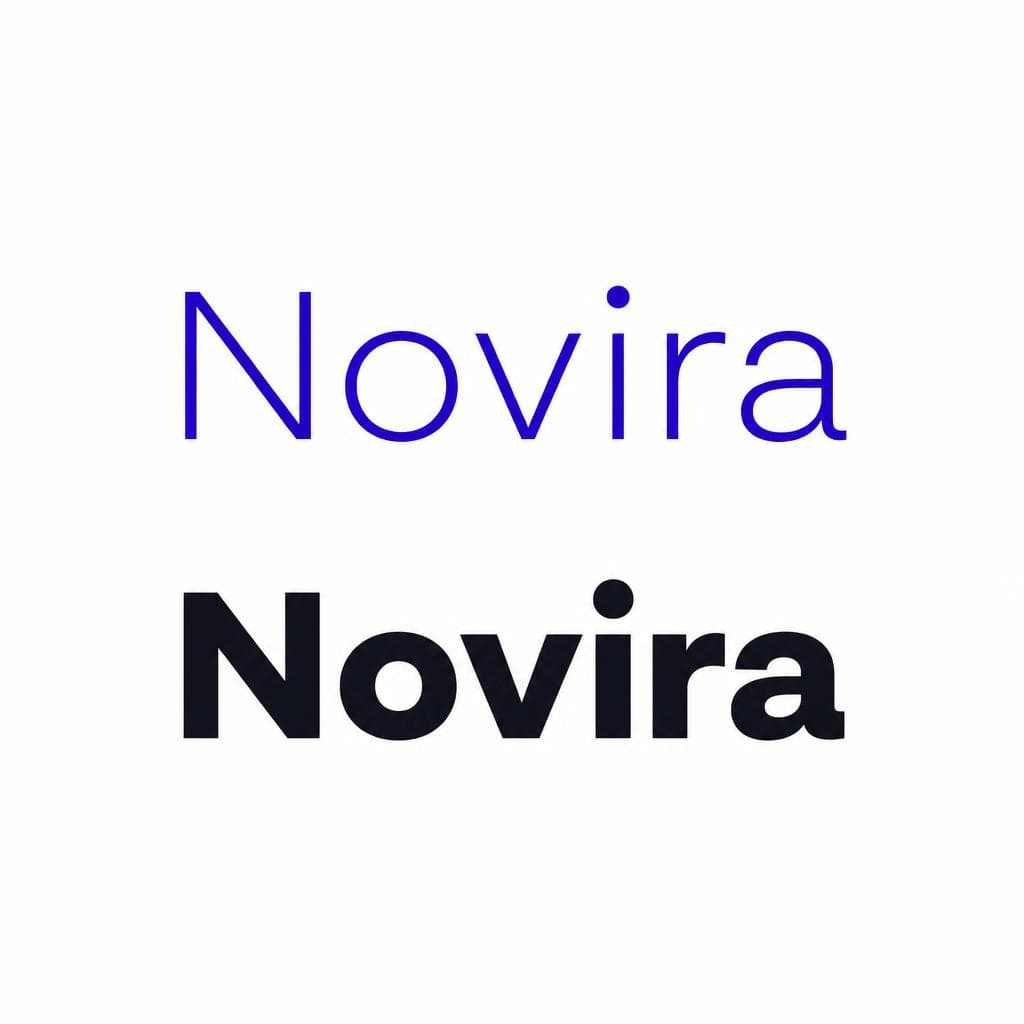
Visual variables shape perception too. Heavy weight can suggest strength and urgency, while light weight can imply refinement or delicacy. Wide letterforms can feel open and relaxed; condensed forms can feel energetic, efficient, or intense. Rounded terminals often read as soft and approachable, whereas sharp angles can appear technical, assertive, or premium. Generous spacing may communicate calm and luxury, but excessive spacing weakens word recognition. These associations are tendencies, not rules. The brand’s category, audience, language, and total visual system determine whether a trait feels appropriate.
A practical exercise is to list three to five attributes the brand should own—such as reassuring, expert, optimistic, discerning, rebellious, or down-to-earth. Then identify the opposite traits that would be damaging. A tax advisory firm might seek “clear, capable, reassuring” and avoid “casual, chaotic, juvenile.” A sustainable skincare brand might seek “considered, natural, modern” and avoid “clinical, loud, mass-produced.” This turns font psychology from vague preference into a concrete decision framework.

How Fonts Affect Trust and Perceived Competence
Trust is rarely created by a font alone. Customers trust brands that deliver, protect data, provide accurate information, and behave consistently. Yet typography can either support those trust-building signals or introduce doubt. Readers use visual cues as shortcuts, particularly when they have little time or limited information. Clean hierarchy, stable alignment, sufficient contrast, and a well-fitted typeface communicate care. Inconsistent styling, cramped text, decorative body copy, and poor contrast can imply that the organization has not considered the reader’s needs.
Competence is especially sensitive to typographic execution. Imagine two identical consultant proposals. One uses a readable text face at an appropriate size, clear section headings, consistent numerals, and restrained emphasis. The other uses three unrelated fonts, centered body paragraphs, tiny footnotes, and all-capital headings. Even if the analysis is identical, the first proposal is more likely to feel organized and credible because its presentation makes the information easier to verify and use.
This is where legibility and accessibility become brand issues rather than merely technical requirements. Use a body font with distinguishable letterforms, ample x-height, and open counters. Avoid light weights on bright backgrounds for essential copy. Test text on small screens, where users may be outdoors, tired, distracted, or using enlarged type. Ensure links, buttons, error messages, and form labels are easy to scan. A brand that asks customers to work harder than necessary may unintentionally appear less transparent or less professional.
It is also important to distinguish a recognizable logo font from a functional brand font. A highly stylized wordmark can be memorable because it appears in a controlled, limited setting. The same style may not be suitable for user interfaces, long-form editorial content, invoices, or customer support emails. Strong systems often pair a distinctive display or logo treatment with a dependable workhorse text family. The contrast gives the brand character without sacrificing comprehension.
Font Influence on Perception and Purchase Behavior
How fonts affect brand outcomes is usually indirect. Typography changes the way people interpret quality, usability, price, and fit; those perceptions then influence willingness to continue reading, explore a product, or purchase. In packaging and retail settings, typeface-product congruence can shape expected taste, craftsmanship, prestige, or value before customers try the product. A refined serif on a wine label may support a premium cue, while bold informal lettering may better suit a playful snack brand. Neither approach is inherently superior—the question is whether it makes the intended audience feel that the product is for them.
Price perception is a good example. Brands often use spacious layouts, restrained typography, and precise details to signal premium positioning. But premium does not mean small text, low contrast, or minimal information. Those choices can create frustration and exclude potential customers. A better approach is to combine confidence with clarity: use a composed type scale, intentional whitespace, high-quality photography where relevant, and direct product information. Luxury is communicated through control, not obscurity.
Typography can also affect conversion through decision friction. If customers cannot quickly understand a plan comparison, delivery condition, size chart, return policy, or call to action, they may abandon the process. Make transactional pages boring in the best sense: readable, predictable, and unambiguous. Reserve highly expressive typography for moments that benefit from emotion, such as campaign headlines, launch pages, or product storytelling. On a checkout page, the brand’s personality should be present but never compete with the customer’s task.
To measure the real typography brand impact, avoid relying only on internal opinion. Run controlled tests where possible. Keep copy, offer, layout, and imagery stable while testing a typeface or hierarchy change. Track task completion, time on task, error rate, scroll depth, add-to-cart rate, conversion, and qualitative responses such as “Which option feels more trustworthy?” Segment results by device and audience, since a font that works beautifully on a large desktop display may perform differently on a phone. Research provides useful hypotheses; testing reveals what is true for your particular customers.
Applying the Research to Your Brand System
A practical font-selection process
Start with the brand strategy, not a font marketplace. Write a short typographic brief that states your audience, category expectations, brand attributes, reading environments, languages, and accessibility needs. Include real use cases: a website hero, product packaging, an email, a 16-pixel mobile interface, a PDF proposal, social graphics, and a printed label. A font that wins only in a logo mockup has not yet proven that it can support the brand.
Next, choose roles rather than collecting fonts. Most brands need a display role for high-impact moments, a text role for sustained reading, and sometimes a utility role for data-heavy or interface content. One versatile family with multiple weights may cover all three needs. If you use a pairing, make the contrast purposeful. For example, an independent coffee roaster might pair a tactile, slightly expressive serif for headlines with a straightforward humanist sans for menus, subscriptions, and product details. The serif carries craft; the sans carries clarity.
Build a small type scale and document it. Define heading sizes, body sizes, line heights, weights, letter spacing, link treatments, and rules for emphasis. Then create a few realistic templates before launch. Test a three-paragraph article, a pricing table, a product page, a confirmation email, and a social post. This exposes issues that polished mood boards hide, including awkward numerals, insufficient italic styles, cramped bold text, poor punctuation, or unreadable small caps.
If your starting point is a unique visual reference—a hand-painted storefront, vintage label, personal handwriting sample, or custom lettering—first decide where that character should live. It may be ideal as a display alphabet, campaign accent, or signature element rather than the sole font used everywhere. Snapafont can turn an image of lettering into a downloadable TTF font, making it easier to explore a distinctive typographic asset in real layouts instead of treating it as a one-off graphic. Before using any reference, confirm that you own the artwork or have permission to use it.
Finally, validate the system with people who resemble your customers. Ask them to complete a simple task and listen for confusion, not just preferences. Ask what three words the page communicates, what they expect the product to cost, and whether they would feel comfortable entering payment details or contacting the company. Their answers reveal whether your intended font brand perception is actually reaching the audience. Refine based on evidence, and preserve enough consistency that repeated exposure can build recognition over time.
Turn a Distinctive Visual Voice Into a Usable Font
The most effective brand typography is both recognizable and useful. If your brand already has a lettering style with genuine meaning—perhaps from a founder’s handwriting, a painted sign, a packaging sketch, or an original campaign treatment—bringing that character into a font can help you use it consistently across digital and print materials.
Rather than repeatedly recreating letters as images, try Snapafont at snapafont.com to convert an image into a downloadable TTF font. Use the result thoughtfully: test it in headlines, labels, and social assets, pair it with a highly readable text face, and make sure its personality supports the trust, competence, and emotion your brand wants customers to feel. A font is not the whole brand, but it is one of the fastest ways to make every word sound like it came from the same place.
Ready to turn your image into a font?
Upload any image and get a real, downloadable .TTF font file in seconds.
Try Snapafont Free →

