For most of history, typefaces were expensive, specialized tools. Creating one meant mastering drawing, spacing, kerning, vector curves, font software, file formats, testing, and licensing. Even a modest custom type family could require months of work and a sizable budget. That reality shaped who got to participate in typography: primarily trained type designers, established foundries, and organizations with enough resources to commission them.
That model is changing quickly. The future of typography is being shaped by artificial intelligence that can analyze letterforms, generate variations, assist with production work, and turn visual references into usable font files. This does not mean typography is becoming effortless, or that skilled designers are about to become unnecessary. It means the barrier between an idea and a working typeface is getting dramatically lower.
For designers, brands, educators, creators, and anyone who works with text, the important question is no longer whether AI will influence font design. It already has. The more useful question is how to use AI responsibly and creatively while preserving the human judgment that makes typography clear, distinctive, and meaningful. This guide explores what AI changing typography actually looks like, what remains uniquely human, and how to prepare for the AI typography future.
How Type Design Worked Before AI
Traditional type design is a deeply considered craft. A designer usually begins with a concept: perhaps a warm, low-contrast serif for a literary publisher, a compact sans serif for a transit system, or an expressive display face for packaging. From there, they draw a small set of foundational characters, often beginning with letters such as H, O, n, o, p, and a. Those shapes establish key decisions about stroke weight, curve tension, width, contrast, terminals, counters, and proportions.
The real challenge is not drawing one attractive letter. It is building a coherent system. Every glyph must appear to belong with every other glyph. A lowercase e must feel related to the c, o, and s. The capital R needs to share the voice of the P while introducing a convincing leg. Numerals, punctuation, currency symbols, accented characters, ligatures, and alternate forms all need the same care. A professional font can include hundreds or thousands of glyphs, especially when it supports multiple languages.
Then comes spacing and kerning. Spacing determines the default breathing room around each character. Kerning adjusts particular pairs that create awkward gaps, such as AV, To, Wa, or Ly. A typeface can contain beautifully drawn letters and still look amateurish if the rhythm of words is uneven. Designers test fonts in real settings: large headlines, dense paragraphs, mobile interfaces, printed labels, all-caps signs, and small sizes where details disappear.
This process has always involved software, but conventional software mainly gave designers manual control. It did not supply the visual logic. Font editors made it possible to create Bézier outlines, manage glyph sets, set metrics, interpolate weights, and export files, yet the designer still had to decide what the typeface should be. Production tasks could also be repetitive: tracing reference material, cleaning scanned characters, making consistent alternate glyphs, and preparing font files for testing.
That rigor remains valuable. Understanding the traditional process helps explain why AI type design is most useful when it supports a system rather than merely produces an isolated image of letters.
What AI Changes in Font Design
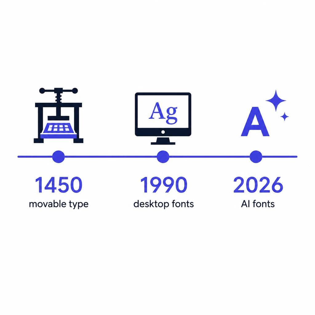
AI font design changes the speed and accessibility of several steps in the workflow. Instead of starting from a blank grid, a creator can begin with an image: a hand-lettered logo, a page from a sketchbook, painted alphabet samples, vintage signage, or their own handwriting. AI-assisted systems can identify characters, infer stylistic patterns, clean visual noise, and help translate the result into digital outlines and font data.
The practical shift is significant. A restaurant owner can preserve the personality of handwritten menu lettering. A teacher can turn classroom lettering into a font for worksheets. A designer can test whether a rough display alphabet deserves further development before spending days refining it manually. An illustrator can create a usable type asset from a style that previously lived only in a drawing.
AI can also help with pattern recognition. It can compare shapes across a character set, identify inconsistencies, suggest missing glyphs, and accelerate tasks such as vector cleanup or generating stylistic explorations. In a mature workflow, AI may act less like a replacement designer and more like a rapid production assistant: handling repetitive analysis while the human sets the visual direction and approves the result.
However, “generated” does not automatically mean “finished.” A font created from an image may need adjustments to spacing, baseline alignment, character recognition, stroke consistency, and language coverage. A display font used for a short headline has different requirements from a text font intended for a 200-page book or an accessibility-focused website. The best AI font design workflows recognize this distinction. They use automation to get from reference to prototype quickly, then apply informed review before the font is used widely.
This is one reason font design 2026 will likely be defined by hybrid workflows. Designers will not choose between fully manual craftsmanship and fully automated generation. They will choose the right balance for the brief. A fast campaign asset may need a clean, distinctive prototype in hours. A brand typeface intended to last a decade may still require extensive human refinement, multilingual expansion, and technical quality assurance.
The Democratization of Fonts: More People Can Make Type
The most important consequence of the future of fonts may be democratization. When the tools required expert knowledge, expensive software, and long production cycles, many visually interesting lettering styles never became fonts. They remained on storefronts, notebooks, family recipes, posters, murals, and personal sketch pages. AI lowers the threshold for transforming those visual materials into something people can type with.
That expands creative ownership. Small brands can develop a voice that does not depend entirely on the same few widely available fonts. Musicians can use a font based on their own lettering for merchandise and social content. Community organizations can preserve local visual character in event materials. Families can digitize a grandparent’s handwriting for a meaningful invitation, memory book, or personal project. These are not trivial use cases. Typography communicates tone before readers consciously process the words.
For example, imagine a coffee shop that has spent years writing playful chalkboard messages in a recognizable hand. Rather than trying to imitate that hand with a generic font, the team could create a font from its own lettering and use it consistently across loyalty cards, seasonal packaging, social graphics, and menus. The result is not just visual consistency; it is a clearer expression of the brand’s personality.
Democratization also brings responsibility. More fonts do not automatically produce better typography. A creator still needs to ask whether the font is readable, whether it suits the audience, whether it works at the intended size, and whether its source material can legally be used. Uploading a photo of someone else’s commercial typeface and treating the output as an original font can create ethical and legal problems. The safest starting point is material you created, own, or have explicit permission to use.
There is another risk: sameness. If every project relies on the same prompts, references, or popular AI styles, visual culture can become repetitive. The opportunity is not simply to generate more type. It is to generate more personal, context-aware, and purposeful type. The people who benefit most from the AI typography future will use these tools to express a distinctive perspective, not to copy one.
What Still Requires Human Designers
AI can accelerate execution, but it does not remove the need for typographic judgment. Typography is not only a collection of character shapes. It is a reading experience, a cultural signal, and often a brand decision with long-term consequences. Humans remain essential wherever context, taste, empathy, and accountability matter.
First, humans define the brief. An AI system may produce a bold condensed sans serif, but it cannot independently determine whether that tone is appropriate for a pediatric clinic, a legal service, a luxury skincare line, or an emergency information system. Designers translate business goals and audience needs into typographic choices. They decide whether a typeface should feel authoritative, optimistic, playful, calm, technical, historical, or neutral—and when those impressions may exclude or confuse people.
Second, humans evaluate readability and hierarchy. A dramatic handwritten font can be memorable on a poster but exhausting in body copy. A thin display face may look elegant in a large mockup but vanish on a low-resolution screen. Type designers and graphic designers understand line length, x-height, contrast, spacing, responsive behavior, and the hierarchy between headings, labels, captions, and paragraphs. Those decisions are central to usable communication.
Third, humans handle cultural and linguistic nuance. A typeface that works well for basic Latin characters may fail when expanded to accented languages, Cyrillic, Greek, Arabic, Devanagari, or other scripts. Even within Latin typography, quotation marks, diacritics, punctuation, and numeral styles deserve care. AI can help identify gaps, but designers must ensure that expansion is respectful, accurate, and visually coherent.
Finally, people remain responsible for quality. Before using an AI-generated font in a brand system, test it in real words. Print it. View it on mobile devices. Try common problem pairs such as “AVATAR,” “Toffee,” “WAVY,” and “minimum.” Check whether commas, apostrophes, quotation marks, and numerals fit the style. Ask whether users can read it quickly. A font is successful when it serves communication, not merely when it looks impressive in a specimen image.
How Designers and Brands Can Adapt
Adapting to AI changing typography starts with treating AI as part of a design process, not as a shortcut around one. The most effective teams will combine faster experimentation with stronger curation. They will generate more possibilities early, but make sharper decisions about which possibilities deserve refinement.
Start by building a clear source library. Save original lettering, sketches, packaging experiments, sign-painting studies, and handwritten samples. Photograph them in good light and keep high-resolution versions. These materials can become valuable inputs for custom font exploration later. A consistent set of alphabet samples is especially useful: include uppercase and lowercase letters, numbers, punctuation, and a few words that reveal how letters connect in context.
Next, distinguish between a prototype font and a production font. A prototype can be ideal for a moodboard, a campaign headline, a social series, or an internal presentation. A production font needs more stringent review. Consider file reliability, character coverage, licensing, web use, app embedding, print output, and accessibility. If the font will become a core brand asset, budget for professional type design support to refine the system beyond the initial concept.
Create a simple testing checklist before release. Test the font at small, medium, and large sizes. Use it in complete sentences rather than only alphabet rows. Check it on dark and light backgrounds. Test numerals if the project includes prices, dates, or data. Review all key characters that appear in the brand name, web navigation, email signatures, and calls to action. If it will be used online, ensure the font format and loading behavior work for the intended platform.
Designers should also expand their skill set rather than fear the tool. Strong art direction, typography fundamentals, licensing literacy, and critique become more valuable when generation is easy. When anyone can make ten font options in a few minutes, the differentiator becomes the ability to recognize the one that communicates best—and explain why.
For brands, the practical opportunity is to create a more ownable visual voice. Instead of using custom type everywhere, consider a tiered system: a distinctive AI-assisted display font for campaigns and personality, paired with a proven text font for long-form reading and interfaces. This approach protects usability while still giving the brand a recognizable typographic signature.
Turn Your Lettering Into a Font You Can Use
The future of typography is not about handing creative control to a machine. It is about giving more people a practical way to turn visual ideas into working typographic tools. If you have handwriting, sketches, illustrated letters, or image-based lettering that deserves to become more than a static graphic, start by making a usable prototype and testing it in real designs.
Snapafont makes that first step straightforward: upload an image of your lettering and turn it into a downloadable .TTF font file. It is a useful way to explore a custom type direction for a personal project, brand concept, classroom resource, event, or creative campaign without beginning with complex font-production software. Once you have the font, use the testing principles above to see where it shines and where it may need refinement.
Try your own lettering at snapafont.com and discover how quickly an image can become a typeable part of your visual identity.
Ready to turn your image into a font?
Upload any image and get a real, downloadable .TTF font file in seconds.
Try Snapafont Free →

