
Font matching is one of those design tasks that looks trivial from the outside and can quietly consume an afternoon. A client sends a photo of an old storefront, a low-resolution product package, a scanned menu, or a social post and asks, “What font is this?” What they usually mean is: can you reproduce this look accurately enough that the new work feels connected to the original?
Experienced designers know that this is rarely a one-click identification exercise. The visible letters may be distorted by perspective, printing texture, compression, shadows, outlines, custom modifications, or decades of wear. Some projects need an exact licensed typeface. Others only need a close visual match. Still others call for a custom recreation because the lettering was never a font in the first place.
The difference between a frustrating hunt and a profitable, reliable process is a documented designer font workflow. This guide explains how professional designers approach client font matching in 2026: how they inspect evidence, narrow the search, decide when to stop looking, generate usable assets when needed, and communicate the scope of the work to clients.
The Classic Font-Matching Problem
The classic request usually arrives with incomplete information: one image, no source files, no brand guide, and a deadline. It might be a photo of lettering on a vehicle, a cropped logo from a competitor’s website, or a scan of a flyer created before the current marketing team existed. The image is evidence, not a specification.
That distinction matters. When a client asks you to match font from image files, the image may not show the original typeface faithfully. A wide-angle phone lens can alter proportions. A sign painter may have condensed, extended, or redrawn letters by hand. A print shop may have added an outline or stretched live text. Letterforms can look heavier because ink spread into paper fibers, and a low-resolution image can erase defining features such as a distinctive terminal or spur.
Professional font matching begins by separating three questions that clients often combine: What was the original font? What is the closest available font? What type solution will produce the correct result in this specific application? These answers may be different. For example, the original could be an obsolete display face that is difficult to license, while a current alternative reproduces the visual character better at the required size. Or the image may show custom lettering, making an exact font identification impossible by definition.
The best outcome is not always historical certainty. It is a defensible recommendation that meets the project’s visual, legal, technical, and budget requirements. That mindset prevents designers from spending two unbillable hours chasing an exact name when a tested, licensed substitute would solve the client’s actual problem.
A Professional Font Identification Workflow, Step by Step
A strong font identification workflow is repeatable. It reduces guesswork, creates a record of decisions, and gives clients clear options rather than a vague answer. The exact tools may change, but the sequence is remarkably stable.
Start by defining the deliverable. Ask where the type will appear: a logo refresh, website heading, packaging, signage, presentation, or a single campaign graphic. Also ask whether the client needs editable text, webfont licensing, multilingual support, numerals, punctuation, or only a small set of uppercase characters. A match that works for a three-word poster may fail immediately when the client needs a full e-commerce site in four languages.
Next, request the best source material available. Do not settle for the first screenshot if a higher-resolution photo, original PDF, vector artwork, or physical sample exists. Ask for more than one word if possible. The letters R, G, Q, a, e, y, 1, and 4 often reveal more about a typeface than common characters such as A, E, H, or O. If the artwork is photographed, request a straight-on image in even lighting. This simple intake step can save more time than any search tool.
Then prepare the sample. Crop tightly around the lettering, rotate it so the baseline is level, correct obvious perspective, and increase contrast carefully. Remove busy backgrounds when possible. Do not sharpen so aggressively that you invent features that are not truly present. For automated matching tools, isolate a single line or word and preserve enough margin around the characters. A clean sample produces better candidate results and makes manual comparison faster.
After preparation, identify the letterform clues before searching. Note the broad classification: serif, sans serif, slab serif, script, blackletter, monospaced, geometric, humanist, or decorative display. Look for the x-height, width, stroke contrast, aperture openness, terminals, axis of round letters, crossbar placement, bowl shape, and the relationship between thick and thin strokes. In a sans serif, the tail of Q, shape of lowercase a, and leg of R can narrow hundreds of possibilities to a manageable category.
Run an initial search using image-based identification and font libraries, but treat the results as leads rather than verdicts. Create a short list of perhaps three to eight candidates. Then type the exact client text in each candidate, at the approximate final size, with comparable tracking, weight, outline, and effects. This is the point where many false matches disappear. A font can resemble one cropped letter and still look wrong as a word.
Finally, document the recommendation. Include the selected font, foundry or vendor, license path, weight and style, usage limitations, and one or two alternatives. If the source appears custom, state that directly and propose a recreation route. Good client font matching is not merely identifying a name; it is delivering an implementable decision.
Tools Ranked by Usefulness for Real Client Work
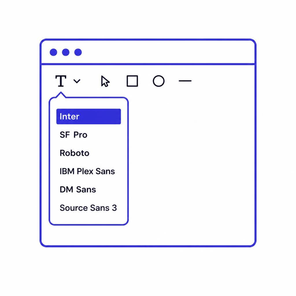
The most useful tool depends on the quality of the sample and the required outcome. Professionals use several methods together instead of expecting one database or algorithm to solve every case.
### 1. A cleaned source image and your own typographic analysis This is the highest-value resource because every later step depends on it. A designer who can recognize proportions, construction, and historical categories will evaluate results far more effectively than someone who simply accepts the top automated suggestion. Manual analysis is especially essential for modified logos, poor images, and display lettering.
### 2. Image-based font matching services Automated image matching is excellent for generating a starting list quickly. It is most effective when the sample is front-facing, high contrast, and made from relatively standard printed type. Use it to surface candidates, then compare the exact text yourself. It is less dependable for connected scripts, distressed signage, extreme perspective, single-character samples, and lettering with extensive effects.
### 3. Large, searchable font marketplaces and foundry catalogs Once you know the likely category, browsing reputable catalogs is often more productive than repeatedly running image recognition. Use filters for classification, width, weight, era, and language support. Foundry specimen pages can also reveal family members, alternate glyphs, and licensing terms that generic font lists may omit. For professional font matching, the availability of the correct license matters as much as visual similarity.
### 4. Vector software and comparison boards Illustrator, Figma, Affinity Designer, and similar tools are where candidates become decisions. Build a comparison board with the original sample on one side and your text set in each candidate on the other. Match scale, tracking, case, and color. For a logo, compare individual letters at large size; for editorial or web work, test a headline and a realistic paragraph. Overlaying semi-transparent versions can reveal differences in width and structure quickly.
### 5. Typography communities and specialist research When the project has historical, regional, or archival importance, experienced type communities and independent researchers can be invaluable. A well-framed question includes a clean crop, approximate date, country, medium, and visible characters. Do the preliminary work before asking. “Can anyone identify this?” gets weaker answers than “This appears to be a 1970s condensed grotesk; the distinctive R leg and flat-topped 3 have ruled out these five families.”
### 6. AI-assisted font generation or reconstruction This becomes highly useful when no available font is close enough or when the client needs a usable extension of image-based lettering. The goal is not to claim certainty about an original font; it is to create a practical type asset for the project. It is particularly effective for limited character sets, campaign lettering, legacy marks, and custom styles where an off-the-shelf font would require excessive compromise.
When to Generate a Font Instead of Finding One
The right question is not “Can I find the exact font?” but “What solution creates the best usable result?” Finding an existing typeface is usually preferable when the client needs a full family, broad language coverage, proven screen rendering, extensive OpenType features, or a long-term brand system. Established fonts come with tested spacing, kerning, italics, weights, support documentation, and licensing options.
Generate or reconstruct when the reference is clearly custom lettering, when the image contains a distinctive style that no available font reproduces, or when the project needs only a focused set of characters. For instance, a restaurant may want to preserve the hand-drawn personality of a 1950s sign for menu headings and social graphics. Searching through thousands of commercial scripts may produce close-but-not-right results. A custom font generated from the reference can be more efficient, more consistent, and more faithful to the visual identity.
This option also helps with legacy projects. Imagine a manufacturer that has only a photograph of product labeling from 1984 but needs to recreate packaging for an anniversary release. The lettering may have been made by a local artist or based on a modified transfer sheet, not a licensable font. In that situation, attempting exact identification can become a dead end. Creating a new, clearly documented recreation gives the client a usable asset without pretending the original source has been conclusively identified.
Before generating anything, define the character scope. Are uppercase A–Z, numerals, and a few punctuation marks enough? Does the client need lowercase, accented characters, currency symbols, or multiple weights? A limited display font can be completed quickly, while a production-ready family is a much larger type design undertaking. Review every output character for consistency, spacing, and readability; generation is a starting point, not an excuse to skip quality control.
Snapafont is useful when an image is the most valuable source material and the project needs a downloadable .TTF rather than another list of approximate matches. It can turn the visual reference into an editable font asset, helping designers move from “we found a lookalike” to “we have a practical file to use.” As with any custom type solution, designers should still test the result in the real layout and ensure the planned use is appropriate for the asset’s character coverage and quality.
How to Bill for Font Matching Without Surprises
Font work is easy to undercharge because it often happens before the visible design work begins. But research, image cleanup, testing, license evaluation, client communication, and implementation all take time. Treat font matching for designers as a defined project task rather than invisible overhead.
For straightforward work, include a fixed discovery allowance in your proposal. For example: “Typography research and recommendation: up to 90 minutes, including review of up to five candidate fonts and one licensed recommendation.” This gives the client certainty while giving you a reasonable limit. Specify that third-party font licenses are separate project expenses unless explicitly included.
For uncertain or archival jobs, use phased billing. Phase one can cover source assessment and a shortlist. Phase two covers deeper research, licensing verification, or custom recreation after the client approves the direction. This structure is especially helpful when the reference may be custom lettering. It prevents a small request—“please identify this font”—from turning into an open-ended investigation.
Be precise about what the client receives. A font recommendation is not the same as a font license; a purchased desktop license is not automatically a webfont, app, broadcast, server, or embedding license. If you buy a license on the client’s behalf, preserve the receipt and ensure the licensee is correct. If the client will edit files internally, confirm that their intended users and devices are covered.
Custom generation deserves its own line item. Your fee should account for source cleanup, character-set planning, output review, testing, revisions, and handoff documentation. If the client needs only a headline wordmark, it may be more economical to deliver vector lettering rather than a font. If they need recurring editable text, a font file may provide much better long-term value. Explain this tradeoff early so the recommendation is tied to the client’s operational needs, not just the visual brief.
A simple project note can reduce confusion: “The selected typeface is a visual match, not a confirmed identification of the historical original.” That sentence protects accuracy, sets expectations, and demonstrates the professional judgment behind your recommendation.
Make Font Matching a Faster, More Useful Part of Your Process
The best client font matching process combines careful observation with a clear stopping rule. Research the source, compare candidates in context, confirm licensing, and choose the solution that the client can actually use. When an existing typeface is right, recommend it confidently. When the reference is custom, incomplete, or impossible to identify with certainty, shift from searching to creating.
If you regularly receive image-based type references and need editable lettering rather than a collection of near misses, try Snapafont at snapafont.com. Upload the reference, create a downloadable .TTF font file, and test it directly in your design workflow. It is a practical way to preserve the character of a visual reference while giving clients an asset they can use in future layouts.
Ready to turn your image into a font?
Upload any image and get a real, downloadable .TTF font file in seconds.
Try Snapafont Free →

