You upload a picture of lettering, wait a few seconds, and a tool suggests a font name. It can feel like magic—especially when the source is a blurry storefront sign, an old magazine scan, or a cropped social-media graphic. But font recognition is not a single act of visual intuition. It is a chain of image-processing, pattern-matching, database-search, and confidence-ranking steps, each with opportunities to succeed or fail.
Understanding how does font recognition work is useful whether you are a designer trying to match a client asset, a marketer recreating a campaign visual, or a developer building a typography workflow. It explains why a clean screenshot with the word “Hamburgefonts” may produce excellent matches while a tilted photo of three handwritten letters may not. It also helps set the right expectation: most tools identify the closest available typeface in a library; they do not necessarily prove the exact font used in the original image.
Modern font recognition technology has improved dramatically through computer vision and machine learning. Yet it still faces hard problems involving low-quality images, altered letterforms, incomplete character samples, ligatures, outlines, shadows, and fonts that are simply absent from the search database. This article breaks down what happens under the hood, why results vary, and how font identification differs from creating a usable font from an image.
How Font Identification Works Step by Step
From uploaded image to ranked font matches
At its core, a font finder takes an image of text and compares the shapes it sees with reference shapes from known typefaces. The workflow usually begins with preprocessing. The system attempts to locate the text, separate it from the background, straighten it if it is rotated or photographed at an angle, and improve contrast. A black word on a white background is ideal because the letter boundaries are obvious. Text over a textured wall, neon sign glare, or a busy photograph requires far more interpretation.
Next comes segmentation: deciding where one character ends and the next begins. In a simple all-caps word with spacing between letters, this is straightforward. In connected script, tightly tracked display type, or a word where letters overlap, segmentation can be the most error-prone stage. Some modern systems avoid treating each letter as a fully separate object and instead analyze the word as a sequence or visual region. This helps with connected lettering, but it also makes the model more dependent on having enough visible text.
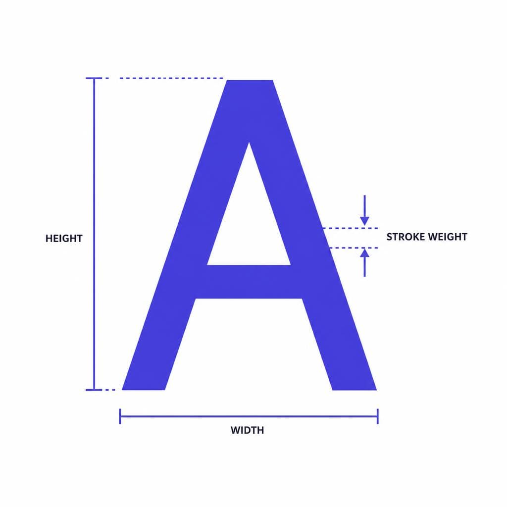
After the image is cleaned, the font detection algorithm extracts features. Traditional approaches measured explicit characteristics such as stroke width, serif shape, aspect ratio, x-height, slant, counter size, terminal style, and the relative positions of curves and corners. For example, a two-storey lowercase “a,” a single-storey “g,” or the distinctive leg on an uppercase “R” can quickly eliminate huge groups of possible fonts.
A modern system may combine those measurements with learned visual features. It compares the observed glyphs or word image against thousands or millions of examples associated with candidate fonts. The output is typically a ranked list, not a single definitive answer. A strong result might say that a particular font is highly likely, followed by several visually similar alternatives. That ranking reflects the evidence available in the uploaded image and the contents of the tool’s database—not an absolute statement that no other font could match.
This is why a good upload strategy matters. Include as many characters as possible, especially diagnostic ones. Uppercase R, Q, G, and J are often useful; in lowercase, a, g, e, r, y, and t can be highly revealing. Avoid cropping too tightly, retain the original resolution, and provide a flat, front-facing image whenever possible. If you know the text content, entering it accurately can also help a system compare the right characters rather than guessing both the words and the typeface.
The Role of Neural Networks in Font Recognition
How machine learning learns typographic features

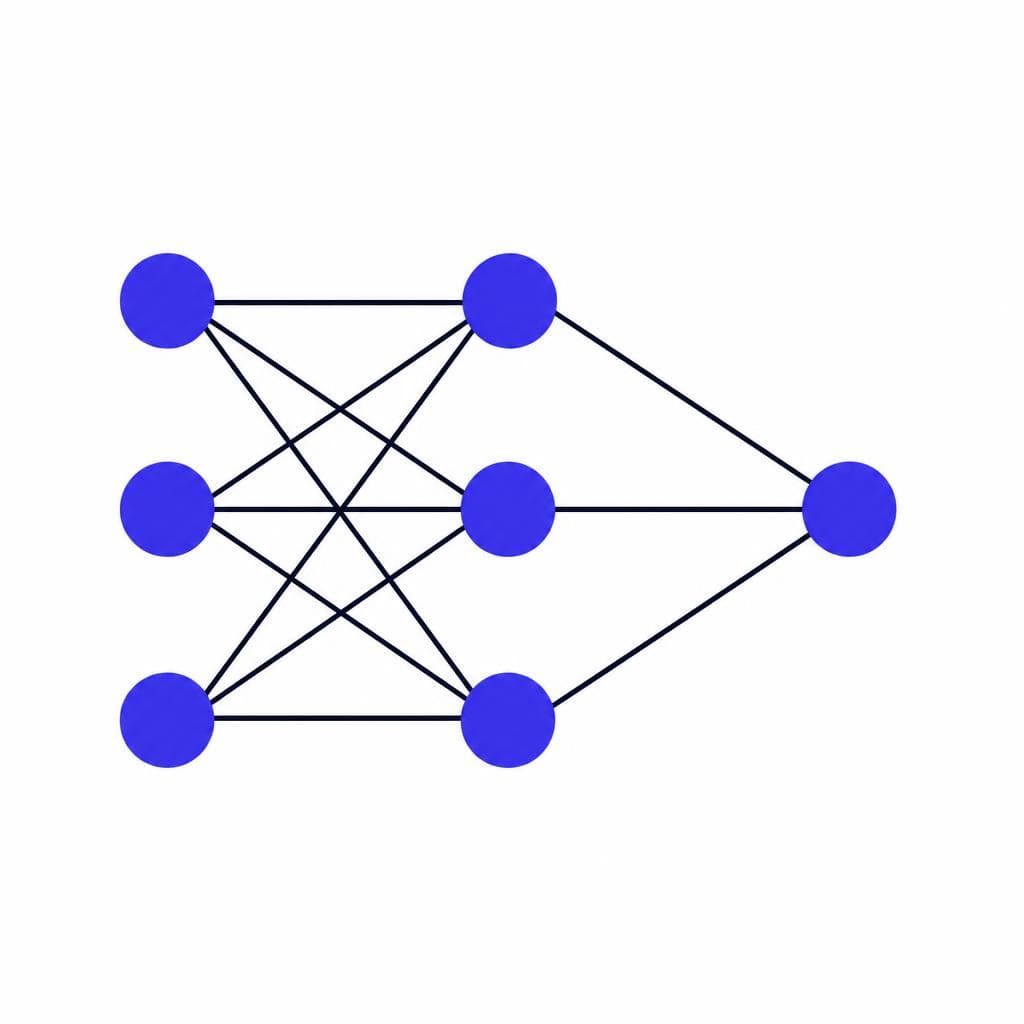
Machine learning font recognition changed the field because neural networks can learn which visual details matter without relying entirely on manually programmed rules. A convolutional neural network, or CNN, is particularly useful for images. It processes small regions of pixels and gradually builds a representation of more complex patterns. Early layers may respond to edges, curves, and line thickness. Deeper layers can learn features such as a bracketed serif, a geometric bowl, a calligraphic stroke contrast, or the characteristic structure of an entire letter.
During training, a model is shown many rendered text samples labeled with their fonts. The samples are often intentionally distorted to resemble real-world conditions: blur, compression artifacts, perspective changes, low resolution, noise, uneven lighting, outlines, and partial occlusion. This process, called data augmentation, teaches the model not to rely on one perfectly clean rendering. A practical font identification AI needs to recognize that the same typeface can look different when printed on fabric, displayed on a low-resolution screen, or photographed through a phone camera.
Many systems also use optical character recognition, or OCR, as a companion technology. OCR answers, “What does this text say?” Font recognition answers, “What typeface does it resemble?” They are related but not identical tasks. If OCR misreads an “I” as an “l,” the font matcher may compare the wrong glyph structure. Conversely, a font model can sometimes offer clues that improve text interpretation when the lettering is clear but unusual.
The most capable workflows use multiple signals rather than trusting one model blindly. They may identify the language and script, estimate whether the lettering is serif, sans serif, script, blackletter, or display type, detect image transformations, and then search within a narrower group of candidate fonts. Restricting the search space improves both speed and relevance. There is little value in comparing a brush script sample against every monospaced programming font in a library.
Still, neural networks do not “understand” a font in the same way a type designer does. They learn statistical visual relationships from training data. If a font has limited training examples, appears in an unusual context, or is represented poorly in the reference collection, the model may return a close lookalike. Its apparent confidence can be useful, but it should be treated as a starting point for visual verification.
Why Font Databases Put a Ceiling on Accuracy
A perfect visual match cannot be found if it is not in the library
The most important limitation in font identification is simple: a matching tool can only directly identify fonts that exist in, or can be connected to, its searchable database. There are tens of thousands of commercially distributed fonts, enormous open-source collections, discontinued families, regional type foundries, custom commissions, modified retail fonts, and personal lettering projects. No single database contains everything.
This matters because the best-looking result may be a near match rather than the original. Imagine a brand used a customized version of Futura: its designer may have altered the crossbar of the A, narrowed several characters, and redrawn the R. A tool might reasonably suggest Futura or another geometric sans, but neither result would be exact. The same issue occurs when a designer manually adjusts tracking, stretches text horizontally, adds a contour, or converts letters to outlines and edits individual nodes.
Image quality creates a second database-related problem. A low-resolution source removes the tiny details that distinguish similar families. Consider Helvetica, Arial, Univers, and dozens of neo-grotesque alternatives. At small sizes or under heavy blur, their distinguishing cues may be invisible. The system may correctly identify the broad category while being unable to make a defensible family-level choice.
Licensing and naming complicate the process as well. The same design may be sold under different names, bundled in different software, revived by another foundry, or available in multiple digitizations with subtle differences. Variable fonts add another layer: a font might have a continuous weight, width, or optical-size axis that produces an appearance between familiar named instances. A tool may identify the family correctly but recommend the wrong weight or width.
For these reasons, treat search results as candidates to inspect. Compare key letters side by side at the same size. Check the uppercase and lowercase forms, punctuation, numerals, and spacing—not just the first letter that appears similar. Before using a suggested commercial font, confirm its licensing terms. A close visual answer is not automatically permission to use that file in a logo, app, product, or advertising campaign.
Font Recognition and Font Generation Are Different Jobs
Identifying a name versus turning lettering into a usable font
A common misconception is that identifying a font and making a font are the same task. They are not. Recognition searches for a pre-existing typeface that resembles the image. Generation creates new font data: glyph outlines, spacing, character mapping, and the technical information required for software to use the result as a font file.
If you upload a photo of a hand-lettered alphabet, there may be no existing font name to find. In that case, a recognition tool can describe the style or recommend similar fonts, but it cannot recover an original digital typeface that never existed. What you need instead is a process that converts the visual source into a new, usable font.
That process usually includes detecting each character, tracing or reconstructing its shapes, normalizing baseline and cap-height relationships, assigning glyphs to Unicode characters, and exporting a format such as TTF or OTF. It may also involve setting side bearings and spacing so that letters work together in words. Kerning—the fine adjustment of specific pairs such as A/V or T/o—is another concern. A set of beautiful individual letters can still feel amateurish if spacing is inconsistent.
This distinction is especially important for handwriting. A font finder works best when it has a known catalog to search. A handwriting-to-font workflow works best when you provide a clear alphabet or character set that can be converted into a personal typeface. Snapafont is designed for this second use case: it turns an image of lettering or handwriting into a downloadable TTF font, giving users an alternative when the desired style is original rather than something that needs to be identified in a library.
Generation also raises a practical quality question. A generated font should preserve the character of the source without preserving avoidable defects. For example, slight variation in handwriting can make a font feel human, but wildly inconsistent baseline alignment can make it difficult to read. The ideal result depends on intended use: an expressive display font can retain more personality, while a font for invitations, labels, or digital documents needs reliable legibility and spacing.
Practical Implications: How to Get Better Results
A field guide for designers, researchers, and creators
Knowing how font finder works makes troubleshooting much easier. Start by preparing the best possible source image. Use a high-resolution original rather than a screenshot of a screenshot. Crop away distractions but leave enough margin that ascenders, descenders, and punctuation are not cut off. Correct perspective when photographing signs or packaging, and increase contrast carefully. Aggressive sharpening can create false edges that confuse a computer vision font system, so clarity is better than overprocessing.
Provide more text than you think is necessary. One distinctive letter can occasionally identify a famous face, but a full word gives the system far more evidence. Ideally, collect several words containing different letter shapes. If the original image only has a short title, look for another brand asset, product label, web page, or print sample that uses the same typography.
Then evaluate results like a typographer. Do not compare only overall “vibe.” Inspect structural details: Is the lowercase g single- or double-storey? Are the terminals horizontal, angled, rounded, or ball-shaped? Does the e have a high or low crossbar? Are circular letters truly geometric circles? Are serifs bracketed? Does the stroke contrast follow a calligraphic angle? These details are more dependable than broad labels such as “modern” or “vintage.”
When an exact match is unnecessary, choose based on function. A similar licensed font may be better than spending hours hunting for an unavailable original. For a web project, verify webfont availability, file size, variable-font support, language coverage, and licensing. For print, test the typeface at the intended size; a close match in a large image may behave very differently in small body text.
When the lettering is unique, stop forcing an identification answer. If it is a family member’s handwriting, a hand-painted sign, a custom monogram, or an illustrated alphabet, making a new font may be the more honest and useful route. Capture the source clearly, include the characters you need, and test the output in real phrases. This approach preserves the visual voice of the original instead of settling for a generic substitute.
Finally, remember that recognition is evidence-based, not infallible. Use it to narrow an overwhelming universe of typefaces into a manageable shortlist. Combine the machine’s speed with human visual judgment, source research, and license verification. That is the workflow most likely to produce a result that is both visually accurate and legally appropriate.
Turn Your Own Lettering Into a Font
Font recognition is ideal when you are trying to locate a known typeface. But if the image contains one-of-a-kind handwriting, hand lettering, or a custom alphabet, the more useful goal is often to create a font you can actually type with. Rather than rebuilding every letter manually in design software, you can start with a clear image and test the resulting font in the tools you already use.
Try Snapafont at snapafont.com to convert your lettering image into a downloadable TTF font. Prepare a clean, well-lit sample with as many characters as possible, then use the exported font in documents, design projects, invitations, mockups, or personal branding. It is a practical way to preserve a distinctive visual style when there is no database entry—and no exact font name—to find.
Ready to turn your image into a font?
Upload any image and get a real, downloadable .TTF font file in seconds.
Try Snapafont Free →

