You spot it on a storefront, vintage poster, product label, menu, or social media graphic: a typeface that feels exactly right for your project. The challenge is turning that visual inspiration into something usable. A screenshot may show only a few letters, the image may be tilted or grainy, and a font name is rarely included. Fortunately, it is now possible to match a font from a photo without manually scrolling through thousands of typefaces.
This guide explains how to identify a font in photo files, prepare the image for better recognition, compare likely matches, and go from a visual reference to a usable font file. Whether you need to recreate a brand-adjacent look, restore old signage, design an invitation, or build a custom typeface from lettering, the process starts with a clear image and the right expectations.
There are two slightly different goals people often mean when they search for a font from photo. The first is font identification: finding the existing commercial or free typeface that most closely matches the letters in the image. The second is font creation: converting the lettering style in an image into a downloadable font you can install and type with. Knowing which outcome you need will help you choose the best workflow and avoid wasting time on near-matches that do not solve the actual design problem.
What Photos Work Best for Font Matching?
The quality of your source image has a major effect on font recognition. A font matching tool does not need a studio-quality photograph, but it does need enough visual information to distinguish meaningful letter features. Details such as the shape of the lowercase “a,” the angle of the “e” crossbar, serif construction, stroke contrast, and terminal shapes are what separate one typeface from another.
The best images have high contrast between letters and their background. Black lettering on a white sign is ideal, but white lettering on a dark wall can work equally well. Aim for letters that are sharp, reasonably large, and unobstructed. A photo where the text occupies at least a few hundred pixels in height will generally produce more useful results than a distant shot of an entire building.
Choose a sample with several distinct characters when possible. The word “SALE” can be useful, but a phrase containing letters such as R, G, A, M, S, e, g, a, and y gives a font finder from image software more identifying clues. A mixed-case sample is especially valuable because uppercase lettering alone can make many typefaces look similar. Numerals and punctuation can also help, particularly when comparing display fonts.
Photos that tend to be more difficult include heavily stylized logos, handwritten scripts, warped lettering on curved surfaces, extreme perspective shots, low-resolution screenshots, and text covered by reflections or shadows. This does not mean they are unusable. It simply means that the result may be a close stylistic match rather than a precise identification. For custom lettering, a photo to font workflow can still be effective if enough individual characters are visible to reconstruct the alphabet.
Before uploading, crop the image so the lettering is the focus. Remove unnecessary margins, surrounding objects, and large areas of background. If the photo includes multiple fonts, make separate crops for each one. For example, on a restaurant menu, upload the script headline separately from the sans-serif body copy. Combining unrelated type styles in one image can confuse the analysis and make the suggested matches less relevant.

How to Match a Font From a Photo: Step by Step
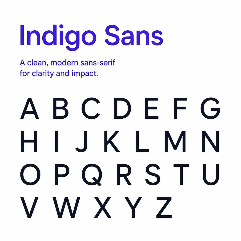
A reliable font matching process combines automation with a quick visual check. The software can narrow the field dramatically, but your own comparison of the letterforms is what confirms whether a candidate is truly right for your project.
### 1. Decide whether you need identification or a usable recreated font
Start by defining the end result. If the lettering is clearly a well-known font and you only need its name or license source, use a font recognition photo workflow to identify close candidates. If the photo contains original lettering, a rare style, or a look you want to turn into a working typeface, you may need to create a new font based on the image instead. This distinction matters because a font identifier can suggest similar existing options, while font-generation tools focus on producing a font file you can use.
### 2. Crop to the clearest text sample
Make a tight crop around one line or word. Keep every part of the letters visible, including ascenders, descenders, dots, serifs, and swashes. Avoid cropping so closely that letter edges are cut off. If the image is skewed, rotate it until the baseline is roughly horizontal. For a word painted on a wall at an angle, use perspective correction in an image editor if available. Straight, front-facing letters are much easier to analyze.
### 3. Improve contrast without changing the letterforms
Use basic edits sparingly. Increase contrast, reduce shadows, and sharpen slightly if the original is soft. Convert the crop to grayscale if a colorful or textured background makes the letters hard to isolate. Do not over-sharpen, heavily blur, or apply filters that alter thin strokes and serif details. A font matching tool needs the original shapes, not an artificial outline.
For example, imagine a cream-colored serif wordmark on a faded red package. First crop the wordmark. Then brighten the cream lettering and reduce the red background saturation until the edges are easier to see. This small adjustment can reveal whether the typeface has bracketed serifs, high contrast, or distinctive ball terminals.
### 4. Upload the image to a font recognition service
Upload the cleaned crop to your chosen tool. Most services analyze the image, isolate text, and compare its shapes against font libraries or visual style models. Review several results rather than accepting the first one immediately. The closest match may be a different weight, width, optical size, or era-inspired revival of the original.
If your goal is to make the photographed style usable as a typeface, Snapafont provides a practical route from visual reference to a downloadable .TTF file. Instead of stopping at a font name, it is designed to help turn an image-based lettering style into a font you can install and use in standard design software.
### 5. Compare the most diagnostic letters
Do not judge a match based only on the overall mood. Zoom in and compare the characters that reveal the most about a typeface. In serif fonts, check the uppercase R leg, lowercase g, lowercase a, the serif shape on E or T, and the contrast between thick and thin strokes. In geometric sans-serifs, compare the roundness of O, the tail of Q, the leg of R, and the width of M. In scripts, inspect joins, entry strokes, loops, and the ending stroke of letters such as y, s, and r.
A candidate may look correct at first glance but fail under close inspection. For instance, two condensed sans-serifs may share a narrow silhouette, yet one has a flat-topped “t” and the other has a curved terminal. If your photo clearly shows that letter, it should carry more weight than a general visual resemblance.
### 6. Test the match with your actual text
Once you have one or two likely fonts, type the words you plan to use. This is essential because a font can resemble the reference in the photographed word but look wrong in a new phrase. Test uppercase and lowercase letters, numbers, punctuation, and any special characters your project needs. Adjust tracking, weight, and size before ruling out a candidate; spacing and scale often influence perceived similarity.
### 7. Verify licensing before using an identified font
Identifying a font does not automatically grant permission to use it. Check whether the typeface is available for personal, desktop, web, app, logo, or commercial use. If the original is unavailable or licensing is unsuitable, choose a legitimate alternative or create a fresh, original font inspired by broad visual characteristics rather than copying protected branding. This is especially important for logos, packaging, and client work.
Tips for Better Font Recognition Results
The fastest way to improve an unsuccessful result is to give the tool a better sample, not to keep uploading the same difficult image. Try multiple crops from the same photo. One crop might contain the whole word, while another focuses on two or three especially distinctive letters. A close crop of “R,” “g,” or “a” can sometimes be more useful than a distant view of an entire sentence.
Keep letters separated when possible. Connected shadows, decorative borders, overlapping objects, and very tight spacing can make character segmentation difficult. If the text is on a patterned surface, make a second version with a cleaner background using basic masking or threshold adjustments. You do not need perfect image editing; you only need to make the letter boundaries more obvious.
Use the style category as a filter. If the image looks like a 1970s soft serif, search and compare within that family rather than across every font style. If it is a blackletter, brush script, monospaced face, or Art Deco display font, tell your search process what you already know. Human classification plus automated matching is usually more accurate than either method alone.
Watch for optical distortions in photographs. Wide-angle lenses can stretch letters near the edges of an image. A sign viewed from below can make vertical strokes lean inward. Embossing, neon glow, print texture, and weathering may also disguise the underlying font. In these cases, focus on structural features: proportions, skeleton shapes, counters, stroke endings, and character construction. Ignore surface effects until after you have found the base style.
When the photo shows only a logo, be prepared for the answer to be “custom lettering.” Many brands modify existing fonts, redraw letters, or use a completely bespoke wordmark. A good result may therefore be a similar font for body use plus manual adjustments to a few headline letters. If you need a reusable typeface rather than a one-off approximation, consider whether creating a custom font from the visual reference better serves the project.
Finally, preserve your reference image and note where it came from. Keeping the original photo, crop versions, likely font names, and licensing links makes it easier to revisit the decision later. This is particularly helpful when working with clients, historical archives, or a long-running brand system.
What You Get When You Go From Photo to Font
A successful font match can give you much more than a name. At minimum, you gain a practical design direction: a shortlist of typefaces with similar proportions, mood, and letter construction. That is often enough to recreate the feel of a reference for a poster, presentation, website, or social campaign.
When you locate the exact font, you can license it appropriately and use it across your design workflow. You may receive multiple weights and styles, such as regular, italic, bold, condensed, or extended versions. These variants make it easier to create hierarchy while keeping a consistent visual voice.
When the original lettering is custom, unavailable, or simply too difficult to identify, the more useful outcome may be a new font file based on the image. A usable .TTF font can be installed on macOS or Windows and used in applications such as Adobe Photoshop, Illustrator, Canva-compatible workflows, Microsoft Office, Figma-supported desktop setups, and many other design environments. The exact character coverage will vary by tool and source material, so check whether you need only basic Latin letters or a broader set of numerals, punctuation, accented characters, and symbols.
This is where moving beyond a simple font finder from image search becomes valuable. Rather than repeatedly hunting for an imperfect substitute, you can create an asset that fits the visual direction of your project. For a wedding stationery designer, that might mean turning a distinctive hand-lettered sample into a typeable style for place cards and menus. For a vintage reseller, it could mean building a display font influenced by packaging references for original promotional graphics.
Remember that consistency matters as much as similarity. Once you settle on a match or custom typeface, document the font name, weight, size range, line-height, and tracking values that produced the desired look. This turns a one-time discovery into a repeatable design system.
Turn Your Best Reference Into a Usable Font
Finding the right typeface begins with looking closely at the letters, but it should not end with a screenshot and a list of guesses. If you have a photo with a style you want to use in real projects, prepare a clean crop, evaluate the letterforms, and decide whether an existing match or a new font is the better answer.
For the moments when you want to go from visual inspiration to a typeable font file, try Snapafont at snapafont.com. Upload your reference, turn the style into a downloadable .TTF font, and test it with the words that matter to your project. It is a straightforward way to make a font from photo references more practical for design, branding, creative experiments, and original typography workflows.
Ready to turn your image into a font?
Upload any image and get a real, downloadable .TTF font file in seconds.
Try Snapafont Free →

