You find it in a product mockup, an old social post, a game screenshot, a scanned sign, or a client’s “can we make it look like this?” reference: a typeface that is exactly right. You crop the lettering, run it through a font matcher, and get nothing useful. That does not necessarily mean you made a bad search. It may mean the lettering is custom, heavily edited, generated, too low-resolution to identify reliably, or simply not indexed in the font databases available to screenshot font finder tools.
The good news is that identifying the original font is no longer the only path forward. If your goal is to use that visual style in a new design, you can recreate a font from a screenshot by treating the screenshot as a visual reference rather than a database lookup. AI-assisted font creation can analyze the letterforms you provide and build a usable font file inspired by their defining characteristics: stroke contrast, width, terminals, curves, spacing, and overall personality.
This guide explains why it can be difficult to identify a font in a screenshot, how AI-based recreation differs from traditional font matching, how to prepare a strong reference image, and when creating a font from an image online is the practical choice. It also covers the important boundary between recreating a visual direction and copying a protected commercial typeface.

Why Screenshot Fonts Are So Hard to Find
A conventional screenshot font finder works by comparing visible glyphs with samples in a library. That approach is useful when the image contains a standard, unmodified font and enough clear characters to compare. But screenshots rarely provide ideal evidence. They are usually compressed, anti-aliased, scaled, cropped, filtered, or displayed on a background that obscures letter edges. A matcher may return several close candidates, yet none will be an exact answer.
There is also a more fundamental issue: the typeface may not exist as a downloadable font at all. Brand marks are often custom-drawn. Editorial headlines may use a display face that has been modified by an art director. A creator may have stretched letters, adjusted individual curves, added outlines, or combined multiple fonts. In those cases, no amount of reverse image searching will successfully identify the font in a screenshot because there is no single source font to identify.
### Screenshots hide the details font matchers need
Font identification depends on distinctive features. For example, a lowercase “a” may be single-storey or double-storey; the tail of a “y” may curve, hook, or end bluntly; the crossbar of an “e” may sit high or low. A screenshot containing only a few letters may not include those decisive shapes. Even when it does, rendering can disguise them. Pixel smoothing softens corners, JPEG artifacts create false texture, and perspective distortion can make a round letter appear narrow or uneven.
Spacing causes another common false lead. What looks like a unique typeface may actually be a familiar font with custom tracking, tight kerning pairs, a thick stroke effect, or vertical scaling. A font extractor can inspect the visible visual result, but it cannot always separate the original outlines from styling applied in Photoshop, Figma, Canva, CSS, or a video editor.
### “Closest match” is not always the useful answer
Suppose a screenshot shows the word “MORNING” in a chunky, friendly serif. A matching tool might suggest five similar retail fonts. Each one has the broad serifs and low contrast you want, but perhaps the screenshot’s “R” has a distinctive curved leg, the “G” has a short spur, and the letters are slightly condensed. If the project needs a matching wordmark, picking the closest library font may still look noticeably wrong.
In that situation, it helps to change the question from “What is this exact typeface?” to “How can I create lettering with these recognizable traits?” That is the gap AI recreation can fill. It is especially useful when the original cannot be found, when a reference is only a few words long, or when you need a custom working font instead of a one-off traced graphic.
Of course, visual similarity does not automatically grant usage rights. If you recognize a living designer’s typeface or a protected brand identity, license the original font or obtain permission where appropriate. Recreation is best used for your own visual references, public-domain material, client-approved assets, or an original style direction—not to impersonate a brand or evade a font license.
How AI Font Recreation Turns a Screenshot Into a Usable Font
AI recreation is not the same as a database match. Instead of searching for an existing font name, the system interprets visual features in the reference and generates consistent glyph outlines across a character set. The practical output is a new typeface file that can be installed and used in design applications, documents, websites, and creative tools.
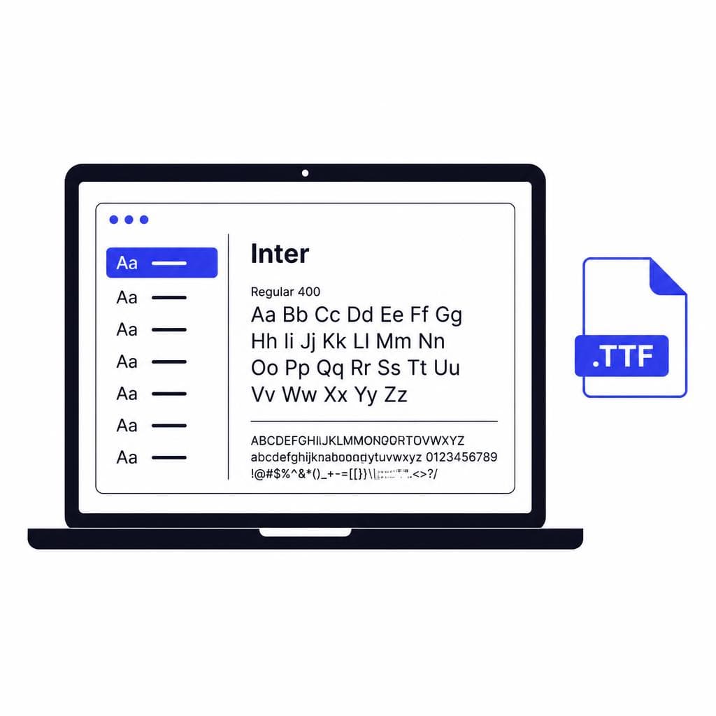
Snapafont follows this reference-to-font workflow: upload a clear image of the lettering, let the AI infer the visual system behind it, then download a .TTF font file. The result is most effective when you use it as a custom font inspired by the reference image, rather than expecting a forensic duplicate of an unavailable original. This distinction sets realistic expectations and produces better creative decisions.
### Step 1: Isolate the type reference
Start by cropping the screenshot so the lettering is the main subject. Remove unrelated UI elements, photos, icons, shadows, and decorative borders whenever possible. If the text is on a busy background, use a basic image editor to increase contrast or create a clean crop around the letters. The goal is to make the structure of each glyph easy to read.
A reference reading “BLOSSOM” gives useful evidence because it contains straight stems, rounded forms, diagonals, and varied terminals. A reference reading only “III” or “OOO” gives much less information. More character diversity generally helps an AI infer a more coherent design. If you have multiple screenshots from the same source, gather them—provided they clearly use the same lettering style.
### Step 2: Read the style before generating
Before creating anything, describe what you see. Is the font geometric or hand-drawn? Narrow or wide? High-contrast or monoline? Formal, retro, playful, industrial, or soft? Look specifically at the capital “R,” lowercase “g,” “a,” “e,” “S,” numbers, punctuation, and any unusual terminals. These observations help you judge whether the generated result preserves the features that matter most.
For example, a 1970s-inspired headline may combine a low x-height, inflated curves, soft corners, and very tight spacing. A tech interface font may instead rely on an open aperture in the “e,” uniform stroke weight, and squared terminals. The overall mood matters, but the small structural details are what make a font feel convincing in use.
### Step 3: Generate, test, and compare at real sizes
Once you have a generated font, do not judge it only by typing the original word in huge letters. Test it in the way you will actually use it: a 16-pixel button label, a 48-point poster headline, a social graphic, or a packaging mockup. Type several words that include different character combinations. A font can look excellent in “MUSE” but reveal awkward spacing in “WAVY,” “minimum,” or “RIVER.”
Check four things: consistency of stroke weight, readability, spacing, and the identity of signature characters. If the screenshot’s charm came from a swooping “R” or rounded “E,” assess those glyphs first. You may also need to adjust tracking after installation; typefaces are designed systems, but final spacing is still part of art direction.
### Step 4: Treat the result as a starting point for a system
The most useful outcome of a font extractor is not merely a single copied word. It is a font you can reuse for headlines, labels, invitations, thumbnails, campaign concepts, or prototypes. Build a small test sheet with uppercase, lowercase, numbers, punctuation, and your common phrases. This reveals where the style is strongest and where you may want a more neutral companion font for body copy.
Pair a recreated display font with a readable sans serif for longer text. For instance, use the recreated face for a coffee brand’s packaging headlines and a clean humanist sans serif for ingredients, web navigation, and legal copy. This keeps the project distinctive without sacrificing usability.
How to Take a Good Screenshot for Font Recreation
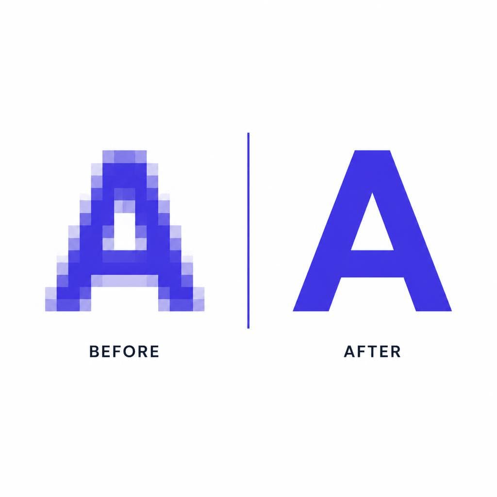
The quality of the input strongly affects the quality of a recreated font from a screenshot. You do not need a perfect studio scan, but you do need legible letterforms. A clean, high-resolution reference helps the AI distinguish intentional shape choices from visual noise.
### Prioritize sharpness, contrast, and character variety
Capture the original at its largest available size. If it appears in a browser, zoom in before taking the screenshot. If it is in a video, pause on the sharpest frame. Avoid screenshots of screenshots, since repeated compression and scaling remove edge information. When possible, save the original image asset rather than capturing it from a small preview.
Aim for dark text on a light background or light text on a dark background. Strong contrast makes counters—the enclosed spaces in letters such as “o,” “p,” and “B”—much easier to interpret. If the type is over a photograph, crop tightly and use image editing to reduce distraction, but do not over-sharpen to the point that you invent jagged edges.
Include as many distinct characters as possible. A good target is a short phrase containing uppercase and lowercase letters, curved and straight forms, and at least one character with a descender if available. “Quick brown fox” is ideal when you can choose the sample, but real-world references are rarely that convenient. If you can collect only a few words, favor the clearest samples over trying to combine mismatched images.
### Avoid distortions that change the letterform
Perspective is a major problem. A photo of a storefront sign taken from an angle can make one side of each letter wider than the other. Straighten the image before using it, or find a front-facing photo. Likewise, avoid extreme motion blur, embossed effects, heavy glows, thick outlines, and text warped around objects. These effects may be part of the design, but they are not always part of the underlying font.
Be cautious with all-caps samples. They can be enough for a display use case, but they reveal little about lowercase construction. If you need body text or mixed-case branding, seek another image from the same source that includes lowercase letters. Similarly, a single logo may have custom glyphs that do not represent a complete alphabet. It can still be a valuable style reference, but it should not be treated as proof of every character’s design.
### Use a simple pre-upload checklist
Before uploading, ask: Can I clearly see the edges of every letter? Is the text mostly flat and front-facing? Does the crop include enough different characters? Have I removed unrelated visual clutter? And do I have the right to create a font inspired by this source? A “yes” to these questions puts you in a much better position than endlessly trying to copy a font from a screenshot with unreliable matching tools.
Practical Uses for a Recreated Font
Recreating a font is most valuable when the reference style needs to become repeatable text. It turns a visual mood board item into something your team can type, revise, and apply consistently instead of manually tracing every new headline.
### Brand concepts and client pitches
Designers frequently receive a reference board with one compelling piece of typography and no usable font file. For an early concept, a recreated font can help demonstrate the intended direction across a logo exploration, landing page hero, social post, and product label. It gives clients a more realistic view of the system than a single hand-built mockup.
This is also useful for internal brands, event identities, and short-run campaigns. Imagine a seasonal market inspired by vintage produce crates. Rather than forcing a generic slab serif into every asset, you can develop a display style based on the reference, then use it for vendor signs, tote bags, digital ads, and schedule graphics.
### Restoring personal and historical lettering
Old family photos, handwritten cards, school newsletters, and community archives often contain lettering that is meaningful even if it has no known font name. A font from image online workflow can preserve the feeling of that material for invitations, memory books, documentaries, or local-history exhibits. When working with historical sources, retain the original image and document what was recreated; this is good archival practice and prevents a new interpretation from being mistaken for the source artifact.
### Content creation and product prototyping
Creators can use a custom display font for YouTube thumbnails, podcast artwork, streaming overlays, newsletter headers, or social templates. Product teams can use one for early game UI, themed app concepts, or marketing prototypes. In both cases, consistency matters: a reusable font makes new assets faster to produce and helps a recognizable visual voice emerge.
For commercial launches, conduct a final legal and brand review. A recreation should be sufficiently original and appropriate for the intended use, especially if the reference is associated with another company or commercially distributed typeface. The safest route is always to use original source material, licensed fonts, or a clearly transformed style direction.
Turn a Strong Reference Into Type You Can Actually Use
When a screenshot font finder cannot produce a confident match, you do not have to abandon the style that caught your eye. Start with the clearest reference you can find, focus on the characteristics that make it memorable, and create a type tool that supports your own work rather than recreating one static image by hand.
Snapafont makes that process straightforward: upload a lettering reference, generate a font based on its visual style, and download a .TTF file to test in your real designs. Visit snapafont.com to turn your best screenshot reference into a usable starting point for headlines, concepts, and custom creative projects.
Ready to turn your image into a font?
Upload any image and get a real, downloadable .TTF font file in seconds.
Try Snapafont Free →

