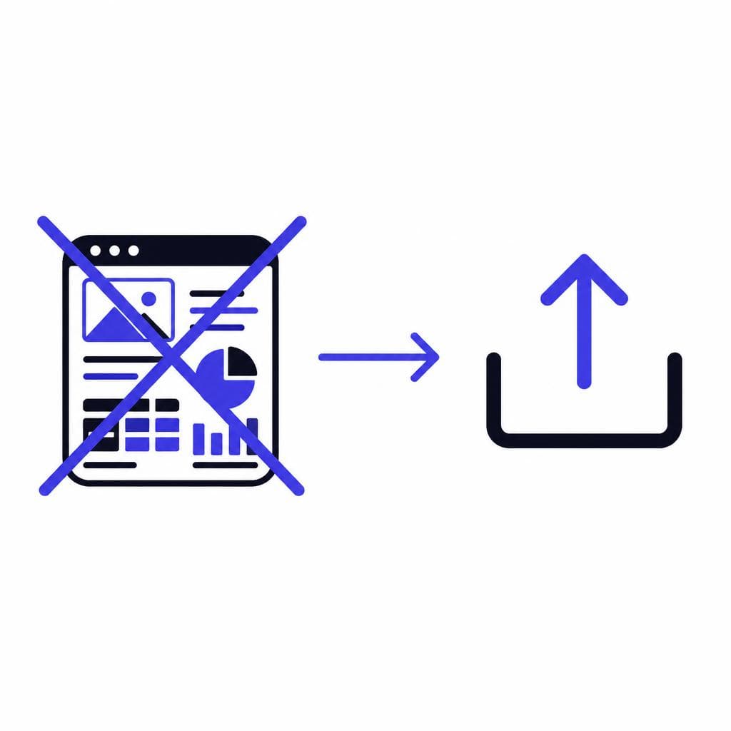
For a long time, making a usable font sounded like a specialist’s job. You needed expensive desktop software, an understanding of Bézier curves and font metrics, and enough patience to draw every letter, number, punctuation mark, and symbol by hand. For anyone who simply wanted to turn their handwriting, a classroom alphabet, a brand sketch, or an illustrated letter set into a font, the process was disproportionally technical.
That is no longer the only route. If your goal is to make a font without software installed on your computer, AI-assisted font creation can handle much of the conversion work that once demanded professional type-design tools. You still need good source material and a clear idea of how the font will be used, but you do not need to become a typographer before you can produce a downloadable font file.
This guide explains what traditional font production involves, why it has been difficult for beginners, and how a modern font maker with no design skills requirement can help you move from an image to a usable font. You will also find a practical, step-by-step process for easy font creation, including tips for getting cleaner results from handwriting, scans, and illustrated alphabets.
How Font Making Traditionally Works
A digital font is more than a folder of letter images. It is a structured file that tells software which visual shape belongs to each character and how those shapes should behave when typed. When you press the A key, for example, the font maps that keyboard character to an outline called a glyph. The same happens for lowercase letters, numerals, punctuation, symbols, accented characters, and, in more advanced typefaces, ligatures and alternate letterforms.
In the traditional workflow, a type designer begins with sketches, then redraws every character as vector outlines in dedicated font-editing software. Those outlines must be clean, closed paths rather than ordinary pixels. The designer sets the baseline, x-height, cap height, ascender, and descender so the alphabet sits consistently on a line. Next comes spacing: each character needs side bearings so words neither crash together nor drift too far apart. Kerning then adjusts troublesome pairs such as AV, To, Wa, or Yo.
After the basic alphabet is complete, the font is tested at small and large sizes, exported as an OpenType or TrueType file, installed, and checked in real applications. A single missing character may not matter for a personal note, but it becomes a problem when you need an apostrophe, an ampersand, a question mark, or the currency symbol required in a design. Professional families often include hundreds or thousands of glyphs and multiple weights, such as regular, bold, italic, and condensed.
This method remains valuable for type designers creating polished commercial families. It gives maximum control over the result. But it is not always necessary for someone who wants to use their own handwriting in invitations, turn a child’s drawn alphabet into a keepsake, or create a distinctive display font for a small project.
Why the Barrier to Entry Was So High
Font design combines several different skills
The biggest obstacle was not simply drawing letters. Font design brings together illustration, technical production, visual consistency, and language support. A letter can look attractive by itself but perform poorly in a sentence if its proportions, spacing, or stroke weight do not relate well to neighboring letters.
Traditional programs also use terminology that is unfamiliar to most beginners: nodes, contours, path direction, overshoot, advance width, hinting, Unicode mapping, and kerning classes. Learning those concepts is worthwhile when you intend to design type professionally. It is excessive, however, when your immediate need is simple font making for a personal, educational, or one-off branding project.
There is also a production burden. To make a font for free in older workflows, users often had to combine several tools: one to scan or photograph artwork, one to clean the image, one to trace vectors, and one to compile the font. Each handoff could introduce mistakes. A faint pencil line might become a stray vector point; a tilted scan could make the whole alphabet feel uneven; a missed character mapping could leave a blank square when the font is typed.
The result was that many people had great letterforms but no practical path to use them. Teachers, crafters, illustrators, parents, and small-business owners were forced either to settle for image-based text or to outsource the work. The need was not for more design controls. It was for a workflow that removes unnecessary technical steps while preserving the character of the original letters.
AI Is the Equalizer for Everyday Font Creation
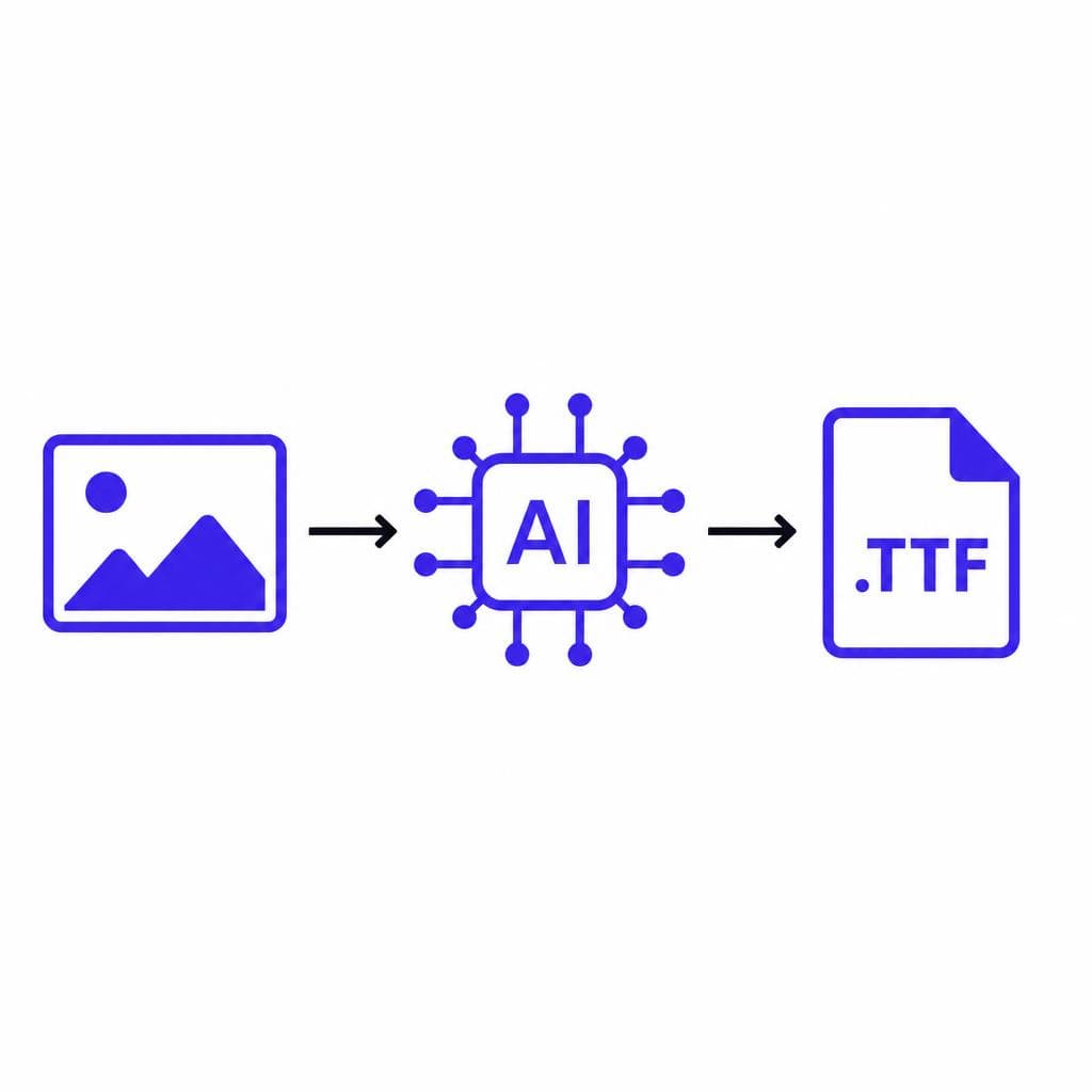
AI changes the process by interpreting the letterforms in an image and helping convert them into a font structure. Rather than manually tracing every character, positioning it in a glyph editor, and exporting technical files, the user can focus on the part humans are best at: creating or choosing an alphabet with personality.
That makes it possible to create font no software installation and no complicated vector workflow. In this context, “no software” means no specialist desktop font-design application to buy, learn, or maintain. You may still use a phone camera, scanner, or basic drawing tool to prepare the source image, but the font-building work happens through a simpler online process.
A tool such as Snapafont analyzes a supplied image of letters and converts the collection into a downloadable .TTF font file. This is especially useful when the goal is to preserve organic imperfections: rounded handwritten letters, marker strokes, classroom-style printing, chalk lettering, or decorative hand-drawn capitals. Those details are often what make a custom font feel personal instead of generic.
AI does not eliminate the value of careful preparation. It cannot reliably infer a character that was never drawn, and it cannot make muddy, overlapping, low-contrast letters magically behave like a professional text typeface. What it does remove is the repetitive technical work between your letter image and a font you can install. For many projects, that is the difference between an idea staying on paper and becoming something you can actually type with.
What You Need Before You Start
Keep the source alphabet clear and consistent
You do not need formal type-design training, but you do need a usable source image. Start with a complete alphabet if possible: uppercase A–Z, lowercase a–z, numbers 0–9, and common punctuation such as periods, commas, apostrophes, question marks, exclamation points, parentheses, hyphens, and ampersands. If you only need a display font for headings, uppercase letters may be enough, but a fuller set makes the final font far more useful.
Use dark lettering on a light, plain background. Black marker on white paper is ideal. Avoid lined notebook paper, textured backgrounds, heavy shadows, and artwork that touches the edges of neighboring characters. Draw each letter at a similar size and leave space around it. Consistency matters more than perfection: a deliberately wobbly alphabet can become a charming font, while wildly different letter heights can make typed words difficult to read.
A phone photo can work well if it is taken straight above the page in bright, even light. A scan is usually even better. Before uploading, crop out irrelevant areas and rotate the image so the baseline is horizontal. If your letters are faint, increase contrast with a basic image editor. You do not need a font without glyphs app or a professional vector package; simple image cleanup is enough.
Think about the intended use before you draw. A bold brush alphabet can be excellent for social graphics and poster titles but hard to read at 10-point body-text size. Fine pencil lettering may look elegant in a logo but disappear in a small caption. For a personal handwriting font, write naturally, but slow down enough to keep each character distinguishable. Pay particular attention to commonly confused forms, including I and l, O and 0, S and 5, and uppercase U and V.
Finally, check licensing and ownership. Your own handwriting and artwork are generally the safest sources. Do not scan an existing commercial typeface, a book’s printed alphabet, or another artist’s lettering and present it as your own font. A custom font should be based on artwork you have permission to use.
Step-by-Step: Make a Font Without Font Design Software
The following workflow is designed for beginners who want a practical result, not a semester-long lesson in font engineering.
1. Plan the character set. Write down where the font will appear. For a birthday invitation, you may only need capitals, numbers, and punctuation. For regular documents, include both cases and everyday symbols. Planning first prevents the frustrating discovery that you forgot the @ symbol or a question mark after the font is already made.
2. Create a clean letter sheet. Use one sheet of white paper and a dark pen or marker. Draw or write each character separately, using a loose grid if helpful. Keep the baseline stable, but do not erase every natural variation; that handmade rhythm is often the point. For example, a baker creating packaging labels might use thick, friendly uppercase letters, while a wedding stationer might use flowing, high-contrast script.
3. Photograph or scan the sheet. Place the paper flat, use even lighting, and make sure the image is in focus. If using a phone, avoid shooting at an angle, because perspective distortion can stretch characters on one side. Review the image at full size. If the edges look soft or gray, reshoot before continuing.
4. Do a quick cleanup. Crop the page, straighten it, and raise contrast if needed. Remove accidental marks, food stains, or shadows that could be interpreted as part of a character. Do not over-edit the letterforms themselves unless you want a more polished appearance. The objective is clarity, not sterile perfection.
5. Upload the image to an AI font converter. Use a service built to recognize and map character shapes, rather than trying to force ordinary image software to do the job. With Snapafont, the image-to-font approach is intended to simplify this stage: upload your alphabet image, let the system process it, and generate a .TTF file you can download.
6. Review character recognition carefully. Confirm that the shape you drew as lowercase g is mapped to lowercase g, not q, and that punctuation has not been overlooked. If a character is unclear, redraw that individual form and use a cleaner replacement image if the tool allows. This review is the most important quality-control moment in a no-code workflow.
7. Download and install the font. On most computers, opening a .TTF file presents an Install option. After installation, restart any programs that were open before the font was added. Then select the font from the type menu in a word processor, design app, presentation program, or browser-based editor.
8. Test real words, not just the alphabet. Type your name, a short sentence, dates, prices, email addresses, and a few punctuation-heavy lines. Test at several sizes. Look for collisions in pairs like “To,” “AV,” and “ry,” as well as awkward spacing after commas and periods. If the font is meant for a logo, test the actual brand name; if it is for a classroom project, test the phrases students will write most often.
9. Iterate with purpose. If one or two letters look wrong, fix those letters rather than redrawing everything. If the font is consistently too light, use a thicker pen for a new version. If it is difficult to read in paragraphs, reserve it for headings and pair it with a simple sans serif for body text. Easy font creation does not mean accepting the first output blindly; it means making improvements without fighting complex software.
Turn Your Lettering Into a Font You Can Use
The best first project is usually a small, specific one: turn your handwriting into a note-taking font, make a playful alphabet for a child’s artwork, or create a headline font from your brand’s hand-drawn lettering. Start with a clear image and a complete enough character set for the job, then test the font in the place it will actually be used.
If you have an alphabet image ready, try Snapafont at snapafont.com to convert it into a downloadable .TTF font. It provides a practical route to make a font for free from your own visual work, without learning traditional font-design software first. You can spend your time refining the style of your letters instead of managing glyph outlines, export settings, and technical font-production tasks.
Ready to turn your image into a font?
Upload any image and get a real, downloadable .TTF font file in seconds.
Try Snapafont Free →

