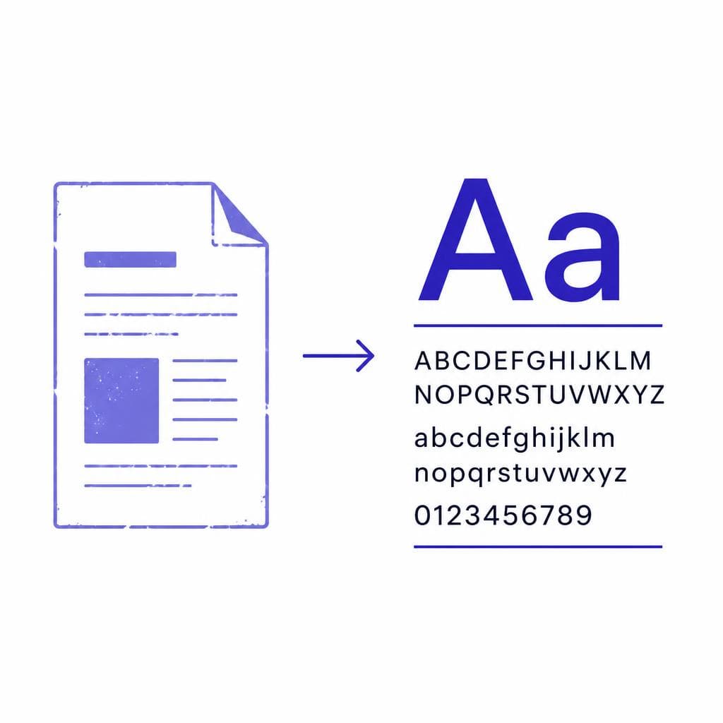
A surprisingly common brand problem starts with a perfectly usable logo file and ends with a missing typeface. The company has a JPEG on an old website, a flattened PDF from a former designer, or a scan of stationery from twenty years ago—but nobody has the original font name, license, or editable artwork. When a new sign, presentation, product label, or website is needed, the question becomes urgent: how do you recover a font from a logo without guessing your way into an inconsistent rebrand?
The good news is that an old image can contain enough letterform information to identify, approximate, or rebuild the type you need. The right path depends on the source file, the amount of text available, the uniqueness of the lettering, and how closely the final result must match. A crisp vector PDF may reveal the exact font in minutes; a low-resolution JPEG may require comparison and cleanup; a hand-drawn wordmark may call for a custom recreation rather than font identification.
This guide explains a practical logo font recovery workflow for JPEGs, PDFs, screenshots, scans, and legacy design files. It also covers what to check before you put the recovered type into production, so your revived old logo font works not only for one headline but across the real-world materials your brand needs.

Why Old Logo Fonts Get Lost
Fonts disappear from brand systems for ordinary reasons. A logo may have been created by a freelance designer who delivered only exported artwork. The original computer may have been replaced, the agency may no longer exist, or the font may have been installed from a library that was never documented. In older workflows, it was also common to convert logo text to outlines before sending files to a printer. That protected the appearance of the mark, but it removed the live text information that would identify the typeface later.
A lost brand font can also be the result of licensing changes. The original typeface might have come with an old desktop package, a discontinued font CD, a subscription that lapsed, or a foundry that renamed its family. In other cases, the logo was never set in a standard font at all. Designers frequently modify individual letters, adjust spacing manually, combine glyphs from different fonts, or draw the entire wordmark from scratch. That is why an exact visual match does not always lead to an installable font file.
The distinction matters. If the old logo is ordinary typesetting with minor tracking adjustments, your goal is to identify the family and obtain a legitimate license. If it is customized lettering, the better goal may be to recreate old font characteristics as a new, usable custom typeface or a limited character set. Treat the logo as evidence, not proof that a font name exists.
Before beginning, collect every version of the mark you can find. A small web JPG, a print PDF, a scan of an envelope, a presentation deck, and an old vector file may each reveal different details. One file might preserve clean contours, while another shows characters that are obscured or cropped in the primary logo. The more letters, sizes, and uses you gather, the more confident your final decision will be.
Start With the Best Available Source Files
Not all logo files are equally useful. Start with the source that preserves the most detail and requires the least reconstruction. This saves time, reduces false matches, and gives you a stronger basis for deciding whether you have found the original typeface or only a close substitute.
A vector PDF, EPS, AI, or SVG is usually the best place to begin. Open it in a vector editor and inspect the artwork. If the lettering is still live text, selecting it may expose the font family and style in the character panel. If it has been converted to outlines, examine the node structure and look for clues in layer names, metadata, linked assets, document properties, or embedded fonts. Some PDFs retain a font listing even when the visible logo has been outlined, especially if the document contains other editable text.
Next, look for high-resolution raster exports: TIFF, PNG, or a large JPEG. Use the largest version available rather than enlarging a tiny web image. For font matching, sharp edge detail is more important than the file extension. A 3,000-pixel-wide scan can be far more useful than a compressed, 200-pixel email attachment. Screenshots should be a last resort unless they show the logo at a large size with clear edges.
For paper-based material, scan rather than photograph whenever possible. Scan at 600 dpi or higher, use even lighting, and save a lossless copy before adjusting contrast. If you must use a phone, photograph the document straight on, avoid shadows and reflections, and correct perspective before attempting analysis. A tilted image changes the apparent proportions of letters and can lead to the wrong match.
Create a working crop containing only the logo lettering. Remove surrounding graphics, borders, and background textures. Then make two copies: one untouched archival version and one analysis version. In the analysis copy, straighten the baseline, increase contrast carefully, and convert to black and white only if doing so preserves the character shapes. Over-sharpening can create false corners and erase thin joins, which are often the exact details that distinguish one typeface from another.

Analyze Letterforms Before You Search
Use distinctive characters, proportions, and spacing as evidence
A productive font search begins with observation, not with a broad search for “similar fonts.” Identify the most distinctive letters in the wordmark. Depending on the logo, that might be the tail of a Q, the crossbar of an A, the leg of an R, the bowl-to-stem join on a P, the terminal of an S, or the shape of a lowercase g. These details narrow the field much faster than overall mood labels such as modern, elegant, retro, or bold.
Record a few measurable traits. Is the type serif, sans serif, script, slab, blackletter, or display lettering? Are the strokes monoline or do they show high contrast? Is the x-height large relative to capitals? Are the characters condensed, wide, rounded, geometric, humanist, or calligraphic? Check whether the letters lean, whether terminals are blunt or angled, and whether the counters—the enclosed spaces inside letters such as O, P, and e—are circular, rectangular, or irregular.
Spacing deserves separate attention. Many logos look unique because of customized kerning rather than because of a rare font. For example, a classic geometric sans may appear very different when the A and V overlap slightly, the O is widened, and the word is tracked tightly. When trying to extract font from an old logo, first compare the underlying glyph shapes with spacing ignored. Once you find a likely family, recreate the optical spacing as a separate step.
Run image-based font identification tools on a clean crop, but treat results as candidates rather than verdicts. Compare each candidate manually at the same approximate size. Type the actual logo word, convert it to outlines if needed, place it over the source image at partial transparency, and compare key points. A candidate that feels right in a font menu can fail immediately when its R leg, lowercase e, or numeral shapes are overlaid.
Keep a short comparison sheet with three columns: exact visual evidence, likely match, and differences. For instance, you may note that a candidate matches the uppercase E and O but has a flatter S and a shorter A crossbar. This turns an uncertain search into a defensible design decision and helps stakeholders understand whether the chosen font is exact, modified, or simply compatible.
Use AI When Identification Is Not Enough
Font matching is ideal when the old logo was made with a commercially available typeface and the source image is clean. But many recovery projects do not fit that simple case. The only surviving logo may be a small JPEG, a photocopy with broken edges, or a custom wordmark that has no corresponding font family. In these situations, AI-assisted reconstruction can turn the visible lettering into a practical starting point.
The process works best when you prepare the image thoughtfully. Use the clearest crop available, make sure the text is as front-facing as possible, and remove noise that is clearly not part of the letters. Do not erase meaningful irregularities too quickly: a slightly unusual terminal or stroke contrast may be a defining part of the logo. If the logo is on a textured background, isolate the lettering while retaining clean contours. A black-on-white version often produces the most predictable results.
Snapafont can help convert a lettering sample into a downloadable TTF font file, making it particularly useful when the goal is more than a one-off vector trace. Instead of redrawing the logo every time a new asset is needed, a custom font can provide reusable characters for packaging, social graphics, signage, or a heritage campaign. This is especially valuable when the original old logo font is unavailable, renamed, or was never a standard font in the first place.
Be realistic about the available character set. A logo that only says “NORTH” does not contain enough evidence to perfectly reconstruct every lowercase letter, punctuation mark, and numeral. AI can infer a consistent system, but inferred glyphs should be reviewed closely. If your business needs only a title font for a limited set of words, prioritize the letters you actually use. If you need an operational brand typeface, test capitals, lowercase, numbers, symbols, accented characters, and key ligatures before adopting it broadly.
A strong workflow is to create the recovered font, then compare the logo word typed in that font against the original. Adjust character spacing, baseline alignment, and any signature letters as necessary. In some cases, the best result is a hybrid: use the font for supporting display text and preserve the historical logo itself as a separate master vector asset. That approach protects the authenticity of the mark while giving your team a flexible type tool for new materials.
Also consider rights before distributing or commercializing a recreated typeface. If the source logo belongs to your organization, recovery is typically part of maintaining your own brand assets. If it belongs to another organization, use may raise trademark, copyright, or contractual issues. A typeface that merely resembles a logo is not a substitute for permission to use that brand identity. When in doubt, consult the rights holder or a qualified legal professional.
Quality-Check the Recovered Typeface Before Launch
A successful logo font recovery is not just a close-looking word on screen. It needs to survive the contexts where the brand will actually appear. Start by testing the original logo word at several sizes. Compare it side by side with the source at a large size, then reduce it to favicon, social avatar, label, and business-card scale. Small-scale tests reveal clogged counters, overly thin strokes, and spacing issues that are easy to miss in a large artboard.
Next, test real phrases rather than isolated characters. Set headings, taglines, web buttons, email signatures, and a short paragraph if the font may be used beyond display work. Look for inconsistent weight, awkward joins, uneven curve quality, and letters that look convincing alone but clash in sequence. Pay special attention to combinations that repeat in your brand name, such as TA, AR, LY, OO, or RN.
Check technical behavior as well. Install the TTF on both macOS and Windows if your team uses both. Test it in the software your staff actually relies on, including design tools, presentation software, word processors, website builders, and print workflows. Confirm that the font name is clear, the intended weight appears correctly, and no characters unexpectedly fall back to another typeface. If a vendor needs files for production, ask whether they require outlined artwork, embedded fonts, or a particular format.
Finally, create an accuracy standard before seeking approval. For a heritage logo restoration, you may require near-pixel-level visual fidelity in the original wordmark. For a campaign inspired by a font from an outdated logo, a stylistic match may be sufficient. Label the outcome honestly as “original font identified,” “licensed replacement,” “custom reconstruction,” or “logo-inspired companion font.” This avoids confusion later and keeps brand documentation trustworthy.
Preserve Your Brand Font So It Is Never Lost Again
Once you have recovered or recreated the type, document it as carefully as you would document the logo itself. Store the original source files, cleaned logo crop, final vector artwork, font files, license records, and a short explanation of how the match or reconstruction was made. Put these assets in a shared, access-controlled brand library rather than on one employee’s computer.
Your documentation should state the exact font family, foundry, style, version, license owner, purchase date, permitted uses, and any custom modifications. Include approved tracking values for the main logo wordmark, minimum-size guidance, color variants, and instructions on when the logo should remain a locked graphic instead of editable text. If the recovered type includes custom glyphs, identify them clearly and retain the editable masters.
It is also wise to separate primary brand typography from the logo lettering. Even if you successfully recreate old font details, the logo may have unique spacing or hand-tuned contours that should not be reproduced casually in body copy. A documented system can use the restored lettering for prominent brand moments and a licensed, readable text family for everyday communication.
Schedule a simple annual asset audit. Verify that font licenses are current, files open correctly, cloud backups are intact, and current staff know where to find the brand kit. This small habit prevents a future team from facing the same lost brand font problem—and makes the next redesign, vendor handoff, or website migration much easier.
Bring Your Old Logo Lettering Back Into Use
If your logo is trapped in a flattened image and conventional font matching keeps producing near misses, a custom reconstruction may be the most useful next step. Start with the clearest crop you can find, preserve the original as your reference, and test the result in the real words and sizes your brand needs.
Snapafont makes that process more accessible by turning image-based lettering into a downloadable TTF font you can test, install, and build into a practical workflow. Visit snapafont.com to try it with your old logo file and move from a fragile JPEG, PDF, or scan to reusable brand typography.
Ready to turn your image into a font?
Upload any image and get a real, downloadable .TTF font file in seconds.
Try Snapafont Free →

