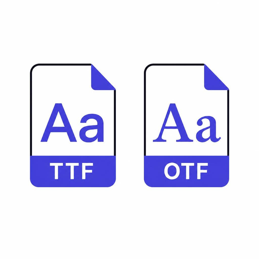
TTF vs OTF is one of those design questions that sounds technical until you need to upload a font to a website, package files for a printer, or install a typeface in an app. Then the choice can feel surprisingly high-stakes: should you download the .ttf file or the .otf file, and will choosing the “wrong” one affect how your text looks?
For most everyday projects, the answer is reassuringly simple: both formats work well, and the visual difference is often none at all. A font’s design—the letterforms, spacing, weight, and style—matters far more than whether its file ends in TTF or OTF. The difference TTF OTF comes down primarily to their underlying technology, the advanced typography features they can contain, and the software or workflow you plan to use.
This font format guide explains TrueType vs OpenType in plain language, compares the practical strengths of each format, and gives a direct recommendation for web, print, apps, and custom-font projects. By the end, you will know which font format fits your use case instead of defaulting to whichever download button you see first.
What Is a TTF Font?
TrueType basics
TTF stands for TrueType Font. Apple developed the TrueType format in the late 1980s, with Microsoft later adopting it broadly. It was designed to provide reliable font rendering across screens and printers at a time when those two outputs often produced very different results.
A TrueType font uses outline data to describe every glyph—the visual shape of a letter, numeral, punctuation mark, or symbol. These outlines are generally made with quadratic Bézier curves. That technical detail is not something most designers need to manage, but it helps explain why TTF files can scale cleanly. A well-built TTF font remains sharp whether it is used at 10 pixels in a user interface or 200 points on a poster.
TTF also includes hinting support. Hinting is a set of instructions that helps a font render more clearly at small sizes and on low-resolution displays. Modern high-density screens have made hinting less critical than it was decades ago, but it can still influence readability in older software, embedded systems, and pixel-sensitive interfaces.
The biggest practical advantage of TTF is compatibility. It is accepted by virtually every modern operating system and supported by common programs such as Microsoft Word, Google Docs, Adobe apps, Canva, presentation tools, website builders, and many desktop publishing applications. If you are sharing a font with an unknown audience or installing it on a variety of devices, TTF is usually a safe, low-friction choice.
A common example is a teacher creating classroom materials to share with colleagues. If the recipients use a mix of Windows laptops, Macs, and office software, a TTF file is easy to install and likely to work without special instructions. Similarly, TTF is often a strong choice for a simple logo font, a handwriting font, or a custom font that does not rely on extensive alternate characters.
What Is an OTF Font?
OpenType basics
OTF stands for OpenType Font. Adobe and Microsoft developed OpenType in the 1990s as a more flexible, cross-platform font standard. It was built to expand on the strengths of older font technologies while making room for richer typographic behavior.
An OTF file can store far more than the standard alphabet. Depending on how the font designer built it, an OpenType font may include ligatures, alternate characters, small caps, oldstyle figures, tabular figures, swashes, fractions, stylistic sets, contextual alternates, and support for multiple languages. For instance, a discretionary ligature can turn a letter pair such as “st” into a specially designed joined glyph. Oldstyle figures can make numbers blend elegantly into running text, while tabular figures give every number the same width for neatly aligned financial tables.
Many people assume every OTF font automatically has all of these extras. That is not true. OpenType is capable of holding advanced features, but the font creator must actually include them. An OTF with only basic characters may offer little functional difference from a TTF of the same design. Before selecting a format based on features, inspect the font’s glyph panel or feature list in the software where you will use it.
OTF fonts commonly use PostScript-style cubic Bézier outlines, although OpenType is a container format and can technically include either TrueType or PostScript outlines. In practical terms, you do not need to choose based on curve mathematics. Choose OTF when your workflow benefits from advanced typographic controls or when the foundry provides OTF as its primary professional desktop format.
For example, a book designer setting chapter titles with ornamental initials and body copy with small caps may prefer OTF. So might a brand designer using a display typeface with contextual alternates that subtly change letter shapes depending on neighboring characters. In these situations, OpenType features can save manual editing time and create more polished typography.
TTF vs OTF: The Key Differences That Matter
A practical comparison, not a format popularity contest
The most useful way to understand TTF vs OTF is to separate what affects your finished design from what affects your workflow. Neither file extension is universally “better.” The right option depends on compatibility requirements, available features, and where the font will be used.
First, consider typographic features. OTF is generally the better choice when you need professional controls such as ligatures, alternates, small caps, number styles, or extensive multilingual glyph sets. TTF can include useful data too, but it is more often distributed as a straightforward font format with a standard character set. If you are simply typing headlines, labels, social posts, forms, or basic paragraphs, that distinction may not matter.
Second, consider compatibility. Both formats are widely compatible on current Windows and macOS systems. TTF has a slight edge as the conservative choice for older software, legacy environments, and broad file sharing. OTF is also well supported in modern creative software, including Adobe InDesign, Illustrator, Photoshop, Affinity applications, and many current office tools. If you know your audience uses current software, either is normally fine.
Third, think about file size and performance. It is tempting to say that one format is always smaller or faster, but that is inaccurate. A font file’s size depends on its glyph count, included language support, hinting, kerning data, and optional features. An OTF with several stylistic sets may be larger than a basic TTF, but a complex TTF can also be substantial. For web use, modern webfont formats such as WOFF2 matter more for performance than the original TTF or OTF source file.
Fourth, understand rendering. With a properly made font on a modern device, viewers will rarely see an obvious visual difference between TTF and OTF. The same typeface can look identical in both formats. Poor rendering is more likely to result from a low-quality font, inadequate hinting at tiny sizes, browser behavior, or screen settings than from choosing TTF or OTF alone.
Here is the short decision rule: choose TTF when you need the widest straightforward compatibility; choose OTF when you need advanced typographic features; and use the exact format requested by your software, client, platform, or printer when one is specified. If both formats are offered and you have no special requirements, either one should serve a standard design project well.

Which Font Format Is Best for the Web?
Use webfont formats for delivery
For websites, the TTF or OTF choice is usually not the final decision. Browsers can support both in many situations, but the preferred production format is WOFF2, with WOFF as a fallback when needed. WOFF2 is designed for the web and typically compresses font data more effectively, helping pages load faster.
A sensible web workflow is to keep TTF or OTF as your editable source font, then generate licensed webfont files in WOFF2. If you are using Google Fonts or another hosted service, that conversion and delivery process is handled for you. If you are self-hosting, use a reliable font conversion tool and test the output across major browsers.
Do not upload a desktop font to a site just because the browser displays it correctly. Check the font license first. Desktop, app, and web licenses are often separate. A paid font may allow you to install it on your computer but prohibit serving it to thousands of site visitors without a webfont license.
For a custom website font, subset the file when possible. Subsetting means including only the characters and language ranges your site genuinely needs. A local bakery site that uses English text may not need a font package containing thousands of glyphs for every script. This can reduce load time, though you should retain characters required for names, addresses, currency, punctuation, accessibility, and future content.
In short, use WOFF2 for a live website. Start with TTF or OTF based on the source font and its features, but do not treat either desktop format as your web performance strategy.
Which Font Format Is Best for Print?
Prioritize the printer’s specifications and font embedding
For modern print design, OTF is often favored by professionals because advanced OpenType features are useful in page layout. In a magazine, annual report, packaging project, or book, small caps, alternate numerals, ligatures, and language-specific forms can improve consistency and reduce manual formatting. Adobe InDesign and similar layout tools are particularly good at exposing these features.
That said, TTF can print beautifully. A high-quality TTF used in a current print workflow is not inherently lower quality than an OTF. The outlines are vector-based in both cases, so they scale for high-resolution output. If a printer accepts your packaged file or print-ready PDF and the text renders correctly, the extension itself is unlikely to be a problem.
The best practice for print is to follow the vendor’s delivery requirements. Many printers prefer a press-ready PDF with fonts embedded, rather than separate font files. Embedding preserves the intended letterforms and helps prevent substitution errors when the printer does not have your typeface installed. Before exporting, check for overset text, missing glyphs, incorrect ligatures, and font licensing restrictions.
For editable files handed to another designer, include the licensed font files only when the license permits transfer. Otherwise, convert display text to outlines only after preserving an editable text version. Outlining can prevent font replacement, but it removes editable type and may make later copy changes difficult. It is useful for final logo artwork, not as a default solution for an entire multipage document.
If you are deciding which font format for a print project with no special features, choose the format your design application and print partner recommend. If you need sophisticated typesetting, choose OTF when available.
Which Font Format Is Best for Apps, Documents, and Everyday Use?
Compatibility is usually the deciding factor
For desktop apps, mobile apps, presentations, office documents, and general installation, TTF is frequently the simplest option. It is recognized across a wide range of systems and tends to cause fewer surprises in environments where advanced typography is not the priority. If you are distributing a font to a nontechnical team, TTF is a practical default.
However, app development has its own rules. A mobile framework, game engine, e-reader platform, or embedded device may specify accepted extensions and may have particular behavior around font embedding, variable fonts, fallback characters, or licensing. Always consult the platform documentation. For example, a developer may use TTF in an app bundle because it is the documented and tested format, while a branding team keeps an OTF version for editorial print work.
For Word documents and slide decks, use whichever version your organization has tested consistently. Avoid mixing TTF and OTF versions of the same typeface in a shared template unless you have a clear reason. Different versions can contain slightly different kerning, glyph coverage, or internal naming, which can lead to substitution when files move between computers.
A reliable handoff checklist is simple: install the font on a test machine, open the intended application, type common punctuation and special characters, test bold and italic styles, export to PDF, and inspect the PDF on a second device. If the work includes non-English text, test actual words in every required language rather than assuming the font supports them.
The practical TrueType vs OpenType conclusion for apps is this: follow the platform requirement first, choose TTF for broad basic deployment, and select OTF when the app or document truly uses OpenType features that have been tested in that environment.
Turn Your Lettering Into a Usable Font
Start with the format your project needs
Choosing a font file format is much easier once you have a clean, usable font to work with. If you have handwritten letters, a distinctive sketch, signage, or a lettering sample you want to preserve, you can turn that visual style into a font rather than recreating each character manually.
Snapafont helps convert an image into a downloadable .TTF font file, giving you a practical starting point for documents, design tools, presentations, and other compatibility-focused workflows. Upload a clear image with consistent characters, review the result, and test it in the actual software where you plan to use it. If your final destination requires a webfont or another format, make sure to convert it appropriately and verify licensing and rendering before publishing.
Ready to make your own lettering reusable? Try Snapafont at snapafont.com and create a font you can install, type with, and build into your projects.
Ready to turn your image into a font?
Upload any image and get a real, downloadable .TTF font file in seconds.
Try Snapafont Free →

