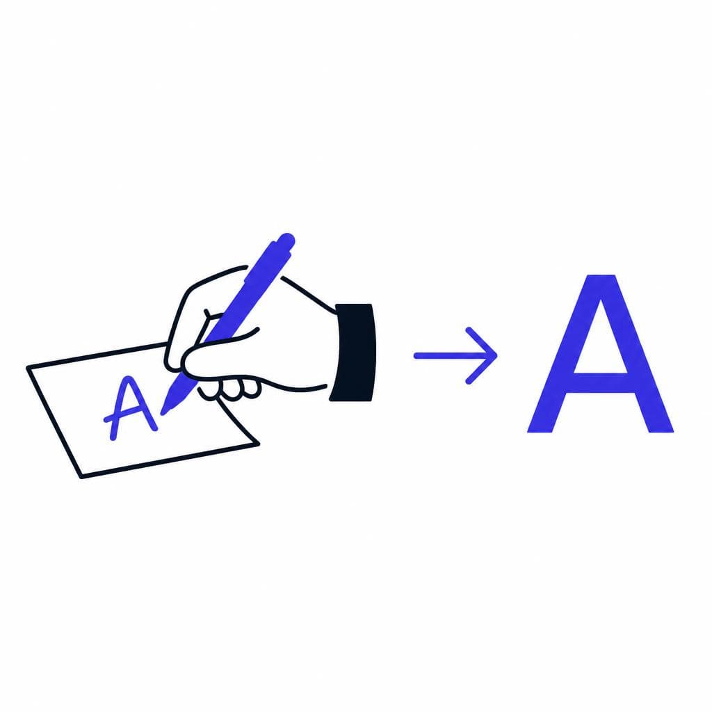
Your handwriting is already a typeface of sorts. It has recognizable letterforms, a natural rhythm, distinctive spacing, and small details that make it unmistakably yours. The difference between a handwritten note and a usable digital font is simply that a computer needs to know which drawing represents each character. Once it does, you can type with your own letterforms in documents, design software, social posts, presentations, and more.
Learning how to turn handwriting into font used to mean tracing every letter by hand in specialized software, adjusting vector points, and building kerning pairs one at a time. That process can still be useful for professional type design, but it is more work than most people need. For a personal project, a gift, a classroom resource, or a brand accent, modern AI-assisted tools can convert a clean handwriting sample into a usable font in minutes rather than months.
This guide explains how handwriting to font conversion works, how to prepare a sample that produces better results, what to refine after digitization, and where a custom handwriting font is most useful. Whether you want to preserve a loved one’s handwriting, make your journals feel more personal, or finally see “my handwriting as a font” on screen, the key is starting with a thoughtful sample.
What Makes Handwriting Work Well as a Font?
Not every handwritten page immediately translates into a polished font, but nearly every writing style can become a readable and charming one. A font works best when its characters are consistent enough to be recognized while retaining the small quirks that make the writing personal. You do not need perfectly uniform letters. In fact, a little variation is often what gives a custom handwriting font its warmth. You do, however, need clear character shapes.
Start with legibility. Each letter should be easy to distinguish from nearby letters, especially pairs such as “I,” “l,” and “1,” or “O” and “0.” If your lowercase “a” looks almost identical to “o,” it may still work in a casual display font, but it can be tiring to read in long paragraphs. The same applies to punctuation. Clear commas, periods, quotation marks, apostrophes, question marks, and exclamation points make the finished font much more practical.
Consistency matters most in a few areas: baseline, height, spacing, and stroke weight. The baseline is the invisible line that most letters sit on. Your handwriting does not have to be ruler-straight, but letters that drift dramatically up and down can make typed text look unstable. Likewise, aim for roughly similar heights for lowercase letters such as a, e, n, and o. Tall letters like b, d, h, k, l, and t should rise above that lowercase height, while descenders such as g, j, p, q, and y should extend below it.
Choose the personality you want before you write your sample. A neat print style is versatile for labels, captions, educational materials, and readable body text. A bouncy, rounded style can be great for invitations or playful branding. A connected cursive or brush-like style is better suited to headings, signatures, short quotes, and packaging because long blocks of script are usually harder to read. If you want to create font from handwriting for everyday typing, write slightly more slowly than normal and prioritize clarity over speed.
It also helps to think beyond the alphabet. A useful handwriting font includes uppercase and lowercase letters, numbers, punctuation, and common symbols. If you regularly write prices, dates, email addresses, hashtags, or web links, characters like @, #, &, /, :, -, and _ are especially valuable. A complete character set gives you a font you can actually use rather than one reserved for a few decorative words.
How to Prepare a Handwriting Sample for Better Results
Use clean tools, controlled spacing, and a complete character set
The quality of the source image strongly affects the quality of the final font. A good sample makes it easier for digitization software to identify each character’s outline, spacing, and proportions. You do not need professional art supplies, but a few simple choices can prevent common problems.
Use plain white paper and a dark pen. Black or dark blue ink usually creates enough contrast, while pencils, pale markers, glitter pens, and textured paper can introduce noise. A medium-tip pen is often ideal: it produces a confident line without making small details fill in. Avoid writing on lined or graph paper when possible, since background lines may interfere with character detection. If you prefer a more expressive look, a felt-tip pen or brush pen can work well, but make sure the strokes do not blur together inside letters such as e, a, p, and g.
Write one character per box or per clearly separated space. This is especially important for letters that have long ascenders or descenders. Leave generous room around each character so the digitization process can tell where one glyph ends and the next begins. Do not allow an f, j, y, or capital Q to overlap the neighboring space. If you are using a template, follow its cell boundaries closely; if you are making your own sheet, draw light guidelines or use a printed grid.
Include all the characters you expect to type. At a minimum, capture A–Z, a–z, 0–9, and basic punctuation. Write both upper- and lowercase letters even if your normal writing style makes them look similar. Computer systems treat “A” and “a” as different characters, so supplying both gives you much better results. Add accented letters or symbols if you need them for your language or workflow. For example, someone creating a font for French may want é, è, à, ç, and œ; a Spanish writer may need ñ and inverted punctuation.
When you are ready to scan handwriting to font, place the page flat in bright, even light. The best option is a flatbed scanner, but a phone camera works very well when used carefully. Photograph from directly overhead rather than at an angle. Avoid strong shadows from your hands or overhead lights, and do not use a dramatic filter. Crop the image to the page, rotate it so it is upright, and keep the original high-resolution file. A sharp, evenly lit JPG or PNG is usually easier to process than a compressed screenshot.
Before uploading, zoom in on several small characters. If you can clearly see periods, commas, dots on i and j, and the inside spaces of letters, your sample is probably ready. If those details look soft or gray, retake the photo. Five extra minutes of preparation can save much more time correcting a font later.
The Digitization Process: From Paper Sample to Font File
Map each handwritten glyph to a keyboard character
Digitization turns the marks on your paper into glyphs that a computer can use. At a basic level, the process identifies each written character, removes the paper background, converts the ink shape into an outline, and assigns that outline to a keyboard character. Your handwritten “A” becomes the glyph that appears when you press Shift+A; your “?” becomes the question-mark glyph; and so on.
Traditional font software often requires you to import each letter, trace it into vector paths, set baseline and side-bearing values, export the font, and test it. That level of control is valuable for designers creating commercial type families, but it can be intimidating for someone who simply wants their own notes to become a usable typeface. A handwriting font maker should reduce the technical burden while still giving you an opportunity to review the result.
With Snapafont, the practical workflow is straightforward: prepare a clear handwriting sample, upload the image, allow the tool to recognize and convert the characters, then download the resulting .TTF font file. A TrueType Font file is widely supported and can generally be installed on Windows, macOS, and many design applications. Once installed, your font appears in the font menu alongside other typefaces, ready to use in tools such as word processors, presentation apps, image editors, and design platforms.
Do not expect every first conversion to be perfect, particularly if the source has uneven lighting, tight letter spacing, or highly stylized writing. Treat the first output as a proof. Install it, type a short test sentence, and look at it at both large and small sizes. Try a pangram such as “The quick brown fox jumps over the lazy dog,” then test a sentence that uses words you write often. This will reveal missing characters, awkward spacing, or letters that look good alone but feel odd in context.
Keep in mind that a font repeats a single saved version of each glyph. If you wrote three slightly different lowercase e characters throughout your sample, the generated font will use whichever e you provided in its assigned position every time you type e. This repetition is normal. It creates the recognizable consistency of digital type. If you want a more natural handwritten effect later, use shorter lines, vary size slightly, or combine the font with occasional manually written accents in your design.

Editing and Refining Your Custom Handwriting Font
A successful conversion is not only about whether the letters appear on screen; it is about whether they work together. Test the font in real situations before deciding it is finished. Write a heading, a paragraph, a date, an email address, a list, and a sentence with punctuation. Look for uneven gaps, letters that collide, characters that sit too high or too low, and symbols that are hard to recognize.
Spacing is the first refinement to consider. Every glyph has space on its left and right, commonly called side bearings. If typed words appear too loose, the font may need tighter spacing. If letters touch when they should not, it needs more room. Pay special attention to combinations such as “To,” “Wa,” “ry,” “ll,” and “tt.” In handwriting, people naturally adjust spacing based on the next letter. A basic font cannot always make those context-specific adjustments automatically, so a few combinations may need visual review.
Next, check visual balance. A lowercase x is useful as a reference because it represents the main body height of many lowercase letters. Compare it with a, c, e, m, n, o, r, s, and v. These letters do not need to be identical in height, but wildly different sizes can make text look accidental rather than intentionally handwritten. Also make sure the dots on i and j are visible and positioned above their stems, and confirm that commas and apostrophes do not look like stray marks.
If an individual character is unclear, it is often faster to rewrite and replace that character than to attempt heavy digital surgery. Common candidates include S, G, 2, 5, 8, 9, &, and @. Rewriting a few weak glyphs with a calmer, more deliberate stroke can dramatically improve the final result. For important work, keep a versioned copy of your sample and font file so you can compare changes without losing an earlier version you liked.
Finally, use the font according to its strengths. A lively handwritten style may look perfect at 24–48 points on a greeting card but feel dense at 10 points in a report. If readability is the goal, increase line spacing and avoid setting long all-caps paragraphs. If personality is the goal, pair your handwriting with a clean sans-serif or serif font for body copy. This contrast lets the handwriting stand out without asking it to do all the readability work.
Practical and Meaningful Uses for a Handwriting Font
A custom handwriting font can be more than a novelty. It can help preserve a voice, create a recognizable visual identity, and make digital communication feel less generic. The best use cases match the mood of handwriting with content that benefits from a personal touch.
For families, one of the most meaningful projects is preserving a relative’s writing. A grandparent’s recipe cards, a parent’s notes, or a child’s early handwriting can be turned into a font and used in recipe books, photo albums, birthday messages, or keepsake prints. Use a copy of the original rather than a fragile archival document, and keep the source image safely backed up. The finished font cannot replace the emotional value of the original, but it can make that handwriting easier to include in new projects.
For small businesses and creators, a handwriting font can add personality to thank-you notes, product labels, packaging inserts, quote graphics, workshop materials, and social media stories. For example, a ceramic artist might use their handwriting for collection names and short care instructions while using a neutral sans-serif for detailed product information. A tutor might create colorful worksheets with handwritten headings but keep the exercise instructions in a highly readable standard font.
Teachers and parents can also create learning materials that feel familiar to children. A font based on a teacher’s neat print can be used for classroom labels, reward cards, reading prompts, or digital feedback. In this case, choose the clearest possible letterforms and avoid overly decorative cursive for early readers. Students benefit from consistent examples of letters, especially when learning the difference between uppercase and lowercase shapes.
For personal productivity, use your font in digital journals, habit trackers, calendar headers, printable planners, and note templates. This is a simple way to make digital systems feel less sterile without giving up the convenience of searchable, editable text. If your goal is “my handwriting as a font” across all your devices, install the font where you do most of your writing and keep the .TTF file in cloud storage for easy access when setting up a new computer.
Be mindful of permissions when using someone else’s handwriting. For a living person, ask before turning their writing into a font, especially if it will be used publicly or commercially. For historical materials, check any applicable rights and archival restrictions. Personal writing carries identity and emotion, so thoughtful use matters as much as technical quality.
Turn Your Handwriting Into a Font Today
You do not need to be a type designer to create font from handwriting. Start with one clean, complete sample, capture it in good light, and test the result in the kinds of projects you actually make. The goal is not mathematical perfection; it is a readable font that retains the character of your writing.
If you are ready to turn a page of handwriting into an installable TrueType font without a long manual design workflow, try Snapafont at snapafont.com. Upload a carefully prepared sample, convert it into a downloadable .TTF file, and use it in your favorite apps. It is a practical way to bring personal handwriting into digital documents, designs, and keepsakes while keeping the process fast and approachable.
Ready to turn your image into a font?
Upload any image and get a real, downloadable .TTF font file in seconds.
Try Snapafont Free →

