
A customer can form an opinion about your business before reading a single sentence. They notice whether your website feels orderly, whether your menu is easy to scan, whether an invoice looks trustworthy, and whether your social posts appear to come from the same company. Much of that reaction comes down to typography.
For a small company, typography is not a cosmetic finishing touch reserved for large brands with creative departments. It is one of the quickest, most affordable ways to make a business look established. The right type choices create clarity, signal care, and help people recognize you again. The wrong ones—even when your product is excellent—can make your business feel inconsistent, confusing, or less credible than it really is.
This guide breaks down typography for small business in practical terms. You do not need a design degree, an enormous brand budget, or a library of hundreds of fonts. You need a clear system: a few typefaces that fit your personality, rules for how to use them, and the discipline to repeat those rules wherever customers encounter your brand.
Why Typography Signals Credibility
Typography affects how people interpret information. A clean, well-spaced headline is easier to read and feels more intentional than a squeezed headline in an overly decorative typeface. A consistent set of weights and sizes makes a price list or service page easier to navigate. Those seemingly small details tell customers that you have considered their experience.
Credibility is especially important when a buyer is choosing between a familiar national brand and a local or newer business. They may not know your history yet, so they look for visual signals. A polished business typography system can communicate organization, confidence, and quality before a sales conversation begins. This is not about pretending to be something you are not. It is about making the quality of your presentation match the quality of your work.
Consider two examples. A neighborhood accounting firm using a highly playful handwritten font for its website body text may accidentally seem less precise, even if its team is highly qualified. Meanwhile, a children’s bakery that uses nothing but cold, narrow corporate sans-serifs can seem less warm than the experience it actually offers. In both cases, the issue is not whether the font is “good.” It is whether the typeface reinforces the promise the business makes to customers.
Good typography also improves usability. Visitors should be able to identify your main offer in seconds, read service descriptions without effort, and find contact details without hunting. Readability is not separate from professionalism; it is one of its foundations. A professional font small business strategy prioritizes legible body text, sensible line spacing, sufficient contrast, and a visual hierarchy that shows people where to look first.
Start by reviewing your most visible customer-facing assets: your homepage, Google Business profile graphics, email signature, proposal template, invoices, social media posts, printed signage, and packaging. If each one uses a different font, color treatment, or headline style, customers receive mixed signals. Fixing that inconsistency is often more valuable than a complete rebrand.
Font Pairing Basics: Build a Simple System That Works
Most small businesses need two fonts, not ten: one display font for headlines and brand moments, and one highly readable text font for paragraphs, descriptions, forms, and documents. In some cases, one versatile typeface family with multiple weights is enough. The goal is not to show how many fonts you know. The goal is to create contrast and hierarchy without visual noise.
A dependable starting point is to pair a typeface with personality with a typeface built for reading. For example, a boutique interior designer might use a refined serif for page titles and a neutral sans-serif for project descriptions. A mobile car-detailing service could use a bold, modern sans-serif for headings and a simple sans-serif for supporting information. A heritage food shop might use a friendly display serif alongside a clean, contemporary body font.
Use contrast deliberately. Pair fonts that differ in one or two meaningful ways—such as serif versus sans-serif, wide versus condensed, or expressive versus neutral—while still sharing a compatible mood. Avoid pairing two display fonts that both demand attention. Also avoid fonts that are nearly identical but not quite; the result can look like an accident rather than a design decision.
Create a short type hierarchy and write it down. A useful starter system might be: Heading 1 for primary page titles, Heading 2 for section titles, body text for normal paragraphs, small text for captions and legal details, and an optional accent style for short pull quotes or labels. Specify the font, weight, size, and capitalization for each. For instance: H1 in a semibold display font; H2 in the same font at a smaller size; body copy in a regular sans-serif; buttons in the body font’s medium weight. Reusing this formula instantly makes a site, brochure, and presentation feel related.
Before committing, test your small business font choices with real words from your business. Type your company name, a long service description, a price, an email address, and a call to action such as “Book a consultation.” A font can look impressive in a specimen but become difficult to read at 14 pixels, confusing in all caps, or awkward when it includes numbers and punctuation. Make sure your selected fonts include the characters you use often, including currency symbols, accented letters, and bold or italic styles where needed.
Keep Typography Consistent Across Every Touchpoint

Customers rarely experience a brand in one place. They may discover you through an Instagram post, visit your website, request a quote, receive an invoice, and later see your van, storefront, or packaging. Every interaction should feel like it belongs to the same business. Consistency is how a small brand becomes recognizable over time.
Begin with the touchpoints that influence revenue or trust most directly. For many companies, that means the website, proposal or quote template, email communications, social media graphics, and printed materials. Use the same headline font, body font, and general hierarchy across these assets. You do not need to make every item identical. A social post may use larger, bolder type than a service page, but it should still look like it came from the same visual family.
A one-page typography guide is enough for many teams. Include your primary and secondary fonts, approved weights, brand colors, heading styles, body text rules, and a few examples of correct use. Add practical instructions such as “Do not use more than two font families,” “Use sentence case for headlines,” or “Use the accent font only for short phrases under eight words.” Save it in a shared folder so employees, freelancers, and print vendors can all work from the same source.
Consistency matters in documents customers may overlook but still judge: receipts, appointment confirmations, onboarding forms, contracts, shipping inserts, and thank-you cards. A thoughtfully formatted invoice can make a freelancer or service provider seem more dependable. A readable booking email reduces customer questions. These are not merely administrative materials; they are part of your brand experience.
Do not forget technical consistency. If the exact font is unavailable in an email platform or a Google document, choose an approved fallback font rather than substituting a random alternative. For example, a brand that uses a geometric sans-serif on its website could use Arial or Helvetica as a practical email fallback. The letterforms will not be identical, but the overall impression will remain clean and readable.
Choose a Font Style That Matches Your Business Personality
The best font for small business branding depends on what customers should feel when they encounter your company. Start with three to five brand attributes, then look for typography that supports them. A law practice might choose “reassuring, precise, established.” A floral studio might choose “personal, romantic, modern.” A tech repair shop could choose “capable, straightforward, fast.” These words give you a more useful decision framework than simply asking whether a font looks nice.
Serif fonts, which have small finishing strokes on letters, often suggest tradition, expertise, editorial quality, or warmth. They can work well for consultants, legal services, luxury goods, bookstores, hospitality brands, and businesses with a craft or heritage story. Sans-serif fonts tend to feel clean, modern, accessible, and direct. They are popular with technology companies, fitness businesses, home services, health providers, and contemporary retail brands.
Script and handwritten fonts can add personality, but they should be used sparingly. They are strongest in a logo, short phrase, packaging detail, or social graphic—not in long paragraphs, navigation menus, or important instructions. Likewise, extra-bold condensed fonts can create energy for a gym, street-food concept, or event business, but may feel too aggressive for a therapist or financial planner.
Think about your audience and buying context. A wedding photographer can use more expressive typography because emotion and aesthetics are central to the purchase. A plumber needs clarity first: customers may be reading on a phone during an urgent problem. An online shop should test whether its font remains readable on product cards and checkout screens, where friction can cost sales.
Also consider accessibility. Body text should be large enough to read comfortably, typically around 16 pixels or more on websites. Avoid ultra-thin weights for important copy, low-contrast color combinations, and all-caps paragraphs. Use generous line height, especially in service pages and emails. Accessible typography helps more people use your content, and it makes every customer experience feel easier.
If you are stuck, choose neutral over trendy. A well-made, readable font will age better than a novelty typeface that dominates every design. You can still express personality through color, photography, language, layout, and a carefully chosen display style.
Custom vs. Off-the-Shelf Fonts: What Is Worth Paying For?
Off-the-shelf fonts are a smart choice for many small businesses. High-quality font libraries offer thousands of professional options, often with web licenses and multiple weights. The key is to verify licensing before using a font commercially. A free download may be limited to personal use, while a paid license may cover print but not website embedding, apps, or logo use. Keep license records with your brand files so you know what is permitted as your company grows.
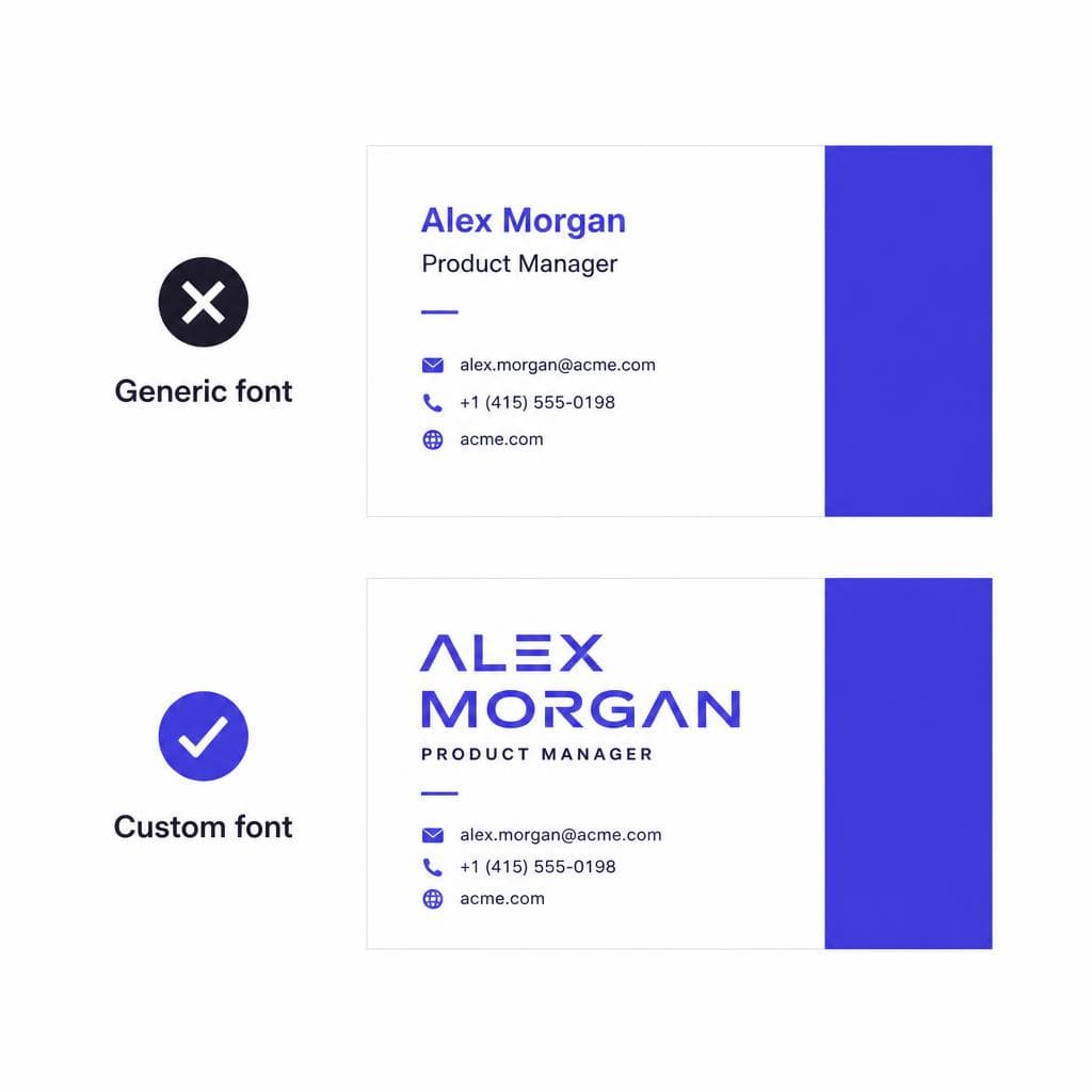
The downside of an off-the-shelf font is that competitors can use it too. That is not always a problem. A strong brand is built from the full system—name, message, colors, imagery, service, and consistency—not from a font alone. But when the lettering in an old sign, a handwritten recipe card, a family document, or a distinctive product label carries real meaning, a custom font can create differentiation that generic type cannot.
A custom brand font small business approach is particularly useful when your visual identity has a recognizable lettering style that you want to preserve and use consistently. For example, a café may have a hand-painted sign that regulars know immediately. A family-run workshop may have decades-old lettering from its original storefront. Turning those letterforms into a usable digital font lets the business bring that history into menus, packaging, website headers, thank-you notes, and merchandise without redrawing it from scratch every time.
Traditionally, custom font development could be expensive and slow. Today, tools such as Snapafont make it possible to turn an image of lettering into a downloadable .TTF font file, giving small teams a practical way to explore custom typography. The best source image is clear, high contrast, and includes as many usable letter shapes as possible. Photograph signage straight on, avoid heavy shadows and glare, and use the highest-resolution original you have.
Custom does not mean you should use the custom font everywhere. In fact, most distinctive typefaces work best as a display face for your logo, headings, packaging, or campaign graphics. Pair it with a simple, highly legible font for long-form content. This balance gives you a recognizable signature while keeping your website, documents, and customer communications easy to read.
Before rolling out any custom font, test it in the places that matter. Does it work at small sizes? Are the numbers clear for prices? Does it contain the punctuation you need? How does it look on mobile screens, in a printed flyer, and in a social profile image? A custom font should make your system more useful and distinctive, not create a new set of production problems.
Make Your Typography a Business Asset
You do not need a complete visual overhaul to look more established. Choose a readable body font, limit your system to one or two type families, define a clear hierarchy, and apply it consistently wherever customers meet your business. Those steps alone can improve trust, make your marketing easier to create, and help customers remember you.
If part of your brand already exists in a sign, sketch, product label, or piece of handwritten lettering, preserve that advantage instead of replacing it with something generic. Snapafont can help you convert that visual character into a usable .TTF font, so you can use it across the materials that tell your story. Visit snapafont.com to turn an image into a font and begin building a more recognizable, professional typographic system for your business.
Ready to turn your image into a font?
Upload any image and get a real, downloadable .TTF font file in seconds.
Try Snapafont Free →

