Typography is one of the fastest ways to make a design feel trustworthy, intentional, and professional—or amateurish. People may not consciously notice that a headline is too cramped or that a button label lacks contrast, but they will feel the effect. Poor type choices make content harder to scan, weaken a brand’s personality, and can even reduce conversions.
The encouraging part is that most typography mistakes are highly fixable. You do not need to memorize every type classification or own hundreds of premium font families to create strong work. You need a reliable process for choosing, arranging, and testing type. This guide breaks down 10 beginner typography mistakes, explains why they hurt a design, and offers practical fixes you can use on websites, social posts, presentations, packaging, and brand materials. Treat these as typography tips beginners can return to whenever a layout feels “off” but the reason is not immediately clear.
1. Using Too Many Fonts
Build a small, purposeful type system instead
One of the most common font mistakes is treating every text block as an opportunity to introduce a new typeface. A script font for the title, a condensed font for the subtitle, a serif for body copy, and another sans serif for buttons can make a page feel chaotic before a reader has absorbed a single word. Too many voices compete for attention and dilute the visual identity.
For most beginner projects, start with two font families: one for display use and one for body copy. A third can work when it serves a specific function, such as a monospace face for code or data labels. Pair fonts by contrast, not by randomness. For example, use a confident geometric sans serif headline with a highly readable humanist sans serif body font, or combine an editorial serif headline with a neutral sans serif for supporting text.
A useful rule: if you cannot explain the job a font is doing, remove it. Use size, weight, color, and spacing to create variety before adding another family. This restraint is one of the simplest ways to avoid beginner typography mistakes.
2. Creating Weak or Confusing Hierarchy
Make the reading order obvious at a glance
Typography hierarchy tells readers what to look at first, what to read next, and what information is secondary. When every line is similar in size, weight, and color, readers have to work to understand the page. Conversely, when everything is bold, large, or colorful, nothing feels important.
Create a clear scale for your design. A simple system might include a page title, section heading, subheading, body text, caption, and small utility text. Give each level a distinct role. For instance, a landing page could use a 48 px bold headline, 28 px semibold section headings, 18 px body copy, and 14 px captions. The exact numbers matter less than visible separation between levels.
Do not rely on size alone. Combine changes in size with weight, whitespace, and placement. A section heading above a paragraph needs enough space above it to announce a new topic and less space below it to show that it belongs to the copy that follows. When reviewing a layout, squint at it or zoom out. If the intended reading order is still clear, your hierarchy is likely working.
3. Using Poor Text Contrast
Prioritize readability before subtle aesthetics
Low contrast is one of the typography mistakes that can look stylish in a mockup but fail in real use. Light gray text on a white background, thin type over a busy photograph, or pale text on a pastel button may be difficult for many readers to see. Contrast is not merely an accessibility concern; it directly affects comprehension, trust, and whether someone can quickly act on your message.
Use dark text on light backgrounds or light text on dark backgrounds for important copy. For digital work, check color combinations against WCAG contrast guidance; normal body text generally needs a contrast ratio of at least 4.5:1. Also consider context: sunlight, low-quality screens, visual impairments, and a user moving quickly through a page all make faint text harder to read.
When placing type over an image, add a solid overlay, a gradient, a blurred background area, or a separate text container. Avoid solving a contrast problem with a heavy drop shadow alone. If the message matters, make it comfortably legible without visual strain.
4. Ignoring Letter Spacing, Line Height, and White Space
Give words room to be read
Spacing is often the hidden cause behind a design that feels crowded, cheap, or strangely difficult to read. Beginners commonly leave every setting at a software default, but typography needs adjustments based on font, size, case, and medium. Tight body copy creates a gray, dense block. Excessively open letters break words apart. Headlines with no breathing room can feel aggressive rather than confident.
Start with line height. For paragraphs, a line-height around 1.4 to 1.7 times the font size is usually a readable range. A 16 px body font, for example, may work well with 24–26 px line height. Larger display headlines often need tighter line height because their letters are naturally more spacious. All-caps text typically benefits from a slight increase in letter spacing, while lowercase body text rarely needs dramatic tracking.
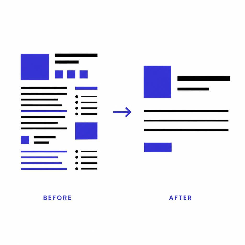
Also pay attention to whitespace around text blocks. Keep related elements close together and separate unrelated sections with larger gaps. This principle, often called proximity, helps readers understand groups of information without extra borders or labels. Thoughtful spacing is one of the most practical answers to how to improve typography quickly.
5. Choosing a Font That Does Not Fit the Context
Match the typeface to the message, audience, and medium
A font can be attractive and still be wrong for the job. A playful bubble font may suit a children’s event poster but undermine a law firm’s credibility. An ornate display serif might make a luxury invitation feel special, yet become unreadable at the small sizes needed in an app interface. Context should guide your type choice more than personal preference or current trends.
Before selecting a font, write down three adjectives for the brand or project. A financial service might need to feel clear, stable, and modern. A neighborhood bakery might need to feel warm, handmade, and welcoming. Then test whether your chosen typeface supports those ideas. Consider audience expectations as well: medical instructions should favor clarity, while a concert poster can tolerate more expressive display type.
Medium matters too. A font that works in a large print headline may not have the x-height, spacing, or screen rendering needed for mobile body copy. Test real words at their final size, not just a beautiful font specimen. This is among the font mistakes to avoid because it can make an otherwise polished visual identity feel inauthentic.
6. Failing to Use Typography Consistently
Define rules so every new asset still feels on-brand
Consistency does not mean every page has to look identical. It means recurring elements follow predictable rules. If one social graphic uses sentence-case bold headings, another uses all caps in a different font, and a third uses a completely new hierarchy, the audience sees separate designs rather than one recognizable brand.
Create a lightweight typography guide, even for a small project. Document your chosen font families, heading sizes, body size, weights, line heights, button styles, and rules for links or captions. You can make it as simple as a one-page reference in your design tool. The important part is that you apply it repeatedly.
For example, decide that H1 headings always use your display font at bold weight, section headings use the same family at semibold, and paragraphs use a body font at regular weight. Then resist one-off changes unless there is a clear reason. Consistency speeds up future design work, helps teams collaborate, and makes a brand appear more established. It is a core principle of typography for beginners and experienced designers alike.
7. Overusing Decorative Effects
Let the typeface do the work
Outlines, shadows, gradients, warped text, glow effects, multiple colors, and exaggerated bevels can turn a simple message into visual noise. Decorative styling is tempting because it makes text feel more noticeable, but noticeability is not the same as clarity. Effects often obscure letterforms, date a design quickly, and fight with imagery or other interface elements.
Use decoration only when it supports a deliberate idea. A subtle shadow may improve legibility on a photograph. A textured treatment may reinforce a vintage poster concept. But body copy, navigation, form labels, and calls to action almost always benefit from clean, unembellished text.
When a headline seems bland, improve it in a more durable order: first adjust the font choice, then the size, weight, color contrast, spacing, and placement. Only add an effect if the message is still clear without it and the effect has a specific visual purpose. This approach prevents a frequent category of common font mistakes: using styling to compensate for weak hierarchy or an unsuitable typeface.
8. Using Inconsistent or Uncomfortable Alignment
Create invisible lines that organize the page
Alignment is a structural tool, not a finishing touch. When text blocks, images, icons, and buttons do not share a clear edge or center line, a design feels unsettled. Even strong type choices cannot fully rescue a layout where labels drift, paragraphs begin at different positions, or elements are centered without a reason.
For longer text, left alignment is usually the most readable option in languages read left to right because every line begins in the same predictable place. Centered text works best for short, self-contained content such as invitations, quotes, or brief hero statements. Avoid centering long paragraphs; uneven starting points make scanning slower. Right-aligned text should be reserved for limited uses, such as numbers in a table or a deliberate editorial composition.
Use a grid or guides in your design software. Align headings, body copy, buttons, and image edges to consistent columns. Watch for accidental near-alignments—elements that are only a few pixels off. They look like mistakes, whereas clearly aligned or intentionally offset elements look designed.
9. Ignoring Font Weight and Style
Use weight to communicate emphasis without shouting
Many people use only Regular and Bold, then wonder why their typography feels blunt. Font weight is one of the most useful tools for building emphasis and hierarchy while keeping a design cohesive. A well-made family may include light, regular, medium, semibold, bold, and black weights, each with a different role.
Use regular weight for most body copy. Medium or semibold can give labels, subheads, and navigation a confident lift without the visual force of bold. Reserve bold or black for genuinely important messages such as major headings, critical numbers, or primary calls to action. If everything is bold, readers lose the ability to identify what is most important.
Avoid fake bold and fake italic controls when possible. Software-generated styles can distort letter shapes, create uneven strokes, and look inferior to the font’s designed variants. If a family does not include the weight or italic you need, choose another family or reduce your reliance on that style. Small weight changes are often more refined than introducing a new font.
10. Relying Only on Generic Font Choices
Add distinctive character without sacrificing usability
Safe, widely available fonts are popular for good reasons: they are familiar, readable, and easy to deploy. But using the same default choices in every project can make a brand disappear into the crowd. The goal is not to avoid popular fonts entirely. It is to make deliberate choices that reflect the brand rather than accepting a default because it is convenient.
Look for a typeface with a subtle point of view: perhaps a serif with distinctive terminals, a sans serif with warm humanist proportions, or a display face inspired by a brand’s local signage or archival materials. Keep usability central by using expressive fonts primarily for logos and headlines while choosing a robust companion for paragraph text.
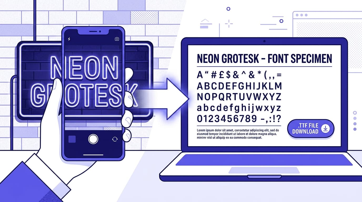
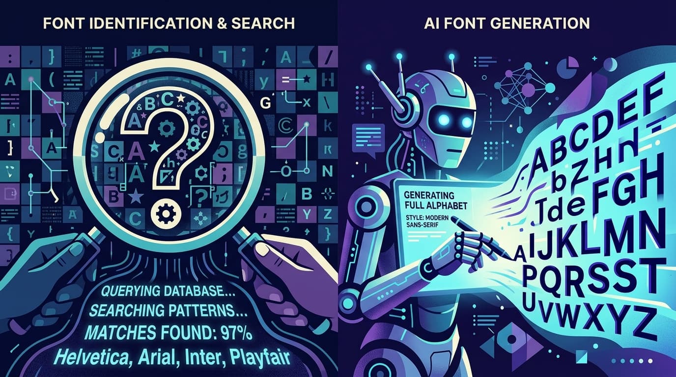
If a project begins with a real-world lettering reference—such as a handwritten sign, a historical document, or a custom wordmark—you can preserve that personality rather than approximating it with a generic substitute. Snapafont can turn a clean image of lettering into a downloadable TTF font file, making it useful for creating a more ownable starting point for logos, headings, or campaign assets. Test any custom font thoroughly for character coverage, spacing, and readability before using it widely.
Turn Typography Into a Recognizable Brand Asset
The best way to improve typography is to practice with intention. Reduce your font count, establish a hierarchy, check contrast, refine spacing, and review every design at its real-world size. These small decisions compound into work that feels clearer and more credible.
When your strongest visual inspiration is a piece of lettering you already have—a photographed sign, a hand-drawn alphabet, or a distinctive brand reference—do not settle for a generic imitation. Try Snapafont at snapafont.com to convert an image into a usable TTF font file and explore a type direction that is genuinely yours. Use the resulting font strategically, pair it with a readable text face, and apply the same typography rules in this guide to make the final system both distinctive and practical.
Ready to turn your image into a font?
Upload any image and get a real, downloadable .TTF font file in seconds.
Try Snapafont Free →