
You have probably seen a typeface in a photograph, an old book cover, a storefront sign, or a scanned handwritten note and wondered: can I turn that look into a font I can actually type with? For years, the practical first step was font identification—finding an existing typeface that looked similar. That can be useful, but it does not solve every problem. The original lettering may be custom, damaged, unavailable, or not a complete font at all.
That is where AI font generation enters the picture. In plain English, it is the use of artificial intelligence to analyze visual letterforms and help create a usable digital font from them. Instead of merely saying, “This resembles a particular font,” the technology can infer the style in an image and use that information to build glyphs you can type with.
This guide answers the question “what is AI font generation?” without assuming you are a type designer or machine-learning engineer. We will cover what the technology does, how AI creates fonts at a practical level, how it differs from font recognition, where it is useful, and the limitations that still matter. The goal is not to suggest that software can replace careful typography. It is to explain why font generation technology is becoming a valuable tool for designers, archivists, brand teams, and anyone who needs to preserve or extend a visual style.
What Is AI Font Generation?
AI font generation is the process of using artificial intelligence to create, reconstruct, extend, or digitize a typeface. The input might be an image of lettering, a few photographed characters, a sketch, a sample alphabet, or an existing font style. The output is usually a font file—often a TrueType Font (.TTF) or OpenType Font (.OTF)—that can be installed and used in standard design and writing software.
The simplest way to understand it is to compare it to an experienced lettering artist. If that artist sees the letters A, R, and S painted on a vintage sign, they can observe features such as stroke width, roundness, slant, terminals, spacing, contrast, and decoration. From those clues, they can make educated decisions about what the other letters should look like. An AI system is trained to perform a related pattern-recognition task at scale: it learns statistical relationships between visible letter shapes and the design rules that tend to connect them.
The phrase AI typography is sometimes used broadly, but it can describe several different capabilities. An AI tool may identify a font, suggest pairings, generate decorative lettering, clean up scanned characters, create missing glyphs, or convert an image-based alphabet into a keyboard-ready font. AI font generation specifically focuses on producing the font itself or the glyph data needed to make one.
A generated font is more than a screenshot of text. It contains individual glyphs—the shapes for letters, numbers, punctuation, and symbols—mapped to keyboard characters. It also needs spacing information so that words do not look cramped or uneven. Better font outputs can include kerning pairs, which adjust the spacing between particular combinations such as “AV,” “To,” or “Wa.” Depending on the source material and tool, a result may range from a simple display font for headlines to a more complete typeface intended for wider use.
This is especially useful when the visual source is distinctive but incomplete. Perhaps you have a title treatment from a family recipe card, six readable characters from a historical label, or a hand-drawn logo that needs to become part of a broader brand system. Rather than tracing every letter manually, you can use a machine learning font workflow to accelerate the repetitive reconstruction work. Human judgment still matters, but the starting point is dramatically faster.
How Does AI Font Generation Work? A Technically Simplified View
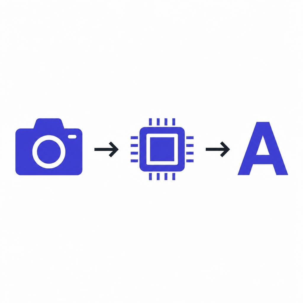
To understand how does AI font generation work, it helps to think of the workflow as a sequence of visual decisions. The exact methods vary between products, but most systems follow the same broad path: inspect the source image, isolate usable character shapes, learn or infer the style, turn those shapes into font outlines, and package the results into a working font file.
First, the software analyzes the image. It looks for text regions and attempts to distinguish letters from background texture, shadows, paper grain, perspective distortion, or surrounding illustration. A clean, high-contrast image is easier to process than a blurry photograph of an angled sign, but modern image-processing methods can often correct some skew, crop unwanted material, and separate dark ink from a light background.
Next comes character segmentation. This means determining where one character ends and the next begins. Segmentation is straightforward when there is a neatly spaced alphabet chart. It becomes harder with joined cursive writing, overlapping decorative letters, ligatures, or tightly tracked logo text. The system may use optical character recognition signals, shape analysis, and contextual clues to make a best guess about the characters it sees.
The core AI step is style inference. A model trained on many letterforms learns that typefaces are not a collection of unrelated drawings. They are systems. A lowercase “n” can tell you something about the arches in “m” and “h.” The curve of “o” can inform “c,” “e,” “d,” and “q.” The angle of a serif on “I” may influence the serif treatment on other capitals. When only part of an alphabet is visible, the model uses these learned relationships, plus the visible evidence, to predict plausible missing shapes in the same style.
After that, the letter images must become editable font geometry. Raster images are made of pixels; fonts are generally built from vector outlines made of points and curves. Vectorization traces the outer and inner contours of each letter and converts them into scalable paths. Good font generation technology also tries to simplify those paths so the result is smooth rather than jagged or overloaded with unnecessary points. This is why a font can remain crisp at both 12 points and 120 points.
Finally, the system assigns glyphs to characters, establishes basic metrics, and exports a font format. Metrics include side bearings—the blank space on the left and right of a glyph—and vertical measurements such as baseline and cap height. These details are easy to overlook, but they determine whether a font feels polished when you type a sentence rather than inspect one letter at a time. A practical tool such as Snapafont focuses on this end-to-end outcome: taking an image source and helping turn it into a downloadable .TTF font you can use.
The important point is that AI does not simply “copy pixels.” It combines image understanding, learned typographic patterns, outline creation, and font engineering. The quality of each step affects the final result.
AI Font Generation vs. Font Identification
Font identification asks, “What existing font is this?” AI font generation asks, “Can we create a usable font based on this visual style?” The distinction sounds small, but it changes what you can accomplish.
Identification tools compare a sample image against a database of known fonts. They may return an exact match, a close alternative, or a list of candidates ranked by visual similarity. This works well when the lettering in your image was made with a commercially available typeface and the image is clear enough to compare. It is a smart choice when you need licensing information, a quick substitute, or a reliable, professionally developed family with multiple weights and language support.
Generation is useful when no exact match exists. Consider a 1930s hand-painted café sign. The letterforms may be unique to that sign painter, altered over time, or visible only in a low-resolution archival photograph. An identification tool might suggest a few retro display fonts, but none will preserve the particular quirks that make the lettering memorable. A generation workflow aims to retain those quirks—perhaps the uneven crossbar on “A,” the elongated tail on “R,” or the soft, bouncy rhythm of the lowercase letters—and make them available for new text.
The two approaches can also work together. Start with identification if you suspect the source used an existing font. An exact match may save time and deliver more complete language coverage. If the search produces only near matches, or if you want to recreate an original hand-rendered style, move to generation. This sequence helps avoid recreating a typeface unnecessarily while giving you a route forward when search alone reaches a dead end.
There is also a difference in the result. Font identification gives you a name or recommendation. AI font generation explained simply gives you an asset: a font file derived from the source. That asset can be tested in a layout, used for headings, adjusted in a font editor, and applied consistently across a campaign.
Real-World Uses for AI-Generated Fonts
One of the most compelling uses is brand preservation. Small businesses often have a hand-lettered logo, packaging mark, or storefront wordmark but no usable font that matches it. Creating a complementary display font lets the business use the same visual voice on menus, social graphics, email headers, event posters, and seasonal promotions. For example, a bakery with a charming hand-painted “Sweet Crumb” sign could digitize its lettering style for short headlines while keeping a highly legible text font for prices and body copy.
Historical and family archives are another strong fit. Museums, local-history groups, and families may have postcards, letters, maps, or labels featuring expressive lettering. A digitized font can make an exhibit, book, or commemorative project feel more connected to the original material. The key is to label the result accurately: if missing glyphs were inferred, describe it as a recreation inspired by the source rather than claiming it is a perfect historical original.
Designers can use generated fonts for concept development. Imagine building a mood board around a worn stencil, a child’s block lettering, or a bold 1970s album sleeve. A custom display font can help test whether that aesthetic works across a full campaign before commissioning a bespoke typeface. It gives teams something tangible to evaluate: not just one beautiful reference word, but realistic headlines, calls to action, navigation labels, and packaging copy.
Content creators also benefit when a signature visual style needs to be repeated quickly. A photographer might create a font from their handwritten caption style. A YouTube channel could transform its illustrated episode-title lettering into a font for thumbnails. A wedding stationer might develop a font from approved calligraphy samples for place cards and signs. In each case, consistency is the advantage. Reusing a font is faster and less error-prone than redrawing every phrase from scratch.
Educational projects offer a more playful use case. Teachers can make classroom materials with student-created letterforms, and lettering instructors can show how a small set of design decisions creates a coherent alphabet. Use these projects to discuss readability, spacing, and context. A highly decorative font may be perfect for a poster title but tiring in a worksheet paragraph.
For the best results, match the project to the font’s likely strength. Image-derived fonts are often strongest as display faces for headlines, logos, labels, and short phrases. Before committing one to a large project, type representative copy. Test capitals and lowercase letters, numbers, punctuation, repeated letters, and pairs such as “LA,” “ry,” and “oo.” That quick test reveals whether the font suits its intended real-world use.
Limitations to Understand Before You Generate a Font
AI can speed up font creation, but it cannot guarantee that every output is production-ready without review. The biggest limitation is source quality. If the image is blurry, compressed, shadowed, or photographed from an extreme angle, the software has less reliable shape information. A clean scan or a straight-on, high-resolution photograph will usually produce better results than a cropped social-media image.
Incomplete references are another challenge. If you only have the word “MINT,” there is no direct evidence for how the source would draw “G,” “S,” “8,” or a question mark. AI can infer those glyphs based on style patterns, but inferred characters are interpretations. Review them closely, particularly if you need an unusual word, non-English characters, or extensive punctuation.
Spacing and readability require testing. A letter may look attractive in isolation but create awkward gaps in a word. Script styles may collide, very thin strokes may disappear at small sizes, and distressed texture that looks authentic in a poster may become distracting in a paragraph. Use the generated font at its intended sizes and on the intended background before finalizing a design. If it is primarily a headline font, do not judge it by body-text standards.
Licensing and ownership deserve careful attention as well. You should have the right to use the image or lettering you submit. A photograph of a famous logo, a commercial typeface sample, or artwork made by another creator may involve trademark, copyright, contractual, or ethical considerations. Generating a new font file does not automatically give you permission to use a protected design commercially. When stakes are high, consult the original rights holder or a qualified legal professional.
Finally, AI is not a substitute for a type designer in every situation. A complete retail-quality family may need multiple weights, italics, advanced kerning, OpenType features, extensive language support, hinting, and deliberate optical corrections. Those are specialized design and engineering tasks. Treat generated fonts as an efficient way to capture a style, prototype a concept, preserve lettering, or create a practical display asset—not as proof that typography no longer benefits from expert craft.
Turn a Lettering Reference Into Something You Can Type
The practical value of AI font generation is simple: it helps bridge the gap between seeing a style you love and being able to use that style in new words. Whether you are preserving a handwritten note, extending a one-off brand treatment, or testing a visual direction for a design project, begin with the best source image you can find and evaluate the result in real text—not just as individual characters.
If you have an image-based lettering style ready to explore, try Snapafont at snapafont.com. Upload a clear reference, generate a downloadable .TTF font, and test it in the tools you already use. Start with a short headline or label, check the characters most important to your project, and refine your source image if needed. That hands-on process is often the fastest way to see how AI creates fonts and whether the resulting typeface fits your creative goal.
Ready to turn your image into a font?
Upload any image and get a real, downloadable .TTF font file in seconds.
Try Snapafont Free →

